Thursday, January 30, 2014

Daily Quick Sketch: Spider-Man Swinging 2

Warming up for a day of drawing, I came up with a Spider-man doodle. So I quickly scanned it into ArtRage Pro 4.1 and inked and colored the image. I wanted the coloring to be very bold and stand out, so the color saturation was increased.


I don't really have time to read comics as much as I used to. I don't enjoy many of them anymore . . . maybe it's the style or how the stories have lost character. Maybe I'm just getting older and I don't relate to what the younger readers enjoy.

Not saying everything's bad. I do find the independent titles are far more enjoyable now and consistent then Marvel and DC. To list a few: Saga, Invincible, Bravest Warriors and any related to BPRD.

DC Comics has totally lost my interest since the reboot of their comics with the New 52; I don't recognize the characters anymore . . . only a handful of title (Batman mostly) have kept the quality of writing good stories. Continuity is no longer found. I can't tell what did or didn't happen in the past anymore. The best creators are being fired or they're quitting DC.
Superman now dating Wonder Woman?
The new Lobo is strangely . . . normal and boring . . . what?

And at Marvel, I find I can't keep up with whatever the main event is anymore; they over saturate the market with too many titles. The only Marvel books I'm really enjoying are "Daredevil", "Hawkeye", "Thunderbolts", "Wolverine and the X-men" and the point to drawing this doodle . . . anything with Superior Spider-man.

Original pencil sketch of Spidey (with pupils)
I read many people were highly upset about Doc Oct taking over the body and mind of Spider-man. And while it's a far fetched concept to handle, I think the stories have been highly entertaining and clever. Taking a villain, giving him a fresh start and exploring how this all effects Peter Parker's world has been a fun read.

As expected, this will end soon and Peter will be back, but I'm glad it happened and it should be seen as a great creative arc in the history of Spider-man (and Doc Oct.) Hats off to Dan Slott for writing such a great twist . . . making Spider-man fun to read again.

Wednesday, January 29, 2014

Daily Quick Sketch: Capt. "Squint"

Today's daily sketch is a pencil sketch from one of my sketch books. The character's full name is Captain Phineas "Squint" Falconi, expert pilot and engineer. 

I don't have any real plans to use this character yet. He was something in the back of my mind and I had time over the holidays to put him down in the sketchbook. I've always liked the idea of bird-like people who can't fly . . . so they use crazy contraptions. 

Pencil sketch of one of my many bird people . . . who can't fly with an aircraft.
If I ever do use him, I'll definitely dress him up more like a WWI pilot with full garb instead of this simple tee and jeans. I imagine when he talks, he would sound like Clint Eastwood (hence the nickname "Squint" and his squinty eyes.)

Wednesday, January 22, 2014

Pro Art Sketchbooks Review

Few words on sketchbooks.

I have several sketchbooks of different sizes and brands available around the house, but there is only one brand I find I'm most comfortable with -- I find 
Pro Art sketchbooks are the best. Here are my key reasons:

#1) The spiral binder: this allows you to sketch the entire page without having to deal with the pinch (or gutter) of a normal binder. It allows the sketchbook to lay flat without having to constantly hold the book open. 
This also allows better scanning since you can lay the page flat on the scanner bed.
Examples of several sketchbooks I randomly use at random times - I only draw on the right side pages of the sketchbooks because I have a heavy hand, (which causes too many pencil line indentations for me to draw on the reverse left sides.)
#2) Perforated Pages: This allows any drawing to be taken out of the sketchbook with a clean edge. This is great for book fairs, book readings or anywhere I may need to draw something to give/sell to someone.
Pro Art sketchbooks come in several sizes and also in normal book binding form, but the spiral binding works best for me and the way I work
#3.) Price. These are very affordable compared to other brands. I get mine from any Michael's Arts + Crafts store. Recently Michael's had a big sale on these sketch books. Prices were from $3 for the 4" by 8" to $7 for 11" by 14", each with 80 sheets.
The paper is also acid free. I stocked up on about $40 worth of sketchbooks, but even without the sale, the prices are usually very reasonable year round.
The Pro Art brand logo on the bottom back of the sketchbooks
#4.) Paper Quality. The paper is an above average quality which handles mixed media very well (Like pencil, ink and charcoals. Note: Markers will bleed through the page, so be aware and add spare sheets between your pages when working with markers.) I find the paper is very durable, enough to easily erase over the same area several times if needed.

Daily Quick Sketch: Grandpa Tuko, the old elephant

Today's daily sketch is a pencil drawing taken from one of my sketchbooks.

Not long ago, I was playing around with a story in my head about large animals. I need to establish a few family members for the story and this was the first image I "saw" in my head. 
(Sidenote: I'm probably years away from ever doing this story, I've about 6 other stories I NEED to do first.)

This was the first sketch attempt of this character. Hopefully during the next few years, I'll go back and re-imagine him again and again -- keeping the features I like and making changes for those I don't like, until I feel his character is exactly what I need for the story.

I know I added too much details for this character to work for a children's book, but it's far better to add more now and edit later. You never know when the slightest of details may inspire a totally new look or feature. 

First original pencil sketch of Tuko, the grandfather elephant of one of my stories.
I feel it's vital to capture as many imaginary thoughts and images you may think of; put them down on paper . . . then give them time. Time helps develop ideas, allows discovery and usually improves the final results exponentially.

Tuesday, January 21, 2014

Daily Quick Sketch: Polar Bear

Today's quick sketch was inspired by the snow storm happening outside. I always enjoy drawing polar bears.  It just seems that you can get more character with a polar bear than any other type of bear.

Polar Bear drawing digitally colored and outlined with crayon/charcoal effects
I always like to exaggerate the neck length of a polar bear. The bulky body is fun to draw too, the bulkier the better it seems. In this particular character design, I really like the flattop head/snout and the small eyes that simply rest on top of the head.

Scan of the original pencil sketch from my sketch book

Monday, January 20, 2014

Daily Quick Sketch: Sneakersaurus

Today's quick sketch is another dinosaur. Like always, the purpose of these quick sketches is to explore making new looks and styles.

For this image, I focused more on the head and face -- keeping the eyes and brows above the head. The blocky teeth create a goofy expression, making the character less gruesome.

Just for fun, I gave him a tippy-toe pose to make it look like he's sneaking around quietly. 
Original sketch done with a Staedtler blue pencil on marker paper

Saturday, January 18, 2014

Illustration Friday: BEGINNING

Illustration Friday: Every Friday a word is given on the website, IllustrationFriday.com. Artists and illustrators then submit an image that represents that word all during the week.
This week's word: BEGINNING

BEGINNING sketch made using pencil and color/toned using Photoshop

Thought Process:
This took awhile. Nothing came to mind at first. Looking at the other submissions to the word, I saw many images related to Spring, babies and seeds. I didn't want to go that route. But still, I couldn't think of what to do. 

So I thought, "Okay . . . how should I begin doing this image for the word BEGININNG?" And there was the answer . . . begin with the first pencil stroke.

I'm still a cartoonist first, so I didn't want to draw a realistic hand. I thought I'd try to do it in the style of Robert Crumb, using lots of cross-hatching and shaky lines. Once I finished the line work, I thought of toning the entire image with a sepia look using Photoshop.

Thursday, January 16, 2014

Daily Quick Sketch: Belly Bottom Shark

Today's daily quick sketch is of a evil shark character I call, Belly Bottom.
I've a story in which this character may play a small part as the villain, (but that story will be a long time coming since I want to do about 5 other stories first.) 


Applying several filters: Adding blotches and crosshatching for more dramatic effect

Even though I have no immediate need for this character, it is always best to get the character down on paper and safely saved on file for future reference. Otherwise, the character would probably just fade away from memory.


This sketch was done in pencil, scanned into Photoshop as the top "Multiply" layer. The next layer down is the color layer, where I used a texture brush to add gritty shading to the pencil lines. The bottom layer is the background, which was made by greatly increasing the texture brush's size and simply adding darker blue tones while moving towards the lower right of the image. The entire background was done in about 3 minutes.
I wanted to exaggerate the shark features and give it an eerie look. This was simply done by using dark colors and giving him soulless, empty white eyes. I feel the mouth is unique enough with an under-bite; but it still needs some work. I'm also thinking of making him look more war torn and roughed up, as if he was in several battles.  (But that might be too much for a children's book character.)
Original pencil sketch scan of Belly Bottom

Tuesday, January 14, 2014

Production Designs: Plush Toy Concept Sketches

I found a disk containing many of the sketch designs I did while working for Nanco.
Most of these are well over 10 years old. Our New Jersey Amusement Plush Division of Nanco was the leader of Amusement Plush; those are the stuffed toys you see in all sizes; from crane machines to the gigantic "how-are-we-ever-going-to-get-this-into-the-car?!" sizes. 


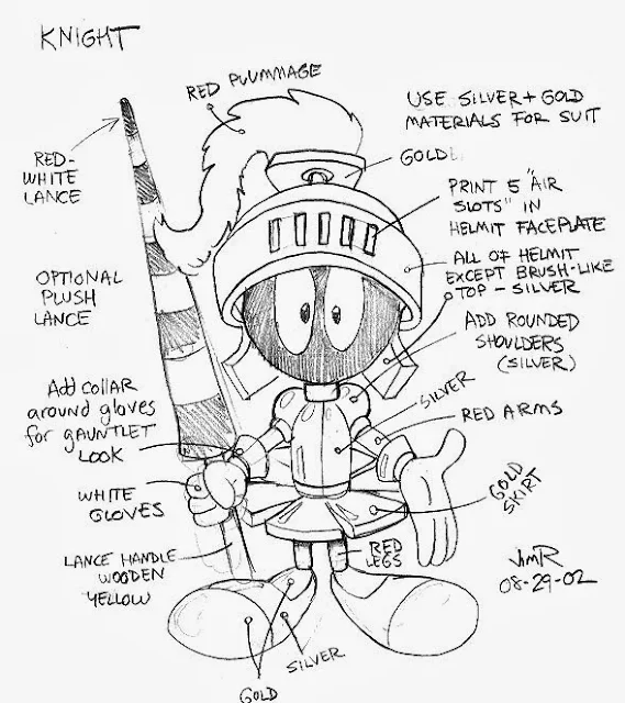
Warner Bros. Marvin the Martain designed as a Knight.
The challenge is to create a new look, while respecting the character and the brand

My job at Nanco was Creative Director, which meant creating designs, getting approvals from licensors, overseeing production overseas and acting as Art Director. Every sketch you see had to be approved by the licensor first, then go to the China factories for samples, usually in 3 to 9 different plush toy sizes. Then every size had to be approved, changed and re-sampled. So you can imagine the amount of work when we had 30-40 licenses, each with an average of 4-6 characters and each of those being done in 3 to 9 sizes. That's a lot of plush . . . 

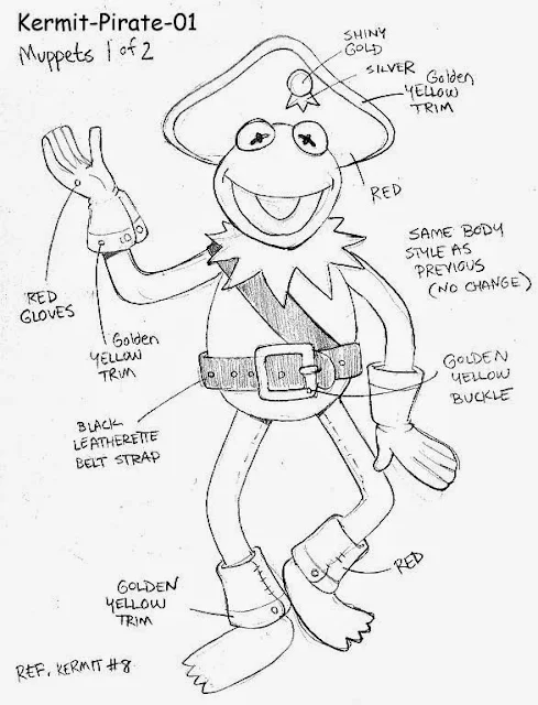
Kermit the Frog as a pirate. This was one of about 6 Muppet Pirate designs.
It's important to also consider the character's persona. Since Kermit is the leader of the Muppets,
it makes sense to make him a Pirate Captain and dress him as one.

Nanco had many licenses such as: Sesame Street, Jim Henson's Muppets, Warner Brothers, CareBears, Nickelodeon, Dreamworks, M+M's, My Little Pony, Simpsons, Family Guy . . . many, many more. First, for each licensed character, we had to create an original, fully approved, "master" plush pattern. Then each following year, we would create themes to freshen-up and dress-up the approved characters. Doing this helped sales since we were introducing new items to appear in the amusement parks each year. We had themes like Pirates, Circus, Birthday, Medieval, Beachwear and even Holiday themes like Christmas, Easter and Halloween.  

Vector color version concept design, Doing the sketch as a vector design allows quick color changes if needed.

These are concept sketches. The concept sketches for plush toys were almost like doing fashion designs, only instead of fancy clothing, we were dressing the characters in cartoon theme related clothing. I would add notes and color call-outs to help the plush designers understand anything the pencil lines could
 not easily convey.

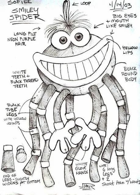
Original design Smiley Spider.
This was done as a follow-up to the very successful Smiley crab design I did the previous year;
but this design was too bulky and expensive to produce.

Occasionally, I would create original characters, (usually with a beach theme since some of our biggest buyers were from boardwalk amusement areas like the Jersey Shore.)  This character is one example that was a nice design, but it was just too costly to make.
One of the many things I learned as a plush designer is that a round ball-like head is more expensive to make because:
#1.) a ball takes a lot of stuffing to fill.
• More filling = more weight = more shipping cost.
#2.) Rounded shapes take up more room in a shipping carton -- adding a lot of wasted empty space. (Think of all the empty gaps of space between balls when they are stacked up.)
• Takes up more space = less items ship in a given carton = very expensive to sell.  


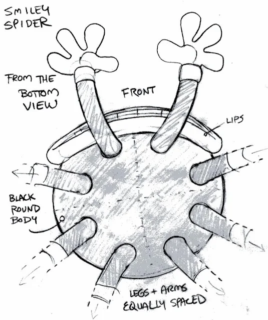
The underbelly of the Smiley Spider design. I felt I needed to show this angle of the toy so that the plush designers I Shanghai could see how I was imagining the character and it's ligaments.

In the future, I'll show more concept designs and licensor approval follow-ups (which I call side-by-sides)

Monday, January 13, 2014

Daily Quick Sketch: Pigley

Today's quick sketch is a little pig I call Pigley. As always, my challenge is to draw a pig differently then I have before. So on this little guy I gave him an egg-shaped body, huge eyes, forward pointy ears, wide flat snout, a non-curly tail and hockey puck hooves. 
Pigley, quick sketch done with Copic markers on Canson marker paper
This sketch was done with markers.
There much lost when scanning markers. I believe the scanner's hard light makes the paper more translucent then it actually is; so the blending of the markers, (like the pig's hind leg) tends to look more blotchy compared to the actual drawing.

For this reason, I doubt I will ever do a complete picture book in markers, because the transfer to print is not truly accurate. (But making images this way is still very nice when you see the actual work.)

The original pencil sketch of Pigley

Monday, January 6, 2014

Pencil Line + Marker Comp Technique II: Fwog the Frog

Here's another example of combining a marker comp of color with the black + white lines of a pencil sketch. I found doing this really helps define an image, especially when viewed on the Internet/monitor. I'll show the different techniques and compare styles below:

I've been doodling over the weekend and wanted to get back to my roots of designing, which is weird, silly and goofy looking characters. I've been playing with an idea I had of small critters having a war in a typical suburban backyard. The character below is Fwog, he is the trusty mount for one of the heroes in the story.

There's something lost whenever I go from pencil to pen. With pencil, my control seems looser and more detailed. Once the image goes to ink, much of those details are lost or simplified. Ink makes an image cleaner and better defined for print . . . but there's something about the original sketch line that has more detail and character.


• The Original Pencil sketch of FWOG. Again, like all of my sketching, I want to create something new
and different from what I've done before. Here, I wanted a warped looking frog, giving him odd and
humorous features. The pose was actually forced due to the limited space on the sheet of paper - but in this
case, I think it worked out very well. The pose has a graceful-clumsiness to it.

• The inked version of FWOG using a Faber-Castell black brush pen (B).
Knowing this was to be combined with a color comp, I tried to keep the image clean and less busy.


• Combining both the pencil sketch image on top of the color comp image.
I believe this gives the best results with a nice balance of outline and color.
• Color comp image using Spectrum Noir markers and a white Gellyroll Pen (8) for highlighting.
The original drawing looks good on paper, but much is lost when scanning to the computer.
Without a solid holding line, this image appears to be sun bleached and faded.

• Combining the inked image over the color comp image - creates a nice bold image.
I feel this is too much black line. Note the slight error near the tip of Fwog's snout that was
altered during inking; the line work does not properly sync together with the color comp below.
It's important to stay consistent on both images when using this technique -- or errors
(as seen here) will occur and ruin the complete effect.

If you want to see another example of how I use this technique, with a little more detail on the process, go to the link here.