6. Fine tuning
The client had liked the direction the logo was heading and decided the highlighted hydrant with the dog hugging was the best, but she didn't want the dog hugging the hydrant. Instead, she wanted the dog facing forward -- so two more versions were created.

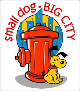
Her choice was to go with the left version with the sitting dog, but she also liked the blue spot background of the right design. She also liked the more rigid typeface the word "BIG CITY" was using in the 2nd image. Her last request was to try and give the dog a little more character.


Unfortunately, like many websites after 9-11, the site never took off that year. I know from my current job that the pet business has been starting to grow again, particularly in the clothing for smaller dogs. I think this website's concept could do very well today - even in a bad economy.
I hope you enjoyed this step-by-step process.
My advice to new designers: be patient with your client and listen to what they say. If you don't agree with the client, try to explain your concept with logic - but always allow the customer to have the last word. Lastly, when designing logos, make sure you simplify as much as possible. The most famous logos are usually the most simplistic; so don't over color, over-shadow or use multiple colors gradients when trying to make a strong logo.
Keep it simple and clean.

Her choice was to go with the left version with the sitting dog, but she also liked the blue spot background of the right design. She also liked the more rigid typeface the word "BIG CITY" was using in the 2nd image. Her last request was to try and give the dog a little more character.
7. Print-out Variants
The follow-up was the sheet below, showing the key design in 3 different printing formats for her to print in many mediums. Also included is an image showing several more design elements like adding spots to the dog, a blue cityscape to the background and changing the typeface of the words "BIG CITY".

To make sure that this was the image the client wanted, I created one more sheet of variations. The goal here was to throw many different colors, size alterations and detail changes to make sure that the client was going to stay with her final choice.
8. Approval
The client was happy with the new element changes -- all but the spot around the dog's eye (which did seem a bit too much). Below is the logo that was given approval.

Unfortunately, like many websites after 9-11, the site never took off that year. I know from my current job that the pet business has been starting to grow again, particularly in the clothing for smaller dogs. I think this website's concept could do very well today - even in a bad economy.
I hope you enjoyed this step-by-step process.
My advice to new designers: be patient with your client and listen to what they say. If you don't agree with the client, try to explain your concept with logic - but always allow the customer to have the last word. Lastly, when designing logos, make sure you simplify as much as possible. The most famous logos are usually the most simplistic; so don't over color, over-shadow or use multiple colors gradients when trying to make a strong logo.
Keep it simple and clean.