Showing posts with label Illustration Friday. Show all posts

Saturday, October 8, 2016

Illustration Friday: ICE (UPDATE)

Illustration Friday: Every Friday a word is given on the website, IllustrationFriday.com. Artists and illustrators then submit an image that represents that word all during the week.

This week's word: ICE
Wrap design made for inflatable swimming pool

Originally posted 

MONDAY, OCTOBER 15, 2012

This is a very busy week for me, so I had to pull from the archives.

This was a design I made recently for an inflatable swimming pool wrap (the image repeats several times around the pool.) I made this thinking how fun it would be seeing playful polar bears and penguins swimming around icebergs during a hot summer's day.

I kept the image very blue and cool, limiting warm colors to just a few highlighted small areas. The composite for this was very important to balance out the polar bears and penguins so that they seemed to mingle all together and not just hang within their own species. Hopefully, when looking at this image, kids get a friendly, fun and cool feeling.

The artwork is vector based so that the image could be enlarged, reduced or re-arranged to be used for other items like beach balls, beach umbrellas, swimmies and life preservers.


RE: Illustration Friday
If you would like to join in on the fun, head over to Illustration Friday. It's totally free, no need to login or sign up for anything. You can view all the submissions from this week (and past archives of previous words.) Have a sketch to show? Send your own artwork up for others to see.

UPDATE:

Below is an image of the finished product. The repeat turned out great. I like how the clouds cast shadows on the inner lining of the pool. This image was taken outside of the factory near Shanghai, China.

The one thing that bothers me is that the tube around the polar bear's waist should be red. I feel the yellow tube competes with the sun in the sky, but at least it's a warm color against all the cool coloring below. Don't know why that change was made.
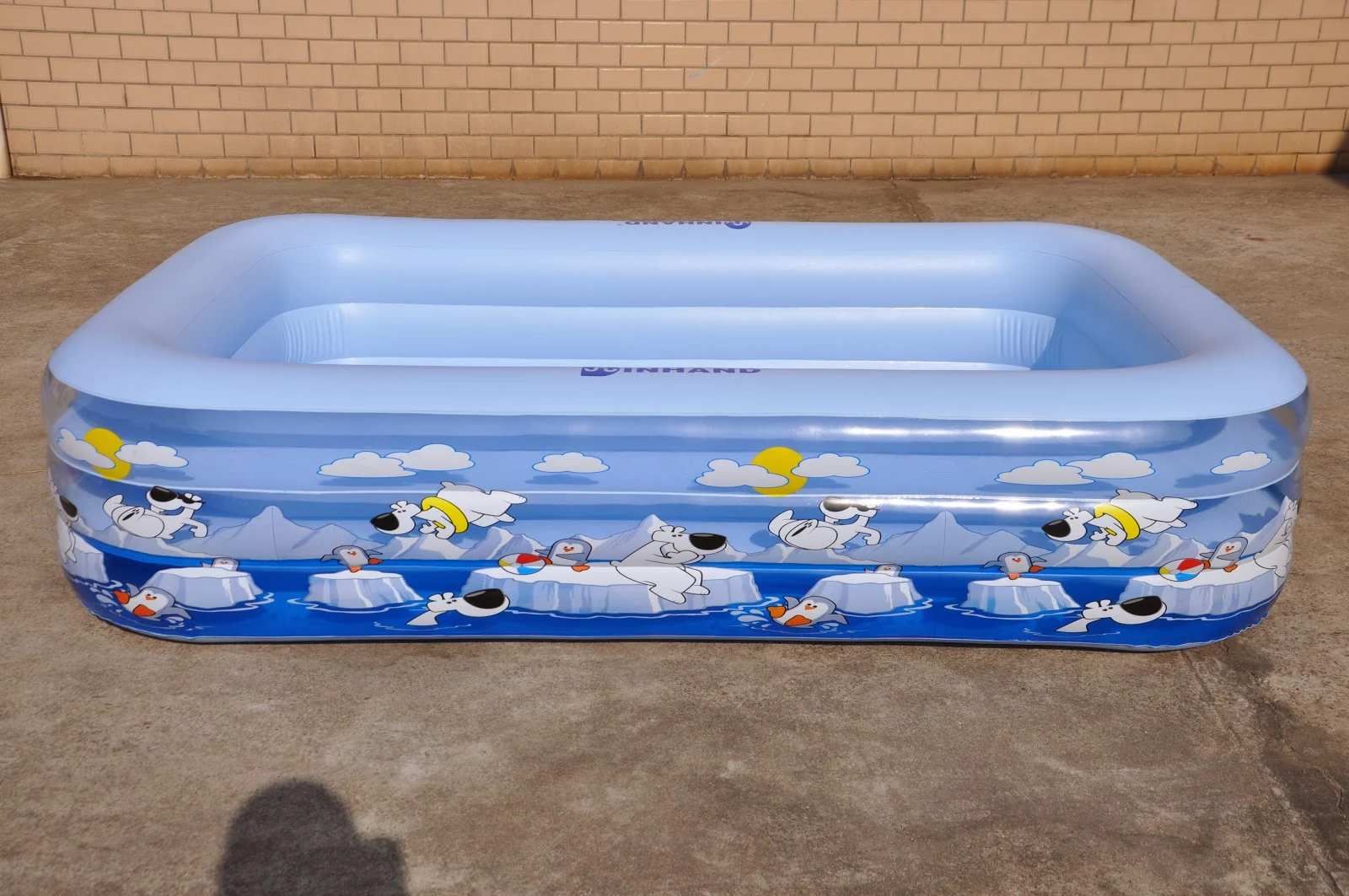


Image of the finished product using a repeat pattern of the design above.

Tuesday, April 5, 2016

Illustration Friday: Sparkle

Illustration Friday: Every Friday a word is given on the website, IllustrationFriday.com. Artists and illustrators then submit an image that represents that word all during the week.
This week's word: Sparkle

Thought Process: It's been some time since I did any sketches for Illustration Friday. The word sparkle immediately made me think of the comical effect of "sparkling teeth" often seen in cartoons, commercials and comedies.


Cartoon lion with a shiny tooth/fang -- hand inked and then scanned into Photoshop for coloring
I remembered doing a pencil sketch of this cartoon lion seen below, except he wasn't smiling -- in fact I drew him without a mouth at all. So I added a huge toothy grin -- exaggerating the smile. 

The original pencil sketch of the cartoony lion (sans mouth)
To add the "sparkle", I had to darken the entire image in order to visually show the white tooth shine. It helped to texture the image, creating a slightly darker tone to help emphasize the sparkle.

Thursday, February 11, 2016

UPDATE!: Sea Tea Time

UPDATE: Feb. 11, 2016
Image color touch-up and added a poem . . . officially FINAL!

- - - - - - - - - - - - - - - - - - - - - - - - - - - - - - - - - - - - - - - - - - - - - - - - - - - - - 
(originally reposted on Dec. 8th, 2015)
Was: Illustration Friday: Wet (aka Sea Tea Time)
Recently revisited this image over the weekend and added more detailing and color. I still feel the tone is too dark, especially with the water. It looks fine on screen, but when printing, everything seems toned down and the colors don't pop the way they do on a computer screen. Arrrggghhh!
Will probably play around with this image again in the future.
Cha-Cha-Changes: The latest and last revision to this image (for now.)
Update Text: Keeping the elements I liked from below, I made changes that I felt were not working in the image below:
• Stronger texture highlights were added.
• I felt the sun didn't fit with the style, so I redrew a more textured pencil sun instead.
• The coloring of the sky and water were too similar; adding textured shadows to the water and toning down the blue sky helped create a stronger contrast between the two.
- - - - - - - - - - - - - - - - - - - - - - - - - - - - - - - - - - - - - - - - - - - - - - - - - - - - - 
This is an old image I did last year* which I'm posting now for Illustration Friday. Every Friday a word is given on the website, IllustrationFriday.com. Artists and illustrators then submit an image that represents that word all during the week.
This week's word: WET
The digitally colored image made in Photoshop
*Below is the pencil sketch I drew during the 2015's SCBWI Winter Conference in NYC in February. I had no reason for drawing this image, just random inspiration. I've already purchased my tickets for this year's conference in February and decided to also show my portfolio this year, looking forward to it.
The original pencil sketch that was drawn on the back of a sheet during the SCBWI Conference

Friday, October 9, 2015

#INKtober 2015 No.8: King Kong + the Empire State Building

For those keeping counts . . . Here's INKtober No.8!
This one goes back to my childhood memories of watching all the big ape movies around Thanksgiving. King Kong is often portrayed hanging from atop the Empire State Building -- that image is as iconic as the film itself. But let's face it, the radio antenna on top the Empire State Building is not made of titanium people!
INKtober 2015 image #8 inked then gray tones added in Photoshop
For creating this image, I needed to work in several steps.
First, I needed to make a picture of the Empire State Building in cartoon form. The goal here was to try and capture the characteristics of the building that make it instantly recognizable. If the building is drawn too stiff, detailed or mechanical, it doesn't work with the cartoon. Inking the lines freehand (without a ruler or straight edge) gave the Empire Building a more playful look.
The original inked image without gray tones.
Once the building was sketched, adding the cartoon of King Kong became easier. I also tilted the building to the right to give a better perspective, movement, and energy to the overall image.
Original pencil sketches. Originally two separate images which were combined to create this look.

Friday, May 29, 2015

Illustration Friday: Ninja Mummy

Illustration Friday: Every Friday a word is given on the website, IllustrationFriday.com. Artists and illustrators then submit an image that represents that word all during the week.
This week's word: MONSTER

This is a word of the week that I can really enjoy! So many monsters!

This was a sketch I had originally created around Halloween 2014. It was going to be an ordinary dancing mummy, but I stopped drawing it after doing the top half of it's body and put it aside for several days.

When I went back to finishing the sketch, I saw the character in a new light. The pose looked more like a martial artist stance, so I started to give the dancing mummy some ninja clothing.

The Ninja Mummy fighting in a sand storm

I started to imagine how this character would animate since its a contradiction of two movement styles:
A.) the fluidly smooth, silent and quick reflexes of a ninja, mixed with
B.) the awkwardly slow, stumbling and limbering motions of a mummy.
Merging the two styles, I'd picture he'd be a quick and skilled martial artist, but he would often spastically twitch uncontrollably, groaning and create nontraditional (but humorous) fighting poses.

The original pencil sketch that was going to be a dancing mummy . . .

Friday, April 10, 2015

Illustration Friday: Warrior (aka Sir B' Gok!)

Illustration Friday: Every Friday a word is given on the website, IllustrationFriday.com. Artists and illustrators then submit an image that represents that word all during the week.
This week's word: Warrior

The chicken warrior known as Sir B'Gok, created in ArtRage Pro

Thought Process:
Through word association, the word "warrior" instantly reminds me of bravery. This, in turn, makes me think how a true warrior would never run away from any fight.
Such a warrior would never be . . . A chicken. This gave me the idea to make a "chicken" hero.

The original pencil sketch of Sir B' Gok

Thursday, April 2, 2015

Daily Quick Sketch: Pirate Dream

Continuing my physical painting: (aka, an attempt to take a break from the digital creating and going old school.)

I've been struggling a bit, learning to leave things alone, where before I would simply make any needed changes in Photoshop or Painter. I've even destroyed another painting due to using liquid frisket. (Note: Liquid Frisket is a liquid form of rubber which can be brushed on a painting to mask and protected areas from being painted over or wet.) In this case, the liquid frisket absorbed into the paper and ripped the top layer of paper when it was being removed. I should have tested this brand of watercolor paper before using the frisket on actual artwork.
The finished image of "Pirate Dream", a watercolor and pencil painting

"Pirate Dream" was an idea I had for a story about a lonely little boy, Rudy, who dreams of adventures. The imaginary friends he meets on these adventures are often his subconscious mind encouraging, motivating and inspiring Rudy to face his fear and be a better person.

The very first concept rough of the image, which was originally set in the day time.

I'm not happy with how the night sky turned out in the painting. It's never easy to paint dark watercolors in such a large portion of the image. I originally planned to use liquid frisket on everything but the sky, this way I could easily and quickly paint in the dark night sky. But after my last incident with using liquid frisket, I opted not to used that technique.and simply painted in the night sky.

The original pencil sketch of the "Pirate Dream" image

I find that painting a large area with a dark watercolor is a challenge. Watercolors tend to dry too quickly which makes it difficult to get a nice consistent coverage. Adding more water to the paint often only dilutes the color making in more transparent.

Oh well . . . live and learn.

Friday, March 13, 2015

Illustration Friday: STRONG

Illustration Friday: Every Friday a word is given on the website, IllustrationFriday.com. Artists and illustrators then submit an image that represents that word all during the week.
This week's word: STRONG


This week's word was easy, because:
HULK IS THE STRONGEST ONE THERE IS!
So many mysteries about the purple Hulk pants . . .

Wednesday, March 11, 2015

Illustration Friday: PATH (was SEARCH)

Illustration Friday: Every Friday a word is given on the website, IllustrationFriday.com. Artists and illustrators then submit an image that represents that word all during the week.
This week's word: Search

Illustration Friday pencil and digital coloring image for the word of the week: SEARCH

Thought Process:
First thought was a magnifying glass -- it's the search icon of the tech world. This meant I probably would need a character using a magnifying glass.

The first sketch of the character before the Illustration Friday idea . . . 
I had just sketched a little penguin recently and thought he'd be a great for this week's image. His goofy look and stance instantly made me think of the old cartoon cliché of a "detective" walking around in circles.

The pencil sketch with character revisions; made using a HB pencil on Canson marker paper

Friday, February 27, 2015

Illustration Friday: Metropolis

Illustration Friday: Every Friday a word is given on the website, IllustrationFriday.com. Artists and illustrators then submit an image that represents that word all during the week. Tossing this in this late submission in the final hours for Illustration Friday's word of the week: Metropolis.

The city celebrations from my picture book "Bobby's Biggest Bubble"

Friday, October 24, 2014

Illustration Friday: Puppet

Illustration Friday: Every Friday a word is given on the website, IllustrationFriday.com. Artists and illustrators then submit an image that represents that word all during the week.

This week's word: PUPPET


Scanned pencils and digital coloring of Shark Puppet

This was an image I did while trying to think of new toy concepts for Springtime. One of the most popular themes for Spring (after Easter of course) is Sealife. But when I did this image, I was just goofing around and liked how silly the sketch was looking. As a finishing touch, adding the hairy arm in the bottom corner made this even funnier to me.

Currently, I now use this image as my gaming avatar for several online games.

Tuesday, August 26, 2014

Illustration Friday: Skull

Illustration Friday: Every Friday a word is given on the website, IllustrationFriday.com. Artists and illustrators then submit an image that represents that word all during the week.
This week's word: Skull

Pencil and Ink variation of Skull & Crossbones

First: I've been away from this blog for practically the entire summer.
Reason: I've injured my shoulder and have been dealing with a frozen shoulder since early April of this year. It makes drawing very uncomfortable, since it is my right arm - a.k.a. my drawing hand. The feeling is a constant pins and needles ache - and at times it feels like the circulation has been tied off. The past few months it's intensified, so being in a creative state of mind has not come easy for me. Hopefully I can recover soon and get back to submitting more drawings to the blog.
Meanwhile: Above is a altered variation of a Skull design I did some time ago.

Thursday, May 15, 2014

Illustration Friday: Voyage (Bobby's Biggest Bubble Sketch)

Illustration Friday: Every Friday a word is given on the website, IllustrationFriday.com. Artists and illustrators then submit an image that represents that word all during the week.
This week's word: VOYAGE
Inked and gray marker comp version of a Bobby's Biggest Bubble Kickstarter sketch
Thought Process: Not much thought behind this one. I had already had this image pencil sketched for one of my KickStarter backers for helping me get my children's book published. In all, I had to make about a dozen different full pages sketches of the four main characters from Bobby's Biggest Bubble. 

Pencil sketch of the four main characters from Bobby's Biggest Bubble
This is very close, but a rougher version to the original Kickstarter reward pencil sketch

This turned out to be my favorite of the group and I've been thinking of doing this image as a promotional poster for the next two sequel books.


Another version of the sketch, playing with different subtle changes with textures and details

Wednesday, April 30, 2014

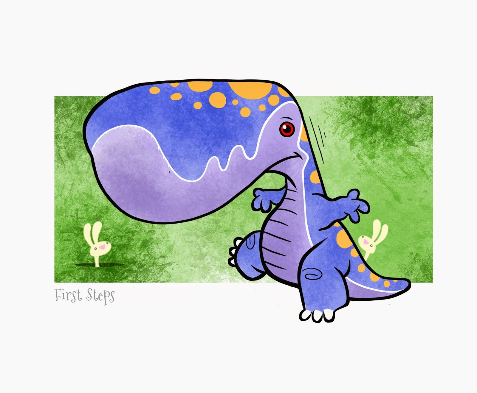
Monsters and Bunnies: First Steps

So for some time now, I've been sketching monsters with bunnies. There something about it that seems interesting to me.  Maybe it seeing the combination of the two "species" together -- how any monster seems to be cuter when in the presence of bunnies. (Go on try it, take the worst monster/killer/evil being and surround it with bunnies. Even if it's covered with blood - the bunnies make it cuter.)
"First Steps" • Part of a 6 image series of monsters with bunnies
This image was inked and colored using RagePro 4
Now, I'm not trying to create grime images, my cartooning style doesn't work like that. Plus, I believe there is a New Mom/Teen/College market for this style of images -- so of course I'm trying to make the monsters very cute even without the bunnies. 
Add those bunnies and the image just ups the cuteness level. 

Original pencils sketch of the baby dinosaur/monster
I plan to make a series of images/prints to sell. It'll take time for me to figure out pricing, material and how to best package. (I may want to soften the artwork and eliminate the black holding line too.)

I'll try to keep this projects's progress up to date here on the blog.


UPDATE:Illustration Friday: Every Friday a word is given on the website, IllustrationFriday.com. Artists and illustrators then submit an image that represents that word all during the week.This week's word: Vanity

Revamped version of "First Step" to "Vanitisaurus" for Illustration Friday's word "Vanity"
For this week's Illustration Friday, I made a variation of the image to work with the word: Vanity.


Sunday, February 23, 2014

Illustration Friday: SPACE

Illustration Friday: Every Friday a word is given on the website, IllustrationFriday.com. Artists and illustrators then submit an image that represents that word all during the week.
This week's word: SPACE

SPOILER ALERT: The big climatic ending to my first children's book: Bobby's Biggest Bubble
Thought Process:
A no-brainer this week.

Space makes me think of the space scene I drew for the climatic ending of my first children's book: Bobby's Biggest Bubble. Of all the terrific comments and kind emails I have received about the book -- this 2-page spread was usually the fan favorite, especially for boys.


I like to think it's the coloring that made this page "pop" . . .
Knowing the amount of pink bubblegum coloring the pages would have, I boosted the night sky's blues and even made the meteor a brighter blue to counter the pink; balancing the warm coloring on the left with the cool coloring on the right. 


This page was the greatest challenge I had when making the book. It was the part of the story I worried about the most. Even though this 2-page spread was near the end of the book, other then the cover, it was the first page I completed with full color.
Once I had this part of the story behind me, the rest of the book fell into place.


You can see more about this comic strip at this link here and more recently here.

Thursday, February 20, 2014

Illustration Friday: TWISTED

Illustration Friday: Every Friday a word is given on the website, IllustrationFriday.com. Artists and illustrators then submit an image that represents that word all during the week.
This week's word: TWISTED

Extra background with a photo of the game Twister was added for Illustration Friday

Thought Process:
This was a busy week. I squeezed in this last day submission for Illustration Friday (which started last Friday.) The word Twisted instantly made me think of an Octopus and it's twisting tentacles. 
I also thought of Chubby Checker with his famous Twisting songs. I could have the octopus dancing the twist, but that is a very dated reference that not many younger generations would relate to. So I drew a cartoon of an Octopus with his twisted tentacles. But it didn't seem to be enough.

Colored version of the Octopus drawn on marker paper using alcohol markers and black tip marker

So, I thought of the popular game, Twister. I could add some humor by placing the octopus on a Twister map. I originally thought to add a pink squid playing against the octopus -- really get their tentacles tangled . . . but that would've taken more time to complete than I had to spare.

The original pencil sketch of the octopus

Saturday, January 18, 2014

Illustration Friday: BEGINNING

Illustration Friday: Every Friday a word is given on the website, IllustrationFriday.com. Artists and illustrators then submit an image that represents that word all during the week.
This week's word: BEGINNING

BEGINNING sketch made using pencil and color/toned using Photoshop

Thought Process:
This took awhile. Nothing came to mind at first. Looking at the other submissions to the word, I saw many images related to Spring, babies and seeds. I didn't want to go that route. But still, I couldn't think of what to do. 

So I thought, "Okay . . . how should I begin doing this image for the word BEGININNG?" And there was the answer . . . begin with the first pencil stroke.

I'm still a cartoonist first, so I didn't want to draw a realistic hand. I thought I'd try to do it in the style of Robert Crumb, using lots of cross-hatching and shaky lines. Once I finished the line work, I thought of toning the entire image with a sepia look using Photoshop.

Wednesday, December 18, 2013

Illustration Friday: Spirit (Updated)

Illustration Friday: Every Friday a word is given on the website, IllustrationFriday.com. Artists and illustrators then submit an image that represents that word all during the week.
This week's word: SPIRIT

Marker and Ink image of Santa for Illustration Friday's word of the week - Spirit
Thought Process:
First thought was the "Christmas Spirit" since it is the middle of December. This made me think of Charles Dicken's "A Christmas Carol" which as everyone knows -- is loaded with spirits. But I didn't want to draw a ghostly figure . . . instead I was looking to show the emotional spirit of Christmas. So who better to do that than ol' Saint Nick. 
Pencil sketch of the Christmas spirited Santa. The original idea was to have him in his red long-johns.

But I didn't want to draw just another Santa image. I wanted the image to show Santa's Christmas spirit on a more personal and emotional level.

By taking away his coat and hat made it seem like Santa was casually relaxing at home; This is not the business-like gift delivering Santa . . . it's the happy and jolly "Thank God that's over and I have 355 days off from work" Santa. 


UPDATE

The background was pretty bland for a cheery spirited Christmas image. And just for good measure, I figured adding a snow storm in the background would help instantly convey that this dancing fool was indeed Santa. (Though, skipping around in a snowstorm like that without proper clothing - it'd be a miracle if he didn't catch pneumonia!)

UPDATE UPDATE

Okay, this is weird.
Somehow either someone or some program turned my non-snowflake falling PNG image into an animated GIF. I found it animated like this several days after I uploaded my original non-animated image to Google+.

Perhaps Google does this to some images automatically? I doubt it, since that could be a few legal problems I'm sure Google lawyers would warn against.

So I think this snow effect is something that Google+ does automatically to snowy images. I've seen several images on there that have this same animation - so i'm guessing that is the answer.

Real nice touch . . . Thank You, mystery animated GIF making app or person! 


My Santa drawing that was mysteriously turned into an animated snowing GIF image


For those interested, I found a webpage that explains how to make this snow effect.
Link: 
http://www.vlogg.com/13203/convert-photo-snow-falling-animated-gif-using-google/

Wednesday, December 11, 2013

Illustration Friday: Pattern

Illustration Friday: Every Friday a word is given on the website, IllustrationFriday.com. Artists and illustrators then submit an image that represents that word all during the week.

This week's word: Pattern


Thought Process:

I do many patterns as a designer for toys, pet, costumes and novelty items. The patterns I make are usually graphically simple, because busier patterns don't sell as well as something clean and simple.

I thought about the many patterns I created over the past decade. I wanted to come up with an idea to alter my artwork slightly and make it funny. Then it hit me, several years ago in Shanghai, I was asked by the product developer and buyer of PetSmart to create patterns for pet blankets. They were looking for something different, not the typical paw print pattern you see everywhere. So I created about 8 patterns to show them.

As usual, I didn't have much time to develop the designs, but as I was sketching and doodling, I came up with this playful puppies jumping fences pattern. I know it doesn't make much sense , but it was still cheery, silly and playful. (PetSmart never bought this design, it's was too comical for their brand of products. But I still remember liking the colorful playful pattern and rhythm it created.)

So I thought, lets break that rhythm, ruin the perfect pattern and have a solo dog doing what usually comes natural.

Sunday, December 1, 2013

Illustration Friday: Refrain

Illustration Friday: Every Friday a word is given on the website, IllustrationFriday.com. Artists and illustrators then submit an image that represents that word all during the week.
This week's word: REFRAIN

Sesame Street's Cookie Monster refraining from eating a big delicious cookie
Thought Process:
This week's word was tough. The first definition to come to mind is "to hold back" which makes me think of curbing one's appetite. I tried to think of characters that couldn't control themselves, especially with food. Wimpy from Popeye was my first thought, but he's pretty old school. Pac Man was another, but I don't think people generally think of him as a compulsive eater (and again old school.)

That's when I thought of Sesame Street's Cookie Monster.
Here's a character that usually has no control over his appetite for cookies. He's still brings back childhood memories of enjoyment when he chows down on a pile of cookies. Though in past few decades, Cookie Monster has been learning to eat healthier and cookies are not his main go to food anymore.

I understand the urge to have children learn to eat healthier -- but I find it sad to see Sesame Street alter a favored character simply for a simple moral spin. Kids understand he is over the top, that's what makes him so lovable and enjoyable. 
Seeing cookie crumbs fly all over when he eats is parts of the fun.  Having vegetable leaves fly all over when he eats? Not as funny.  
Original pencil sketch of the Cookie Monster concept for Illustration Friday's Refrain word of the week
Drawing Process:
The focus is on the huge forefront cookie that stands out on a bright foreground with Cookie Monster centered directly behind it. I decided to have Cookie Monster posed grimacing, head in hand, gazing over the cookie which is less than an arm's length away. The motion lines around the character help express his urges to pounce on the cookie. In the background, a radial burst of energy is center to the head of Cookie Monster to help pull the focus to the center of the image.