Showing posts with label Cartoon. Show all posts

Saturday, August 4, 2018

Throwback Thursday: L.B. Monster sketch found

REPOST DUE TO CORRUPT AND/OR LOST IMAGE FILE:
Many posts labelled with Throwback Thursday suddenly missing or corrupt images.
Why is this happening Blogger (aka Google?)
Originally posted on 6/24/16


UPDATE: Color

Marker comp: Coloring LB slightly different than usual . . . testing the waters

UPDATE: Inked version


Brush pen inked version of the found Lumpy Bumpy Monster pencil sketch 

Originally Posted on 1-7-2016 - - - - - - - - - - - - - - - - - - - - - - - - - - - - - - - - - - -
It's a strange feeling to find some of my work from the past. There's this sense of seeing it with new eyes again as if looking at someone else's work. This one in particular really surprised me. It was hidden on an old hard drive I was cleaning out to scrap.This image was sketched sometime back around 2003.

An old pencil sketch of my series's main character called The Lumpy Bumpy Monster ( aka L.B.)

L.B. (short for Lumpy Bumpy) is one of my oldest and favorite characters to draw. It took me nearly a decade to mold him into the character he is today. Yet, while I have 100s of sketches and drawings, I've yet to ever really do anything with him (and his supporting characters.) L.B. was originally intended to be part of a series of books for children. I felt I needed to be established in the publishing world before I could ever do the tales I wanted with L.B. and Timmons.

I'm sure I will be finding more hidden works on old sketch pads, hard drives, floppy disks and CDs. If I ever get the time, I'd like to clean up and ink this image ...

Throwback Thursday: Golf Dad Mug Design

REPOST DUE TO SO CORRUPT AND/OR LOST IMAGE FILE WITH BLOGGER:
Originally posted on 2/4/16


This one goes back many years ago when I worked for a giftware company designing novelty products. They wanted a humorous Father's Day mug related to golf. I wrote as many insults and oddities about a typical Dad playing golf.


The mug sold well on the market, so someone asked me to create 3 more for the following year. I remember the three follow-up mugs were, Fisherman, BBQ Chef and Couch Potato -- but this original Golf mug outsold the other mugs combined.

One thing I remember while creating this design was that I did a spotless vector version, which looked very polished with solid clean lines. But this rough and loose style seemed to work much better with the text humor.

Wednesday, April 11, 2018

UPDATE Daily Quick Sketch: Piggin' and Grinnin'

UPDATE: I never liked the framing I did in this image, so I eliminated the background coloring.

Originally posted on 3/11/15:

Today's quick sketch was inspired by the blog: Dueling Banjo Pigs, a blog run by illustrators, Guy Francis and Stacy Curtis.

I seem to have jumped on the bandwagon long after this blog first started, but when viewing the blog and it's many banjo-playing pig images . . . I felt like tossing one on top of the already impressive 700+ picture collection pile.
Fully colored digital image of Piggin' and Grinnin' for the "Dueling Bango Pigs" blog site

Doing this image was a lot of fun. It's nice to just jump into doing a fun sketch with nothing but a suggested topic (a pig and a banjo.)

Inked version of the pencil lines created in ArtRage Pro

NOTE: Anyone can submit to the blog, professional or beginning artist. The blog is purely for fun. Even if you don't want to submit an image, it's worth seeing all the variations people have sent over the years. Visit the site here: http://banjopigs.blogspot.com/

Original pencil sketch from one of my sketchbooks

Saturday, October 8, 2016

Illustration Friday: ICE (UPDATE)

Illustration Friday: Every Friday a word is given on the website, IllustrationFriday.com. Artists and illustrators then submit an image that represents that word all during the week.

This week's word: ICE
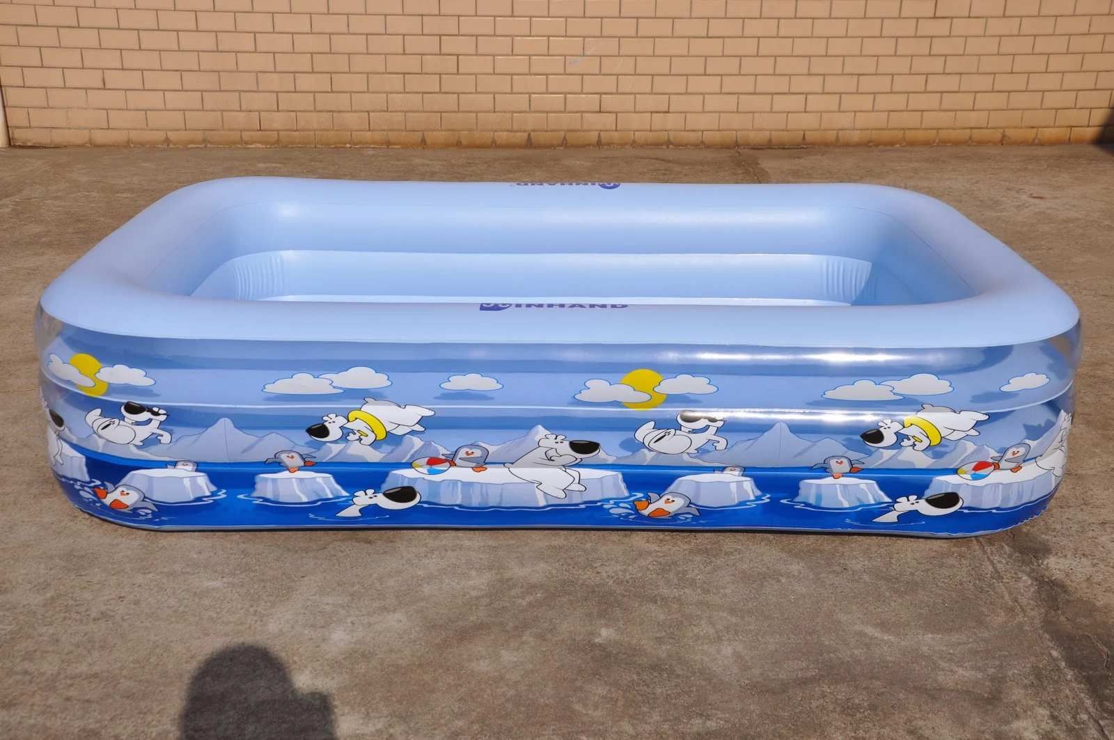
Wrap design made for inflatable swimming pool

Originally posted 

MONDAY, OCTOBER 15, 2012

This is a very busy week for me, so I had to pull from the archives.

This was a design I made recently for an inflatable swimming pool wrap (the image repeats several times around the pool.) I made this thinking how fun it would be seeing playful polar bears and penguins swimming around icebergs during a hot summer's day.

I kept the image very blue and cool, limiting warm colors to just a few highlighted small areas. The composite for this was very important to balance out the polar bears and penguins so that they seemed to mingle all together and not just hang within their own species. Hopefully, when looking at this image, kids get a friendly, fun and cool feeling.

The artwork is vector based so that the image could be enlarged, reduced or re-arranged to be used for other items like beach balls, beach umbrellas, swimmies and life preservers.


RE: Illustration Friday
If you would like to join in on the fun, head over to Illustration Friday. It's totally free, no need to login or sign up for anything. You can view all the submissions from this week (and past archives of previous words.) Have a sketch to show? Send your own artwork up for others to see.

UPDATE:

Below is an image of the finished product. The repeat turned out great. I like how the clouds cast shadows on the inner lining of the pool. This image was taken outside of the factory near Shanghai, China.

The one thing that bothers me is that the tube around the polar bear's waist should be red. I feel the yellow tube competes with the sun in the sky, but at least it's a warm color against all the cool coloring below. Don't know why that change was made.


Image of the finished product using a repeat pattern of the design above.

Thursday, August 4, 2016

Daily Quick Sketch: My dog . . .

He's a quick sketch I based on my little dog, Brady. She's an Australian Cattle Dog, which is simply a ball of hyper energy wrapped in fur. She's an attention sponge that loves pampering. She also seems immune to pain, will oppose any size dog and is fearless on most grounds (except thunder and fireworks.) When she wants your attention, her ear-splitting yelps make one wonder, who's the master and who's the pet . . .
This little image was created shortly after Brady was in an angry and demanding mood 

Here's the little girl in a silent moment.

Wednesday, May 4, 2016

Wait - What? #1: The Office Monster?

Every once in awhile, I sketch something that I have no idea what it is or why I drew it. Can't explain why this happens. Probably a result of playing around or just looking to create something different. So this is a new category for the blog that I'll label as "Wait - What?"

A pencil marker image of whatever this is . . . 
This guy was in an old sketch book, I do remember drawing it . . . but I can't explain why. A robot head, tentacles and it seems to be wearing some office attire. Maybe an alien disguised as an accountant? Maybe it's a coffee robot? Or some traveling volcano simulator?
I don't know . . . your guess is good as mine. 

Monday, May 2, 2016

Daily Quick Sketch: Dog Dress Boat

This is another quick sketch done with the help of the children at Reynolds School. They were asked to name an animal, what is it wearing and what is it doing. The results were: a dog in a dress driving a boat. I had less than 10 minutes, so this sketch looked very rushed and unfinished. Last weekend, I cleaned the line work, erased the scribbles and quickly added digital color to the image.

Digitally colored version created with ArtRage Pro 4
Not having enough time, I added more details later and added several things to make the boat seem to have motion and speed; such as the dress ribbons, flag post and the dog's long ears all flapping in the wind.
The original pencil sketch created for the 1st graders at Reynolds

Wednesday, April 27, 2016

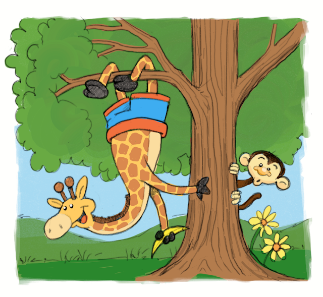
Daily Quick Sketch: Giraffe in Shorts Hanging Upside Down from a Tree

Recently, I had the privilege to draw for the children at Reynold School. All this week, I will be posting a few examples of these images made at various schools + library readings.

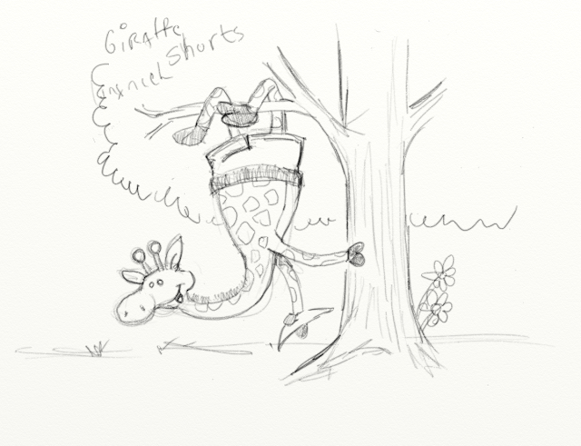
The sketch below was created by asking several children the following: Name an animal. What is it wearing? What is it doing? Their answers given were: A giraffe, wearing shorts and hanging upside-down from a tree.

With less than 15 minutes to sketch, the image was roughed out enough for the children to see their concept. Over the weekend, I cleaned up the original sketch, added a simple color layer and added the confused looking monkey.
The pencil sketch cleaned up and colored (with an extra character watching the monkey business)
I thought this one sketch was quite a challenge with the limited time, but everything seemed to work out okay. The biggest response from the children was when I added the banana in the giraffe's hand. I decided to add the monkey to give the image more of a story and action.

The original digital pencil sketch made using ArtRage Pro 4 on a Surface Pro tablet

Tuesday, April 26, 2016

Daily Quick Sketch: Lasso Dog

Another quick sketch made digitally (circa 2014). This image was originally created at a local library, projecting my work to a huge screen, as the children helped suggest what I should draw. Their answers to my questions (what animal, what's it wearing, and what's it doing?) were: dog, big hat, lasso. They seemed to really enjoy how I created the rope using a simple pattern technique.

Digital sketch made using hard pencil setting in ArtRage Pro

Monday, April 25, 2016

Daily Quick Sketch: Stealing Honey Bear

This sketch was created some time ago (~ spring 2015) with a group of children at a local library supplying these three subjects: Name an animal. An article of clothing. An action.

They gave me a BEAR wearing a HAT and he's STEALING HONEY. (Pretty sure "hat" was picked after "bear" because of the very popular Jon Klassen picture book at that time: "This is Not My Hat". If you don't know what that means -- look it up!) 
The revised version of the first sketch below after being revised -- more of a stealing action

I'm showing these now because it has been awhile since I drew images with a group of children. I usually try to get the children involved in helping me decide what to draw as I explain a little about the thought process of creating something new. Originally I finished with the image below, but then the child who gave me "stealing honey" insisted the bear was just holding honey -- so I quickly made changes and made him running -- that seemed to make everyone happy.  (That kid's probably going to be an art director or critic one day.)
The original pencil sketch of a BEAR wearing a HAT and STEALING HONEY

Wednesday, February 10, 2016

Daily Quick Sketch: Running Gator

Testing out some new alcohol based markers. These aren't as good a Copic markers, but far cheaper. The brand is called Premiere, and they sell 2 for $5 in Michael's stores. Like Copics, they also have dual tips on both ends; one pointed and the other a broad flat tip.

Sketch made using new Premiere alcohol-based markers - then inked with a Jet pen

The colors are okay, but the ink doesn't spread out evenly the way Copic markers do. Instead, these markers clump up and cause streaks if you go over any area that's already been colored. In contrast, a Copic marker would allow you to build up and go over the same area many times to create deeper colors without causing streaks or clumping.

Image sans the pen/markers:
Note the unevenness of the ink, especially around the mid belly - causing a coffee stain effect
So I guess the bottom line here is: you get what you pay for. A marker for $2.50 doesn't come close to the high-quality marker that costs $7. Overall, I'd give the Premiere Markers a 3 out of a 5-star rating. I wouldn't want to do complete images using just these markers, but if needing a specific color for detail or highlights - this marker will do the job for a great price. I plan on buying more Premieres that are missing from my huge collection of Copic markers. (Especially the lighter shades of color.)

Tuesday, February 9, 2016

Follow-up: Using RedBubble.com

I mentioned in a previous post about using RedBubble.com and I wanted to follow-up on my experience using their custom product/printing service. I first tested them out by ordering a couple of t-shirts using some of my 2015 INKtober sketches: T.H.E. Walking Dead and Batman vs. Baseball. The shirts arrived in less than a week after the online order was made.

Image showing the high-quality T-Shirt printing
The quality of the t-shirts was excellent. Tight coverage and spot-on color. The shirts are very comfortable and light, great for spring and summer wear. (My only issue was that some of my designs had transparent backgrounds, so those parts of the images blended into the color of the t-shirt. This could make the print look muddy if a dark colored t-shirt is selected.)

Metal traveling coffee mug using my image "T.H.E. Walking Dead", created using RedBubble.com
Link to the T.H.E. Walking Dead product page CLICK HERE

After getting the T-shirts, I purchased 5 other items from Redbubble: pouch, travel mug and pillows. All of these items were very reasonably priced for the high-quality made-to-order products. It used to be, (not too long ago), you had to buy a costly minimum quantity to get this level of quality. 

A zipper pouch using my design "Ghostie Emojis" on RedBubble.com
Link to the Ghostie Emojis product page CLICK HERE

I've added several other designs in the past few months, which have already been selected by other people to create their own products. There is also cash back sent to the artist for each item being made using their artwork. It's not a HUGE amount . . . but still, it's nice to see others enjoying the artwork.
There are so many great gifts and self-promotional ideas that can be used with this service.
Imagine creating products using your child's artwork, creating a prototype sample of an idea or design or making personalized "inside joke" t-shirts for friends, etc.

I highly recommend Redbubble.com
They often have discount sales from 20%-30% off . . . sign-up to get email notifications when these sales happen. (I suggest only purchasing when there is a discount sale. Usually, their best discounts occur around holidays.)

To see all my designs available on RedBubble.com - go to: Arrrggghhh's Shop

Monday, February 8, 2016

UPDATE: #INKtober 2015 No. 7: T.H.E. Walking Dead


UPDATE to the Update:
You can see my follow-up post using this image to create custom RedBubble.com products.
Link: CLICK HERE.

- - - - - - - - - - - - - - - - - - - - - - - - - - - - - - - - - - - - - - - - - - - - - - - - - - - - - - - - - -

Originally Updated on Dec. 3, 2015
UPDATE:
I colored this image over the weekend to test out the website RedBubble. RedBubble is a company that prints customized t-shirts, pillows, mugs, etc. It allows you to easily use your own images, even sell your own work and setup is very easy.

I've ordered two t-shirts to test the quality of their product. The cost was around $50, which for two customized t-shirts is a fairly good price.

- - - - - - - - - - - - - - - - - - - - - - - - - - - - - - - - - - - - - - - - - - - - - - - - - - - - - - - - - - 

Originally Posted on Oct 8th, 2015

#7 and I think it's my favorite so far, mostly because it made me smile as I drew it. This is a great example of writing a joke where maybe I'm the only one who finds it amusing.
INKtober 2015 image #7 inked with a brush pen then gray tones added in Photoshop
As I finished the image, I started wondering if my little play on words would go over some people's heads since the cartoon has a double meaning to it.
Some might just think it just "a DEAD character WALKING his pet" and that's as far as they'll see it. But those who read into the ghost's full name and dog's name tag should see the actual pun intended.
Inked on Canson marker paper with a black Faber-Castell brush pen
I'm sure it'll annoy some Walking Dead fans simply because there is no zombie in the image. That kinda makes me smile too . . .
The original combined pencil sketches.
This was actually made combining two sketches into one with the leash bridging the two sketches together.

Friday, January 1, 2016

UPDATE: Daily Quick Sketch: Happy Baby New Year

UPDATE: New Digital Version of New Year Baby for 2016

5 gooder than 3! Much gooder!!!

Did a quick digital ink version of my 2013 marker comp image of Baby New Years. This time dropping the top hat and making it a little more about everyone world-wide.
This is a much cleaner drawing process than the Copic markers version (see that one below.) I've decided to not shade or highlight this time too. This technique also allows a transparent background, so it's nice to have the option to place this image on or over any background image or color.

Can't believe 2 years went by so fast.


Black ink lines were created in my latest art program, Mischief -- and then colored in Photoshop.


 - - - - - - - - - - - - - - - - - - - - - - - - - - - - - - - - - - - - - - - - - - - - - - - - - - - 

Originally posted on Monday, December 23, 2013

I know it's not even Christmas yet, but I had a vision of this Baby New Year in my head and needed to put it on paper before the image faded from my memory. (That happens often -- thinking/imagining a character (or idea) which I don't get down on paper in time - forever lost.) 

Baby New Year, kicking off the new year . . . 
I would like to thank everyone who visited this blog over the past year and wish you all a Happy and Healthy New Year! There are more drawings to come in the upcoming year!
The original Pencil sketch of Baby New Year
UPDATE
Added a new sketch version of the baby for illustration Friday. The word of the week is "Reflect", so I created a "reflective" version of the New Year Baby 2014 with an Old Year 2013. 


Thursday, December 31, 2015

Throwback Thursday: The Christmas Card Design of 2002

Just found this old Christmas card design from 2002. Back then I did an annual Christmas card cartoon which usually had bathroom related humor. I think friends enjoyed them, but family didn't quite appreciate the humor at that time of year. (Sorry, Nana!)
2002's Christmas card cartoon entirely digitally designed usig Photoshop

Tuesday, December 1, 2015

UPDATE: #INKtober 2015 No.22: Batman vs Baseball

UPDATE:
I colored this image over the weekend to test out the website RedBubble. RedBubble is a company that prints customized t-shirts, pillows, mugs, etc. It allows you to easily use your own images, even sell your own work and setup is very easy.
I've ordered two t-shirts to test the quality of their product. The cost was around $50, which for two customized t-shirts is a fairly good price.

- - - - - - - - - - - - - - - - - - - - - - - - - - - - - - - - - - - - - - - - - - - - - - - - - - - - - - - - - - 

Originally Posted on Oct 23rd, 2015
For #22 of the INKtober drawings, I couldn't help but go back to Batman.
Intober #22: Inked with brush pen and digitally toned in Photoshop

The original pencil sketch

The inked image sans type and gray tones.

Wednesday, November 18, 2015

Daily Sketches: Sweet Tooth Reaper and Post Inktober Comments

Well, I wasn't able to complete the entire month of Inktober. This is the most stressful and demanding time of the year in my line of work. I actually worked several 18+ hour days to reach deadlines. It's mentally and physically exhausting, especially when considering that the same similar holiday designs are needed over and over each year.

In times of a better economy, designers can experiment more, take risks and do ideas never seen before. But it's the opposite in our current poor economy. Retail store buyers want the same price and quality products as their previous years - while the manufacturers face inflation to materials, labor, safety regulations and shipping costs. As a designer, I must help create sensible high-quality designed items that don't cost more to create.

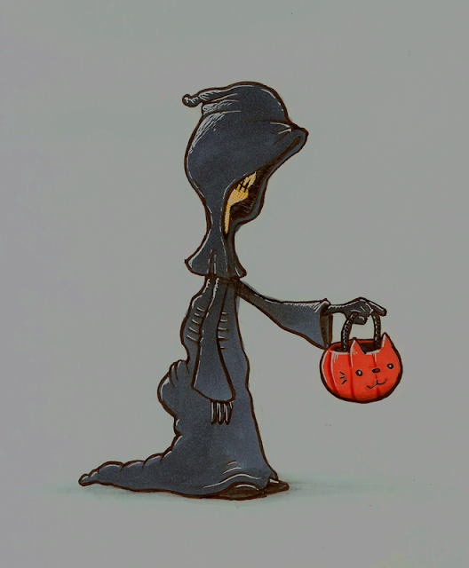
Anyway, my job took over all of my spare time and pretty much burnt me out. I have many doodles and sketches that could have worked for Inktober, but for legal reasons I can not share those on the blog. But there are a few loose images that were not used for my job. I will throw a few of these sketches up on the blog as I get the time; like the one seen below. Many of these are related to Halloween given that it was around that time when they were created.

This image was created using pencils and Copic markers with light highlight Gelly Roll pen

Tuesday, October 20, 2015

#INKtober 2015 No.19: Batman Bat'room

For the 19th image of INKtober, I decided to do a day-in-the-life cartoon of Batman.
I believe some of the best cartoons about Batman have been the ones from the perspective of Batman doing everyday common things. And who doesn't like a little bathroom humor too?
Inktober #19: Drawn with a pen brush and colored with Photoshop
I had a little problem figuring out the composition for this cartoon. Most of this image was done in parts, so that I could move them around in Photoshop until I found the right layout that worked.

Inked version sans the type and color

It might seem simple, but much had to be considered.  The toilet needed to be seen enough to instantly know it was a toilet, all of the text had to flow a certain ways and I toned down the wackiness of Batman so that he was more simple and easily identified.

The original pencil sketch of Batman sitting on the throne
Originally I was going to add pupils to his eyes so that his eyes would direct the flow of reading the cartoon. But leaving the eyes blank seemed funnier since it creates a more brooding expression. Brooding on the toilet = more funny.

Monday, October 19, 2015

#INKtober 2015 No.18: Lone Ranger VS. The Wolfman

The 18th image for this year's INKtober is my childhood memory of The Lone Ranger.
Maybe it was just a coincidence that I found out around the same time that: #1.) The Wolfman could be killed with a silver bullet, and #2.) The Lone Ranger used only silver bullets.
I guess in my head I thought, "Why would the Lone Ranger use such bullets unless he intended to hunt down the Wolfman?"
Inktober image #18: inked with a pen brush and toned in Photoshop

Funny though, the recent Lone Ranger movie starring Johnny Depp and Armie Hammer, originally had the Ranger fighting werewolves in the script. Those werewolves were eventually replaced with train fights. Knowing how the movie flopped, I'm guessing the movie would have been more successful if those original werewolves were included!

The inked version of the drawing, sans type and tones

Original Pencil Sketch

Sunday, October 18, 2015

#INKtober 2015 No.16: Moon Ride (Halloween in 2 weeks)

No joke today for INKtober #16.
This was an image I sketched quite some time ago for a Halloween Trick or Treat bag. It was a very rough idea that I decided wasn't going to work for my client. I have made many sketches like this just laying around. Even though this might be a nice concept image - it just doesn't fit into what retailers want to sell on the market.

INKtober #16 using a very soft bristle brush pen and Photoshop digital toning

 I used a much softer bristle brush pen for this image. Notice how the lines are more flexible and loose since the bristle tend to bend much easier with the slightest pressure. The result is a more interesting line that feels much more playful and relaxed. Just for added effect, I decided to add the burst of orange tone in the background to make the image stand out.
Inked version of the image

The original rough sketch that was done in pencil (and bit of gray marker on the hat)