Showing posts with label Children's Book. Show all posts

Saturday, October 8, 2016

Inktober 2016: Rock (#08 of 31)

For the 8th day of Inktober, the word of the day is Rock. That reminded me of my rock people characters . . . And my favorite is King Mudsok.

Blue pencil and inked character design of King Mudsok, the beloved leader of the Molten People.

Mudsok is one of the many characters I have been developing for a humorous story that takes place underground. His name is King Mudsok. Not sure where I got the name, but it popped into my head as soon as I finished drawing him. He is the king of the Molten People, a tribe that is at war with the Mucklugs, (a tribe of underground plant people.)

I see his character as being one who intimidates those who meet him. His voice is deep and rough, and his size is pretty impressive. He speaks with a loud, aggressive tone that vibrates the surrounding area. But underneath all that tough persona lies a very passionate, loving and caring soul. He really is a softie -- made of stone.

King Mudsok is a part of one of my many children's book stories for my "Timmons and the Lumpy Bumpy Monster" series. I'll try to find the Mucklug leader, Zoobi-Dang and post it when I can.

Friday, September 30, 2016

Illustration Friday: Weapon

Illustration Friday: Every Friday a word is given on the website, IllustrationFriday.com. Artists and illustrators then submit an image that represents that word all during the week.

This week's word: Weapon

For this week's submission, I simply took from an old image I did of my character Hairy. The page had Hairy getting ready to battle a monster in the closet, using the best toy weapons he could find.

Hairy loaded and ready for battle. Image taken from one of my oldest picture book stories.

Below is the original full image from which this image was taken from. This page is  #14 from the story, "Timmons and the Lumpy Bumpy Monster" back in the early 90's.

Original full colored dummy book page from "Timmons and the Lumpy Bumpy Monster"

Sunday, August 28, 2016

Daily Quick Sketch: Octopus Character (for another children's book concept)

It's been awhile since I posted on the blog. I'm in a bit of a low creative mode lately due to work and general stress. Yet, another concept for a children's book idea came to me recently during the night. I woke up and created this character sketch to get that concept down on paper.
(Too many other ideas have floated away when I didn't do the same . . . )

ADDED: Just added a quick color version of the sketch above.

Digitally colored using PhotoShop

Inked Octopus character for a children's book idea set in an underwater setting
The first thing I thought was, "I need an octopus character." I've drawn many octopus characters over the years, often created with a typical look and style. So I thought I'd change my usual technique and think outside the box.

Original pencil sketch design of my Octopus character for my newest children's book story

I thought adding a long neck/torso would make the octopus look unique enough. I also envision him walking on four arms and using the remaining limbs as arms. Like all characters I create, this one will be redrawn, adjusted and hopefully improved to have a unique character look.

Watercolor + Pen variation

Sunday, June 26, 2016

Daily Quick Sketch: Witch Nazel

UPDATE: B+W Image Colorized
Digitally colored in Photoshop
Quick note on the information below. I mention publishing an eBook version of the story, but after reading up on the market, eBooks aren't really catching fire . . . especially with children's books. Parents still want higher quality printed books and are willing to pay for that quality.

The major problem with eBooks is that everyone can make one - and it seems like they do. This creates a huge glut of poorly edited, poorly drawn and unprofessional picture books, which in turn makes any worthy eBook harder to find among all the clutter.

Bottomline: I'm no longer considering eBook publishing . . . going to try the old fashion way of submitting and waiting. We'll see if I can break into the business the proper way.


Originally Posted on Friday, December 20, 2013

I just purchased a new set of Copic Cool Gray markers and wanted to test them out.

I already had Warm and Neutral Grays . . . so I thought it would be best to try to create a wintry image with the cool grays. This was also a good opportunity for me to develop one of my supporting characters, Witch Nazel.

This version of Witch Nazel is more feminine, friendly and less freakish looking.
Marketing wise, this would be a better choice for her design since she would be accepted by more people. But the wacky side of me prefers a weirder looking Witch Nazel, (or at least not as clean cut as she appears in this image.) So, this may not be the version of Witch Nazel once the eBook is published. (. . . or . . . maybe it is . . . too early to tell.)


Gray toned image of Witch Nazel made with a cool gray set of Copic markers

This image of Witch Nazel is taken from one of the pages in my eBook, Worm Wire Glasses. I altered the background to make it more of a winter scene. Below is the original pencil sketch. You can slightly see a hint of the monster, Bladimir, flailing about in the lower right corner -- kicking a garbage can. This is from the scene where Witch Nazel floats over the ruckus that Bladimir is causing below on Halloween.   

Original pencil sketch of Witch Nazel flying on her broom during a Halloween night

Thursday, June 23, 2016

Throwback Thursday: Milo

Here's an old character I have been keeping for a certain story I wrote over 20 years ago. I named him Milo, after the main character from my favorite story when I was a kid . . . (Norton Juster's) The Phantom Tollbooth. That story captivated me like no other book, filled with crazy characters, wordplay, and imagination.

Old color comp of my character Milo for a picture book story

My character, Milo, is a smart nerdy little kid with a troublesome baby sister. Their story takes place on a Saturday morning, the time of the week when Mom & Dad sleep late -- appointing Milo the "Saturday Morning Boss of the House."

The first pencil sketch of Milo wearing pajamas
I originally pictured Milo differently with a big blockhead and very angular features. I was never satisfied by his look. Years later, looking at random sketches in a pad, I added big glasses to a doodle of a little boy's face . . . and that created the Milo character I was searching for all this time.

Pencil sketch of Milo readying for a major confrontation in the kitchen
One of the first major changes to the character was his clothing. I originally had drawn him wearing shorts, sneakers and a t-shirt (even a baseball cap in some sketches.) But since this story happens during the early hours of a Saturday morning, Milo should be wearing his pajamas. It made sense, though it never dawned on me until years later. Sometimes figuring out little details takes time . . .

Sunday, June 12, 2016

Daily Quick Sketch: More Monstas and Bunnies sketch stuff

Had this sketch laying around since the end of last year. The sketch was an idea I had envisioned and quickly jotted down on paper before forgetting it. It helped that it was the holiday season, which inspires this type of work. Looking at the image now, a half-year later, there are many changes needed to improve the composition. Mostly the sizing of everything is off. The characters and the tree need to be bigger with less emphasis/detail to the background.
Inked rough sketch of a concept for a Monsta and Bunnies calendar

I would like to create a calendar of this subject one day. This one would be December's image. I know the subject and images would work well, but I'm still undecided on what style medium I would want to use for final images. Time will tell.
Original pencil sketch of the holiday concept

Sunday, June 5, 2016

Old Sketch found: Bladimir Blarfarg Trick or Treating (from the story Worm-Wire Glasses)

Found this image on a memory stick. It's a scan of my character Bladimir Blarfarg from my Halloween picture book story, "Worm-Wire Glasses". This was done with pencil, brush pen and finished with markers.
Marker sketch of the star character from "Worm-Wire Glasses", Bladimir Blarfarg trick or treating

Monday, May 30, 2016

Daily Quick Sketch: Baby Elephant

Few years ago, I created a story that needed a small elephant (and several other creatures.) This sketch was one of the first I created trying to develop a look for one of the main characters. While it is a cute elephant, I quickly rejected it because it just wasn't a proper fit for the character of the story.

Digitally colored image made with Photoshop
My overall feeling of this character is that it is too generic. In other words, if I needed to draw many elephants together, this would be the typical look all those elephants would have. A key character needs to have something more.

Original inking of Baby Elephant

Thursday, February 11, 2016

UPDATE!: Sea Tea Time

UPDATE: Feb. 11, 2016
Image color touch-up and added a poem . . . officially FINAL!

- - - - - - - - - - - - - - - - - - - - - - - - - - - - - - - - - - - - - - - - - - - - - - - - - - - - - 
(originally reposted on Dec. 8th, 2015)
Was: Illustration Friday: Wet (aka Sea Tea Time)
Recently revisited this image over the weekend and added more detailing and color. I still feel the tone is too dark, especially with the water. It looks fine on screen, but when printing, everything seems toned down and the colors don't pop the way they do on a computer screen. Arrrggghhh!
Will probably play around with this image again in the future.
Cha-Cha-Changes: The latest and last revision to this image (for now.)
Update Text: Keeping the elements I liked from below, I made changes that I felt were not working in the image below:
• Stronger texture highlights were added.
• I felt the sun didn't fit with the style, so I redrew a more textured pencil sun instead.
• The coloring of the sky and water were too similar; adding textured shadows to the water and toning down the blue sky helped create a stronger contrast between the two.
- - - - - - - - - - - - - - - - - - - - - - - - - - - - - - - - - - - - - - - - - - - - - - - - - - - - - 
This is an old image I did last year* which I'm posting now for Illustration Friday. Every Friday a word is given on the website, IllustrationFriday.com. Artists and illustrators then submit an image that represents that word all during the week.
This week's word: WET
The digitally colored image made in Photoshop
*Below is the pencil sketch I drew during the 2015's SCBWI Winter Conference in NYC in February. I had no reason for drawing this image, just random inspiration. I've already purchased my tickets for this year's conference in February and decided to also show my portfolio this year, looking forward to it.
The original pencil sketch that was drawn on the back of a sheet during the SCBWI Conference

Friday, February 5, 2016

UPDATE! Monsters and Bunnies: Hopscotch

UPDATE!: Background added
Finally added the much-needed background to this image. This is the image that will be used for my promotional postcard during the approaching SCBWI conference.

BELOW IS THE ORIGINAL POST THAT WAS CREATED ON 01-14-2015
UPDATE: Color!
2014 was a terrible year, mentally and physically. For over 9 months I dealt with a frozen right shoulder, my drawing arm, making every action and motion painful and irritating . . .
Even though that shoulder is still not 100%, 2015 is going to change for the better.
I plan to be more committed to art projects like this for 2015.

Exactly 7 months ago, I posted this image on the blog as a pencil sketch only. Then over the recent holidays, I added color to the sketch. It is one of a set of six images for "Monsters and Bunnies".

Because these images were all done at various times, with different techniques and styles, I intend to redo the entire set of 6 images again. Only this time, the style will remain the same for all of the images, along with a more limited pallet of colors. The style for all six images will pretty much follow the style of the image below . . . 

UPDATED pencil sketch with digital under coloring.
This is by far my favorite of the 6 images and it will serve as the style template for all six images.


BELOW IS THE ORIGINAL POST THAT WAS CREATED ON 6-14-2014

Here's another of the 6 images I've been working on for the past several months; these images feature monsters and bunnies. I've been too busy lately to finish the coloring, but this one came out nice just in gray tones.
Hopscotch: Another Monsters and Bunnies image done in pencil.
I plan to make all six images fully digitally colored and then make several high-quality prints of each to sell on my website. (But that won't be for a least a few months.) The current working size is 7" X 5", but that might change once all the images are finalized.

Tuesday, January 5, 2016

Daily Quick Sketch: Happy Monkey Cheese Day

I created this sketch over the Holiday break. Pretty much just doodling.
I thought back to my childhood, a time when silly words and phrases could really make me burst out in laughter. Silly names and phrases always got my attention and it is probably the key reason why "The Phantom Tollbooth" remains my all-time favorite children's book.

There is an art to making silly names, words and sayings; it can not simply be gibberish.
A good silly name needs rhythm. It needs to be colorful and playful. But the most important element . . . it needs to make you stop, think and imagine. That's what weird, creative and strange things do -- they make us stop, think and imagine. The funnier the words are, the longer they stay with us.

"Monkey Cheese" was pencilled then colored with Copic alcohol markers . . .
and "No", I wasn't drinking the markers' alcohol when creating this image!

"Monkey Cheese" is a phrase that always made me laugh as a kid. It made no sense. It's also something I thought only I created, but if you googled that phrase today -- apparently many similar like minds have thought of the same saying.

So this is my visual image of Monkey Cheese. Does it make sense? No.
Doesn't have to . . . but having created this little sketch did bring a smile to my face.
NOTE: The Urban Dictionary even defines "Monkey Cheese" as: " Term often used to describe a random, pointless act or outburst. Commonly used in an attempt to draw hilarity where none is found. "

Happy Monkey Cheese Day everyone . . . 

Sunday, October 18, 2015

#INKtober 2015 No.16: Moon Ride (Halloween in 2 weeks)

No joke today for INKtober #16.
This was an image I sketched quite some time ago for a Halloween Trick or Treat bag. It was a very rough idea that I decided wasn't going to work for my client. I have made many sketches like this just laying around. Even though this might be a nice concept image - it just doesn't fit into what retailers want to sell on the market.

INKtober #16 using a very soft bristle brush pen and Photoshop digital toning

 I used a much softer bristle brush pen for this image. Notice how the lines are more flexible and loose since the bristle tend to bend much easier with the slightest pressure. The result is a more interesting line that feels much more playful and relaxed. Just for added effect, I decided to add the burst of orange tone in the background to make the image stand out.
Inked version of the image

The original rough sketch that was done in pencil (and bit of gray marker on the hat)

Friday, October 16, 2015

#INKtober 2015 No.15: Pumpkin Head

For Inktober image #15, I wanted to do something a little different.
I wanted to demonstrate how the meaning of words can be altered by associating them with an image. In this case, the lyrics from a popular Christmas song, which in my opinion always had a creepy vibe.


So the next time you hear that Christmas song, maybe you'll remember this little experiment -- and hopefully I haven't ruined that song for you . . . (snicker).

The original image sans words.
Inked with a SB brush pen on toned paper and colored with markers and highlighted with a white opaque pen.
The original pencil sketch

Thursday, October 15, 2015

#INKtober 2015 No.13: Dracula - Sans Cape

Next in my line of INKtober 2015 submissions is good ol' Dracula. Like many of these inked cartoons I have been doing, this one goes back to my childhood where I wanted to absorb all stories about monsters, aliens, mythology and the unknown. I believe it's what drove me to be creative, to ponder and question the impossible and somehow make it seem like it could be real.
INKtober #13: using Ink brush pen and digitally toning in Photoshop
I still remember images of Bela Lugosi's Dracula holding out his cape and transforming into a bat. It was a very impressive visual effect for the time. But then came the questions . . . so the cape melds and becomes a part of his biological bat form? What is the cape made of? Can any cape be used in this fashion? What if Dracula decided to transform into a bat but forgot to wear his cape?

Inked version without gray toning
Notice below that I changed the angle of the original sketch. I felt rotating the bat so that he was looking and facing downward was better to convey that he was in fact falling.
Original light pencil sketch

Wednesday, October 7, 2015

#INKtober 2015 No. 6: Darth Vader Gnat Force

No. 6 for this month's INKtober drawing is good ol' Darth Vader. Vader is alway fun to draw since he is such an iconic figure of evil. So this image shows Darth in one of his weaker moments, dealing with an annoying insect.

Inktober 2015 image #6 inked with a brush pen and digitally gray tone coloring

This image above is just the inked lines without digitally coloring

The original pencil sketch

Thursday, April 2, 2015

Daily Quick Sketch: Pirate Dream

Continuing my physical painting: (aka, an attempt to take a break from the digital creating and going old school.)

I've been struggling a bit, learning to leave things alone, where before I would simply make any needed changes in Photoshop or Painter. I've even destroyed another painting due to using liquid frisket. (Note: Liquid Frisket is a liquid form of rubber which can be brushed on a painting to mask and protected areas from being painted over or wet.) In this case, the liquid frisket absorbed into the paper and ripped the top layer of paper when it was being removed. I should have tested this brand of watercolor paper before using the frisket on actual artwork.
The finished image of "Pirate Dream", a watercolor and pencil painting

"Pirate Dream" was an idea I had for a story about a lonely little boy, Rudy, who dreams of adventures. The imaginary friends he meets on these adventures are often his subconscious mind encouraging, motivating and inspiring Rudy to face his fear and be a better person.

The very first concept rough of the image, which was originally set in the day time.

I'm not happy with how the night sky turned out in the painting. It's never easy to paint dark watercolors in such a large portion of the image. I originally planned to use liquid frisket on everything but the sky, this way I could easily and quickly paint in the dark night sky. But after my last incident with using liquid frisket, I opted not to used that technique.and simply painted in the night sky.

The original pencil sketch of the "Pirate Dream" image

I find that painting a large area with a dark watercolor is a challenge. Watercolors tend to dry too quickly which makes it difficult to get a nice consistent coverage. Adding more water to the paint often only dilutes the color making in more transparent.

Oh well . . . live and learn.

Thursday, March 12, 2015

Daily Quick Sketch: Using Watercolor Pencils + Water Pen

I bought a water brush some time ago and I haven't really had the chance to use it. I keep thinking I want to physically paint artwork so that I actually have . . . physical artwork. But, I'm so used to working digital, that it makes it very hard for me to get back into doing the physical artwork.

Run, Bladimir, Run! Get away from those watercolors!
My first attempt at using water color pencils and a water brush on watercolor paper . . . looking muddy

Basically my biggest problem is this . . . the physical world doesn't allow you to make mistakes. Nor does it allow quick experimenting or provide quick alternatives the way digital does. To me, the look of watercolors just screams "picture book". Its just one of the best mediums for creating images for children. Yet, I find physically painting with watercolors so stressful, frustrating and chaotic. Colors fade or bleed into each other. The paper wraps. Colors look different once dry. Etc, etc, etc.


Water Brush: a brush tipped pen that can be filled with water to help blend and control watercolors 

So, in my humble attempt to control watercolors better, I decided to try using watercolor pencils with a water brush. The pencils offer me the most control, since pencils are what I feel most comfortable using. The water brush allows me to add water where I want and it allows me to blend the water color pencils with ease. (The only real issue I have with the water brush is that sometimes dries a little while using it, which doesn't allow the water to flow out as much as I would like.)

Overall: The image above turned out too dark and muddy for my taste. Adding the ink lines didn't help the image either, since they overpowered the subtle colors of the watercolor pencils. I also believe the watercolor paper I was using was too rough.

I'll try to do several more tests and see if I can improve.
And if that doesn't work . . . there's always the option to going back to digital watercolors.

Friday, March 6, 2015

UPDATE! Character Development: Witch Nazel Color Style

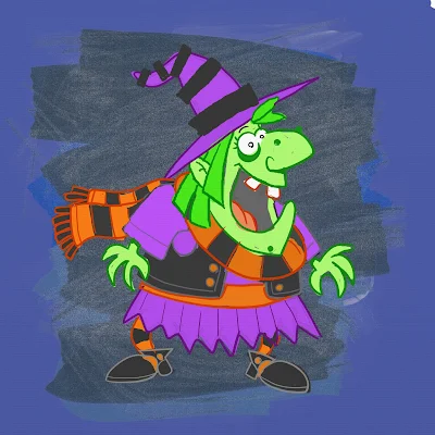
UPDATE: I've been going back to my picture book concepts lately and decided to revamp another of my characters, Witch Nazel from my story "Worm Wire Glasses". It's been over two years since I originally posted about this character. 


Fine tuning and testing the pencil/oil brushes with an old favorite: Witch Nazel from my story "Worm Wire Glasses"

Originally, this story was to going to be an eBook, since making an eBook was way more cost efficient than printing another hard cover. But as I started talking to others self publishers at meet-the-author gatherings, libraries and art festivals - I was finding out that the e-book market wasn't really that great.

The biggest problem I felt was that I wouldn't have anything physical to promote anymore. Which makes going to school readings, meet-the-authors and art festivals pretty much worthless -- (unless I could get people to go directly online and purchase my book right at that moment. It's just not realistic.)  Plus, children still want real books.


So, I'm back submitting the old way. Hoping that the one right person in publishing will read my stories.


Below is the the original post from 2/4/2013:


I'm testing out working in a slightly different style for the Bladimir Blarfarg and the Worm Wire Glasses eBook. I'm enjoying using the pen +
 ink style, but I want a different look for the eBook. I feel my work gets too clean and stiff - I want to try and become more loose with my strokes, not worry about being 100% in the lines. I also want to stop wasting hours of correcting the holding lines . . . I want it to look more sketched.


Below is a quick color sketch of Witch Nazel. The overall look in generally there - but I need to turn down the color vibrancy a bit and get the colors to have more of an equal balance. 


I don't think I like the green skin, it's too much . . . GREEN.  Thinking of either going more pale ashy skin -- or just bring it to a more reasonable, normal flesh tone. Orange/Red hair I think will be a better solution too.
The black articles of clothing need to be darker, but not so much to over power the highlights of color.

Note to Self: all of the holding lines' coloring will need to be adjusted, the purple outline is far to harsh and the green outline seems a bit too dark.

Friday, February 27, 2015

Illustration Friday: Metropolis

Illustration Friday: Every Friday a word is given on the website, IllustrationFriday.com. Artists and illustrators then submit an image that represents that word all during the week. Tossing this in this late submission in the final hours for Illustration Friday's word of the week: Metropolis.

The city celebrations from my picture book "Bobby's Biggest Bubble"

Friday, February 13, 2015

Updated: Monsters and Bunnies: Nap Time

UPDATE: You'll notice the right leg is now properly at rest on the floor. Gone is the shaking leg and the motion lines around the area.

This one I had put aside for some time.
Originally the monster was suppose to be more dragon like, with tiny wings coming out of his back. But the sleeping position made it hard to place the wings since they would be pressing against the wall. I liked the composition as it was -- and decided to simply eliminated the dragon wings.

Grayscale sketch of Nap Time, the fourth of six illustrations featuring Monsters with Bunnies

The other problem I still have is trying to show the monster's right leg shaking, like a dog's involuntary leg reaction to it's back being scratched. The motion lines are not that apparent and the right leg looks like it's just floating the the air. I will change this so that the leg lays on the ground properly, (and I'll probably adjust the position of the bunny's head so his ears point out to the left.)

The original pencil sketch. Notice his right leg is shaking in mid air - this has been corrected.
To confirm that they were fast asleep, I added a big fluffy pillow behind the monster's head. The pillow help to create a humorous contradiction to the harsh and dank cavern surroundings. (Ups the cuteness too.)