Showing posts with label Worm Wire Glasses. Show all posts

Sunday, June 26, 2016

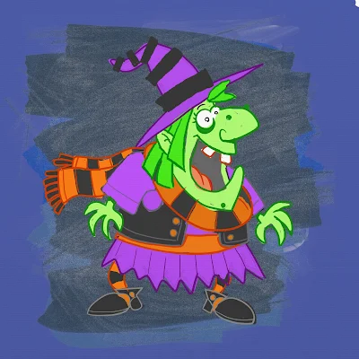
Daily Quick Sketch: Witch Nazel

UPDATE: B+W Image Colorized
Digitally colored in Photoshop
Quick note on the information below. I mention publishing an eBook version of the story, but after reading up on the market, eBooks aren't really catching fire . . . especially with children's books. Parents still want higher quality printed books and are willing to pay for that quality.

The major problem with eBooks is that everyone can make one - and it seems like they do. This creates a huge glut of poorly edited, poorly drawn and unprofessional picture books, which in turn makes any worthy eBook harder to find among all the clutter.

Bottomline: I'm no longer considering eBook publishing . . . going to try the old fashion way of submitting and waiting. We'll see if I can break into the business the proper way.


Originally Posted on Friday, December 20, 2013

I just purchased a new set of Copic Cool Gray markers and wanted to test them out.

I already had Warm and Neutral Grays . . . so I thought it would be best to try to create a wintry image with the cool grays. This was also a good opportunity for me to develop one of my supporting characters, Witch Nazel.

This version of Witch Nazel is more feminine, friendly and less freakish looking.
Marketing wise, this would be a better choice for her design since she would be accepted by more people. But the wacky side of me prefers a weirder looking Witch Nazel, (or at least not as clean cut as she appears in this image.) So, this may not be the version of Witch Nazel once the eBook is published. (. . . or . . . maybe it is . . . too early to tell.)


Gray toned image of Witch Nazel made with a cool gray set of Copic markers

This image of Witch Nazel is taken from one of the pages in my eBook, Worm Wire Glasses. I altered the background to make it more of a winter scene. Below is the original pencil sketch. You can slightly see a hint of the monster, Bladimir, flailing about in the lower right corner -- kicking a garbage can. This is from the scene where Witch Nazel floats over the ruckus that Bladimir is causing below on Halloween.   

Original pencil sketch of Witch Nazel flying on her broom during a Halloween night

Sunday, June 5, 2016

Old Sketch found: Bladimir Blarfarg Trick or Treating (from the story Worm-Wire Glasses)

Found this image on a memory stick. It's a scan of my character Bladimir Blarfarg from my Halloween picture book story, "Worm-Wire Glasses". This was done with pencil, brush pen and finished with markers.
Marker sketch of the star character from "Worm-Wire Glasses", Bladimir Blarfarg trick or treating

Friday, March 6, 2015

UPDATE! Character Development: Witch Nazel Color Style

UPDATE: I've been going back to my picture book concepts lately and decided to revamp another of my characters, Witch Nazel from my story "Worm Wire Glasses". It's been over two years since I originally posted about this character. 


Fine tuning and testing the pencil/oil brushes with an old favorite: Witch Nazel from my story "Worm Wire Glasses"

Originally, this story was to going to be an eBook, since making an eBook was way more cost efficient than printing another hard cover. But as I started talking to others self publishers at meet-the-author gatherings, libraries and art festivals - I was finding out that the e-book market wasn't really that great.

The biggest problem I felt was that I wouldn't have anything physical to promote anymore. Which makes going to school readings, meet-the-authors and art festivals pretty much worthless -- (unless I could get people to go directly online and purchase my book right at that moment. It's just not realistic.)  Plus, children still want real books.


So, I'm back submitting the old way. Hoping that the one right person in publishing will read my stories.


Below is the the original post from 2/4/2013:


I'm testing out working in a slightly different style for the Bladimir Blarfarg and the Worm Wire Glasses eBook. I'm enjoying using the pen +
 ink style, but I want a different look for the eBook. I feel my work gets too clean and stiff - I want to try and become more loose with my strokes, not worry about being 100% in the lines. I also want to stop wasting hours of correcting the holding lines . . . I want it to look more sketched.


Below is a quick color sketch of Witch Nazel. The overall look in generally there - but I need to turn down the color vibrancy a bit and get the colors to have more of an equal balance. 


I don't think I like the green skin, it's too much . . . GREEN.  Thinking of either going more pale ashy skin -- or just bring it to a more reasonable, normal flesh tone. Orange/Red hair I think will be a better solution too.
The black articles of clothing need to be darker, but not so much to over power the highlights of color.

Note to Self: all of the holding lines' coloring will need to be adjusted, the purple outline is far to harsh and the green outline seems a bit too dark.

Sunday, October 27, 2013

Illustration Friday: Creature

Illustration Friday: Every Friday a word is given on the website, IllustrationFriday.com. Artists and illustrators then submit an image that represents that word all during the week.

This week's word: CREATURE


As previously mentioned, I've been swamped with work lately, so I haven't been submitting illustrations to the website Illustration Friday for weeks now.
Fortunately, this week's word is easy for me to submit past works.

Bladimir, the Blogdunsta from the upcoming eBook "Bladimir Blarfarg and the Worm Wire Glasses".

Thought Process:
Not much thought process to this submission, my first thought to the word CREATURE is obviously going to be the creature I've been working on for the past year. I simply submitted one of my illustrations from my eBook, 
Bladimir Blarfarg and the Worm Wire Glasses".

(Sidenote: Noticed that the font I picked has a "y" that looks like a "g" - I'm constantly seeing "Tiny Legs" in the lower right corner read as "Ting Legs". Even though that does bother me, I like this font's style since it goes so well with the mood and character of the story.)

Thursday, February 28, 2013

Character Development: Using What Worked in the Past

For a long time, I've needed to develop a witch character for my upcoming eBook, "Bladimir Blarfarg and the Worm Wire Glasses". Making a good cartoon witch character isn't easy, especially when its a story for children.

The character of Witch Nazel needs to be a kind, helpful and happy witch. She is a crucial character to the story so she can't be too ugly because children would hate her. She shouldn't be too cute and pretty - that would make her more of a fairy then witch.  And since I always want to write humorous stories that make children laugh, she MUST be funny. Knowing these features I needed for the character, I still struggled to put it all together and get the right look.
One of my many Witch sketches: This one was too thin and lanky to use.
I noticed I was making my witch sketches too thin and tall. Thinking how Witch Nazel would interact with Bladimir, (who's a short stocky monster), I realized the layout needed to be more compact. Most picture book eBooks are read horizontally then vertically. So I needed short, stocky and funny . . . that's when I remembered an old favorite character of mine: Chef Gordon Baloo.
The transformation of creating Witch Nazel from key features of an old favorite, Chef Gordon Baloo.

Chef Gordon Baloo was a character I created long ago. I have always loved the look of this character and have made cartoons, animation clips and one of my old website's used him as a company mascot. So the answer was easy, take Chef Baloo's best features and dress him up as a witch.

Witch Nazel was born . . .