UPDATE: I've been going back to my picture book concepts lately and decided to revamp another of my characters, Witch Nazel from my story "Worm Wire Glasses". It's been over two years since I originally posted about this character.
Originally, this story was to going to be an eBook, since making an eBook was way more cost efficient than printing another hard cover. But as I started talking to others self publishers at meet-the-author gatherings, libraries and art festivals - I was finding out that the e-book market wasn't really that great.
The biggest problem I felt was that I wouldn't have anything physical to promote anymore. Which makes going to school readings, meet-the-authors and art festivals pretty much worthless -- (unless I could get people to go directly online and purchase my book right at that moment. It's just not realistic.) Plus, children still want real books.
So, I'm back submitting the old way. Hoping that the one right person in publishing will read my stories.
I'm testing out working in a slightly different style for the Bladimir Blarfarg and the Worm Wire Glasses eBook. I'm enjoying using the pen + ink style, but I want a different look for the eBook. I feel my work gets too clean and stiff - I want to try and become more loose with my strokes, not worry about being 100% in the lines. I also want to stop wasting hours of correcting the holding lines . . . I want it to look more sketched.
 |
| Fine tuning and testing the pencil/oil brushes with an old favorite: Witch Nazel from my story "Worm Wire Glasses" |
The biggest problem I felt was that I wouldn't have anything physical to promote anymore. Which makes going to school readings, meet-the-authors and art festivals pretty much worthless -- (unless I could get people to go directly online and purchase my book right at that moment. It's just not realistic.) Plus, children still want real books.
So, I'm back submitting the old way. Hoping that the one right person in publishing will read my stories.
Below is the the original
post from 2/4/2013:
I'm testing out working in a slightly different style for the Bladimir Blarfarg and the Worm Wire Glasses eBook. I'm enjoying using the pen + ink style, but I want a different look for the eBook. I feel my work gets too clean and stiff - I want to try and become more loose with my strokes, not worry about being 100% in the lines. I also want to stop wasting hours of correcting the holding lines . . . I want it to look more sketched.
Below is a quick color sketch of Witch Nazel. The overall look in generally there - but I need to turn down the color vibrancy a bit and get the colors to have more of an equal balance.
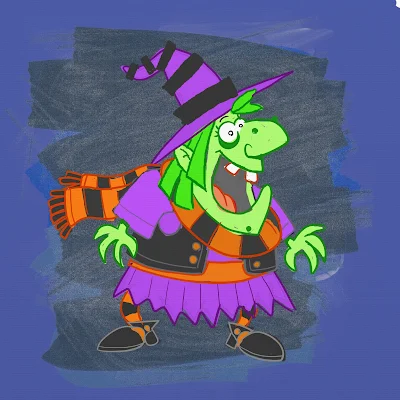
I don't think I like the green skin, it's too much . . . GREEN. Thinking of either going more pale ashy skin -- or just bring it to a more reasonable, normal flesh tone. Orange/Red hair I think will be a better solution too. The black articles of clothing need to be darker, but not so much to over power the highlights of color.
Note to Self: all of the holding lines' coloring will need to be adjusted, the purple outline is far to harsh and the green outline seems a bit too dark.