Showing posts with label Inktober. Show all posts

Friday, October 7, 2016

Inktober 2016: Lost (#07 of 31)

Today's word of the day for Inktober 2016: Lost.
This word brings me back to one of my very first cartoons.

During my college years, I was the college newspaper cartoonist doing weekly drawings. One year, I won the national Columbia University Golden Circle Award for Best Cartoon from a Collegiate Newspaper. This inspired me to try going professional. I drew up about 3 dozen cartoons to submit to the New Yorker, Playboy, Reader's Digest and several other popular magazines. All were rejected. With good reason . . .
Rehashing an old cartoon I did while in college.
After all the rejections, I changed my focus and started doing a comic strip called Home of the Brave, which ran monthly in a fanzine for 2.5 years and then was reprinted/rehashed for a Spa/Health magazine for about a year. This old lady became one of the regulars in that strip (years later, she was also used in my first children's book Bobby's Biggest Bubble.)

Original pencil sketch
I'm going to search for the original old cartoon and post it (even though doing so will bother me tremendously -- looking at how I used to draw! Bleh! ) If I find the image, I'll update this post.

Thursday, October 6, 2016

Inktober 2016: Hidden (#06 of 31)

Today's 6th Inktober 2016 image is based on the word: HIDDEN.

Not much to explain on this one. Just keeping the jokes gross, dark and uncomfortable . . . (because those are the drawings that are getting the most attention! Go figure.)
Alien Hide N' Seek professional Mr. Glorp playing with the Elf on the Shelf (he's hiding, kinda.)

I will admit I do have a bit of hatred for the Elf on the Shelf. He just seems to be the most obnoxious and shady elf in the world. Glad I put him in his place with this cartoon . . . 

Original pencil sketch of Mr. Glorp (sans the elf . . . )

Wednesday, October 5, 2016

Inktober 2016: Sad (#05 of 31)

Okay, I'm already going dark in the very first week of Inktober. Nothing wrong with a little dark humor, right? (I have to admit, I found myself giggling a few times while doing this image.)

Here's my Inktober image for Oct 5th. The prompt word for this day was "SAD."
I thought of all the saddest characters out there -- Pooh's friend Eeyore easily made the top of my list.
Oct 5th's Inktober image for the word "Sad", made using a pencil, brush pen, and Copic gray markers

Now I don't ever remember seeing Eeyore happy or smiling. That was the first part of this image, making Eeyore super happy. Once I sketched out what he'd look like . . . I started to think of what could possibly make him so happy. That's when everything turned dark.
I first focused on this key element of the drawing -- I found only one reference image of a happy Eeyore
Recalling my youth watching cartoons of Pooh, I've always disliked Rabbit. Face it, he was a jerk most of the time. A snoop, a bully, a control freak and just too darn excitable. So it was easy to make him be the fall guy for this joke. 
The rest of the image was roughed in around the Eeyore character, with the tragedy emphasized in the foreground
I needed to really make his death be totally abnormal with the environment of the characters. I went all Donny Darko and decided to drop a jet engine on poor old Rabbit. Wanting to not over offend people, I toned down the violence and kept it on a comical cartoony level. (No blood, guts, or gore.  I made sure to hide Rabbit's face to help soften his tragic death.)

Tuesday, October 4, 2016

Inktober 2016: Hunger (#04/31)

Today's Inktober word on the prompt list: Hunger.
Immediately zombies come to mind. Generally, that's is their entire life . . . eating, walking and looking for more to eat.

There are so many unanswered questions about zombies and eating:
1.) Do zombies ever get "full"?  2.) Do zombies only prefer "fresh" food?  3.) Why don't they eat each other?  4.) Do zombies poop?**
Image #4 "Hunger " for Inktober 2016, made with a mechanical pencil, Kuretake brush pen and Copic gray markers

This drawing touches on one of the things I always wondered as a kid; would a zombie ever eat itself?  If it did, that would be such a great efficient ecological system . . . am I right? I mean, if zombies can do that -- it'd make them have the smallest carbon footprint in the world!
Original pencil sketch of the self-sustaining zombie named Earl
(**Anyone have answers to these questions, let me know!)

Monday, October 3, 2016

Inktober 2016: Collect (#03/31)

Today's Inktober word on the prompt list: Collect.


SpongeBob SquarePants immediately came to mind with his impulsive hobby of jelly-fishing. I remember an episode where a giant jellyfish started to attach SpongeBob, to stop him from collecting little Jellyfish. I thought I'd take from that event and exaggerate the size of the bigger Jellyfish (and add more monstrous features like the teeth.)

Sketched, inked and highlighted this SpongeBob image on Toned Tan paper

I used to draw SpongeBob many times during my former job as a Creative Director in the Amusement business. It's been about 12 years since I drew this character. Back then I would design new outfits and concepts for new plush SpongeBob toys.

No sketch for this image since it was penciled and inked on the same sheet of paper.

Sunday, October 2, 2016

Inktober 2016: Noisy (#02)

Today's Inktober word is "noisy", I started thinking of characters that were loud. The first character I thought of was Godzilla, but I already did Godzilla last year. So, thinking Sci-Fi, Chewbacca came to mind with his loud growl. I thought of this little joke where Chewbacca would amplify his voice.
Inktober 2016: Oct 2nd NOISY -- inked with Tombow brush pen and shaded with Copic markers

What actually took me some time was trying to make the megaphone look like something from the Deathstar. I thought, "What would Darth Vader use as a megaphone?". (I know, Vader wouldn't use a megaphone, he'd just used the force with some Jedi mind cast instead.)

Original pencil sketch of Chewbacca with a megaphone

Saturday, October 1, 2016

Starting Inktober 2016: Fast (#01)

For the last few years, October has been the month for creating daily inked drawings thanks to Jake Parker's Inktober. Artists from all over the world partake in this creative event by simply drawing and posting their work online with the hashtag #Inktober (or more precisely #Inktober2016.) You can find out more at Jake's site here: http://www.inktober.com/

Last year, I did drawing based on childhood memories and concepts. This year, I'm going to follow Jake's Prompt List, which is a listing of random words for each day of the month. Oct. 1st's word of the day: FAST.
Inktober 2016: Oct 1st FAST -- inked with Tombow brush pen and shaded with Copic markers 

Just like last year, I'm doing dinosaur images right out the gate. I'll admit, dinosaurs are fun to draw and those images seem to get the most attention (along with dog and superhero sketches.) Since it's the Halloween season, I'll be doing many monsters, creatures, and science fiction related images.
The original digital pencil sketch of Oct 1st FAST 
Now technically, it's just supposed to be the inking with no wording . . . but I like adding humorous captions to the images. So this year I'll submit wordless images to my Twitter account and post the captioned images here on the blog and Facebook.
Original pencil rough of the concept.
Not happy with the character sketch, I scanned the image and started to change the character's features, details and positioning in Photoshop.

Tuesday, February 9, 2016

Follow-up: Using RedBubble.com

I mentioned in a previous post about using RedBubble.com and I wanted to follow-up on my experience using their custom product/printing service. I first tested them out by ordering a couple of t-shirts using some of my 2015 INKtober sketches: T.H.E. Walking Dead and Batman vs. Baseball. The shirts arrived in less than a week after the online order was made.

Image showing the high-quality T-Shirt printing
The quality of the t-shirts was excellent. Tight coverage and spot-on color. The shirts are very comfortable and light, great for spring and summer wear. (My only issue was that some of my designs had transparent backgrounds, so those parts of the images blended into the color of the t-shirt. This could make the print look muddy if a dark colored t-shirt is selected.)

Metal traveling coffee mug using my image "T.H.E. Walking Dead", created using RedBubble.com
Link to the T.H.E. Walking Dead product page CLICK HERE

After getting the T-shirts, I purchased 5 other items from Redbubble: pouch, travel mug and pillows. All of these items were very reasonably priced for the high-quality made-to-order products. It used to be, (not too long ago), you had to buy a costly minimum quantity to get this level of quality. 

A zipper pouch using my design "Ghostie Emojis" on RedBubble.com
Link to the Ghostie Emojis product page CLICK HERE

I've added several other designs in the past few months, which have already been selected by other people to create their own products. There is also cash back sent to the artist for each item being made using their artwork. It's not a HUGE amount . . . but still, it's nice to see others enjoying the artwork.
There are so many great gifts and self-promotional ideas that can be used with this service.
Imagine creating products using your child's artwork, creating a prototype sample of an idea or design or making personalized "inside joke" t-shirts for friends, etc.

I highly recommend Redbubble.com
They often have discount sales from 20%-30% off . . . sign-up to get email notifications when these sales happen. (I suggest only purchasing when there is a discount sale. Usually, their best discounts occur around holidays.)

To see all my designs available on RedBubble.com - go to: Arrrggghhh's Shop

Monday, February 8, 2016

UPDATE: #INKtober 2015 No. 7: T.H.E. Walking Dead


UPDATE to the Update:
You can see my follow-up post using this image to create custom RedBubble.com products.
Link: CLICK HERE.

- - - - - - - - - - - - - - - - - - - - - - - - - - - - - - - - - - - - - - - - - - - - - - - - - - - - - - - - - -

Originally Updated on Dec. 3, 2015
UPDATE:
I colored this image over the weekend to test out the website RedBubble. RedBubble is a company that prints customized t-shirts, pillows, mugs, etc. It allows you to easily use your own images, even sell your own work and setup is very easy.

I've ordered two t-shirts to test the quality of their product. The cost was around $50, which for two customized t-shirts is a fairly good price.

- - - - - - - - - - - - - - - - - - - - - - - - - - - - - - - - - - - - - - - - - - - - - - - - - - - - - - - - - - 

Originally Posted on Oct 8th, 2015

#7 and I think it's my favorite so far, mostly because it made me smile as I drew it. This is a great example of writing a joke where maybe I'm the only one who finds it amusing.
INKtober 2015 image #7 inked with a brush pen then gray tones added in Photoshop
As I finished the image, I started wondering if my little play on words would go over some people's heads since the cartoon has a double meaning to it.
Some might just think it just "a DEAD character WALKING his pet" and that's as far as they'll see it. But those who read into the ghost's full name and dog's name tag should see the actual pun intended.
Inked on Canson marker paper with a black Faber-Castell brush pen
I'm sure it'll annoy some Walking Dead fans simply because there is no zombie in the image. That kinda makes me smile too . . .
The original combined pencil sketches.
This was actually made combining two sketches into one with the leash bridging the two sketches together.

Tuesday, December 1, 2015

UPDATE: #INKtober 2015 No.22: Batman vs Baseball

UPDATE:
I colored this image over the weekend to test out the website RedBubble. RedBubble is a company that prints customized t-shirts, pillows, mugs, etc. It allows you to easily use your own images, even sell your own work and setup is very easy.
I've ordered two t-shirts to test the quality of their product. The cost was around $50, which for two customized t-shirts is a fairly good price.

- - - - - - - - - - - - - - - - - - - - - - - - - - - - - - - - - - - - - - - - - - - - - - - - - - - - - - - - - - 

Originally Posted on Oct 23rd, 2015
For #22 of the INKtober drawings, I couldn't help but go back to Batman.
Intober #22: Inked with brush pen and digitally toned in Photoshop

The original pencil sketch

The inked image sans type and gray tones.

Wednesday, November 18, 2015

Daily Sketches: Sweet Tooth Reaper and Post Inktober Comments

Well, I wasn't able to complete the entire month of Inktober. This is the most stressful and demanding time of the year in my line of work. I actually worked several 18+ hour days to reach deadlines. It's mentally and physically exhausting, especially when considering that the same similar holiday designs are needed over and over each year.

In times of a better economy, designers can experiment more, take risks and do ideas never seen before. But it's the opposite in our current poor economy. Retail store buyers want the same price and quality products as their previous years - while the manufacturers face inflation to materials, labor, safety regulations and shipping costs. As a designer, I must help create sensible high-quality designed items that don't cost more to create.

Anyway, my job took over all of my spare time and pretty much burnt me out. I have many doodles and sketches that could have worked for Inktober, but for legal reasons I can not share those on the blog. But there are a few loose images that were not used for my job. I will throw a few of these sketches up on the blog as I get the time; like the one seen below. Many of these are related to Halloween given that it was around that time when they were created.

This image was created using pencils and Copic markers with light highlight Gelly Roll pen

Thursday, October 22, 2015

#INKtober 2015 No.21: Iron Baby

For this drawing, #21 for INKtober, I wanted to experiment with a few new brush pens I bought on Amazon. I've been seeing other artists' using different pens and I wanted to try a few and compare them to what I've been using. 

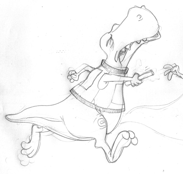
The image below was a pencil doodle of a baby Iron Man. I inked over the pencils using a Tombow N15 brush pen and then colored with a Tombow N60. Note: The pens have two ends, one end is the brush tip and the other end is a normal fine point marker tip.
INKtober image #21: Pencilled and then inked using TomBow N15 and N60 brush pens
For most of these INKtober images, I have been using a Faber Castell SB brush pen.
The ink in that pen is solid black, good coverage, ink dries instantly and the brush nib is very flexible.

The Tombow N15 I used for this image had several issues. The ink was not a solid black as with the Faber-Castell SB. The ink didn't dry quickly, smeared and when used with a second marker the black line blended into the lighter gray marker. These pens also create bands and lines when coloring, typically seen with most water-based markers. The Tombow brush pens are definitely not the quality level of Copic markers for coloring.

The lower two pen brushes were used to create the Iron Baby image seen above

The only plus to the Tombow pens is that the brush nib is very long, extremely flexible and durable. It can definitely take more pressure, allowing more control for thin to thick lines. It seems like the tips of these pens are made of a strong poly-fibre and will hold it's point much longer than the Faber Castell SB. I really like the line control with these pens, but the ink needs a lot of improvement.

Comparing the two brush pen nibs

Tuesday, October 20, 2015

#INKtober 2015 No.19: Batman Bat'room

For the 19th image of INKtober, I decided to do a day-in-the-life cartoon of Batman.
I believe some of the best cartoons about Batman have been the ones from the perspective of Batman doing everyday common things. And who doesn't like a little bathroom humor too?
Inktober #19: Drawn with a pen brush and colored with Photoshop
I had a little problem figuring out the composition for this cartoon. Most of this image was done in parts, so that I could move them around in Photoshop until I found the right layout that worked.

Inked version sans the type and color

It might seem simple, but much had to be considered.  The toilet needed to be seen enough to instantly know it was a toilet, all of the text had to flow a certain ways and I toned down the wackiness of Batman so that he was more simple and easily identified.

The original pencil sketch of Batman sitting on the throne
Originally I was going to add pupils to his eyes so that his eyes would direct the flow of reading the cartoon. But leaving the eyes blank seemed funnier since it creates a more brooding expression. Brooding on the toilet = more funny.

Monday, October 19, 2015

#INKtober 2015 No.18: Lone Ranger VS. The Wolfman

The 18th image for this year's INKtober is my childhood memory of The Lone Ranger.
Maybe it was just a coincidence that I found out around the same time that: #1.) The Wolfman could be killed with a silver bullet, and #2.) The Lone Ranger used only silver bullets.
I guess in my head I thought, "Why would the Lone Ranger use such bullets unless he intended to hunt down the Wolfman?"
Inktober image #18: inked with a pen brush and toned in Photoshop

Funny though, the recent Lone Ranger movie starring Johnny Depp and Armie Hammer, originally had the Ranger fighting werewolves in the script. Those werewolves were eventually replaced with train fights. Knowing how the movie flopped, I'm guessing the movie would have been more successful if those original werewolves were included!

The inked version of the drawing, sans type and tones

Original Pencil Sketch

Sunday, October 18, 2015

#INKtober 2015 No.17: Peanuts Confidential

This INKtober image is yet again inspired by my thoughts as a young kid. It always bothered me that the adults in the Peanuts cartoons were never seen. I was freaked out whenever the teachers spoke on the cartoon shows. Sure it was funny . . . but also quite eerie, especially when as a child one would try to envision what those teachers + parents looked like whenever they spoke.

INKtober image #17: Using a SB brush pen on Canson marker paper and digitally toned in Photoshop.

So this was my conclusion . . . a very rare skin disease that occurs during puberty. I would imagine the entire Peanuts' community was under quarantine and under the watch + care of the U.S. military. If fact, I'd imagine it was the US military that gave these sick people the cruel and heartless code-name: "PEANUTS".

The inked version sans all the type

With this theory, it all made sense. It explained why the adults were never seen on the cartoon shows and why all of the adults spoke so strangely due to their enclosed and hardened mouths. Makes total sense to me . . .

The original pencil sketch

#INKtober 2015 No.16: Moon Ride (Halloween in 2 weeks)

No joke today for INKtober #16.
This was an image I sketched quite some time ago for a Halloween Trick or Treat bag. It was a very rough idea that I decided wasn't going to work for my client. I have made many sketches like this just laying around. Even though this might be a nice concept image - it just doesn't fit into what retailers want to sell on the market.

INKtober #16 using a very soft bristle brush pen and Photoshop digital toning

 I used a much softer bristle brush pen for this image. Notice how the lines are more flexible and loose since the bristle tend to bend much easier with the slightest pressure. The result is a more interesting line that feels much more playful and relaxed. Just for added effect, I decided to add the burst of orange tone in the background to make the image stand out.
Inked version of the image

The original rough sketch that was done in pencil (and bit of gray marker on the hat)

Friday, October 16, 2015

#INKtober 2015 No.15: Pumpkin Head

For Inktober image #15, I wanted to do something a little different.
I wanted to demonstrate how the meaning of words can be altered by associating them with an image. In this case, the lyrics from a popular Christmas song, which in my opinion always had a creepy vibe.


So the next time you hear that Christmas song, maybe you'll remember this little experiment -- and hopefully I haven't ruined that song for you . . . (snicker).

The original image sans words.
Inked with a SB brush pen on toned paper and colored with markers and highlighted with a white opaque pen.
The original pencil sketch

#INKtober 2015 No.14: Godzilla OOPS!

Continuing with this year INKtober images and my childhood thoughts about monsters.
I LOVED giant monsters! I can still remember rushing home after school with my best friend Joe to watch the 4:30 movie on ABC (Channel 7.)
Several times a year, Channel 7 would run Monster Week. Sometimes it was the classic Universal Pictures monster movies like The Mummy or Frankenstein -- but the best was Giant Monsters week!
One thing that confused us as kids was why in some movies Godzilla was good and in others he was bad. In the original Godzilla movie - he's bad. In Destroy All Monsters - he's good. In King Kong vs. Godzilla - he's bad. Godzilla vs. Ghidorah - he's good. So confusing . . . 
So my friend and I came to a conclusion that Godzilla is never bad, he's just misunderstood. His size is threatening and causes damage, so the military has to step in. If Godzilla just stayed home on Monster Island, none of this conflict would have ever happened. So he is basically guilty of having a curiosity that has made him wander -- which got him into a whole lot of trouble.
One last note: If you haven't heard -- there is a re-make of King Kong vs. Godzilla in the works and set for 2020. I'm not a fan of re-makes . . . But I have to admit that is something I would like to see.

Thursday, October 15, 2015

#INKtober 2015 No.13: Dracula - Sans Cape

Next in my line of INKtober 2015 submissions is good ol' Dracula. Like many of these inked cartoons I have been doing, this one goes back to my childhood where I wanted to absorb all stories about monsters, aliens, mythology and the unknown. I believe it's what drove me to be creative, to ponder and question the impossible and somehow make it seem like it could be real.
INKtober #13: using Ink brush pen and digitally toning in Photoshop
I still remember images of Bela Lugosi's Dracula holding out his cape and transforming into a bat. It was a very impressive visual effect for the time. But then came the questions . . . so the cape melds and becomes a part of his biological bat form? What is the cape made of? Can any cape be used in this fashion? What if Dracula decided to transform into a bat but forgot to wear his cape?

Inked version without gray toning
Notice below that I changed the angle of the original sketch. I felt rotating the bat so that he was looking and facing downward was better to convey that he was in fact falling.
Original light pencil sketch