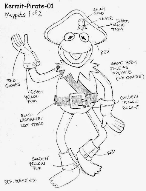
Most of these are well over 10 years old. Our New Jersey Amusement Plush Division of Nanco was the leader of Amusement Plush; those are the stuffed toys you see in all sizes; from crane machines to the gigantic "how-are-we-ever-going-to-get-this-into-the-car?!" sizes.
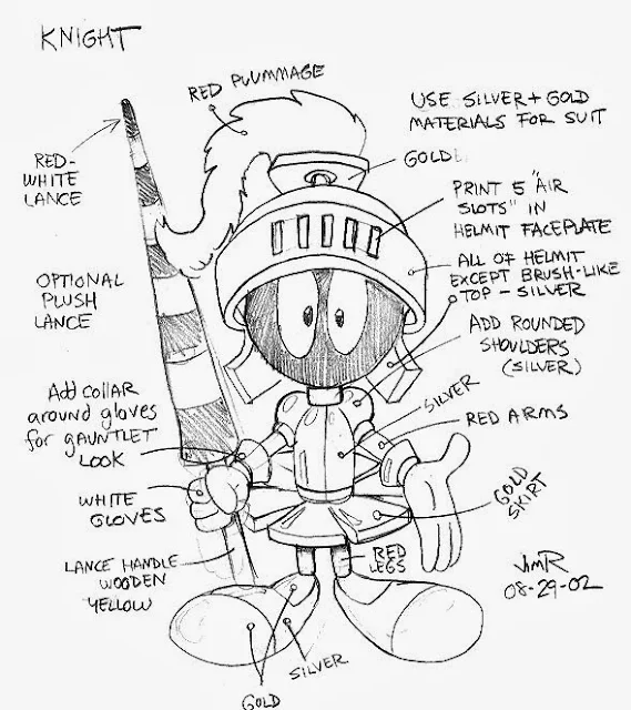 |
| Warner Bros. Marvin the Martain designed as a Knight. The challenge is to create a new look, while respecting the character and the brand |
My job at Nanco was Creative Director, which meant creating designs, getting approvals from licensors, overseeing production overseas and acting as Art Director. Every sketch you see had to be approved by the licensor first, then go to the China factories for samples, usually in 3 to 9 different plush toy sizes. Then every size had to be approved, changed and re-sampled. So you can imagine the amount of work when we had 30-40 licenses, each with an average of 4-6 characters and each of those being done in 3 to 9 sizes. That's a lot of plush . . .
Nanco had many licenses such as: Sesame Street, Jim Henson's Muppets, Warner Brothers, CareBears, Nickelodeon, Dreamworks, M+M's, My Little Pony, Simpsons, Family Guy . . . many, many more. First, for each licensed character, we had to create an original, fully approved, "master" plush pattern. Then each following year, we would create themes to freshen-up and dress-up the approved characters. Doing this helped sales since we were introducing new items to appear in the amusement parks each year. We had themes like Pirates, Circus, Birthday, Medieval, Beachwear and even Holiday themes like Christmas, Easter and Halloween.
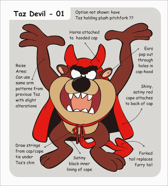 |
| Vector color version concept design, Doing the sketch as a vector design allows quick color changes if needed. |
These are concept sketches. The concept sketches for plush toys were almost like doing fashion designs, only instead of fancy clothing, we were dressing the characters in cartoon theme related clothing. I would add notes and color call-outs to help the plush designers understand anything the pencil lines could not easily convey.
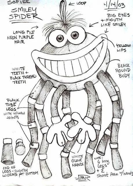 |
| Original design Smiley Spider. This was done as a follow-up to the very successful Smiley crab design I did the previous year; but this design was too bulky and expensive to produce. |
Occasionally, I would create original characters, (usually with a beach theme since some of our biggest buyers were from boardwalk amusement areas like the Jersey Shore.) This character is one example that was a nice design, but it was just too costly to make.
One of the many things I learned as a plush designer is that a round ball-like head is more expensive to make because:
#1.) a ball takes a lot of stuffing to fill.
• More filling = more weight = more shipping cost.
#2.) Rounded shapes take up more room in a shipping carton -- adding a lot of wasted empty space. (Think of all the empty gaps of space between balls when they are stacked up.)
• Takes up more space = less items ship in a given carton = very expensive to sell.
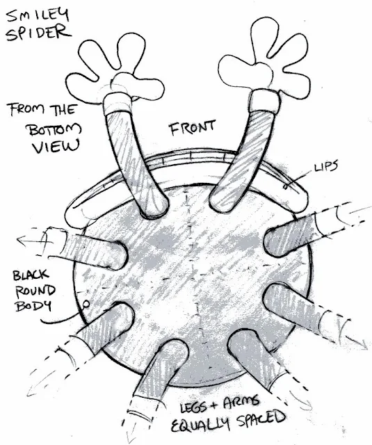 |
| The underbelly of the Smiley Spider design. I felt I needed to show this angle of the toy so that the plush designers I Shanghai could see how I was imagining the character and it's ligaments. |
In the future, I'll show more concept designs and licensor approval follow-ups (which I call side-by-sides)
