Thursday, January 8, 2015

Daily Quick Sketch: B'Gok

Been cleaning up my hard drives for the new year. I found many sketches and images that I had the best intentions to post here, but never found the time. Many are now out of season, (quite a lot of Santa sketches.)

This character was made shortly after I did the image of the monster character Margarrr for Illustration Friday back on Oct 24th, 2014.  I actually sketched 4 characters but only colored two. Here is the giant monster B'Gok!

One of four giant monster characters made in Oct 2014.

These giant monsters were inspired by the old video game Rampage and Godzilla movies. The failure here is that I didn't create a city background to help scale the size of the monsters. Without that scale, this creature could be two foot tall. 

The original pencil sketch - seen here facing left. Later the image was flipped when being colored.

Inked version before it was cleaned up and colored.


Sunday, January 4, 2015

Character Re-Design: Card Goblin

Okay . . . a new year.

Time to get back into the swing of things. This past holiday season has been a complete mental and physical drain both with work and life in general. I'm looking forward to a better year.
So let's begin with this project I did recently for Geoff Smith who hails from the UK . . .

In late October, Geoff had contacted me on Facebook. He had seen my work and was interested in a custom design, especially one that would be similar to the Goblin I created for Steve Radabaugh's Dungeon Marauders game last year.

At first I was against doing the project, especially being in the middle of a highly stressful deadline holiday season. But we agreed on a one&done deal, where I would do a pencil sketch based on what he wanted, then ink/color in my spare time . . . no deadline, no revisions/changes.

Final colored version, inked & colored in ArtRage Pro
Whenever I had the spare time, I'd doodle a few ideas out for composition and character in my sketchbook. The first character image was too happy and pleasant . . . almost too elf-like. But I did like aspects of the character. Geoff did say he wanted a bright eyed goblin, but this was going away for goblin territory and more into a Archie comics territory.

Pencil doodle in my sketchbook that started looking more like an elfish version of Jughead. 

I decided to use more of the character I made for Dungeon Marauders, creating a more grittier and gruesome look. But this time I went too far in the other direction . . .

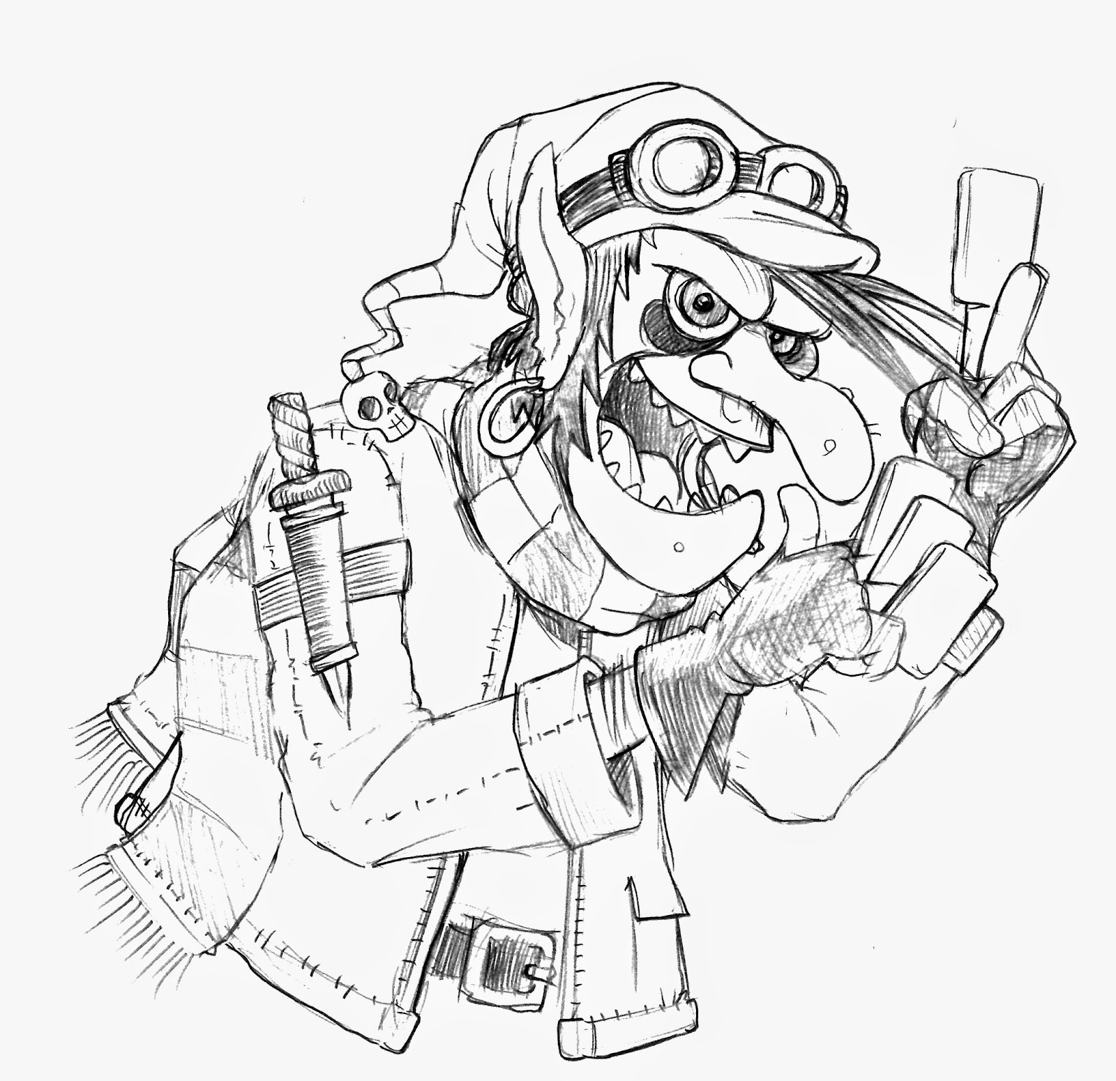
Rough sketch. It was here that I knew that the legs would have to be omitted to keep it close-up and truly see the cards in his hands. Though the cards are blank, their positioning and general focus is just as important as the character.

The Goblin became too evil looking and creepy. He definitely didn't seem of sound mind. Since Geoff wanted to used this character for his website/small business (trading cards & games) this character needed to be a little more friendlier and look less like a zombie. The entire composition balance was off too; too much space behind his head and the shoulder dagger just wasn't working for me. Still . . . he needed a weapon. A sword would be the answer to both composition issues.

The plan then was to go somewhere in the middle of the two sketches. It would be quite some time later that the 1st official sketch was done over the Thanksgiving break. On Dec 2nd, I sent the below pencil sketch to Geoff. The rope was a last minute decision to create a nice border for this image to be used as a spot illustration.

Second pencil sketch: tighter details and the composition was now balanced thanks to the addition of a long sword.

It wasn't until New Year's weekend that I finally inked and colored the image, creating several variations for Goeff to play with. With the final touches finished, I sent several files off into a DropBox folder and shared the contents with Goeff.

A color variant, giving the character a very unique look from the normal Goblin traditional colors.
Funny how we take today's technology for granted . . . sending something instantly overseas in a matter of seconds. Geoff seemed very please by the work. Glad I could help. I wish him the best luck in his business ventures.

Now onto another little project for my friend Steve and his new game Fae Ball.

Saturday, December 13, 2014

Daily Quick Sketch: Heppy Santa

Been quite awhile since I posted anything here.

My job has me running in circles, fried and exhausted. But things are starting to slow down and there is the holiday break soon approaching. So I thought I'd throw in some Holiday images in the next week.

First up . . . It's Heppy Santa, Kids!

Heppy Santa was create using ArtRage Pro 4.5 with the ink pen for outlines and charcoal settings for coloring

I've been sketching many different Santas lately, mostly for work. Trying to find different ways to draw him and alter his appearance.

The original pencil sketch, one of many various Santas I have been designing these past few weeks 
Creative Process:
This one I simply wanted a big, grinning, funny Santa.
Once I drew the grin, it inspired me to make a huge and wide mustache to cover the lips. Then once I curled the mustache -- I had to do the same for his hair. Small hat + huge body; always one of my favorite character trait combos. Of course giving him tiny hands really helps make the image look even more weird. I just always love making big bulky characters with thin arms and legs . . . it's very pleasing to me for some reason.

To help soften the image, the outlines were toned down to a bluish hue. A nice, snowy, cool-toned background was thrown in to counter the warm Santa suit and create a proper environment for the character.

I liked this Santa so much -- I created a new cover image for my Facebook page using him (in a kinda creepy way though)

Wednesday, October 29, 2014

Daily Quick Sketch: Frankenstein's Monster

Today's daily sketch is one based on the current design work I am doing for next year's Halloween products. I was looking for a way to make a more simplistic and iconic version of Frankenstein's Monster for a bag design. So I simply started by sketching a cartoon version of what I already visualized the character to be -- with one major difference: greatly elongating his forehead.

Quick daily sketch: digitally colored with thick brush settings in Photoshop

After sketching I laid in quick thick brush strokes of muted colors, trying to downplay the color saturation, making the image dark and gritty.

The final product design is based on this sketch -- but looks completely different and far more graphic and colorful. (Sorry, I can not show the actual artwork since the design is exclusively for the client.)

Hopefully if the buyer likes the design, we will see the bag in the stores next Halloween.
The original pencil sketch of my visual cartoon conception of Frankenstein's Monster

Friday, October 24, 2014

Illustration Friday: Puppet

Illustration Friday: Every Friday a word is given on the website, IllustrationFriday.com. Artists and illustrators then submit an image that represents that word all during the week.

This week's word: PUPPET


Scanned pencils and digital coloring of Shark Puppet

This was an image I did while trying to think of new toy concepts for Springtime. One of the most popular themes for Spring (after Easter of course) is Sealife. But when I did this image, I was just goofing around and liked how silly the sketch was looking. As a finishing touch, adding the hairy arm in the bottom corner made this even funnier to me.

Currently, I now use this image as my gaming avatar for several online games.

Illustration Friday: Trouble

Illustration Friday: Every Friday a word is given on the website, IllustrationFriday.com. Artists and illustrators then submit an image that represents that word all during the week.

This week's word: TROUBLE

I'm throwing this on to Illustration Friday on the last day before a new word is selected tomorrow morning. It's basically a sketch from one of my pads that I've had for awhile.

Penciled and digitally colored sketch of the creature who goes by the name, Margarrr!
I figure, if anyone was to bumped into this creature . . . it would probably mean trouble.

Original penciling from one of my sketch pads


Wednesday, October 22, 2014

Daily Quick Sketch: Pumpkin

Today's sketch was another test of getting loose with my designs and looking for different styles than my usual clean ink clean approach.
Loose digital sketch of a traditional Halloween Pumpkin.

It was also sketched because I've been doing Halloween designs for 2015. So I'm always hoping I can discover a new way to draw the traditional icons we see every year.

Monday, October 20, 2014

Daily Quick Sketch: Spooky Spectre

Today's quick sketch was done while I was thinking of new designs for Halloween Trick or Treat bags. This character was mostly influenced by the many macabre and goth graphic designs I saw during this year's New York Comic Con.

Spooky little specter character, rough sketched and colored with markers. Glow effect was added using Photoshop.
It's nothing new, cute goth items have been selling for well over 20 years now. It seems the big thing lately though is that the cuter and darker the subject matter, the more people like it. (Of course, there's still a fine line to how dark one can go -- but much more darker topics and images are accepted today then say ten years ago.)


Wednesday, October 15, 2014

Daily Quick Sketch: 3 Little Pigs

This was a quick exercise trying to get very loose with my digital drawing/coloring. This is part of a new picture book story I wrote recently, which borrows heavily from classic fairy tales.

Quick digital sketching and coloring of the pencil sketch seen below.

I wanted to create a very sketchy style, but I still feel this isn't what I'm looking for. The also wanted the colors to be very subtle, but there isn't the balance that I want between the holding lines and color.

Original pencil sketch of the three pigs.


Thursday, October 9, 2014

Daily Sketch: Halloween Sacko

Today's daily sketch is a burlap bag character I simply call, Sacko.
Not sure where the idea came from, I'm guessing this was strongly inspired by Tim Burton's "Nightmare Before Christmas" Boogeyman character.

Digitally colored with limited Fall colors, simply called Halloween Sacko
Sketching
I remember trying to develop a large, bulky character; but it still had to have some grace . . . not just be a lumbering creature. So I drew a more flowing dance/sweeping pose. Once I decided not to add any limb extremities, it looked more and more like a sack.  So I just went with it . . . and got this.


Original pencil sketch of Sacko from sketchbook

I was looking to practice a woodcut/stamp style of inking with brush pens.
This drawing was sitting in my sketchbook for quite some time. Flipping through the sketchbook, I immediately thought this sack character could be better, with more detail and expression.

Inking
I used a Faber-Castell B brush pen to ink the character. First, I'd draw a heavy outline, making sure it the entire silhouette was completed and adding more pressure to the marker brush then usual.
Then, I started working on the inner lines and cross hatching more details.

I felt the sketch lacked some interaction, so I had added the Halloween Pumpkin for Sacko to toss around.
Testing out a new woodcut style of inking, adding many short lines for shading and textures.
A Faber-Castell B brush markers was used for more natural pen lines.
A white Gelly Roll (8) pen was used for adding white lines, cleaning and correcting errors.

Coloring
Once I finished inking, I scanned the sketch into Photoshop, where I used a limited palette of Fall colors and a radial blend for the background. I decided to keep the colors flatter than I usually do, giving the final image a more "colored stamp" look.

Wednesday, October 8, 2014

Daily Sketch: The Lion and The Mouse

Here's another pencil sketch from one of my sketch books. This one is a nod to the classic fable, The Lion and the Mouse. Of course, I made it more silly . . . usually illustrators do a very realistic image of a real looking lion and mouse. Realistic just ain't my thing . . . while I highly admire those who can create beautiful realistic imagery, I really have not desire to do such images.

Pencil sketch of The Lion and The Mouse from my sketchbook.
I realize now that this lion reminds my a lot of the character Tigger, from Winnie the Pooh;
mostly because of the large snout, beady eyes, rounded ears and gaping mouth.
The resemblance was not intentional, just turned out that way.
To be honest, I was just sketching the lion's head at first. Then I added his body in a silly fetal like position - so he looked like he was floating. The lion's body pose made me think of the Aesop's fable, so I added the thorn in his paw which made the lion now looked more startled than . . .floating.
The mouse was squeezed into the page towards the end of the sketch.

The sketching process is always a surprise. I never draw exactly what I first imagine because the creative process is ALWAYS changing as the pencil moves on the paper. There's a constant trial and error that competes with new ideas and experimentation as the sketch is being made.

Hopefully when finished, the sketch resembles the basis of the original idea.
Hopefully that idea was improved upon from it's original conception.
And hopefully it all translates well to others who see it.

(Hmm, I seem to get too philosophical when I drink Chia Tea at night. . . )

Saturday, October 4, 2014

Sunny the Snowman sketch

This was an old pencil sketch I had found recently. This was the front cover of a two fold hangtag for several plush Christmas toys selling at H.E. Butt grocery stores back in the early 90's. The plush toys came out great - made of mostly fleece materials.

Pencil sketch of a Christmas line I created for H.E. Butt stores

I know I have a sample of the finished printed tag somewhere; If I find it - I'll upload it into this post.

Sunday, September 28, 2014

Product Design: Side-by-Side technique

Today, I'm just going to post a little example of the "Side-by-Side" technique I use to help the factory create better looking products.I create a before and after image to show the changes needed to improve a product. This is usually done by taking a photo and altering it in PhotoShop.

Even the slightest changes make a complete difference in the final product. The photo below is the front view of a plush lion rocking chair. Notice with 4 simple changes how the lion seems more friendly and happy.

Side-by-Side comparison showing the before and after images of my Lion Rocking Chair design
(Sidenote: Sadly, the way work is done today, there is less time to do the fine tuning. This is mostly due to the short turn-around time schedules that many buyers demand.)

Sunday, September 21, 2014

Recovered Image: Playing Yuk-Zee

Recently found some old sketches that I don't remember doing (happens a lot.) This one was very strange because it was colored with watercolor pencils, something I rarely used when I was younger. It's not dated, but I'm guessing by my style and the characters in the image, this was probably done around the early 90's.

Found image of L.B., Timmons and Hairy playing a game of Yuk-Zee in a water color pencil sketch 

Another strange thing about this image was that I drew it on watercolor paper, which meant I had the intention to actually add water to the image, spreading the water color pencils to look more like a real watercolor painting. But this image was never wet. Nor was it finished, as seen by the light pencil sketch of a window in the background. The entire top of the sheet is roughly torn as if the sheet was quickly torn in half.

So my guess is that I was going to experiment with the water color pencils, sketched this scene, colored the characters -- but then stopped, because the look just wasn't what I was wanted. Probably torn the image out of the pad and threw it aside onto the pile of images I had stored away until this moment.

Tuesday, September 16, 2014

Product Designs: Pet Riders (PetSmart)

Few of my designs just arrived in the PetSmart stores for Halloween. These are just a couple of the Pet-Rider designs I have done over the past 5 years.

This is from the PetSmart.com website, showing my Cowboy Rider design that is on sale on for Halloween 

Packaging photo for the Cowboy Rider

We first made this type of pet costume for Target stores in 2009. They sold very well for four years, usually selling out. Since then, I've designed many versions: The Headless Horseman, Horse Jockey, Caveman on Dinosaur, Chef on Lobster and many, many more.

Packaging Photo for the Princess Rider

Below is a sampling of the artwork that is needed to print the faces for the riders.

Artwork for printing faces and details for the Pet Rider costumes' dolls.

Tuesday, August 26, 2014

Illustration Friday: Skull

Illustration Friday: Every Friday a word is given on the website, IllustrationFriday.com. Artists and illustrators then submit an image that represents that word all during the week.
This week's word: Skull

Pencil and Ink variation of Skull & Crossbones

First: I've been away from this blog for practically the entire summer.
Reason: I've injured my shoulder and have been dealing with a frozen shoulder since early April of this year. It makes drawing very uncomfortable, since it is my right arm - a.k.a. my drawing hand. The feeling is a constant pins and needles ache - and at times it feels like the circulation has been tied off. The past few months it's intensified, so being in a creative state of mind has not come easy for me. Hopefully I can recover soon and get back to submitting more drawings to the blog.
Meanwhile: Above is a altered variation of a Skull design I did some time ago.

Thursday, June 19, 2014

Monsters and Bunnies: Sled Ride!

Here's yet another Monsters and Bunnies sketch. This image is a part of my group of 6 images I had been sketching for a long time. I hope to eventually finish them, fully colored . . . then create high quality prints.
A grey scale version of one of a set of 6 images for "Monsters and Bunnies"
This one I thought of because all the other images felt like they were set in a Spring/Summer setting. So I thought it would be good to have a cooler setting and get more blues and cool colors into the set of images.


Friday, May 30, 2014

Illustration Friday: Temptation (Slojo Intro)

Illustration Friday: Every Friday a word is given on the website, IllustrationFriday.com. Artists and illustrators then submit an image that represents that word all during the week.
This week's word: TEMPTATION
Thinking of the word temptation reminded me of an old animate clip i made. Click "Start the Cartoon" below to watch the clip . . . 

This is an old animated clip from 2000, one of my first Flash animations when I was still learning Actionscript coding. It features a sad sack character, Slojo, who used to be a clown. The premise was simple, he's the most unlucky person in the world and generally bad things happen to him for no given reason. Even when he does good things for others, karma is not on his side.


It was important to give Slojo normal, yet clown-like features. I didn't want the character to instantly be recognized as a clown, but looking at him you can see the former clown that is still his persona. 

Even though I wrote several 5 minute cartoon shorts for the character, I never finish animating them. It was a hectic time with the Internet bubble breaking and the company I was working for had to let go of about 85% of my fellow co-workers. 2000 wasn't an inspirational year . . . and then of course by 2001, things became even worse.

Sunday, May 25, 2014

Daily Quick Sketch: Baby Hawkman

It's been a busy month between work, festivals and fixing up our home so we can put it up on the market. I've also have a frozen shoulder again, this time the right side, which makes working even harder since I'm right-handed. But finally a breather with this Memorial weekend holiday.
So I want to try to get back into doing a few daily sketches this week.

The sketch below was done for CBC ComicBook Alley which had the theme of Thanagarians this week. Those who grew up reading comics like me, know this to be the people of Hawkman's home world. I thought it would be fun to make a baby version of Hawkman, since his people are a warrior class from birth. (This is also a nod of inspiration to the best "Baby Super Hero" artist/cartoonist out there . . . Scottie Young.)

Quick sketch of Baby Hawkman made using ArtRage Pro pen and water brush settings
Few words about Hawkman. I always liked his character as a hard-headed warrior, a space officer and as a brutally violent avenger. He is one of the few heroes who doesn't consider killing a foe to be wrong. But his history is probably the most messed-up. Hawkman has been revamped and resurrected into so many different versions - it hard to identify him anymore. Even with DC Comics constantly rebooting their comic books, Hawkman's history is still a mixed bag of conflicting origins.

The original pencil sketch of Baby Hawkman

Friday, May 16, 2014

Daily Quick Sketch: It's Over!

Had this sketch laying on my desk for quite some time now. No idea why I would sketch an image of the old cliche "It ain't over till the fat lady sings". Simple no idea why I drew this. 

Sometimes, sketches just happen with no reason at all. Perhaps I overheard someone say the phrase -- or saw a TV commercial that referred to the saying. Either way, I feel it's always nice to simply draw whatever comes to mind. I rarely use reference when sketching, doing this challenges my memory and forces me to think about what I'm creating. It also helps explore and discover new ideas.


Daily pencil sketch . . . Well, I guess that's it!It's over!

I like this sketch, but feel there's much to be improved.
Her shoes should be sandals or something more relative to the era. I like the face, but the body needs to be tweaked. It doesn't balance that well and the overall composition and center of gravity of her girth should be corrected. I think she should be holding a shield too . . .

Curious about the origin phrase itself, I found the saying refers to the Valkyrie Brünnhilde in Wagner's opera, Ring Cycle. She sings an aria that is about 20 minutes long towards the end of the opera - which then ends with the Armageddon of the Norse Gods called Götterdämmerung.

So yeah, I guess that is definitely an end to everything . . .

Thursday, May 15, 2014

Illustration Friday: Voyage (Bobby's Biggest Bubble Sketch)

Illustration Friday: Every Friday a word is given on the website, IllustrationFriday.com. Artists and illustrators then submit an image that represents that word all during the week.
This week's word: VOYAGE
Inked and gray marker comp version of a Bobby's Biggest Bubble Kickstarter sketch
Thought Process: Not much thought behind this one. I had already had this image pencil sketched for one of my KickStarter backers for helping me get my children's book published. In all, I had to make about a dozen different full pages sketches of the four main characters from Bobby's Biggest Bubble. 

Pencil sketch of the four main characters from Bobby's Biggest Bubble
This is very close, but a rougher version to the original Kickstarter reward pencil sketch

This turned out to be my favorite of the group and I've been thinking of doing this image as a promotional poster for the next two sequel books.


Another version of the sketch, playing with different subtle changes with textures and details

Tuesday, May 13, 2014

Doodle: Lyon

Here's another doodle of something I made while trying to think of designs for pet toys.
Again . . . a doodle to me is when I simply sketch without any forethought or plan to what I am drawing. Sometimes the final results surprises even me.
A doodle of a lion made with a #2 pencil
This character looks like I was starting to draw my dog character, Roger, (from my comic strip, "Home of the Brave" and children's book "Bobby's Biggest Bubble".) It definitely has Roger's face -- but then with more doodling, the character turns into a vagabond looking lion.

Why a lion?

Why worn out clothing?
No idea . . .

Friday, May 9, 2014

Doodle: Perched Owl

Another Doodle posting. I had a couple of people write me saying they enjoy seeing the unpolished designs. So I'll probably start adding more Doodles along with the Daily Sketches and Illustrated Friday images I try to post here each week.


This one turned out to be an owl perched on a branch.
Again, my doodles are very sketchy drawings I do without any plan or reason. The pen line just wanders until an image is formed. Generally these are made in several minutes.

I'm posting these on the blog because I have no time to submit finalized colored images this week (due to a heavy workload.) I'll be posting several more to keep the blog updated with new content.

Doodle: Korky

I find sometimes I just start doodling, with no plan or idea what I'm going to draw. It's almost like being in a state of meditation. So what starts as a few scribbles and lines, slowly starts to form into something unexpected. This was the case for this doodle below.

Sketch of my character Korky -- drawn with a ballpoint pen on the back of my 2013 tax forms
I've many doodles laying around, I'm thinking I'll throw a few up on the blog whenever my workload gets too hectic (like this week.) This way, it may not be my best work, but at least there'll be something new on the blog to look at.

Monday, May 5, 2014

Daily Quick Sketch: Thor

Had this sketch laying around for quite some time now. I believe it was initially drawn shortly after we saw the second Thor movie.

Fan Art: Thor in mid-float, colored digitally with Photoshop and ArtRage Pro

I went retro with the costume since it's the Thor costume I grew up seeing. I like the newer look of Thor's chain-mail textured suit seen in today's Marvel comics . . . But the classic Kirby style is the iconic look I prefer drawing. Probably because it is so "comic book."  If you were to wear such bright colors in real life, it would seem quite campy.

The original pencil sketch of classic Thor

While the modern style of superhero costumes tends to be more movie-like with realistic qualities, I feel the characters lose some of their iconic presence.  Every artist seems to take more liberties with how superheroes look today, which is a good and bad thing. (Look at Iron Man, he appears in so many difference suits - what is his traditional iconic look of today?)

Going slightly off topic: An example of comparing when a new costume design works for me and when it doesn't
(Images of Superman are the property of DC Comics)


Another good example is how Superman looked when DC's launch it's reboot with the New 52: Superman wore jeans, a t-shirt, and his cape. It was very enjoyable seeing him look more like an ordinary person. Then, several months later, DC's New 52 decided to make Superman's suit look like armor. He's Superman . . . Why does he need armor? DC's New 52 seemed like they were on the right track . . . But then they did a complete 180 and made his costume worse by adding the metallic armor style.

I'd rather see Superman go through 200 t-shirts and jeans a week, where every fight looks like he was in a battle. I never liked the idea that Superman would come out of a major battle without a single thread of this costume being torn or damaged.