Wednesday, March 11, 2015

Illustration Friday: PATH (was SEARCH)

Illustration Friday: Every Friday a word is given on the website, IllustrationFriday.com. Artists and illustrators then submit an image that represents that word all during the week.
This week's word: Search

Illustration Friday pencil and digital coloring image for the word of the week: SEARCH

Thought Process:
First thought was a magnifying glass -- it's the search icon of the tech world. This meant I probably would need a character using a magnifying glass.

The first sketch of the character before the Illustration Friday idea . . . 
I had just sketched a little penguin recently and thought he'd be a great for this week's image. His goofy look and stance instantly made me think of the old cartoon cliché of a "detective" walking around in circles.

The pencil sketch with character revisions; made using a HB pencil on Canson marker paper

Friday, March 6, 2015

UPDATE! Character Development: Witch Nazel Color Style

UPDATE: I've been going back to my picture book concepts lately and decided to revamp another of my characters, Witch Nazel from my story "Worm Wire Glasses". It's been over two years since I originally posted about this character. 


Fine tuning and testing the pencil/oil brushes with an old favorite: Witch Nazel from my story "Worm Wire Glasses"

Originally, this story was to going to be an eBook, since making an eBook was way more cost efficient than printing another hard cover. But as I started talking to others self publishers at meet-the-author gatherings, libraries and art festivals - I was finding out that the e-book market wasn't really that great.

The biggest problem I felt was that I wouldn't have anything physical to promote anymore. Which makes going to school readings, meet-the-authors and art festivals pretty much worthless -- (unless I could get people to go directly online and purchase my book right at that moment. It's just not realistic.)  Plus, children still want real books.


So, I'm back submitting the old way. Hoping that the one right person in publishing will read my stories.


Below is the the original post from 2/4/2013:


I'm testing out working in a slightly different style for the Bladimir Blarfarg and the Worm Wire Glasses eBook. I'm enjoying using the pen +
 ink style, but I want a different look for the eBook. I feel my work gets too clean and stiff - I want to try and become more loose with my strokes, not worry about being 100% in the lines. I also want to stop wasting hours of correcting the holding lines . . . I want it to look more sketched.


Below is a quick color sketch of Witch Nazel. The overall look in generally there - but I need to turn down the color vibrancy a bit and get the colors to have more of an equal balance. 


I don't think I like the green skin, it's too much . . . GREEN.  Thinking of either going more pale ashy skin -- or just bring it to a more reasonable, normal flesh tone. Orange/Red hair I think will be a better solution too.
The black articles of clothing need to be darker, but not so much to over power the highlights of color.

Note to Self: all of the holding lines' coloring will need to be adjusted, the purple outline is far to harsh and the green outline seems a bit too dark.

Friday, February 27, 2015

Illustration Friday: Metropolis

Illustration Friday: Every Friday a word is given on the website, IllustrationFriday.com. Artists and illustrators then submit an image that represents that word all during the week. Tossing this in this late submission in the final hours for Illustration Friday's word of the week: Metropolis.

The city celebrations from my picture book "Bobby's Biggest Bubble"

Sunday, February 22, 2015

UPDATE - Daily Quick Sketch: Space Frog

Update: Space Frog in Color

I took the pencil sketch and colored it in ArtRage Pro using the Oil Brush and Rough Canvas. I was very busy with work and fixing my computer this week, so I didn't have much time to spend on these personal images. I was mostly looking for speed with coloring and adding the background, so I kept everything very simple.

Frog freaking out that he is in space.
Colored with ArtRage Pro using Everlasting Oil brush settings and Smooth Ink pen.

Today's daily sketch is little scared character. For now, I'm just calling him Space Frog.
Looking online, I found quite a few "Space Frogs" using that name. But this character design was done entirely without knowing about the other existing space frogs. (Hmm, maybe that's why he feels so scared and all alone.)

Pencil sketch of Space Frog ( for now . . . until I think of a better name . . . )
If I get the time, I will return to this image and try to add color and a scenic background. Maybe add a space monster behind him, eh? (That'll give the little fella a reason to be scared.)


Friday, February 13, 2015

Updated: Monsters and Bunnies: Nap Time

UPDATE: You'll notice the right leg is now properly at rest on the floor. Gone is the shaking leg and the motion lines around the area.

This one I had put aside for some time.
Originally the monster was suppose to be more dragon like, with tiny wings coming out of his back. But the sleeping position made it hard to place the wings since they would be pressing against the wall. I liked the composition as it was -- and decided to simply eliminated the dragon wings.

Grayscale sketch of Nap Time, the fourth of six illustrations featuring Monsters with Bunnies

The other problem I still have is trying to show the monster's right leg shaking, like a dog's involuntary leg reaction to it's back being scratched. The motion lines are not that apparent and the right leg looks like it's just floating the the air. I will change this so that the leg lays on the ground properly, (and I'll probably adjust the position of the bunny's head so his ears point out to the left.)

The original pencil sketch. Notice his right leg is shaking in mid air - this has been corrected.
To confirm that they were fast asleep, I added a big fluffy pillow behind the monster's head. The pillow help to create a humorous contradiction to the harsh and dank cavern surroundings. (Ups the cuteness too.)

Wednesday, February 11, 2015

One from the Archives: Toad & Troll Ad

Pulling another image from the past. This one is from my freelance years. The files says it's save date was on Thursday August 9th, 2001.  I remember being very busy around that time and how all the freelance work went away after the 9-11 attacks.

Looking at this now, it really looks busy, especially without color to add depth. The directions I was given were very detailed and very type heavy. It was extremely difficult to squeeze everything they wanted into 6 panels. But I guess they were happy since they asked me to do several other designs for their company, including the new versions of their company mascots.

Comic strip style advertisement for the card game company Toad and Troll.

Toad and Troll still exist as a company, they're based in Corbin, KY.  Their website seems more streamline now, like an online store.  It doesn't have any of my artwork anymore, which makes sense since their website's "real estate" is better off showing products than promotional images/branding.


I had forgotten about working with them; that is until last year's New York Comic Con, where Toad and Troll had a booth adjacent to my brother's ChopShop table.
Small world, eh?

Tuesday, February 10, 2015

Daily Quick Sketch: Chicken Little and the SCBWI Winter Conference

This was a sketch I did during last weekend's SCBWI (Society of Children's Book Writers & Illustrators) conference in NYC. I had a terrific time meeting so many people who have the same drive and passion about telling stories.

Pencil sketch of Chicken Little, one of many classic storybook characters to be used to pitch my next book.

Funny thing about hearing people talk about creativity. . . It makes me want to become even more creative. So as I was listening to the speakers and taking notes, I realized I was sketching subconsciously in my notepad.

Grand Hyatt's lobby area during the SCBWI conference in NYC. This was one of the few images I took since there is a general request to not take any photos of the speakers and to respect the copyrights/ideas of others at the conference. 

Overall at the conference, I was able to hand my promotional card to two picture book editors and now have several good sources where I believe my stories will work. So a submission blitz is being planned out. I've four picture book manuscripts just about ready to submit. In the upcoming two months, I will send each one out to a different editors or literary agents, wait for their responses/rejections and then rotate the submissions -- and do it all over again.

I've set a goal of 5 years: February 2020.
If nothing happens by then -- I'm out for good. But somethings tells me these stories will be made . . . it's just going to take some time and a lot of patience.

Sunday, February 8, 2015

Old Timey Baseball Mug Wrap

This one goes way back into my ol' Papel Freelance/Russ Berrie days where we designed novelty gifts. This design was created somewhere around 20 years ago for a Father's Day mug.

The work itself was done by first drawing four pen & ink illustrations. I had to do some old timey library searching for black & white photos to use for reference. Then I needed to create poses that worked well together to create a balanced composition, Once that was done, I took the image, reduced the size, flopped the film and created a repeating pattern in the background. Final stage, everything had to be rubber glued into place on a heavy press board.

Old Timey Father's Day mug design made with pen & ink and then step and repeat photos stats.

Today, this could easily be done on computer in a heartbeat. But back then, this job was tedious. I had to measure everything and figure the proper spacing for the repeating images in the background. As you can probably see, everything had to be hand cut using an Exacto knife.

I do remember that they liked the design so much, I was "awarded" by having to do another similar design with golfers.

Saturday, January 31, 2015

Daily Quick Sketch: Goblin Week!

So tomorrow (Saturday) is the end of Goblin Week, aka #Goblin Week which has been running since JAN 25th until tomorrow JAN 31th, 2015.

#Goblin Week was established several years ago on Tumblr & Twitter. It is basically a fun and friendly creative gathering of people drawing/sketching goblins. All images of goblins that are tagged with #goblin week will be gathered by the event creator Evan Dahm.


Playing around with goblins. This image was pencil sketched and then digitally colored.

There's still one more day to go if anyone is interested in submitting there own images.

Saturday, January 24, 2015

Flip side: Otter sketches

In the last post, I showed an old Christmas card sketch in blue line pencil. Funny thing is, on the other side of that paper there are several sketches of my supporting character, Otter, from my book, Bobby's Biggest Bubble. You can actually see the pencil indentations of Otter in the paper.

Several character sketches fleshing out the character, Otter, from Bobby's Biggest Bubble

These sketches weren't the first of Otter. These are closer to the actual final version of the character seen in the book. Originally, Otter was to be the antagonist. But over the years, it became more important for Otter to be the supporting friend during Bobby's adventure.

Daily Quick Sketch: Christmas Card Concept

This was an old concept I had when I tried to get into gift cards business a long, long time ago. At the time, I did many silly pet cartoon cards and sent a packet of a dozen dummy mock-ups to Hallmark and Gibson cards.

A rough concept sketch for a humorous Christmas card.

Once I found how little greeting cards paid, I quickly decided to look elsewhere for work.

Original blue line sketch from several decades ago . . . 

Tuesday, January 20, 2015

First Business Card + Origin of Arrrggghhh Ink

I think one thing all artists, illustrators and designers can agree on, is that they hate looking at some of their early work. At least I feel that way about this item: my very first business card. It has so many errors and flaws -- it makes me cringe. Too many small details, too many motion lines and let's not talk about that font!

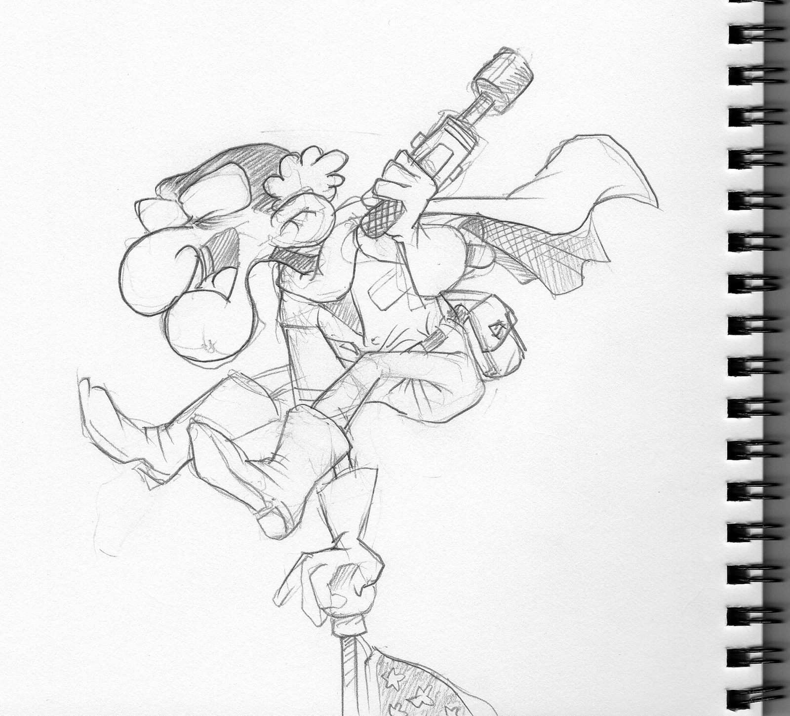
My first business card as a freelancer (can't believe people actually hired me!)

Looking back, I remember this image helping me decide on my company name, Arrrggghhh Ink. This card inspired me to make several other similar images. In all those versions, things were always going wrong with the characters screaming, "ARRRGGGHHH!"

This eventually led to things going wrong with pen ink; for example, ink spilling on a white horse getting zebra-striped ink stains along his back. (And instead of screaming "Arrrggghhh", the characters usually just cursed the ink.) Adding the word "Ink" to "Arrrggghhh" was a simple play on words so that, "Arrrggghhh Ink", when spoken would sound like an incorporated pirate company. (And of course there's the Ink/Inc pun . . . )

With so many characters cursing the spilled ink over the years, eventually the tipping ink bottle became my company icon.

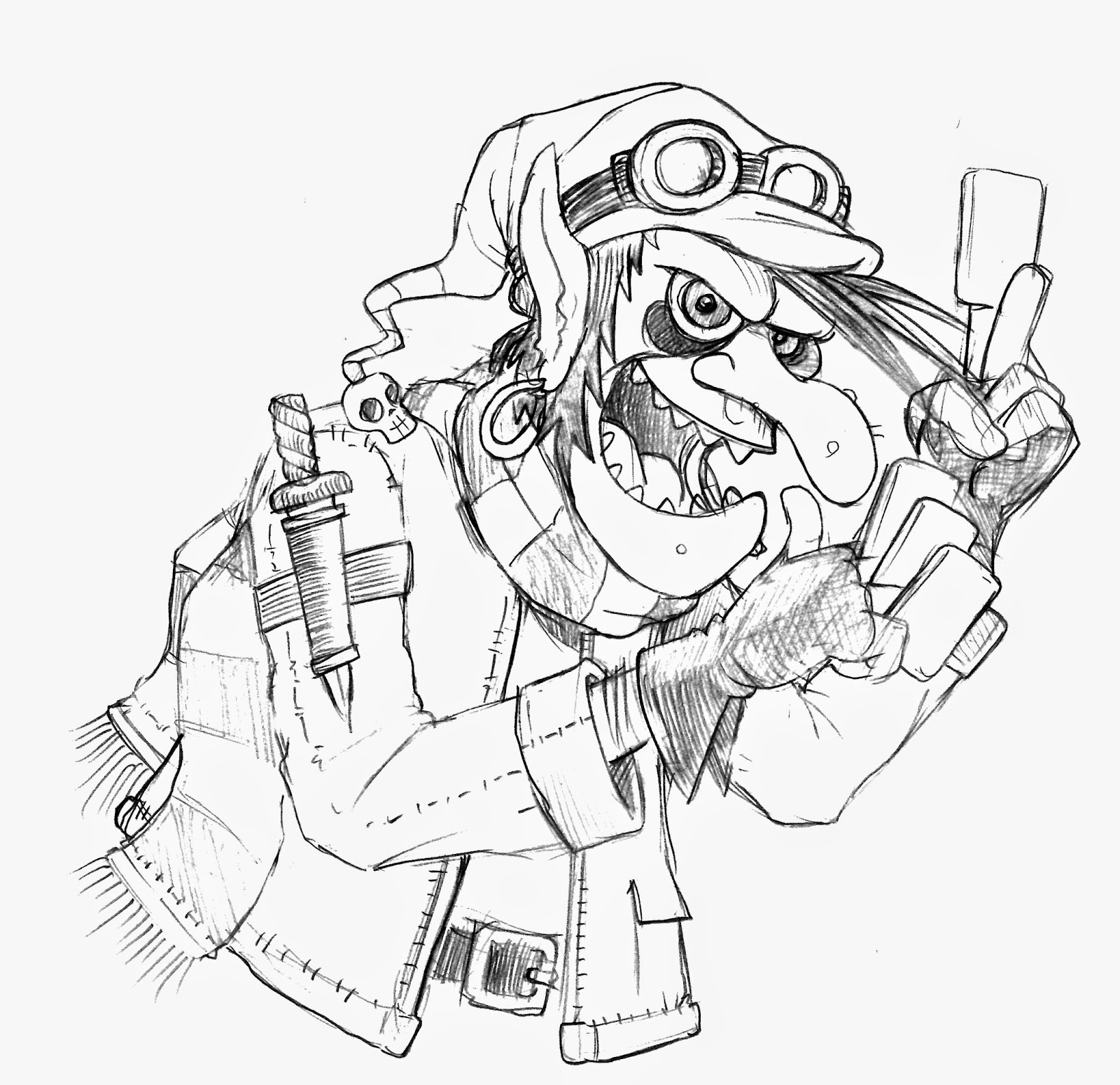
An example how the spilling ink bottle became my company icon for Arrrggghhh Ink


My use of the word "Arrrggghhh" has been with me for decades. It was equally inspired by Charles Schultz's Peanuts (which was more Aaugh! than Argh!) and Monty Python's Holy Grail. As a kid, I always loved seeing different spellings of word ARGH in comic books. There was even a short lived comic by Marvel called Arrgh Comics!

When I started using computers, I created my I.D./handle as Arrrggghhh for bulletin boards, online services and I've been using it as my username in almost every online game I've played.


The latest version of the company logo, using the same elements, but cleaner and simplified

Looking back, was it the smartest name to use? Probably not.
People rarely ever spell the name right. Verbally telling someone my email address is often a task.Yet, people smile or laugh at the name when they see or hear it . . . that's why it's a great name. (I've even had several people snort with laughter on the phone; one time was with an IRS agent . . . really, some of them do have a sense of humor!)

People do remember the name - just not the spelling.

I can live with that . . .

Sunday, January 18, 2015

Children's Book: Lil' Mouse in New York City

Back in 2001, I was working on a children's book idea about a small mouse visiting New York City. I had the story summarized and even started to take reference photos of the city, especially at night around Time Square - the central focus area of the story. My idea was to alter the photos into graphic backgrounds and draw the characters on top of those background. (Similar to what an animated film does.) The difference would be that I'd make the backgrounds very abstract but still recognizable as being New York City. Doing this gave the book a nice look and it would  also help stop any legal or copyright problems from occurring.

The now defunct children's book "Lil' Mouse in New York" circa 2001

In the story, Mouse is awestruck and overwhelmed by the pace of the city. At one point, Mouse feels he doesn't belong and could never live in such a huge city. Then one by one, other animals appear before Mouse; several park pigeons, a police horse, a guard dog and even a mouse-friendly cat. They each convince Mouse that he would be great in the city. In the end, Mouse, with guts and determination . . . decides to call NYC his home. (The running theme throughout the story was pretty much set to the song New York, New York.) This was all coming together during the Spring of 2001.

Then 9-11 happened. Everything changed. I stopped working on my books, especially a children's book about a city that just went through hell . . . it no longer made sense to continue.

Being a freelancer at the time, the attacks made it impossible to find new work. Even companies that would normally pay on time, were now taking months to send their checks. I couldn't continue my desire to do children's books anymore . . . I needed to find steady work to pay the bills. I went back into the toy making business.

Simon Prescott;s "Small Mouse Big City" - published in 2010 by Sterling

Cut to nearly a decade later, the same concept was done by another writer illustrator, Simon Prescott. My feeling now is that even though my idea for designing the story is very different, my fear is that my idea is too close to his story.

Friday, January 16, 2015

Quick Daily Sketch: Gramps Attacks!


I can't tell you how strange it is to find old work that I did . . . and have no memory of drawing it. That's what happened today. As I mentioned in prior posts, I've been trying to organize my work and sketch books. I have too many sketch books that I start then I jump into another, then another . . .
After awhile, I lose track of where my sketches are stored.

In this case, it was a smaller sketch book, trapped between two larger books on my top office shelf. I quickly flipped through, not expecting to find anything . . . but there were quite a few sketches, including this one:

Gramps flagpole leaping into action with probably one of the most dangerous guns ever created.
At least he's not pointing it at someone . . . 


Of all the characters I have created in my lifetime, Gramps is my favorite.  Gramps is from my comic strip, "Home of the Brave". He was a super spy, who caused many well known events in history to occur (good and bad.)  He, along with some of the greatest inventions and weapons ever created, have spent the past several decades hiding in the family attic. Though the family thinks he is insane, and he is . . . the things Gramps knows could topple governments, change history and alter reality (which might be why he's insane.) So it was a pleasant surprise to find this sketch, since I don't remember ever creating it.

I even put a version of Gramps into my first kid's books: Bobby's Biggest Bubble.

Every once in a while, I think of possibly going back to the strip. In the last 80's, there was no world wide web access, only dial-up services and bulletin boards. The strip was available via a monthly downloadable fanzine format, which could be accessed through Qlink's dial-up service. And though we had a very limited audience, I was really inspired by the fans' comments and emails about the strip. (The strips were later reprinted and then continued with new monthly strips in a local tri-state tabloid called Spa Times.)

Another sketch of Gramps, though this time he's a bit more younger and this image I remember drawing.
This is how Gramps looked just before he hid away in the family attic.

There is so much material on the strip, yet I've never taken much care of my artwork in the past. Drawings were often just piled up and thrown into random boxes. Hopefully, one day I can find which box I put them in . . . then maybe reboot this strip into the 21 century.

Wednesday, January 14, 2015

One from the Archives: Wooster-Sawz

Found this old sketch from one of my old hard drives. All I remember is creating several young kids who grow up in a very bad neighborhood, wanting to make a change. They decide to wear super hero costumes and start helping people in trouble around the neighborhood.
Circa 2000: Original pencil sketch of team leader, Wooster Saws

Wooster is the key character, motivator and leader of the group. Ironically, he is incredibly skinny, very weak and is usually picked on in school. But it is his street smarts, drive and heart that make the others follow him -- even under the worst situations. The group consists of a motley crew of characters: Shelli, a freckled faced girl with braces who is shunned by the other girls. Todd, a huge muscular jock who is picked on by his peers because of his speech impediment. And Chaz, the overweight mathematical whiz-kid who lacks any and all social skills.

I still haven't located the other three character sketches, hopefully if I do, I will update this post with those images. There is also a rough summery of the story somewhere on one of these old CDs/Hard Drives. Hopefully one day I can revisit the idea, and maybe do something with it.

Sunday, January 11, 2015

Daily Quick Sketch: Santa? (Updated)

Well . . . better late than never.

During the holiday break, I did many Santa doodles - trying to design new and different designs for Santa. I never had the time to post these during the holidays, so here are a few you can see now, post-Christmas.

This one was inspired by Aardman Animations' Wallace and Gromit style. It's the only Santa I colored and posted to Google+ to see it they would "auto awesome" the image with a snow effect (like they did to my Santa image from last year.)

Wacky Santa highly inspired by Nick Park of Aardman Animations (of Wallace and Gromit fame)

Still haven't seen the effect be made on the image, maybe they stopped doing that effect to the images due to too many people complaining that Google was altering their images.

This one was made because I was thinking of all the versions of Santa around the world. Many Santas were inspired by national traditions or fables. Our American Santa image was heavily inspired by the poem "The Night Before Christmas" and visually branded by Coca Cola's advertising in the early part of the 20th century. But what if another American classic had inspired the look of Santa instead . . . that's when I thought of one of America's most popular fables, Paul Bunyan.

This one I call Lumberjack Santa. A Paul Bunyon inspired Santa sans his big blue reindeer.

His open coat/bare chest was inspired by the Ghost of Christmas Present, in which several old "A Christmas Carol" movies had the ghost seemingly naked underneath his huge robe.  I was going to include a huge blue reindeer too . . . but didn't get around to it.

Here are a few more doodle sketches from around that same time:

Rushing Santa - always seems like Santa should be rushing around , especially in December.


This was a little weary Santa, looking like he a bit tired of it all . . . 

Not sure what to make of this Santa, but his mustache is definitely too crooked.

Saturday, January 10, 2015

Daily Quick Sketch: Trick or Treat Ghost

Another sketch from several months ago in my sketch book. This one a simple ghost trick or treating on Halloween. I like the idea of not showing any visible hands holding the pumpkin handle, yet you can easily imagine that a hand is there.

Pencil sketch from one of my sketchbooks in 2014

Thursday, January 8, 2015

Daily Quick Sketch: B'Gok

Been cleaning up my hard drives for the new year. I found many sketches and images that I had the best intentions to post here, but never found the time. Many are now out of season, (quite a lot of Santa sketches.)

This character was made shortly after I did the image of the monster character Margarrr for Illustration Friday back on Oct 24th, 2014.  I actually sketched 4 characters but only colored two. Here is the giant monster B'Gok!

One of four giant monster characters made in Oct 2014.

These giant monsters were inspired by the old video game Rampage and Godzilla movies. The failure here is that I didn't create a city background to help scale the size of the monsters. Without that scale, this creature could be two foot tall. 

The original pencil sketch - seen here facing left. Later the image was flipped when being colored.

Inked version before it was cleaned up and colored.


Sunday, January 4, 2015

Character Re-Design: Card Goblin

Okay . . . a new year.

Time to get back into the swing of things. This past holiday season has been a complete mental and physical drain both with work and life in general. I'm looking forward to a better year.
So let's begin with this project I did recently for Geoff Smith who hails from the UK . . .

In late October, Geoff had contacted me on Facebook. He had seen my work and was interested in a custom design, especially one that would be similar to the Goblin I created for Steve Radabaugh's Dungeon Marauders game last year.

At first I was against doing the project, especially being in the middle of a highly stressful deadline holiday season. But we agreed on a one&done deal, where I would do a pencil sketch based on what he wanted, then ink/color in my spare time . . . no deadline, no revisions/changes.

Final colored version, inked & colored in ArtRage Pro
Whenever I had the spare time, I'd doodle a few ideas out for composition and character in my sketchbook. The first character image was too happy and pleasant . . . almost too elf-like. But I did like aspects of the character. Geoff did say he wanted a bright eyed goblin, but this was going away for goblin territory and more into a Archie comics territory.

Pencil doodle in my sketchbook that started looking more like an elfish version of Jughead. 

I decided to use more of the character I made for Dungeon Marauders, creating a more grittier and gruesome look. But this time I went too far in the other direction . . .

Rough sketch. It was here that I knew that the legs would have to be omitted to keep it close-up and truly see the cards in his hands. Though the cards are blank, their positioning and general focus is just as important as the character.

The Goblin became too evil looking and creepy. He definitely didn't seem of sound mind. Since Geoff wanted to used this character for his website/small business (trading cards & games) this character needed to be a little more friendlier and look less like a zombie. The entire composition balance was off too; too much space behind his head and the shoulder dagger just wasn't working for me. Still . . . he needed a weapon. A sword would be the answer to both composition issues.

The plan then was to go somewhere in the middle of the two sketches. It would be quite some time later that the 1st official sketch was done over the Thanksgiving break. On Dec 2nd, I sent the below pencil sketch to Geoff. The rope was a last minute decision to create a nice border for this image to be used as a spot illustration.

Second pencil sketch: tighter details and the composition was now balanced thanks to the addition of a long sword.

It wasn't until New Year's weekend that I finally inked and colored the image, creating several variations for Goeff to play with. With the final touches finished, I sent several files off into a DropBox folder and shared the contents with Goeff.

A color variant, giving the character a very unique look from the normal Goblin traditional colors.
Funny how we take today's technology for granted . . . sending something instantly overseas in a matter of seconds. Geoff seemed very please by the work. Glad I could help. I wish him the best luck in his business ventures.

Now onto another little project for my friend Steve and his new game Fae Ball.

Saturday, December 13, 2014

Daily Quick Sketch: Heppy Santa

Been quite awhile since I posted anything here.

My job has me running in circles, fried and exhausted. But things are starting to slow down and there is the holiday break soon approaching. So I thought I'd throw in some Holiday images in the next week.

First up . . . It's Heppy Santa, Kids!

Heppy Santa was create using ArtRage Pro 4.5 with the ink pen for outlines and charcoal settings for coloring

I've been sketching many different Santas lately, mostly for work. Trying to find different ways to draw him and alter his appearance.

The original pencil sketch, one of many various Santas I have been designing these past few weeks 
Creative Process:
This one I simply wanted a big, grinning, funny Santa.
Once I drew the grin, it inspired me to make a huge and wide mustache to cover the lips. Then once I curled the mustache -- I had to do the same for his hair. Small hat + huge body; always one of my favorite character trait combos. Of course giving him tiny hands really helps make the image look even more weird. I just always love making big bulky characters with thin arms and legs . . . it's very pleasing to me for some reason.

To help soften the image, the outlines were toned down to a bluish hue. A nice, snowy, cool-toned background was thrown in to counter the warm Santa suit and create a proper environment for the character.

I liked this Santa so much -- I created a new cover image for my Facebook page using him (in a kinda creepy way though)

Wednesday, October 29, 2014

Daily Quick Sketch: Frankenstein's Monster

Today's daily sketch is one based on the current design work I am doing for next year's Halloween products. I was looking for a way to make a more simplistic and iconic version of Frankenstein's Monster for a bag design. So I simply started by sketching a cartoon version of what I already visualized the character to be -- with one major difference: greatly elongating his forehead.

Quick daily sketch: digitally colored with thick brush settings in Photoshop

After sketching I laid in quick thick brush strokes of muted colors, trying to downplay the color saturation, making the image dark and gritty.

The final product design is based on this sketch -- but looks completely different and far more graphic and colorful. (Sorry, I can not show the actual artwork since the design is exclusively for the client.)

Hopefully if the buyer likes the design, we will see the bag in the stores next Halloween.
The original pencil sketch of my visual cartoon conception of Frankenstein's Monster

Friday, October 24, 2014

Illustration Friday: Puppet

Illustration Friday: Every Friday a word is given on the website, IllustrationFriday.com. Artists and illustrators then submit an image that represents that word all during the week.

This week's word: PUPPET


Scanned pencils and digital coloring of Shark Puppet

This was an image I did while trying to think of new toy concepts for Springtime. One of the most popular themes for Spring (after Easter of course) is Sealife. But when I did this image, I was just goofing around and liked how silly the sketch was looking. As a finishing touch, adding the hairy arm in the bottom corner made this even funnier to me.

Currently, I now use this image as my gaming avatar for several online games.

Illustration Friday: Trouble

Illustration Friday: Every Friday a word is given on the website, IllustrationFriday.com. Artists and illustrators then submit an image that represents that word all during the week.

This week's word: TROUBLE

I'm throwing this on to Illustration Friday on the last day before a new word is selected tomorrow morning. It's basically a sketch from one of my pads that I've had for awhile.

Penciled and digitally colored sketch of the creature who goes by the name, Margarrr!
I figure, if anyone was to bumped into this creature . . . it would probably mean trouble.

Original penciling from one of my sketch pads


Wednesday, October 22, 2014

Daily Quick Sketch: Pumpkin

Today's sketch was another test of getting loose with my designs and looking for different styles than my usual clean ink clean approach.
Loose digital sketch of a traditional Halloween Pumpkin.

It was also sketched because I've been doing Halloween designs for 2015. So I'm always hoping I can discover a new way to draw the traditional icons we see every year.