Friday, March 29, 2013

Daily Quick Sketch: LB Monsta

I thought I'd test out my new upgrade of ArtRage Studio Pro (now version 4.0.2). Using one of my oldest characters, I tried the new interface using the soft pastel settings in the program on rough canvas background. I still need to work out the kinks of using the upgraded version with it's changes.

My Alien/Dinosaur character: Lumpy Bumpy Monsta


To anyone who is looking for a powerful art program for a great price, check out ArtRage Pro. They have a trial program on their site with giving it a try. (The program is even available via Steam if needed.) The user interface is nice and compact compared to Painter. Painter & Photoshop have much more control, but ArtRage allows you to simply get into your work.

AND, when comparing ArtRage to Painter or Photoshop, you can't beat the price . . .
The upgrade was only about $25. For those new to the program, you'll need a good stylus and a copy of the 4.0.2 Artrage Studio Pro program will only cost about $50.

Illustration Friday: Egg!

This week's topic at Illustration Friday is EGG.

Below is the image I submitted to http://illustrationfriday.com.
It's a fun site and I find it to be a great way to exercise creative thinking and honing up my drawing skills. I highly suggest all to join (or at least take a look at the other great submissions made by all the fantastic artists there.)


Wednesday, March 27, 2013

Images from da Ol' Creaky Hard Drive: Bobby

Digital watercolor base with color pencil lines (Painter 12)
I have an old, external hard drive that sounds like it is on its last leg. I can hear the ball bearings starting to rattle inside the casing . . . so, I've been backing everything that's worth saving onto another drive.

What's strange is finding images on the drive that I don't remember making . . . ( I do find this happening more often as I get older.)  I'm pretty sure I did these images . . .
yea . . . 
pretty sure . . .

This image is one of those test sketches I was doing last year when I was making my children's book. I do remember making quite a few test sketches, trying different styles and looks -- but time was the key back then. To do the entire book in a more painterly style would have easily added another month to the workload.


I really wanted a sketchier style to the book, but I was concerned on how to control the pencil line details.  Transferring pencil lines to print is tricky and risky; it's very easy to lose many pencil strokes when scanning into a computer.  Since this was to be my first major self published book . . . I wanted no risks taken. The final decision was to go with heavy ink lines and spot coloring, making it a very cartoony-looking style.

Friday, March 22, 2013

Daily Quick Sketch: Beached Whale (Updated)

Quick little sketch made for the website Illustration Friday, a site where people upload their artwork based on the topic of the week. This week's topic was: SWIM.

Beached Whale colored in ArtRage

UPDATE: Added the original pencil sketch seen below.

Original pencil sketch. Note the nose clip looked too much like a mustache

Thursday, March 21, 2013

Publisher's Weekly Review! (Updated)

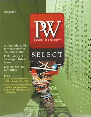
Just found out today that my first children's book, Bobby's Biggest Bubble, was selected and reviewed by Publisher's Weekly and printed in their bi-monthly magazine for independent publishers called PW Select. Too exciting!

Cover to the PW Select Feb 2013 Magazine
Above: clipping of the book review from PW Select magazine
Update:
Adding direct link to the review on PW's website:

Friday, March 1, 2013

Daily Quick Sketch: Balding Eagle (Updated)

Daily sketches are quickly drawn sketches that come to mind on paper with no rhyme or reason. They generally are just flashes of images imagined.  It is through this process that hopefully something good comes to light.

But sometimes . . . something appears on the paper which just seems so weird, bizarre and unexplainable . . . yet it makes me laugh (and I may be the only one laughing.)
This is one example:

Original B&W ink quick sketch


UPDATE: added color version

Thursday, February 28, 2013

Character Development: Using What Worked in the Past

For a long time, I've needed to develop a witch character for my upcoming eBook, "Bladimir Blarfarg and the Worm Wire Glasses". Making a good cartoon witch character isn't easy, especially when its a story for children.

The character of Witch Nazel needs to be a kind, helpful and happy witch. She is a crucial character to the story so she can't be too ugly because children would hate her. She shouldn't be too cute and pretty - that would make her more of a fairy then witch.  And since I always want to write humorous stories that make children laugh, she MUST be funny. Knowing these features I needed for the character, I still struggled to put it all together and get the right look.
One of my many Witch sketches: This one was too thin and lanky to use.
I noticed I was making my witch sketches too thin and tall. Thinking how Witch Nazel would interact with Bladimir, (who's a short stocky monster), I realized the layout needed to be more compact. Most picture book eBooks are read horizontally then vertically. So I needed short, stocky and funny . . . that's when I remembered an old favorite character of mine: Chef Gordon Baloo.
The transformation of creating Witch Nazel from key features of an old favorite, Chef Gordon Baloo.

Chef Gordon Baloo was a character I created long ago. I have always loved the look of this character and have made cartoons, animation clips and one of my old website's used him as a company mascot. So the answer was easy, take Chef Baloo's best features and dress him up as a witch.

Witch Nazel was born . . .

Monday, February 18, 2013

Design Process: SCBWI contest

Below is the entry image I sent to SCBWI (Society of Children’s Book Writers and Illustrators), which is one of the largest existing organizations for writers and illustrators of children's books.
Final illustration submitted to the SCNBWI contest

I became a member of SCBWI last December and was sent an email about an illustration contest for New Jersey members. The rules were: 5" by 5" black & white image with one color showing a kite (which is the group's key logo element.) It was also suggested to not get too detailed since the image would print small . . . (but this was a concept I thought of when I first heard of the contest. Couldn't help myself!)
Below, I will show my process for developing this concept, how I technically do projects like this, and the changes that occurred along the way.

1. The Concept Sketch (Getting It on Paper)

The first thing I do is quickly doodle what I'm thinking. The image doesn't need to be clean, neat or even recognizable -- at this point, I just want to get the image in my head down on paper.


First pencil sketch of the initial concept

2. The Main Focus
The concept here was to have many characters of different genres coming out of a giant book and looking up at a kite. Since the kite represents the SCBWI group, it should be the main focus of every character. The most prominent character was going to be the book. It is important that the book be the "leader" whose eyes make you, the viewer, look up to the kite. Knowing this, I created huge glasses to exaggerate the book's eyes . . .

3. Fine-Tuning the Characters
Now that I know the characters I want to place in the image, I focused on each one as an individual. This way I don't have to worry about the layout or composition of the image. I can just make sure that each character is clearly seen, understood, and detailed to represent different genres in children's books.
Original ink sketches of characters for the image

4. Putting the Puzzle Together
Now that I have all the pieces needed -- I start to re-arrange, re-size and change the characters trying to give each one their proper spacing so as not to crowd too much in one area of the image. This is where it all starts to come together. You'll notice the changes being made: like the monster in the book, deleted one of the flowers in the lower corner, and the princess (who just wasn't princess-y enough.)

The basic layout for the final image

5. Going Vector
I bring the image into a vector program. {CorelDraw X6 was used in this case.} The image needs to print in black and white . . . so there can be no grey (like a pencil sketch) because details would fade/smudge in print. Creating the work in a vector program will give a bold, clean look.

One should keep in mind that doing vector images can something feel too mechanical and cold. So to create more of a natural pen flow, I constantly altered the thickness of the pen lines to give a more freehand style to the image.

The entire concept image is being recreated in vector format

The concept sketch is laid and locked on the bottom (or base) layer. It is then toned down to a faded/ghosted image which makes it easier to redraw over. To make it easier to arrange and control, each character/element is created on a separate layer. You'll notice above, I don't bother to create the eye focus on the kite yet; Since items and the kite itself are being moved around, it's best to change the eye focus when everything is in place.

6. Final Tweaking
Once each of the characters is re-drawn in vector lines, many things were re-sized, altered, and shifted to create a more balanced spacing. Then, all the characters' eyes were fixed to focus on the kite.


Revised simplified Gray image sans the Elf

Tuesday, January 29, 2013

Greeting Card Market

Before making a career in toy design, I tried my hand at many things: comic strips, magazine cartoons, children's books and greeting cards. Submitting to Greeting Card companies was just as difficult as submitting to the children's book publishers. (Maybe even harder, since many greeting card companies started to hire in-house artists - which meant you needed to live reasonably nearby the company.) It also wasn't a great paying job.  You didn't get to keep your work, the company had full ownership and you would have to constantly churn out new materials daily to stay competitive. I knew all of this, but still decided to give it a try.

Below is one of the few card designs I still have on record, mostly because it is was a favorite of mine. Seeing it now, it really doesn't work for the general public's sense of humor, especially for Christmas. But I still think it's a great funny card (. . . for those with a warped sense of humor.)


Thursday, January 24, 2013

Bobby's Biggest Bubble: The Doggie Story

Those who have read my first children's book, Bobby's Biggest Bubble, should already know that I put a little secondary story inside the book. The two dogs in the book, Woger and Oggy are having their own little adventure as Bobby's story is told. Woger is the bigger dog whose constantly watching his mischievous little pal, Oggy.
Seen here is Bobby's dog Woger (left) and Otter's dog, Oggy (right) having their own little adventure.

I knew I wanted supporting characters in the story, but I didn't want a lot of dialogue. So what better then to use two cute dogs following the boys in the adventure. The dogs don't need to talk. Kids love animals. Win, Win.

Then it occurred to me, these dogs could have their own tiny adventure in the background.
As Bobby's is creating his biggest bubblegum bubble -- Oggy starts chewing on a few spare gumballs and creates his own bubble. The major difference? Little Oggy starts to float away with his bubble.

Woger, the ever faithful pup, is always seen watching Oggy as he floats away higher and higher. But by the story's ending, something happens and it all comes around full circle. Oggy is seen safely back down on earth, (though stuck up in a tree.)

It was surprising to find that many children saw this secondary story immediately. I thought it might be something they would find on the 3rd or 4th reading. But many parents tell me that their children loved seeing Oggy floating in the background. Children like to search for Oggy before the page is read to them.

Roger and Oggy will return along with Bobby and Otter in the book's sequel: Bobby's Ginormous Jelly set for release by Fall 2013.

Tuesday, January 22, 2013

The Importance of the Re-Write!: Intro

RE: Bobby's Biggest Bubble and its Re-Writes
Before finally printing my first book last year, I gathered all the past information and images I could find. Some things were lost due to a broken hard drive or merely misplacing a file or two. But most of the material was archived on several backup drives.


Somethings didn't change that much at all. The original cover from the B+W dummy book .

Since the book's first version was made nearly 19 years ago, the story itself has gone through quite a few major revisions over the years. I found one of the original dummy books that I tried to get published nearly a decade ago (this, in particular, was made during my second attempt of breaking into the publishing business.) All of the following images for this posting will be from this black & white mock-up book.

Just to Note: It's safe to say that I HATE seeing my old work. 
I see so many poor decisions in the storytelling from looking at these old alternative versions of Bobby's Biggest Bubble. The main elements are all there: the gumballs, the big bubble, the meteor and of course Bobby. But much of the story's flow and structure has been tweaked.


So . . . I'm going to share some of these alternative versions of the book here in 3 parts this week. Think of it as one of those DVD extras where the clips that were edited out.
These postings will assume many have read the story - and if you haven't, there will be spoilers (so don't spoil it for the children!)

Part One will be about the arrival of the gumballs and the neighborhood children.

Part Two will look at Otter and how the bubble was originally going to get around town.

Part Three will show the not so great original rushed ending. (sigh)

You know, I'm starting to think I shouldn't show this stuff. But hopefully, in doing so, others can see how important rewriting a story really is when trying to craft a better story.

The Importance of the Re-Write!: Part 1

Part 1: Delivery and the Town's Children


Image #1: The first noticeable change from today's version of Bobby's Biggest Bubble is the long time spent getting to the gumballs. It took an extra 4 pages for the gumballs to finally enter the story. Initially, I thought it was important to show how the gumballs arrived at Bobby's home. But when I analyzed what parts of the story I thought were more enjoyable and what was lacking . . . the arrival of the crate just didn't seem that important.
Image #1: Poor Melman the Mailman struggling to get the package delivered on time.
Image #2: A whole group of neighborhood children was developed as supporting characters. Their job here was to imagine what could be inside the mystery crate. About 10 children characters were developed.  The original plan was to eventually write a "Really Tall Tale " for each of the town's children. (But that concept was put aside since I have many other stories I want to tell first.) Seeing this page now, it feels like a lot of unnecessary filler. 
Image #2: The neighborhood children guessing what was inside the crate
Image #3: This page was basically used as seen, except for Wilbie, the town's book smart kid.  Wilbie was originally going to be the best friend/sidekick to Bobby, but Otter seemed like a better choice to play a sidekick/fall guy. I still like the idea of the polka dotted gorilla . . . But that would have distracted from what was happening in the image -- which was the opening the crate.
Image #3: The whiz kid, Wilbie, was edited out the book.
Image #4: I thought by showing Bobby sharing the gumballs with all of the children, it would help establish Bobby as a very likable character. This was a cute page, one I wanted to keep for the book. But eventually, this had to be cut out and replaced by a 2-page spread of the gumballs spilling out of the crate. The 2-page spread does a great job of showing the vast amount of gumballs flowing from the box. . . Far better than if it all happened on a single page.
Image #4: Bobby sharing the goods

[ Note: You can see Otter in the distance as an outcast; longing to be a part of the fun - but he stubbornly refuses to be friendly. More about that in Part 2 tomorrow. ] 

Go to Part Two

The Importance of the Re-Write!: Part 2

Part 2: Otter and Bubble Transportation

Image #5: I always knew I wanted a character to sidekick and assist in Bobby's bubble adventure. I thought, "If I had a loner/bully character who joins in on Bobby's adventure, they would become the best of friends." So I originally created Otter as the nosy, spying and pesty kid, (who looks somewhat like Curly from the Three Stooges.)

But I started to find that the story was already getting too wordy. I had Otter always in the backgrounds, occasionally making snide comments and snooping around to see what was happening. The transition of them being strangers and then suddenly best friends was a bit too abrupt. Because of the limited pages, I gave up on having the two eventually become friends -- instead, I just had them as friends from the start. This made it so much easier, and it actually allowed me to add two more pages of the boys' with their crazy gumball activities.
(FYI: Those four pages are my favorite part of the book.)

Image #5: Otter getting closer but still casually strolling by the crate . . .  


 Image # 6: Having Otter become the best friend freed up a lot of explaining.  It also allowed me to use Otter's reactions to focus on what was happening on each page. But most important, Bobby needed someone to assist him in moving that giant bubble around. My original writing simply had them head to the hills in the park. No interactions with the townspeople at all (not at all like the book today.) 
This part of the story always annoyed me; just running the huge bubblegum bubble to the hills was boring. So I did a fourth re-write -- and then it came to me. I would have Bobby go to several locations, each one stating that Bobby could no longer stay because his bubble was getting too big. (This was the most significant change I made from the original story, and it makes me so happy to see that the alternative idea worked so well.)
Image #6: Headin' fer them thar hills!


Image #7: Now moving the bubble from place to place was crucial to help show the overall size of the bubble and how much it was growing. To help emphasize the massive scale, I would start to have them struggle with controlling and moving the bubble, especially uphill.
Image #7: The struggle of moving the world biggest bubblegum bubble uphill.


Image #8: I knew how I wanted the story to end, but how to get there wasn't easy. In the original story, they make it to the top of the hill -- and then a gust of wind takes it away.


Image #8: A similar image is used in the book, except the boys don't lose the bubble -- yet!


Image #9: This page was left out. It was always the weakest part of the book to me.  But it was my only solution at the time. I can safely say that the story has gotten considerably better because of the rewrites. It's important to step back from your work, give it a rest and then approach I again with new eyes.
Image 9: Chasing after the floating giant bubblegum bubble heading towards the town
\(Warning: spoilers abound. I will be revealing how the book ends!)


Tomorrow I will try to cover and explain . . . (shudder) . . . The original ending. Go to Part Three

Monday, January 21, 2013

The Importance of the Re-Write!: Part 3

Part 3: The BIG problematic finale!
I take back what I said before. This part is the most significant change to the story -- where my climatic ending just wasn't that exciting! (Lots of standing around.)
SPOILER ALERT: I'm about to give away the end, so here goes . . . 


Image #10: We left off where the boys lost the giant bubble to the wind while on the park's highest hill.
I knew my ending already:
the giant bubble deflects a meteor that was heading to the center of the town. I was stuck on how to get to that point. So I wrote the following: 
1.) The bubble floats away with the wind. (Ok, that's how the bubble collides with the meteor.)
2.) The boys run after it, leading them to the center of town. (Ok, that gets them to the location)
3.) My story's BIG problem: how to suddenly mention that a meteor was heading toward the town.

I worked around this problem by having the town already know the meteor was coming and that officer Augie (later named Mike) was evacuating the area. I was not happy with this idea.

Image #10: Those who have read the book may notice this is now Mrs. Applebottom's location.
Note the newspaper headline . . .


Image #11:
I had to take a page or two to explain the dire situation. So I had Officer Augie explain to the boys about the danger approaching the town. I didn't realize it back then, but I was creating a situation in the story that could potentially scare children who were reading the book. I didn't want the story to focus so much on the meteor and the danger. I didn't want children thinking their town too could be hit with meteors.
When doing the 3rd rewrite, the idea of losing the bubble to the wind and the evacuated town was utterly tossed aside.
Image #11: Officer Augie is taking WAY too much time telling the boys they are about to get hit by a meteor.


Image #12: This is such a poor perspective and such a mediocre attempt at creating tension to the story. I started to notice what was missing -- and that was Bobby's biggest bubble. The main focus was nowhere to be seen. To follow just the characters without even seeing the bubble for many pages, was a poor decision.
When doing picture books, it's vital that the images alone can tell the story. If I took the words away from these several pages -- no one would know what was happening, including me.

Image #12: Oh No! Guess who wasted too much time hanging around a danger zone area?
(And where did Officer Augie's newspaper go?  Where'd that squirrel come from?)


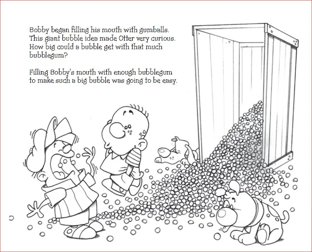
Image #13: This was just a silly filler page I added, but later I used this as a promotional idea.
I took the gum-wrapper artwork and made mock versions using packs of Trident and Dentyne gum. I would send a pack of gum wrapped with the Bobby gum-wrapper to publishers, along with a query letter and dummy book. (See my past blog about this by clicking HERE.)


To the people who have read the story, you can see the big changes that were made to Bobby Biggest Bubble. The re-writes helped me iron out the weaker areas and helped me revision the story in a far better way than I originally imagined.
Now the bubble appears on almost every page (in one form or another!) While it still has the meteor ending, it feels more humorous now than the original doom and gloom of the original. Bobby and Otter are visually the best of friends from the start. Overall, there a pattern and flow to the story.

Every story I do from now on will be re-written many times for this simple reason; every re-write tends to bring new and better ideas. Every re-write helps eliminate errors and weaknesses.I'm very proud of how the story turned out and heard many comments from parents who say their children enjoy the book ( -- 
and THAT is the importance of the re-write.)

Monday, January 14, 2013

Bobby's Ginormous Jelly: Beginning of the sequel

As of this writing, over 350 copies of Bobby's Biggest Bubble have been sent out to KickStarters, online purchasers, agents, publishers and libraries.
Getting published can take years so I'm prepared for the long haul.

But no writer (or illustrator) should just wait around for something to happen.
So, the sequel to Bobby's Biggest Bubble is now in the works. I already have the basic outline of the story written and 
I plan to complete the 1st draft and rewrite by the end of this month. The story with layout sketches should be completed by March. Then hopefully I can ink and color the book by June. If that all happens as scheduled, I plan to print 500 soft cover books** and have them ready to be sent out by mid August.

One thing about this book: it should be much easier than the first. The main reason is that the entire cast of characters will be back again -- and generally they will appear in the same background settings. There will be differences but the layout will be very close to the 1st book.

There is a special group of new characters that are very important to the story.The aliens. I have been playing around, trying to make the aliens that would work best for the story. It's taken awhile, but I think I'm close to what I need. 
These are the Moop-Meeps. They'll be giving Bobby an unexpected visit in Bobby's Ginormous Jelly.
I needed the aliens to be funny, small and generally not scary but at the same time, these aliens mean business. (Note to parents: Revealing these little guys now is a bit of a spoiler to the 2nd story so any of you planning to get the 2nd book for your little ones - don't tell them aliens are in the 2nd book!)

These little guys may still change a bit. I'm still thinking about dressing them in outfits similar to Bruce Lee's yellow jumpsuit.

** Just to note: I won't be using KickStarter again for the sequel. Soft cover books will be much cheaper to make than hardcover books. Plus with a smaller order, we should easily afford the printing costs on our own.

Check back here for more updates as the book is developed.