Wednesday, April 22, 2015

Doodle: Lil' Batman on Yellow Sticky Note

Been awhile since I posted anything, haven't been drawing much for some time. But I do have many doodles around my desks.

Doodles are images that I simply draw without thinking, as if my subconscious mind has taken over and the pencil just moves. Most doodles are done while I'm working . . . part of the creative process I guess.

Here's one of a tiny stubby Batman . . .

Batman pencil doodle on a traditional yellow sticky note

Friday, April 10, 2015

Illustration Friday: Warrior (aka Sir B' Gok!)

Illustration Friday: Every Friday a word is given on the website, IllustrationFriday.com. Artists and illustrators then submit an image that represents that word all during the week.
This week's word: Warrior

The chicken warrior known as Sir B'Gok, created in ArtRage Pro

Thought Process:
Through word association, the word "warrior" instantly reminds me of bravery. This, in turn, makes me think how a true warrior would never run away from any fight.
Such a warrior would never be . . . A chicken. This gave me the idea to make a "chicken" hero.

The original pencil sketch of Sir B' Gok

Sunday, April 5, 2015

UPDATE: Ulric Evil Unicorn

UPDATE:

Had a few minutes to spare, so I colored Ulric, the Evil Unicorn.

UPDATED: added a color version
I thought of this character when the popularity of the "My Little Pony" craze took off several years ago. Unicorns are usually born "Lawfully Good" creatures; so in D+D/geek speak, this means a unicorn should never be inherently evil.

The crazy (and evil) unicorn, Ulric.
But what if a unicorn was insane? Then it wouldn't know it was doing evil. That's where the idea of the horsefly comes in. The horsefly is infatuated by Ulric's shiny horn and flies around it constantly in circles. This in turn drives Ulric insane on two counts:
#1 The constant buzzing sound is driving him mad.
#2 Ulric constantly argues with the horsefly that he is not a horse, so it should leave and find a real horse to bother.
Ulric constantly talks to the horsefly though it never replies back, making Ulric seem even crazier . . .

The original pencil sketch of Ulric the unicorn from one of my sketchbooks

Thursday, April 2, 2015

Daily Quick Sketch: Pirate Dream

Continuing my physical painting: (aka, an attempt to take a break from the digital creating and going old school.)

I've been struggling a bit, learning to leave things alone, where before I would simply make any needed changes in Photoshop or Painter. I've even destroyed another painting due to using liquid frisket. (Note: Liquid Frisket is a liquid form of rubber which can be brushed on a painting to mask and protected areas from being painted over or wet.) In this case, the liquid frisket absorbed into the paper and ripped the top layer of paper when it was being removed. I should have tested this brand of watercolor paper before using the frisket on actual artwork.
The finished image of "Pirate Dream", a watercolor and pencil painting

"Pirate Dream" was an idea I had for a story about a lonely little boy, Rudy, who dreams of adventures. The imaginary friends he meets on these adventures are often his subconscious mind encouraging, motivating and inspiring Rudy to face his fear and be a better person.

The very first concept rough of the image, which was originally set in the day time.

I'm not happy with how the night sky turned out in the painting. It's never easy to paint dark watercolors in such a large portion of the image. I originally planned to use liquid frisket on everything but the sky, this way I could easily and quickly paint in the dark night sky. But after my last incident with using liquid frisket, I opted not to used that technique.and simply painted in the night sky.

The original pencil sketch of the "Pirate Dream" image

I find that painting a large area with a dark watercolor is a challenge. Watercolors tend to dry too quickly which makes it difficult to get a nice consistent coverage. Adding more water to the paint often only dilutes the color making in more transparent.

Oh well . . . live and learn.

Saturday, March 28, 2015

Daily Quick Sketch: Dinosaur on Toned Tan Paper

I've been trying to get back into the physical drawing and painting world, having been digitally illustrating most of my work for the past two decades. I like how it forces me to change my style and technique, but I also hate when things go wrong. There something assuring and refreshing when a simple keystroke can erase any mistake instantly; but in the non-digital world, a simple mistake can ruin the entire image.

Dinosaur character created on Toned Tan paper, using pencil, ink and a white Gelly Roll pen.

I always enjoy seeing images on toned paper. Usually created with charcoals or pencils with white accents that make the images pop. For this image, I lightly pencil sketched the character first, then colored with a blue color pencil. For an added effect, I tried to maintain a horizontal stroke whenever coloring.

The dino image was made using only old school materials: india ink, pencils and a good ol' white Gelly Roll pen

Next, using a white Gelly Roll Pen, I created white horizontal lines for the light areas and highlights; finishing with the black outlines with a fountain pen filled with india ink.

Friday, March 13, 2015

Illustration Friday: STRONG

Illustration Friday: Every Friday a word is given on the website, IllustrationFriday.com. Artists and illustrators then submit an image that represents that word all during the week.
This week's word: STRONG


This week's word was easy, because:
HULK IS THE STRONGEST ONE THERE IS!
So many mysteries about the purple Hulk pants . . .

Thursday, March 12, 2015

Daily Quick Sketch: Using Watercolor Pencils + Water Pen

I bought a water brush some time ago and I haven't really had the chance to use it. I keep thinking I want to physically paint artwork so that I actually have . . . physical artwork. But, I'm so used to working digital, that it makes it very hard for me to get back into doing the physical artwork.

Run, Bladimir, Run! Get away from those watercolors!
My first attempt at using water color pencils and a water brush on watercolor paper . . . looking muddy

Basically my biggest problem is this . . . the physical world doesn't allow you to make mistakes. Nor does it allow quick experimenting or provide quick alternatives the way digital does. To me, the look of watercolors just screams "picture book". Its just one of the best mediums for creating images for children. Yet, I find physically painting with watercolors so stressful, frustrating and chaotic. Colors fade or bleed into each other. The paper wraps. Colors look different once dry. Etc, etc, etc.


Water Brush: a brush tipped pen that can be filled with water to help blend and control watercolors 

So, in my humble attempt to control watercolors better, I decided to try using watercolor pencils with a water brush. The pencils offer me the most control, since pencils are what I feel most comfortable using. The water brush allows me to add water where I want and it allows me to blend the water color pencils with ease. (The only real issue I have with the water brush is that sometimes dries a little while using it, which doesn't allow the water to flow out as much as I would like.)

Overall: The image above turned out too dark and muddy for my taste. Adding the ink lines didn't help the image either, since they overpowered the subtle colors of the watercolor pencils. I also believe the watercolor paper I was using was too rough.

I'll try to do several more tests and see if I can improve.
And if that doesn't work . . . there's always the option to going back to digital watercolors.

Wednesday, March 11, 2015

Illustration Friday: PATH (was SEARCH)

Illustration Friday: Every Friday a word is given on the website, IllustrationFriday.com. Artists and illustrators then submit an image that represents that word all during the week.
This week's word: Search

Illustration Friday pencil and digital coloring image for the word of the week: SEARCH

Thought Process:
First thought was a magnifying glass -- it's the search icon of the tech world. This meant I probably would need a character using a magnifying glass.

The first sketch of the character before the Illustration Friday idea . . . 
I had just sketched a little penguin recently and thought he'd be a great for this week's image. His goofy look and stance instantly made me think of the old cartoon cliché of a "detective" walking around in circles.

The pencil sketch with character revisions; made using a HB pencil on Canson marker paper

Friday, March 6, 2015

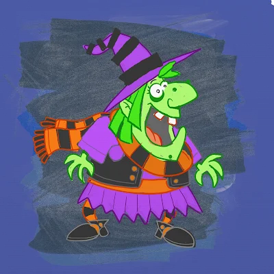
UPDATE! Character Development: Witch Nazel Color Style

UPDATE: I've been going back to my picture book concepts lately and decided to revamp another of my characters, Witch Nazel from my story "Worm Wire Glasses". It's been over two years since I originally posted about this character. 


Fine tuning and testing the pencil/oil brushes with an old favorite: Witch Nazel from my story "Worm Wire Glasses"

Originally, this story was to going to be an eBook, since making an eBook was way more cost efficient than printing another hard cover. But as I started talking to others self publishers at meet-the-author gatherings, libraries and art festivals - I was finding out that the e-book market wasn't really that great.

The biggest problem I felt was that I wouldn't have anything physical to promote anymore. Which makes going to school readings, meet-the-authors and art festivals pretty much worthless -- (unless I could get people to go directly online and purchase my book right at that moment. It's just not realistic.)  Plus, children still want real books.


So, I'm back submitting the old way. Hoping that the one right person in publishing will read my stories.


Below is the the original post from 2/4/2013:


I'm testing out working in a slightly different style for the Bladimir Blarfarg and the Worm Wire Glasses eBook. I'm enjoying using the pen +
 ink style, but I want a different look for the eBook. I feel my work gets too clean and stiff - I want to try and become more loose with my strokes, not worry about being 100% in the lines. I also want to stop wasting hours of correcting the holding lines . . . I want it to look more sketched.


Below is a quick color sketch of Witch Nazel. The overall look in generally there - but I need to turn down the color vibrancy a bit and get the colors to have more of an equal balance. 


I don't think I like the green skin, it's too much . . . GREEN.  Thinking of either going more pale ashy skin -- or just bring it to a more reasonable, normal flesh tone. Orange/Red hair I think will be a better solution too.
The black articles of clothing need to be darker, but not so much to over power the highlights of color.

Note to Self: all of the holding lines' coloring will need to be adjusted, the purple outline is far to harsh and the green outline seems a bit too dark.

Friday, February 27, 2015

Illustration Friday: Metropolis

Illustration Friday: Every Friday a word is given on the website, IllustrationFriday.com. Artists and illustrators then submit an image that represents that word all during the week. Tossing this in this late submission in the final hours for Illustration Friday's word of the week: Metropolis.

The city celebrations from my picture book "Bobby's Biggest Bubble"

Sunday, February 22, 2015

UPDATE - Daily Quick Sketch: Space Frog

Update: Space Frog in Color

I took the pencil sketch and colored it in ArtRage Pro using the Oil Brush and Rough Canvas. I was very busy with work and fixing my computer this week, so I didn't have much time to spend on these personal images. I was mostly looking for speed with coloring and adding the background, so I kept everything very simple.

Frog freaking out that he is in space.
Colored with ArtRage Pro using Everlasting Oil brush settings and Smooth Ink pen.

Today's daily sketch is little scared character. For now, I'm just calling him Space Frog.
Looking online, I found quite a few "Space Frogs" using that name. But this character design was done entirely without knowing about the other existing space frogs. (Hmm, maybe that's why he feels so scared and all alone.)

Pencil sketch of Space Frog ( for now . . . until I think of a better name . . . )
If I get the time, I will return to this image and try to add color and a scenic background. Maybe add a space monster behind him, eh? (That'll give the little fella a reason to be scared.)


Friday, February 13, 2015

Updated: Monsters and Bunnies: Nap Time

UPDATE: You'll notice the right leg is now properly at rest on the floor. Gone is the shaking leg and the motion lines around the area.

This one I had put aside for some time.
Originally the monster was suppose to be more dragon like, with tiny wings coming out of his back. But the sleeping position made it hard to place the wings since they would be pressing against the wall. I liked the composition as it was -- and decided to simply eliminated the dragon wings.

Grayscale sketch of Nap Time, the fourth of six illustrations featuring Monsters with Bunnies

The other problem I still have is trying to show the monster's right leg shaking, like a dog's involuntary leg reaction to it's back being scratched. The motion lines are not that apparent and the right leg looks like it's just floating the the air. I will change this so that the leg lays on the ground properly, (and I'll probably adjust the position of the bunny's head so his ears point out to the left.)

The original pencil sketch. Notice his right leg is shaking in mid air - this has been corrected.
To confirm that they were fast asleep, I added a big fluffy pillow behind the monster's head. The pillow help to create a humorous contradiction to the harsh and dank cavern surroundings. (Ups the cuteness too.)

Wednesday, February 11, 2015

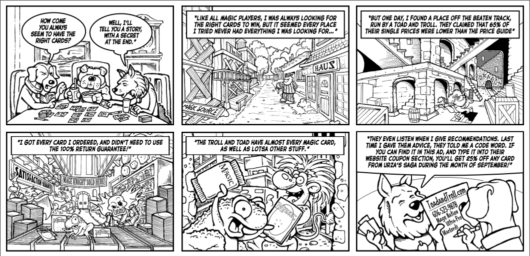
One from the Archives: Toad & Troll Ad

Pulling another image from the past. This one is from my freelance years. The files says it's save date was on Thursday August 9th, 2001.  I remember being very busy around that time and how all the freelance work went away after the 9-11 attacks.

Looking at this now, it really looks busy, especially without color to add depth. The directions I was given were very detailed and very type heavy. It was extremely difficult to squeeze everything they wanted into 6 panels. But I guess they were happy since they asked me to do several other designs for their company, including the new versions of their company mascots.

Comic strip style advertisement for the card game company Toad and Troll.

Toad and Troll still exist as a company, they're based in Corbin, KY.  Their website seems more streamline now, like an online store.  It doesn't have any of my artwork anymore, which makes sense since their website's "real estate" is better off showing products than promotional images/branding.


I had forgotten about working with them; that is until last year's New York Comic Con, where Toad and Troll had a booth adjacent to my brother's ChopShop table.
Small world, eh?

Tuesday, February 10, 2015

Daily Quick Sketch: Chicken Little and the SCBWI Winter Conference

This was a sketch I did during last weekend's SCBWI (Society of Children's Book Writers & Illustrators) conference in NYC. I had a terrific time meeting so many people who have the same drive and passion about telling stories.

Pencil sketch of Chicken Little, one of many classic storybook characters to be used to pitch my next book.

Funny thing about hearing people talk about creativity. . . It makes me want to become even more creative. So as I was listening to the speakers and taking notes, I realized I was sketching subconsciously in my notepad.

Grand Hyatt's lobby area during the SCBWI conference in NYC. This was one of the few images I took since there is a general request to not take any photos of the speakers and to respect the copyrights/ideas of others at the conference. 

Overall at the conference, I was able to hand my promotional card to two picture book editors and now have several good sources where I believe my stories will work. So a submission blitz is being planned out. I've four picture book manuscripts just about ready to submit. In the upcoming two months, I will send each one out to a different editors or literary agents, wait for their responses/rejections and then rotate the submissions -- and do it all over again.

I've set a goal of 5 years: February 2020.
If nothing happens by then -- I'm out for good. But somethings tells me these stories will be made . . . it's just going to take some time and a lot of patience.

Sunday, February 8, 2015

Old Timey Baseball Mug Wrap

This one goes way back into my ol' Papel Freelance/Russ Berrie days where we designed novelty gifts. This design was created somewhere around 20 years ago for a Father's Day mug.

The work itself was done by first drawing four pen & ink illustrations. I had to do some old timey library searching for black & white photos to use for reference. Then I needed to create poses that worked well together to create a balanced composition, Once that was done, I took the image, reduced the size, flopped the film and created a repeating pattern in the background. Final stage, everything had to be rubber glued into place on a heavy press board.

Old Timey Father's Day mug design made with pen & ink and then step and repeat photos stats.

Today, this could easily be done on computer in a heartbeat. But back then, this job was tedious. I had to measure everything and figure the proper spacing for the repeating images in the background. As you can probably see, everything had to be hand cut using an Exacto knife.

I do remember that they liked the design so much, I was "awarded" by having to do another similar design with golfers.