The next few posts will be dedicated to showing a sample of my design process for making a company logo.
According to my records, this work was done in 2001, a little over a month after 9-11. The contract was to create a new logo/mascot for a new website. The site's goal was to sell pet items for tiny dogs that lived in larger cities like New York City. The entire process took 1 month to complete. This is not the full record of the work, but I'll try to focus on the main points and show the development as the project moved along.
I asked the client what type of dog she wanted to represent her company. She wanted it to be instantly recognizable as a dog - so this eliminated any exotic featured small dogs like a chihuahua whose features may not be immediately seen as a cartoon dog. It was agreed that a beagle Snoopy-like dog would work best.
I sent her several sketches of cartoon dogs, from various levels of comically exaggerated features -- to a very toned down character.
1: Character Development
I asked the client what type of dog she wanted to represent her company. She wanted it to be instantly recognizable as a dog - so this eliminated any exotic featured small dogs like a chihuahua whose features may not be immediately seen as a cartoon dog. It was agreed that a beagle Snoopy-like dog would work best.
I sent her several sketches of cartoon dogs, from various levels of comically exaggerated features -- to a very toned down character.
Her response was that she wanted fewer details to the dog. The character should be very minimal in design - yet unique enough not to be confused with any other dog character.
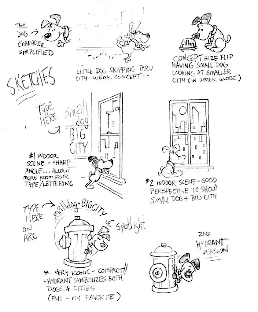
2: Concept Sketches
I then sent a page of rough concept sketches showing the simplified dog character doing various things related to cities. She liked the idea of seeing a city outside the window. She favored the version with the side view of the dog - wanting to see his face.
3: Color Comps
The following images were tightening up and colored including a couple of font/logos.
She felt the dog looked too rigid and angular. She was also starting to feel that maybe this wasn't the look she wanted. I sent her these follow-up colored comps making small adjustments and softening the dog a bit.


