continued . . .
4. Revision (Typeface Logo)
I could sense the client was starting to have doubts about the direction of the design.
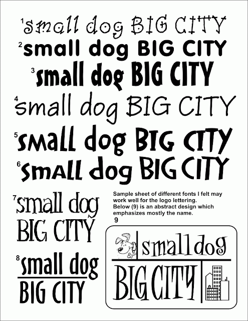
So trying to keep the design process moving, I put aside the graphics and focused on typefaces for the logo. Allowing her to see her company name in various typefaces could inspire a better direction. The focus here was to keep "small dog" in lower case and "BIG CITY" in upper case lettering. She really liked that concept for the typeface.
5. Revision (Graphics)
The next few days talking with her, I tried to convince her that the hydrant concept, (my personal favorite) was the stronger design in my opinion. At first she was negative of having a fire hydrant, something dogs urinate on, be the focal point to her company logo.
I tried to point out that a fire hydrant is one of the most popular icons (next to a bone) that you could have for representing dogs. But to me, not only does a red fire hydrant represent dogs - but also cities and urban communities. She liked that angle . . . so I began creating variations to the hydrant/dog theme.
After sending her the Hydrant theme samples, her response was now excited; She now felt like the direction was exactly what she wanted.
More to follow . . .

