Showing posts with label Children's Book. Show all posts

Tuesday, February 10, 2015

Daily Quick Sketch: Chicken Little and the SCBWI Winter Conference

This was a sketch I did during last weekend's SCBWI (Society of Children's Book Writers & Illustrators) conference in NYC. I had a terrific time meeting so many people who have the same drive and passion about telling stories.

Pencil sketch of Chicken Little, one of many classic storybook characters to be used to pitch my next book.

Funny thing about hearing people talk about creativity. . . It makes me want to become even more creative. So as I was listening to the speakers and taking notes, I realized I was sketching subconsciously in my notepad.

Grand Hyatt's lobby area during the SCBWI conference in NYC. This was one of the few images I took since there is a general request to not take any photos of the speakers and to respect the copyrights/ideas of others at the conference. 

Overall at the conference, I was able to hand my promotional card to two picture book editors and now have several good sources where I believe my stories will work. So a submission blitz is being planned out. I've four picture book manuscripts just about ready to submit. In the upcoming two months, I will send each one out to a different editors or literary agents, wait for their responses/rejections and then rotate the submissions -- and do it all over again.

I've set a goal of 5 years: February 2020.
If nothing happens by then -- I'm out for good. But somethings tells me these stories will be made . . . it's just going to take some time and a lot of patience.

Saturday, January 24, 2015

Flip side: Otter sketches

In the last post, I showed an old Christmas card sketch in blue line pencil. Funny thing is, on the other side of that paper there are several sketches of my supporting character, Otter, from my book, Bobby's Biggest Bubble. You can actually see the pencil indentations of Otter in the paper.

Several character sketches fleshing out the character, Otter, from Bobby's Biggest Bubble

These sketches weren't the first of Otter. These are closer to the actual final version of the character seen in the book. Originally, Otter was to be the antagonist. But over the years, it became more important for Otter to be the supporting friend during Bobby's adventure.

Sunday, January 18, 2015

Children's Book: Lil' Mouse in New York City

Back in 2001, I was working on a children's book idea about a small mouse visiting New York City. I had the story summarized and even started to take reference photos of the city, especially at night around Time Square - the central focus area of the story. My idea was to alter the photos into graphic backgrounds and draw the characters on top of those background. (Similar to what an animated film does.) The difference would be that I'd make the backgrounds very abstract but still recognizable as being New York City. Doing this gave the book a nice look and it would  also help stop any legal or copyright problems from occurring.

The now defunct children's book "Lil' Mouse in New York" circa 2001

In the story, Mouse is awestruck and overwhelmed by the pace of the city. At one point, Mouse feels he doesn't belong and could never live in such a huge city. Then one by one, other animals appear before Mouse; several park pigeons, a police horse, a guard dog and even a mouse-friendly cat. They each convince Mouse that he would be great in the city. In the end, Mouse, with guts and determination . . . decides to call NYC his home. (The running theme throughout the story was pretty much set to the song New York, New York.) This was all coming together during the Spring of 2001.

Then 9-11 happened. Everything changed. I stopped working on my books, especially a children's book about a city that just went through hell . . . it no longer made sense to continue.

Being a freelancer at the time, the attacks made it impossible to find new work. Even companies that would normally pay on time, were now taking months to send their checks. I couldn't continue my desire to do children's books anymore . . . I needed to find steady work to pay the bills. I went back into the toy making business.

Simon Prescott;s "Small Mouse Big City" - published in 2010 by Sterling

Cut to nearly a decade later, the same concept was done by another writer illustrator, Simon Prescott. My feeling now is that even though my idea for designing the story is very different, my fear is that my idea is too close to his story.

Wednesday, October 15, 2014

Daily Quick Sketch: 3 Little Pigs

This was a quick exercise trying to get very loose with my digital drawing/coloring. This is part of a new picture book story I wrote recently, which borrows heavily from classic fairy tales.

Quick digital sketching and coloring of the pencil sketch seen below.

I wanted to create a very sketchy style, but I still feel this isn't what I'm looking for. The also wanted the colors to be very subtle, but there isn't the balance that I want between the holding lines and color.

Original pencil sketch of the three pigs.


Sunday, September 21, 2014

Recovered Image: Playing Yuk-Zee

Recently found some old sketches that I don't remember doing (happens a lot.) This one was very strange because it was colored with watercolor pencils, something I rarely used when I was younger. It's not dated, but I'm guessing by my style and the characters in the image, this was probably done around the early 90's.

Found image of L.B., Timmons and Hairy playing a game of Yuk-Zee in a water color pencil sketch 

Another strange thing about this image was that I drew it on watercolor paper, which meant I had the intention to actually add water to the image, spreading the water color pencils to look more like a real watercolor painting. But this image was never wet. Nor was it finished, as seen by the light pencil sketch of a window in the background. The entire top of the sheet is roughly torn as if the sheet was quickly torn in half.

So my guess is that I was going to experiment with the water color pencils, sketched this scene, colored the characters -- but then stopped, because the look just wasn't what I was wanted. Probably torn the image out of the pad and threw it aside onto the pile of images I had stored away until this moment.

Thursday, June 19, 2014

Monsters and Bunnies: Sled Ride!

Here's yet another Monsters and Bunnies sketch. This image is a part of my group of 6 images I had been sketching for a long time. I hope to eventually finish them, fully colored . . . then create high quality prints.
A grey scale version of one of a set of 6 images for "Monsters and Bunnies"
This one I thought of because all the other images felt like they were set in a Spring/Summer setting. So I thought it would be good to have a cooler setting and get more blues and cool colors into the set of images.


Thursday, May 15, 2014

Illustration Friday: Voyage (Bobby's Biggest Bubble Sketch)

Illustration Friday: Every Friday a word is given on the website, IllustrationFriday.com. Artists and illustrators then submit an image that represents that word all during the week.
This week's word: VOYAGE
Inked and gray marker comp version of a Bobby's Biggest Bubble Kickstarter sketch
Thought Process: Not much thought behind this one. I had already had this image pencil sketched for one of my KickStarter backers for helping me get my children's book published. In all, I had to make about a dozen different full pages sketches of the four main characters from Bobby's Biggest Bubble. 

Pencil sketch of the four main characters from Bobby's Biggest Bubble
This is very close, but a rougher version to the original Kickstarter reward pencil sketch

This turned out to be my favorite of the group and I've been thinking of doing this image as a promotional poster for the next two sequel books.


Another version of the sketch, playing with different subtle changes with textures and details

Thursday, May 1, 2014

Daily Quick Sketch: Prof. Vormit

UPDATE:
It worked out that this sketch fits perfectly with Illustration Friday's word of the week: REVENGE. So I digitally colored the original sketch and submitted this to the I.F. website.

Illustration Friday: 
Every Friday a word is given on the website, 
IllustrationFriday.com. Artists and illustrators then submit an image that represents that word all during the week.


Digitally colored and added a dark background, helps emphasize the glow of the fizzy drink test tube

THOUGHT PROCESS:
Well, immediately, I thought of this character, and how I could use this sketch to emphasize "evil" . . . even though this character would actually be the kindest person on the planet, having just invent a great tasting and healthy fizzle drink for children.


The first version of this image: Digitally colored in Photoshop using various water color and texture brushes
Image felt too flat  . . . needed more depth and darkness

This sketch was inspired by a character concept I thought about for a story.
The idea is simple - create a character who appears to be vile, corrupt and evil -- but make him really be the kindest, most generous and caring person possible. I could see many uses for such a character, mostly for the humor, but also as a children's book character who can teach life lessons about prejudging others.


Original Pencil Sketch: Prof. Vormit excited about creating his great tasting health drink for children
The first thing that came to mind was the image of an evil scientist. It's such a strong stereo type, especially in cartoons. I gave him a hideous beastly face, with a bell-shaped figure and of course the mandatory evil looking goggle glasses. To counter his evil persona: He's always smiling, has lollipops in his lab coat pocket (gives them out to everyone he meets) and he's created the best tasting fizzle water soft drink that's healthy for children.

Once I finished the sketch, his name came to me instantly.
Prof. Vormit 
(a combination of varmint and vomit. I dropped the second T in his name, it just looks better.)

He's such a nice guy . . . really. . . 

Monday, April 21, 2014

Daily Quick Sketch: Sword Fightin'

Been a long time since I posted something here. Work is getting stressful and I'm having a very hard time getting the work done lately. It's probably a combination of burn out and simply doing seasonal concepts over and over again. The market is still in recession, and no one is risking on ordering anything remotely new or different. This makes it hard to do postings here, since my creativity for this type of work usually comes from less stressful times. But enough with my belly aching . . . 

The revamp version of  an old pencil sketch I call "Sword Fighin'!"
This is a revamped version of a very old sketch I did of Timmons, L.B. and Hairy. Back when I worked in New York City, I would often sketch my characters while commuting on the train to/from work. It was a nice way to practice fleshing out and fine tuning my characters.

The original sketch with all it's gritty and fading pencil lines

I hope to one day compile all of the trial and error it took to create Lumpy Bumpy to what he looks like today. (FYI: He's the big alien dinosaur laying down in the background.) L.B. is totally different from then when he was first conceptualized many, many years ago.

I also hope to start posting more images here on the blog again.
I can probably handle posting pencil sketches, but coloring images is too time consuming at this point. Hopefully things will slow down in the upcoming months and most posts here will be back on track.

Friday, March 7, 2014

Daily Quick Sketch: Lil' Lumpy

I've been trying to get my office organized and in doing so - I keep finding old sketches long forgotten. Most are not worth remembering. Many are just scribbles or half drawn characters. But a few are worth bringing back to revamp or update. This image is one of those scribbles that I feel needs more attention.


Lil' Lumpy drawn with digital inking and color pencil crosshatching using ArtRage Pro 4.0.6

Lumpy is one of my oldest children's book characters from a story over 15 years ago. The story's characters were fleshed out over years of redrawing and tweaking. Today, Lumpy looks totally different then what I had originally created so many years ago. I think what happens is subconscious editing, where the focus on what works is emphasized; while eliminating or changing the parts of a character that don't work.

Lumpy's story is part of a 10 book series I plotted out years ago.
I always felt that the story's characters would do very well with the children's book market. But for me to create the series, I would need a good publishing house to support it. I always felt I needed to do other stories first before bringing this character up to the plate . . .


The original rough pencil sketch of Lil' Lumpy recently found among a stack of papers

At least, that was my thinking for last decade and a half. Now publishing has changed drastically. Publishing a book is now the "easy" part - it's the marketing that will exhaust a new writer.

I've not found the answer to getting noticed yet. It's still a mystery why some succeed -- while others fumble. Perhaps it's all about who you know. Or it's just luck. Either way, I'm looking forward to seeing if I can finally discover the answer.

Sunday, February 23, 2014

Illustration Friday: SPACE

Illustration Friday: Every Friday a word is given on the website, IllustrationFriday.com. Artists and illustrators then submit an image that represents that word all during the week.
This week's word: SPACE

SPOILER ALERT: The big climatic ending to my first children's book: Bobby's Biggest Bubble
Thought Process:
A no-brainer this week.

Space makes me think of the space scene I drew for the climatic ending of my first children's book: Bobby's Biggest Bubble. Of all the terrific comments and kind emails I have received about the book -- this 2-page spread was usually the fan favorite, especially for boys.


I like to think it's the coloring that made this page "pop" . . .
Knowing the amount of pink bubblegum coloring the pages would have, I boosted the night sky's blues and even made the meteor a brighter blue to counter the pink; balancing the warm coloring on the left with the cool coloring on the right. 


This page was the greatest challenge I had when making the book. It was the part of the story I worried about the most. Even though this 2-page spread was near the end of the book, other then the cover, it was the first page I completed with full color.
Once I had this part of the story behind me, the rest of the book fell into place.


You can see more about this comic strip at this link here and more recently here.

Thursday, January 16, 2014

Daily Quick Sketch: Belly Bottom Shark

Today's daily quick sketch is of a evil shark character I call, Belly Bottom.
I've a story in which this character may play a small part as the villain, (but that story will be a long time coming since I want to do about 5 other stories first.) 


Applying several filters: Adding blotches and crosshatching for more dramatic effect

Even though I have no immediate need for this character, it is always best to get the character down on paper and safely saved on file for future reference. Otherwise, the character would probably just fade away from memory.


This sketch was done in pencil, scanned into Photoshop as the top "Multiply" layer. The next layer down is the color layer, where I used a texture brush to add gritty shading to the pencil lines. The bottom layer is the background, which was made by greatly increasing the texture brush's size and simply adding darker blue tones while moving towards the lower right of the image. The entire background was done in about 3 minutes.
I wanted to exaggerate the shark features and give it an eerie look. This was simply done by using dark colors and giving him soulless, empty white eyes. I feel the mouth is unique enough with an under-bite; but it still needs some work. I'm also thinking of making him look more war torn and roughed up, as if he was in several battles.  (But that might be too much for a children's book character.)
Original pencil sketch scan of Belly Bottom

Sunday, October 27, 2013

Illustration Friday: Creature

Illustration Friday: Every Friday a word is given on the website, IllustrationFriday.com. Artists and illustrators then submit an image that represents that word all during the week.

This week's word: CREATURE


As previously mentioned, I've been swamped with work lately, so I haven't been submitting illustrations to the website Illustration Friday for weeks now.
Fortunately, this week's word is easy for me to submit past works.

Bladimir, the Blogdunsta from the upcoming eBook "Bladimir Blarfarg and the Worm Wire Glasses".

Thought Process:
Not much thought process to this submission, my first thought to the word CREATURE is obviously going to be the creature I've been working on for the past year. I simply submitted one of my illustrations from my eBook, 
Bladimir Blarfarg and the Worm Wire Glasses".

(Sidenote: Noticed that the font I picked has a "y" that looks like a "g" - I'm constantly seeing "Tiny Legs" in the lower right corner read as "Ting Legs". Even though that does bother me, I like this font's style since it goes so well with the mood and character of the story.)

Tuesday, August 6, 2013

Library Book Reading: South River Public Library

Getting ready for the reading at South River Library.

Attached is the promotional flyer. Please help spread the word . . . 

South River Public Library is located: 
55 Appleby Avenue
South River, NJ 08882
Contact: Dawn Bladzinski 732-254-2488 registration@southriverlibrary.org


Saturday, August 3, 2013

Illustration Friday: Hybrid

Illustration Friday: Every Friday a word is given on the website, IllustrationFriday.com. Artists and illustrators then submit an image that represents that word all during the week.

This week's word: Hybrid

This was a vacation week for my wife and me, so I pulled an old image from the archive for this week's word.

This is one of my favorite supporting characters to an old story I wrote many years ago. It's a story I plan to tell one day in a children's book, but it won't be for at least a few years from now.


One of my "hybrid" characters, Babbit. (He's a Bat + Rabbit)

Tuesday, July 23, 2013

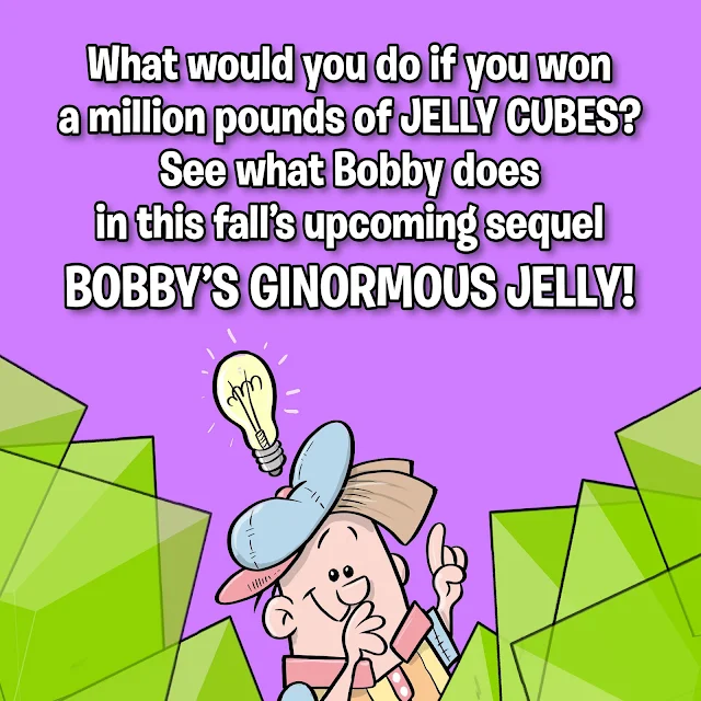
The sequel: Bobby's Ginormous Jelly

Already getting a little overwhelmed that its already past mid-summer and I need to get the sequel finished in the next few weeks. I'll have a few days of vacation to focus on getting the work done.
Being to promo the new sequel book due this fall.
Hope to have it all done in time to have something to show for library book readings like the one in South River, NJ on Aug 12th and especially for the Collingswood Book Festival in NJ this Oct. 5th.
I'll be sure to post more info here as thing move along.

Thursday, June 20, 2013

Daily Quick Sketch: Laughing Dog

This is an old image I used for several projects.
Originally it was the cover illustration of a greeting card. It has since gone on to be used for a pet toy website logo and part of a design for a European nursery rhyme book (Hey Diddle Diddle)


Recently I inked the image for printing, replacing the shading with lines. I kept the pen work very loose to give a playful feel to the overall image.

Image redrawn with ink lines (for printing)

Tuesday, June 18, 2013

Daily Quick Sketch: Lil' Hippo

Had this little guy made quite some time ago, finally had it colored.
"Percy" was a character that was made from random sketching and doodling
No reason for creating this character, he was just developed from random sketching and doodling. I will archive "Percy" away until a character like this is needed.

Saturday, June 15, 2013

Drawing Process: Bobby's Biggest Bubble

I've recently had quite a few people asking about how I did the artwork for my children's book Bobby's Biggest Bubble. I'll try to explain my process below:

I used a great small (and inexpensive) program called ArtRage Pro to do my line work and coloring. My story was very whimsical and funny, so I wanted the book to have a Saturday morning cartoon style, using solid black outlines and vibrant flat "cel"-like coloring.

The finalized kitchen scene from a page of Bobby's Biggest Bubble (sans type/lettering)

I found ArtRage Pro was the best program for the line control I needed. (Other more popular programs, like Photoshop and Painter, just didn't have that feel or line control I wanted.) Using the program's default "Round and Smooth" ink pen setting and adjusting it's Smoothing setting to about 40-50% gave me just enough control while keeping the line smooth and clean.

The image was first pencil sketched, scanned and then placed into ArtRage where I traced in the ink lines (using about 9% pen size).

The original pencil sketch scanned into ArtRage Pro to be inked and colored

Each element (e.g. kitchen background, the bubble) and character were drawn on separate layers, allowing composition/size adjustments.
The "inked" layers all seen together without coloring. Note: many background items were extended in more detail from the original pencil sketch. Doing this allows more control of placement and making adjustments if needed.

For coloring, I used the Watercolor setting of Wet on Dry to get the solid color fills.
I created separate layers for 
highlights and shades and placed their layers over the color layers. Then I drew in the highlights and shadows using the same smooth Ink Pen as before, only at a much larger size (about 15%). For shading, the layer's Opacity was turned down to 15-20% using black as the color. For highlights, the layer's Opacity was turned down to about 60% using white as the color.
Lowering the opacity creates a transparent coloring control that allows me to darken or lighten the colors underneath.

The image shown w/o highlights/shading, but includes the word balloon and outer framing (via Photoshop)

When the image was finished, it was exported to a Photoshop PSD file (with layers) so that I could compile and convert all images (and layers) into a high quality TIF files and place them into Adobe's InDesign for publishing. Final touches like text, word balloons and outline frames were done in Photoshop.

FYI: I plan to use ArtRage again for the book's sequel . . . love using this program!

Sunday, April 7, 2013

Arrrggghhh! It's Another Quick Sketch Video: Chuck

Just posted another drawing technique video up on YouTube.

This time it's a little character I named Chuck, whose the twin brother of his "older" sister Charly**. The twins are part of a story I plan for release in 2015. 


Lil' Chuck: the subject of the newest Arrrggghhh video

This is a good example of developing years before finalizing the story. Though I have no plan to work on the book for some time, I will let these characters sit around in my head until I'm ready to do their story. They may change or something might inspire me to create a new look . . . but doing a sketch of them now helps me develop a better book in the future.

**(See Charley's previous post.)