Thursday, October 1, 2015

#INKtober 2015 No.1: Normal-Size Foot


There is an event ever year called Inktober where illustrators draw inked images daily for the entire month of October and share them online. I'm going to try it this year since it not only looks fun but it's also a great way to hone and practice my drawing skills.

Since it is the "Halloween" month, I'm going to also try to and keep all of these images as funny monsters. It is the busiest time of the year for me, so we'll see how it goes.

#1. Average-Size Foot: The idea of this character goes back to my childhood when UFOs, sharks attacks and unexplained mysteries were all the rage. The basis of this character was from one simple question: Would the public still have an interest in such a creature if his foot size was the same as the average man?
Inktober 2015 image #1. created with a "B" Faber-Castell brush pen
Added a bit of Liquid Ink coloring

Tuesday, September 8, 2015

Daily Quick Sketch: Birthday Bee

This is a sketch of a custom birthday card I made for my wife's birthday a few years ago. I decided to shade the pencil sketch with gray Copic markers. I find coloring with alcohol-based markers allows more control on how and where the color goes on the papaer.

Digitally color version using Photoshop's Hue/Saturation sliders to change the coloring

The biggest problem I have using marker is . . . once the color is on the paper, you're pretty much stuck with the results you get. Most water-based/ink markers tend to color too dark, bold or over-power to the line work. The solution I found to this problem was to use alcohol-based markers, (such as Copic.) Alcohol-based inks give far more control when coloring with markers.

The original pencil sketch that has been colored and shaded using gray markers

It does this in two ways:

1.) Alcohol based ink spreads more evenly, which eliminates the streaks, white gaps or darkened lines usually seen with water/ink based markers. The end result is a smooth and even texture with a slight watercolor look.

2.) Alcohol based markers allow you to build up to darker tones by simply going over the same areas with the same marker. This is a gradual build up too, allowing a lot of control with shading and highlighting.

It's important to use the proper paper. Some papers absorb ink too quickly which doesn't allow the proper even spread. Marker Paper or Mixed Media will usually give the best results.

Saturday, September 5, 2015

Character Development: Prince Mudslide

This is another character, part of the Molten People living underground. He is Prince Mudslide, son of King Mudsok.

UPDATE: Added some digital color tones.

Updated digitally colored version, using Photoshop.

Mudslide is very lovable, gentle and simple minded soul. He's amazed at the upper world and desperately wants to learn . . . but like most Molten People, it takes him a very long time to learn new things. He is the only child of King Mudsok. The king loves his son dearly, but worries for his people that Mudslide will not be ready to take his place when the time comes.

A scan of the original pencil sketch, colored and shaded using Cool Gray Copic markers.

Monday, August 17, 2015

Daily Quick Sketch: Mean Pig with Banjo

I started sketching this long ago, to be submitted to the Dueling Banjo Pigs' website. But I never got around to coloring or submitting this image to the site. (Another banjo pig image I created awhile ago was colored and sent to the website instead.)
Grumpy ol' pig not having a good day, drawn with a pencil and shaded with a Copic gray marker C3

I shaded the pencil drawing with a copic gray marker while on vacation. This was done while lying on the beach. The great thing about Copic markers is how you can layer, creating darker shades from the same color marker. It also blends so cleanly that you can't really detect any marker strokes. 

Thursday, August 13, 2015

Character Development: Subconscious design

I'm often asked where I get my ideas and characters.
The honest truth is usually subconsciously.

I find that I often dream up stories and wake with the ideas floating in my head. The idea is never complete in full detail, that takes time. But if the thought is strong enough, it's often the kickstarter into a much bigger well-rounded story.

An example would be how I recently woke up with a idea for a story. I could envision how the story flows and ends and list all the characters needed. In this particular tale, a fox is one of two main characters needed, but I don't have the slightest idea of what the fox character should look like.

I find that I start to subconsciously doodle, sometimes on a pad, worksheet or in this case . . . sticky notes. This doesn't mean I'm half-asleep while I doodle, it simply describes the zen-like state of just letting the pencil wander without focus. I don't know what is going to appear on the paper when I'm done, but I collect the results and use that as reference to create the final image. In a way, I'm creating my own line-up of character references to pick and choose what I like and dislike.

Subconsciously designing and feeling out a character through doodling on sticky notes

The beginning sketches are usually very light pencilling, nothing really definite in form. Just feeling around for features that will make the character be instantly recognized as a likable fox. As time goes by, the features start to appear more defined and the pencilling gets stronger and darker. Finally, the character is slowly forming to a point that I can visualize it in my head - I quickly transfer that image to paper.

It's safe for me to say I dislike all of the rough sketch characters (seen on the left above), which causes me to continue until I finally reach the look that satisfies me. This isn't always 100% foolproof for developing characters -- it's a constant hit or miss. There are still characters I try to develop that have taken years -- AND several that still haunt me because I never reached a point of satisfaction.

Friday, May 29, 2015

Illustration Friday: Ninja Mummy

Illustration Friday: Every Friday a word is given on the website, IllustrationFriday.com. Artists and illustrators then submit an image that represents that word all during the week.
This week's word: MONSTER

This is a word of the week that I can really enjoy! So many monsters!

This was a sketch I had originally created around Halloween 2014. It was going to be an ordinary dancing mummy, but I stopped drawing it after doing the top half of it's body and put it aside for several days.

When I went back to finishing the sketch, I saw the character in a new light. The pose looked more like a martial artist stance, so I started to give the dancing mummy some ninja clothing.

The Ninja Mummy fighting in a sand storm

I started to imagine how this character would animate since its a contradiction of two movement styles:
A.) the fluidly smooth, silent and quick reflexes of a ninja, mixed with
B.) the awkwardly slow, stumbling and limbering motions of a mummy.
Merging the two styles, I'd picture he'd be a quick and skilled martial artist, but he would often spastically twitch uncontrollably, groaning and create nontraditional (but humorous) fighting poses.

The original pencil sketch that was going to be a dancing mummy . . .

Wednesday, April 22, 2015

Doodle: Lil' Batman on Yellow Sticky Note

Been awhile since I posted anything, haven't been drawing much for some time. But I do have many doodles around my desks.

Doodles are images that I simply draw without thinking, as if my subconscious mind has taken over and the pencil just moves. Most doodles are done while I'm working . . . part of the creative process I guess.

Here's one of a tiny stubby Batman . . .

Batman pencil doodle on a traditional yellow sticky note

Friday, April 10, 2015

Illustration Friday: Warrior (aka Sir B' Gok!)

Illustration Friday: Every Friday a word is given on the website, IllustrationFriday.com. Artists and illustrators then submit an image that represents that word all during the week.
This week's word: Warrior

The chicken warrior known as Sir B'Gok, created in ArtRage Pro

Thought Process:
Through word association, the word "warrior" instantly reminds me of bravery. This, in turn, makes me think how a true warrior would never run away from any fight.
Such a warrior would never be . . . A chicken. This gave me the idea to make a "chicken" hero.

The original pencil sketch of Sir B' Gok

Sunday, April 5, 2015

UPDATE: Ulric Evil Unicorn

UPDATE:

Had a few minutes to spare, so I colored Ulric, the Evil Unicorn.

UPDATED: added a color version
I thought of this character when the popularity of the "My Little Pony" craze took off several years ago. Unicorns are usually born "Lawfully Good" creatures; so in D+D/geek speak, this means a unicorn should never be inherently evil.

The crazy (and evil) unicorn, Ulric.
But what if a unicorn was insane? Then it wouldn't know it was doing evil. That's where the idea of the horsefly comes in. The horsefly is infatuated by Ulric's shiny horn and flies around it constantly in circles. This in turn drives Ulric insane on two counts:
#1 The constant buzzing sound is driving him mad.
#2 Ulric constantly argues with the horsefly that he is not a horse, so it should leave and find a real horse to bother.
Ulric constantly talks to the horsefly though it never replies back, making Ulric seem even crazier . . .

The original pencil sketch of Ulric the unicorn from one of my sketchbooks

Thursday, April 2, 2015

Daily Quick Sketch: Pirate Dream

Continuing my physical painting: (aka, an attempt to take a break from the digital creating and going old school.)

I've been struggling a bit, learning to leave things alone, where before I would simply make any needed changes in Photoshop or Painter. I've even destroyed another painting due to using liquid frisket. (Note: Liquid Frisket is a liquid form of rubber which can be brushed on a painting to mask and protected areas from being painted over or wet.) In this case, the liquid frisket absorbed into the paper and ripped the top layer of paper when it was being removed. I should have tested this brand of watercolor paper before using the frisket on actual artwork.
The finished image of "Pirate Dream", a watercolor and pencil painting

"Pirate Dream" was an idea I had for a story about a lonely little boy, Rudy, who dreams of adventures. The imaginary friends he meets on these adventures are often his subconscious mind encouraging, motivating and inspiring Rudy to face his fear and be a better person.

The very first concept rough of the image, which was originally set in the day time.

I'm not happy with how the night sky turned out in the painting. It's never easy to paint dark watercolors in such a large portion of the image. I originally planned to use liquid frisket on everything but the sky, this way I could easily and quickly paint in the dark night sky. But after my last incident with using liquid frisket, I opted not to used that technique.and simply painted in the night sky.

The original pencil sketch of the "Pirate Dream" image

I find that painting a large area with a dark watercolor is a challenge. Watercolors tend to dry too quickly which makes it difficult to get a nice consistent coverage. Adding more water to the paint often only dilutes the color making in more transparent.

Oh well . . . live and learn.

Saturday, March 28, 2015

Daily Quick Sketch: Dinosaur on Toned Tan Paper

I've been trying to get back into the physical drawing and painting world, having been digitally illustrating most of my work for the past two decades. I like how it forces me to change my style and technique, but I also hate when things go wrong. There something assuring and refreshing when a simple keystroke can erase any mistake instantly; but in the non-digital world, a simple mistake can ruin the entire image.

Dinosaur character created on Toned Tan paper, using pencil, ink and a white Gelly Roll pen.

I always enjoy seeing images on toned paper. Usually created with charcoals or pencils with white accents that make the images pop. For this image, I lightly pencil sketched the character first, then colored with a blue color pencil. For an added effect, I tried to maintain a horizontal stroke whenever coloring.

The dino image was made using only old school materials: india ink, pencils and a good ol' white Gelly Roll pen

Next, using a white Gelly Roll Pen, I created white horizontal lines for the light areas and highlights; finishing with the black outlines with a fountain pen filled with india ink.

Friday, March 13, 2015

Illustration Friday: STRONG

Illustration Friday: Every Friday a word is given on the website, IllustrationFriday.com. Artists and illustrators then submit an image that represents that word all during the week.
This week's word: STRONG


This week's word was easy, because:
HULK IS THE STRONGEST ONE THERE IS!
So many mysteries about the purple Hulk pants . . .

Thursday, March 12, 2015

Daily Quick Sketch: Using Watercolor Pencils + Water Pen

I bought a water brush some time ago and I haven't really had the chance to use it. I keep thinking I want to physically paint artwork so that I actually have . . . physical artwork. But, I'm so used to working digital, that it makes it very hard for me to get back into doing the physical artwork.

Run, Bladimir, Run! Get away from those watercolors!
My first attempt at using water color pencils and a water brush on watercolor paper . . . looking muddy

Basically my biggest problem is this . . . the physical world doesn't allow you to make mistakes. Nor does it allow quick experimenting or provide quick alternatives the way digital does. To me, the look of watercolors just screams "picture book". Its just one of the best mediums for creating images for children. Yet, I find physically painting with watercolors so stressful, frustrating and chaotic. Colors fade or bleed into each other. The paper wraps. Colors look different once dry. Etc, etc, etc.


Water Brush: a brush tipped pen that can be filled with water to help blend and control watercolors 

So, in my humble attempt to control watercolors better, I decided to try using watercolor pencils with a water brush. The pencils offer me the most control, since pencils are what I feel most comfortable using. The water brush allows me to add water where I want and it allows me to blend the water color pencils with ease. (The only real issue I have with the water brush is that sometimes dries a little while using it, which doesn't allow the water to flow out as much as I would like.)

Overall: The image above turned out too dark and muddy for my taste. Adding the ink lines didn't help the image either, since they overpowered the subtle colors of the watercolor pencils. I also believe the watercolor paper I was using was too rough.

I'll try to do several more tests and see if I can improve.
And if that doesn't work . . . there's always the option to going back to digital watercolors.

Wednesday, March 11, 2015

Illustration Friday: PATH (was SEARCH)

Illustration Friday: Every Friday a word is given on the website, IllustrationFriday.com. Artists and illustrators then submit an image that represents that word all during the week.
This week's word: Search

Illustration Friday pencil and digital coloring image for the word of the week: SEARCH

Thought Process:
First thought was a magnifying glass -- it's the search icon of the tech world. This meant I probably would need a character using a magnifying glass.

The first sketch of the character before the Illustration Friday idea . . . 
I had just sketched a little penguin recently and thought he'd be a great for this week's image. His goofy look and stance instantly made me think of the old cartoon cliché of a "detective" walking around in circles.

The pencil sketch with character revisions; made using a HB pencil on Canson marker paper

Friday, March 6, 2015

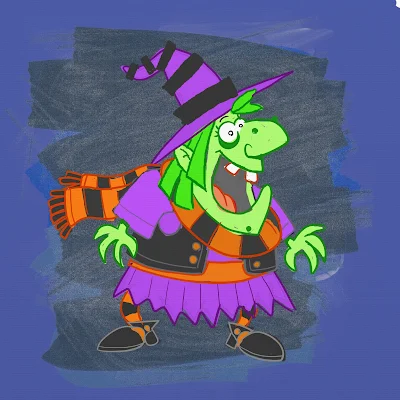
UPDATE! Character Development: Witch Nazel Color Style

UPDATE: I've been going back to my picture book concepts lately and decided to revamp another of my characters, Witch Nazel from my story "Worm Wire Glasses". It's been over two years since I originally posted about this character. 


Fine tuning and testing the pencil/oil brushes with an old favorite: Witch Nazel from my story "Worm Wire Glasses"

Originally, this story was to going to be an eBook, since making an eBook was way more cost efficient than printing another hard cover. But as I started talking to others self publishers at meet-the-author gatherings, libraries and art festivals - I was finding out that the e-book market wasn't really that great.

The biggest problem I felt was that I wouldn't have anything physical to promote anymore. Which makes going to school readings, meet-the-authors and art festivals pretty much worthless -- (unless I could get people to go directly online and purchase my book right at that moment. It's just not realistic.)  Plus, children still want real books.


So, I'm back submitting the old way. Hoping that the one right person in publishing will read my stories.


Below is the the original post from 2/4/2013:


I'm testing out working in a slightly different style for the Bladimir Blarfarg and the Worm Wire Glasses eBook. I'm enjoying using the pen +
 ink style, but I want a different look for the eBook. I feel my work gets too clean and stiff - I want to try and become more loose with my strokes, not worry about being 100% in the lines. I also want to stop wasting hours of correcting the holding lines . . . I want it to look more sketched.


Below is a quick color sketch of Witch Nazel. The overall look in generally there - but I need to turn down the color vibrancy a bit and get the colors to have more of an equal balance. 


I don't think I like the green skin, it's too much . . . GREEN.  Thinking of either going more pale ashy skin -- or just bring it to a more reasonable, normal flesh tone. Orange/Red hair I think will be a better solution too.
The black articles of clothing need to be darker, but not so much to over power the highlights of color.

Note to Self: all of the holding lines' coloring will need to be adjusted, the purple outline is far to harsh and the green outline seems a bit too dark.