Wednesday, September 18, 2013

Illustration Friday: Totem


Illustration Friday: Every Friday a word is given on the website, IllustrationFriday.com. Artists and illustrators then submit an image that represents that word all during the week.
This week's word: Totem


Though Process:
Totems make me think of stacked creatures, usually with a canister-shaped body. I didn't want to do the typical tiki head look. Instead I thought of something else that was stackable . . . marshmallows.

So once I pictured the marshmallows stacked, I figured they were running. But what were they running from? Only thing I could think of that would make marshmallows run, was an angered chocolate bar and graham cracker - with sticks.


Makes sense . . . right?

Tuesday, September 10, 2013

Illustration Friday: Hidden

Illustration Friday: Every Friday a word is given on the website, IllustrationFriday.com. Artists and illustrators then submit an image that represents that word all during the week.

This week's word: Hidden


Thinking Process: Not much time to spend on this, so I did a quick pencil sketch for this week. Thinking of something "hidden", made me think of cats -- the way they hide and get ready to pounce on anything that comes by. I thought it would be funny to have the cat hide under a rug, which holds the entire shape of the cat, making it very obvious that the cat thinks it's hidden -- but it's not. Adding a simple mouse just standing there, staring at the cat added the little touch of humor I wanted.

Saturday, August 31, 2013

Illustration Friday: LUSH

Illustration Friday: Every Friday a word is given on the website, IllustrationFriday.com. Artists and illustrators then submit an image that represents that word all during the week.
This week's word: Lush

Though Process:
My first thought was the work LUSH my immediate thought was a thriving vegetated area. Then I thought of the word as an adjective: luxurious, abundance and thriving. But there was nothing humorous.

But when I look at the word as a noun as a heavy drinker, a drunkard;
I thought of an old cartoon I did year ago. This was originally a card that simply said "Hep-fee Burphday!" inside.

[ Sidenote: Looking at the many other drunken/alcohol images on Illustration Friday site - I guess I wasn't the only one thinking of using the NOUN version of the word this week! ]

Tuesday, August 13, 2013

Illustration Friday: Fresh

Illustration Friday: Every Friday a word is given on the website, IllustrationFriday.com. Artists and illustrators then submit an image that represents that word all during the week.
This week's word: Fresh


My submitted drawing for Illustration Friday's word of the week: Fresh.
Thought Process: The idea came immediately to me because I already did a sketch many years ago by request of my brother for his web design company, Chopping Block.

He called me asking for a character design, a cool nerdy grocer. I did several goofy cartoon sketches and sent they to him.  My style tends to be very cartoony, 
It wasn't the type of look he wanted. But I had a good time drawing the images and kept them all these years.

So the concept here is that the grocer is getting "Fresh" with the "Fresh" Produce. There is also something very funny to me about the phrase "cute tomato". It reminds my of those old B+W movies, especially East Side Comedy's Bowery Boys where it seemed like every girl in those movies were referred to as a "cute tomata". 


The original rough pencil sketch


Tuesday, August 6, 2013

Library Book Reading: South River Public Library

Getting ready for the reading at South River Library.

Attached is the promotional flyer. Please help spread the word . . . 

South River Public Library is located: 
55 Appleby Avenue
South River, NJ 08882
Contact: Dawn Bladzinski 732-254-2488 registration@southriverlibrary.org


Saturday, August 3, 2013

Illustration Friday: Hybrid

Illustration Friday: Every Friday a word is given on the website, IllustrationFriday.com. Artists and illustrators then submit an image that represents that word all during the week.

This week's word: Hybrid

This was a vacation week for my wife and me, so I pulled an old image from the archive for this week's word.

This is one of my favorite supporting characters to an old story I wrote many years ago. It's a story I plan to tell one day in a children's book, but it won't be for at least a few years from now.


One of my "hybrid" characters, Babbit. (He's a Bat + Rabbit)

Tuesday, July 23, 2013

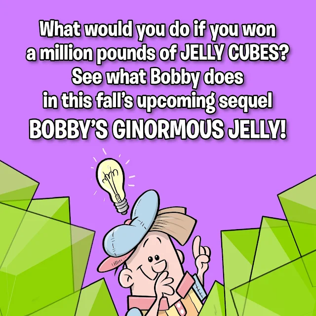
The sequel: Bobby's Ginormous Jelly

Already getting a little overwhelmed that its already past mid-summer and I need to get the sequel finished in the next few weeks. I'll have a few days of vacation to focus on getting the work done.
Being to promo the new sequel book due this fall.
Hope to have it all done in time to have something to show for library book readings like the one in South River, NJ on Aug 12th and especially for the Collingswood Book Festival in NJ this Oct. 5th.
I'll be sure to post more info here as thing move along.

Friday, July 19, 2013

Product Design: Robot Basket

Few people asked me what I do for a living.
I'm a Creative Director under my own company name (Arrrggghhh Ink LLC) and I work exclusively for a company in China. I help design and create fabricated textile products, which is a fancy way to say I design toys, costumes, pet and novelty items.

I can not usually show my work online, because many items are exclusively made for major retail stores like Target, PetSmart and Wal-Mart. We would not be a leading company today if we didn't secure our designs from the general public (and our competitors.)


Attached is a design I did several years ago. It was a robot design for an Easter Basket. Usually I sketch out and color a design. I then add bits of detail information to help explain the look and materials for the prototype designers in China. The team in China are usually so talented, that there is rarely a time I need to do turn-arounds or sketch from another point of view for them to design a prototype.

A Robot Easter Basket design that was too costly to make

This particular design came out very well as a  prototype, but unfortunately the design's cost caused it to be too expensive to make for the retail market. This is the part that many people do not realize about designing products: Not only does the product need to look and fell good, but you are limited to what you can design because of pricing.
This becomes even more of a challenge in a bad economy.

The original concept design including text directions on the design.

In a bad economy, retail prices tend to stay the same or go lower. But the cost of labor, material goods and shipping do not stay the same. So what most retailers do during bad times? They find cheaper alternative/substitute solutions -- without giving up too much quality to the product.

Personally, when I design, I think of things I would have enjoyed as a child. I still want to see this being sold in retail stores one day. Maybe if/when the economy gets better . . .

Monday, July 8, 2013

Illustration Friday: Protest

Illustration Friday: Every Friday a word is given on the website, IllustrationFriday.com. Artists and illustrators then submit an image that represents that word all during the week.

This week's word: Protest
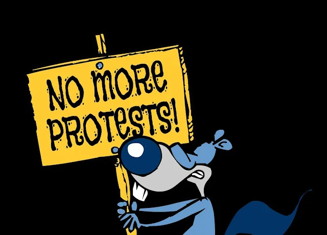
Protesting the protestin' . . . a single frame image of a little animation for this week's Illustration Friday
Thought Process:
This week's word was easy because I already have a character who lives to protest. This was a cartoon concept I had long ago about two animals in New York's Central Park. I don't want to give anymore information than that - since it's still something I may do one day.

But this particular character is a very sly and manipulating power-crazy squirrel. (I always pictured his voice to be similar to Joe Pesci.)


UPDATE 3: Added a Play Again button to the animation.  So now it automatically plays once, stops and waits for you to click the button to play again.


Thursday, June 20, 2013

Daily Quick Sketch: Laughing Dog

This is an old image I used for several projects.
Originally it was the cover illustration of a greeting card. It has since gone on to be used for a pet toy website logo and part of a design for a European nursery rhyme book (Hey Diddle Diddle)


Recently I inked the image for printing, replacing the shading with lines. I kept the pen work very loose to give a playful feel to the overall image.

Image redrawn with ink lines (for printing)

Tuesday, June 18, 2013

Daily Quick Sketch: Lil' Hippo

Had this little guy made quite some time ago, finally had it colored.
"Percy" was a character that was made from random sketching and doodling
No reason for creating this character, he was just developed from random sketching and doodling. I will archive "Percy" away until a character like this is needed.

Monday, June 17, 2013

Illustration Friday: WORN Darth Vader

Illustration Friday: Every Friday a word is given on the website, IllustrationFriday.com. Artists and illustrators then submit an image that represents that word all during the week.
This week's word: WORN

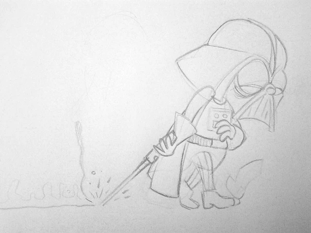
Remember: Even Darth Vader had a few bad days . . . 
Thought Process:
The first thing I thought with the word WORN, was someone tired . . . exhausted. That made me think of characters you never really see portrayed that way. Darth Vader came to mind. The thought of Darth Vader looking fatigued, slumped shouldered, dragging his light sabre on the ground (while it's still on) seemed like a good image to do.

For this image, I wanted to stay very loose and sketchy.
It took about 20 minutes to finish.


The original pencil sketch

Saturday, June 15, 2013

Drawing Process: Bobby's Biggest Bubble

I've recently had quite a few people asking about how I did the artwork for my children's book Bobby's Biggest Bubble. I'll try to explain my process below:

I used a great small (and inexpensive) program called ArtRage Pro to do my line work and coloring. My story was very whimsical and funny, so I wanted the book to have a Saturday morning cartoon style, using solid black outlines and vibrant flat "cel"-like coloring.

The finalized kitchen scene from a page of Bobby's Biggest Bubble (sans type/lettering)

I found ArtRage Pro was the best program for the line control I needed. (Other more popular programs, like Photoshop and Painter, just didn't have that feel or line control I wanted.) Using the program's default "Round and Smooth" ink pen setting and adjusting it's Smoothing setting to about 40-50% gave me just enough control while keeping the line smooth and clean.

The image was first pencil sketched, scanned and then placed into ArtRage where I traced in the ink lines (using about 9% pen size).

The original pencil sketch scanned into ArtRage Pro to be inked and colored

Each element (e.g. kitchen background, the bubble) and character were drawn on separate layers, allowing composition/size adjustments.
The "inked" layers all seen together without coloring. Note: many background items were extended in more detail from the original pencil sketch. Doing this allows more control of placement and making adjustments if needed.

For coloring, I used the Watercolor setting of Wet on Dry to get the solid color fills.
I created separate layers for 
highlights and shades and placed their layers over the color layers. Then I drew in the highlights and shadows using the same smooth Ink Pen as before, only at a much larger size (about 15%). For shading, the layer's Opacity was turned down to 15-20% using black as the color. For highlights, the layer's Opacity was turned down to about 60% using white as the color.
Lowering the opacity creates a transparent coloring control that allows me to darken or lighten the colors underneath.

The image shown w/o highlights/shading, but includes the word balloon and outer framing (via Photoshop)

When the image was finished, it was exported to a Photoshop PSD file (with layers) so that I could compile and convert all images (and layers) into a high quality TIF files and place them into Adobe's InDesign for publishing. Final touches like text, word balloons and outline frames were done in Photoshop.

FYI: I plan to use ArtRage again for the book's sequel . . . love using this program!

Thursday, June 6, 2013

Post-It Note Sketches

Post-It Note Sketches 

Occasionally, I'll simply start sketching on post-it notes. These sketches come out my head without rhyme or reason, almost in a meditative state. (Like the alien guy with a baseball cap - no idea what I was thinkin' of at the time -- I have no idea what he is either . . . ) 

Here are a few of those pencil sketches . . . 


Tuesday, June 4, 2013

Arrrggghhh! It's Another Quick Sketch Video: Illustration Friday SWEET

A video showing my technique sketching, using ArtRage Studio Pro 4.0.2 . This image was created for the website, IllustrationFriday.com, where artists and illustrators submit artwork based upon the site's word of the week. The word for this image was SWEET.