Tuesday, June 18, 2013

Daily Quick Sketch: Lil' Hippo

Had this little guy made quite some time ago, finally had it colored.
"Percy" was a character that was made from random sketching and doodling
No reason for creating this character, he was just developed from random sketching and doodling. I will archive "Percy" away until a character like this is needed.

Monday, June 17, 2013

Illustration Friday: WORN Darth Vader

Illustration Friday: Every Friday a word is given on the website, IllustrationFriday.com. Artists and illustrators then submit an image that represents that word all during the week.
This week's word: WORN

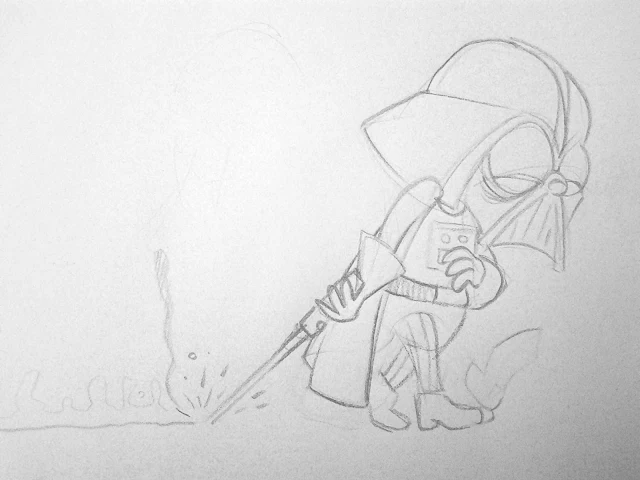
Remember: Even Darth Vader had a few bad days . . . 
Thought Process:
The first thing I thought with the word WORN, was someone tired . . . exhausted. That made me think of characters you never really see portrayed that way. Darth Vader came to mind. The thought of Darth Vader looking fatigued, slumped shouldered, dragging his light sabre on the ground (while it's still on) seemed like a good image to do.

For this image, I wanted to stay very loose and sketchy.
It took about 20 minutes to finish.


The original pencil sketch

Saturday, June 15, 2013

Drawing Process: Bobby's Biggest Bubble

I've recently had quite a few people asking about how I did the artwork for my children's book Bobby's Biggest Bubble. I'll try to explain my process below:

I used a great small (and inexpensive) program called ArtRage Pro to do my line work and coloring. My story was very whimsical and funny, so I wanted the book to have a Saturday morning cartoon style, using solid black outlines and vibrant flat "cel"-like coloring.

The finalized kitchen scene from a page of Bobby's Biggest Bubble (sans type/lettering)

I found ArtRage Pro was the best program for the line control I needed. (Other more popular programs, like Photoshop and Painter, just didn't have that feel or line control I wanted.) Using the program's default "Round and Smooth" ink pen setting and adjusting it's Smoothing setting to about 40-50% gave me just enough control while keeping the line smooth and clean.

The image was first pencil sketched, scanned and then placed into ArtRage where I traced in the ink lines (using about 9% pen size).

The original pencil sketch scanned into ArtRage Pro to be inked and colored

Each element (e.g. kitchen background, the bubble) and character were drawn on separate layers, allowing composition/size adjustments.
The "inked" layers all seen together without coloring. Note: many background items were extended in more detail from the original pencil sketch. Doing this allows more control of placement and making adjustments if needed.

For coloring, I used the Watercolor setting of Wet on Dry to get the solid color fills.
I created separate layers for 
highlights and shades and placed their layers over the color layers. Then I drew in the highlights and shadows using the same smooth Ink Pen as before, only at a much larger size (about 15%). For shading, the layer's Opacity was turned down to 15-20% using black as the color. For highlights, the layer's Opacity was turned down to about 60% using white as the color.
Lowering the opacity creates a transparent coloring control that allows me to darken or lighten the colors underneath.

The image shown w/o highlights/shading, but includes the word balloon and outer framing (via Photoshop)

When the image was finished, it was exported to a Photoshop PSD file (with layers) so that I could compile and convert all images (and layers) into a high quality TIF files and place them into Adobe's InDesign for publishing. Final touches like text, word balloons and outline frames were done in Photoshop.

FYI: I plan to use ArtRage again for the book's sequel . . . love using this program!

Thursday, June 6, 2013

Post-It Note Sketches

Post-It Note Sketches 

Occasionally, I'll simply start sketching on post-it notes. These sketches come out my head without rhyme or reason, almost in a meditative state. (Like the alien guy with a baseball cap - no idea what I was thinkin' of at the time -- I have no idea what he is either . . . ) 

Here are a few of those pencil sketches . . . 


Tuesday, June 4, 2013

Arrrggghhh! It's Another Quick Sketch Video: Illustration Friday SWEET

A video showing my technique sketching, using ArtRage Studio Pro 4.0.2 . This image was created for the website, IllustrationFriday.com, where artists and illustrators submit artwork based upon the site's word of the week. The word for this image was SWEET.


Illustration Friday: Sweet

Illustration Friday: Every Friday a word is given on the website, IllustrationFriday.com. Artists and illustrators then submit an image that represents that word all during the week.
This week's word: SWEET


THOUGHT PROCESS:
Thinking of the word SWEET, I immediately thought of candy.
That made me think of popular characters related to candy. Willy Wonka, M&M's and the cartoon Adventure Time came to mind, but I wanted a contradiction to the word SWEET. Something sweet that wasn't being sweet.


This instantly made me think of the classic ending of the original Ghost Busters movie with the fantastic character: Stay Puft Marshmallow Man.

The sweet and lovable Stay Puft Marshmallow Man tapping the city into oblivion.

I originally thought of an image of Stay Puft fighting the Michelin Man (the famous tire company mascot) since they both looked very similar in size and shape. I was going to do a Godzilla-like side-by-side fight overshadowing a city . . . but while it might have been a good image - it didn't focus enough on the word SWEET.

Going back to the concept "sweet not being sweet", I instead decided to focus on just Stay Puft tap dancing like Shirley Temple -- and in doing so -- destroying the city behind him.

The original pencil sketch of the IF: SWEET concept
FOCUS:
I wanted to originally have a dramatic image looking up under the belly of Stay Puft, from the point of view of people being demolished below. But it was hard to convey that Stay Puft was being "sweet" and tap dancing from that angle. He would just look too menacing. So instead, I did a spotlight focus with Stay Puft tap dancing with his telephone pole "cane". Doing this makes a "sweeter" and cuter persona -- and eliminated seeing people being trampled on (which would be too dark for some people and make the cartoon less "funny".)

RE: Illustration Friday
If you would like to join in on the fun, head over to Illustration Friday. It's totally free, no need to login or sign up for anything. You can view all the submissions from this week (and past archives of previous words.) Have a sketch to show? Send your own artwork up for others to see.

Friday, May 10, 2013

Illustration Friday: Future

It's Illustration Friday -- which means it's time to play creative word association! Each week a word is given on the website, IllustrationFriday.com. Artists and illustrators then submit an image that represents that word. My added challenge is to try to do something humorous. I find this is not only fun - but just a great exercise for creating and experimenting with painting programs.

This week's word: FUTURE

I didn't have much time this week since my workload is very heavy making pet clothing designs/sayings/patterns for PetSmart -- but I still wanted to submit an image for the site. So I did a digital sketch in pencil. No coloring, inking, etc.
Cartoon pencil sketch based on Rodin's The Thinker

THOUGHT PROCESS:
For me, the first thing that comes to mind about the future is a robot. When I think of robots, I often wonder if I'll see the day a robot or computer will have it's own thoughts (or develop an original thought/concept based on existing patterns of design.) We are getting closer and closer to actual artificial intelligence, and while the true concept of that may never be achieved, we know we already use A.I.-like programming to solve and explore possibilities never previously thought of before. 

So a robot thinking made me think of Rodin's timeless classic statue, The Thinker. I found a reference image and began drawing a robot sitting is that familiar pose.

Image of Rodin's Thinker used for reference
FOCUS & TWIST:
So what would a robot be thinking of? I tried to convey that the computer the robot was sitting on wasn't working and the robot was trying to figure out "why?" By making his eyes look down and away from the computer's plug, we get the sense he may never come up with a solution -- that the solution is so apparently close.

The typed message is a spin on the old catch phrase, but I thought it'd be fun to change the phrase "under our noses" to "under our olfactory sensory nodules."


Illustration Friday

If you would like to join in on the fun, head over to Illustration Friday. It's totally free, no need to login or sign up for anything. You can view all the submissions from this week (and past archives of previous words.) Have a sketch to show? Send your own artwork up for others to see.

Wednesday, May 1, 2013

Illustration Friday (on Wednesday): Farewell

You may notice it's not Friday. 
This past Illustration Friday I was too busy getting ready being the Best Man for my brother's wedding. (And yes, it was a wonderful weekend at the Physick House in Philadelphia.)

The word for this week is: FAREWELL. This word was a big challenge, especially since I want to do only humorous/fun images -- and this word was directly associated with sadness.


Illustration Friday's submission for the word FAREWELL done in digital color pencil
THOUGHT PROCESS: My first thought was to create an image of a small character waving goodbye to a large character walking away. The farewell ending music from my childhood TV show "The Incredible Hulk" started to come to mind. That classic image of Bruce ("David") Banner walking away from yet another location. But doing an image of Hulk sulking away didn't seem funny -- and I couldn't think of an appropriate small character to be waving goodbye. 

Quick pen doodle of my "mental" concept for FAREWELL
So I thought what type of goodbye would seem funny?
A goodbye that was sarcastic.


That's when I thought of a parent saying goodbye to their child leaving home, (but deep down the parent is extremely happy to see the child go) -- aka leaving the nest.

That's when I first envisioned the image of a Momma bird "encouraging" her young to leave the nest. Originally, I did a quick sketch with two chicks being booted, but somehow the idea of several being "kicked" at once seemed more cruel then just the one.

FOCUS: I also thought the idea of giving zombie-like, dead pan eyes would make the bird characters funnier. The eyes make it seem like the Momma bird is just going through the motions - staring at you, the viewer, as if to say "I'm doing this because this is what nature intended me to do." There is also a humorous disconnect of the Momma not looking at the chick as it plummets. (But don't worry, the chick flies away safely . . . honest!)

DRAWING PROCESS: For this image - I used digital color pencils on very rough textured papered surface. When finishing, I used a very thin eraser across the image's outlines to make them break up and seem more scratchy.

(UPDATE)
I had played around with this style of the image, with more solid ink lines and a moss paint brush canopy of "leaves" on top of the image. I didn't care for the solid lines for this image - and the 3D Moss brush clashes with the 2D line work. The "leaves" are also too strong and take away from the focus of the image.
I thought I'd post it here just to show the difference.


Earlier pen ink style lines with 3D moss brush for leaves

Sunday, April 21, 2013

Arrrggghhh! It's Another Quick Sketch Video: Illustration Friday TRAIN

A video showing my technique sketching, ArtRage Studio Pro 4.0.2 was used for creating this image. This was an image created for the website, Illustration Friday, where artists and illustrators submit artwork based upon the site's word of the week. The word for this image was TRAIN.

Friday, April 19, 2013

Illustration Friday: Train

It's Illustration Friday -- which means it's time to play creative word association! Each week a word is given on the website, IllustrationFriday.com. Artists and illustrators then submit an image that represents that word. My added challenge is to try to do something humorous. I find this is not only fun - but just a great exercise for creating and experimenting with painting programs. 

This week's image for Illustration Friday: TRAIN

The purpose of blogging this is to try and explain the thought process behind creating this image. I like to time myself so that the creative process is instant . . . no lingering on how the image will be made -- just jump right into it. The total time for this took 1 hour and 10 minutes.

Thought Process: The word given was TRAIN. So my first thought was: Do I go with just drawing a train - OR - Do I create the action of someone training something. Then I thought, "why not do both?" Someone training a train. But who? A conductor would be the most obvious choice. So that made it really easy. There is only one cartoon conductor that I can think of, Conjunction Junction, from ABC's School House Rock! I quickly looked online for reference to this popular 70's character and started sketching right away. Drawing CJ was easy . . .

An old childhood favorite: School House Rock's Conjunction Junction image used for reference
. . . but the train was a little bit of a challenge. It needed to be detailed enough to be recognized as a train -- but not too detailed as to make it too busy to see it was "sitting" up like a dog being trained.  The final small detail I added was making the "doggie" treat be a piece of coal.

Image Flow:  This one was simple. Have two "characters" interacting + facing each other. The focus would be the little bit of coal in CJ's hand, which is dead center in the image. Some motion lines were added around the little train to show it was struggling a little to stay in place. 
Original pencil sketch scanned into ArtRage Studio Pro
If you would like to join in on the fun, head over to the Illustration Friday. It's totally free, no need to login or sign up for anything. You can view all the submissions from this week (and past archives of previous words.) Have a sketch to show? Send your own artwork up for others to see.
NOTE: See the video of this sketch being made.  It's available on YouTube

Friday, April 12, 2013

Illustration Friday: Wild!

Every Friday is Illustration Friday where many illustrators and artists submit their images based on the word of the week. The word this week is: WILD!

I always want to submit work that focuses on character design and humor. I also try to experiment with new styles and looks using different brushes or techniques... experimenting is fun.

The final image after adjusting the composition. the color value and tweaking the background


Thought Process: For the word "Wild", I thought of the jungle, which then through word association - made me think of a lion. I could have just made a wild-looking lion and be done with it, but I wanted to add humor to the image. So, I thought of making the "King of the Jungle" with a lion terrified of bunnies.

Illustration Friday: WILD week
Visual Targets: Throwing the lion in a tree added to the scared effect and emotion I wanted.  I need his fear appearing over-the-top and exaggerated for it to be comical. For the bunnies, I made them as plain,  simple and timid as possible... this is where "less is more" pays off. Keeping them all white too hopes to convey that these bunnies are angelic, pure and innocent.

Original pencil sketch of a scared lion
Image Flow: When someone first sees this image, the warm-colored lion should be the focus. As we follow his eyes to the left, it leads us to see the "un-scary" trio of bunnies. The blank unemotional stares of the bunnies back at the lion adds to the comical effect.

If you would like to join in on the fun, head over to the Illustration Friday. It's free to join in on the fun, no need to login or sign up for anything. There you can view all the submissions from this week and past archives of previous words. Have a sketch to show? Send your own artwork up for others to see.

Sunday, April 7, 2013

Arrrggghhh! It's Another Quick Sketch Video: Chuck

Just posted another drawing technique video up on YouTube.

This time it's a little character I named Chuck, whose the twin brother of his "older" sister Charly**. The twins are part of a story I plan for release in 2015. 


Lil' Chuck: the subject of the newest Arrrggghhh video

This is a good example of developing years before finalizing the story. Though I have no plan to work on the book for some time, I will let these characters sit around in my head until I'm ready to do their story. They may change or something might inspire me to create a new look . . . but doing a sketch of them now helps me develop a better book in the future.

**(See Charley's previous post.)

Friday, April 5, 2013

Illustration Friday: Urban

It's Illustration Friday!
Every week, the website 
Illustration Friday posts a word and invites everyone to submit their illustrations for all to see. 

The word this week is URBAN
Since I've been pulling many all-nighters this week. I'm going into my archives for this week's image.

This image is from a children's book I was working on long ago, but never published. I was experimenting with altering images from NYC as the background. The character, Lil' Mouse, was painted digitally
 and shaded on top of the abstract images of the city. I did about 8 pages of the story before moving on to another project. (One of the reasons for dropping the project was the concern of owner's rights to the original NYC photos I used and manipulated.)

Cover to a children's book concept using abstract photos of NYC merged with digital characters and type.
The background used here was an image of NYC's Time Square.
Want to see more images of what others are doing with the word?
Have an image you want to show everyone else? Then go here: Illustration Friday

Wednesday, April 3, 2013

Daily Quick Sketch: Charley

This is a character for a children's story I plan to do next year. The setting will be in a very snowy area where she and her brother encounter a very strange . . . "thing". (I have her brother sketched up too - maybe I will post him this weekend.)

Charley: Quick sketch done in ArtRage 4.0.2.
Copyright ©2013 Arrrggghhh Ink Publishing
The difficult thing lately is that I have been dealing with too many ideas at once. I've over ten stories that I constantly juggle and visualize in my mind, especially when going to sleep. Occasionally, I'll get an idea to improve a book, envision a whole new story concept or visualize a new character in my imagination. Many times, if I don't get these ideas down on paper, they are quickly forgotten.

I don't plan on working on the story that Charley is in until early next year. Yet, I can't let the image of her dissolve away. So, doing a quick sketch of what I imagined and putting it down on paper (and this blog) will help assure that Charley will be there when I finally need her character.

Saturday, March 30, 2013

Daily Quick Sketch Video: Lumpy Bumpy Monsta

I've always enjoyed see others showing their creative techniques . . . so I'm going to start posting videos of my process of digital sketching/painting.
If people seem to enjoy this, I'll be sure to post more.


Update: Few people had been asking what I used and how I did this: