Wednesday, June 27, 2012

Slugg!!!


Another character design from very long ago.
Originally this was a design for my cousin, but the look was too comical and wasn't what he was looking for.
This is original pencil digitally colored.


What sets the Hulk off 80% of the time?


Tuesday, June 26, 2012

Elph


Another kid's book character named Elph, the Tiniest Elephant.


I feel there's not enough personality or something lacking with Elph's look. Its important that Elph look uniquely different, to stand out from other elephants in the story. Yet, I want to keep him very simple. His body shape may be what's bothering me, because he is very limited in ranges of motion with this type of body shape. So I will put him aside for a later time -- hopefully something I see or do will inspire a new idea.

Monday, June 25, 2012

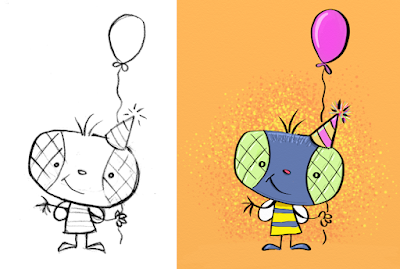
B-Day Bee


This was a little character I made for my wife's Birthday Card last year.


Side-by-Side: Pencil vs Ink  

I've recently had several people ask me to show my pencils, wanting to compare to difference between the inking lines and the pencil lines. Below is a simple side-by-side, showing the sketch and then the finalized image of the right.

It's always interesting how slight corrections and subtle adjustments are subconsciously made when re-doing an image a second (or third) time.
You can easily see the shoulders/arms have been adjusted - compared to the bee's right arm in the sketch (which seems to be too short and stiff.)

The flattening of the feet to show more body weight on a flat surface. The slightly longer balloon which gives more of a feeling of it pulling away.
Pencil details are lost when converting any image to ink. Pencil sketches keep all the scribbles and marks of the hand shaping and creating the image. For this reason, I often find I enjoy looking at an artist's pencil sketches - since it gives me an idea of the artist's thinking/creative process.


Thursday, June 21, 2012

Balancing Bobby


Color Pencils on Dura-lar.
Dura-lar is a treated film that really picks up and holds a pencil line. The very smooth surface allows the pencil to glide. I find I have an easier time keeping the surface clean of pencil smudges too . . . don't know if it's because I'm more subconscious about not smudging or if it's the material itself.

Tuesday, June 19, 2012

Babbit

Another old favorite character of mine; Babbit.
He's part-bat and part-rabbit.


Sunday, June 17, 2012

Frickin' Mickey!!!

This is something I kept for well over 25+ years.
From long ago, when I was working on nothing but Disney + Mickey Mouse designs . . . 

EVERY! 
SINGLE! 
DAY!  
Just couldn't help it . . . and he still suffers today on my tack board . . . 


Pool Wrap


Below is part of a plastic pool wrap I made this year for the Euro-Asian market. I kept it very clean and graphic, minimum highlights and heavy with cool colors. 


Thursday, June 14, 2012

Yabbi, the forgotten Wild Thing


This was a 10-minute sketch, testing my program setting and trying to get loose with the lines.
He started looking like one of Sendak's Wild Things, so I had him doing the marchin' dance.


Saturday, June 9, 2012

Hairy


One of my long time characters. He's a major supporting character in a series of kid's stories I wrote many years ago. He doesn't speak, but he does express his emotions quite frequently (often bitter.)

Hairy is actually a mix of several animals . . . bear, hamster and squirrel. Took quite a few revisions to get him to look this way. I'll try to gather the various sketches of him over the years and post them together showing the development of his character.


Little Vader Bubble

Below is a little promotional image I drew in hopes to drum up some KickStarter support for Bobby's Biggest Bubble. Seeing this now, I kinda wish I made the subtle details of the "Death Star" bubble a bit more apparent.


Fuzzy Monsta!


It's great when you get the muse of creating stuff and new ideas start popping in your head.This little guy is a concept for another children's book story that I will hopefully publish one day. As with most character designs, I will return to it again one day and tweak the look. I find giving a character some time and returning with a fresh look helps fine tune the overall look.


This is the first time I used the program SketchBook Pro, trying out it's interface to see if I like the control better than ArtRage. I like the painting feel and flow of the program's control, the color picker is very handy and the interface is uncluttered - but I still prefer ArtRage's control of the line. It may just take getting used to and tweaking the brushes to how I want them to work.

Startin' a Blog

With my 1st book project on the way, I figure now is the best time to start a blog.

I feel like I finally hit a new wave of creative inspiration after years and years of just doing product designs. I've found it too easy to just do work for work sake; and I have forgotten about getting creative for simply having fun and experimentation. 


So, I want to blog about my latest designs and hopefully have fun in the process.

Occasionally, I will be posting about my first children's book: Bobby's Biggest Bubble. Nearly 20 years since I first created the story, and the book will finally be finished this year. (Thanks to a successful KickStarter project and the many supporting people who helped reach the goal.)


The book is set for release this September 2012.