Friday, February 2, 2018

Finally got my website updated!

The new website design is up, and it has a new name: www.jimromer.com

It's been about five years since the last update. Adding my animation clips to the video page will take some tweaking to get all those old Flash files to work correctly. Plus, I'm still digging into my archives to find some ancient stuff for the About Me page. All of this will take some time, but for now, there's enough completed for the new site design to go active.

The new website design's homepage

I'm planning to have the newer website design link to www.jimromer.com. My primary domain, www.arrrggghhh.com, will stay as is for now, (which is mostly a promotional site to sell my picture book.) I'll be focusing on branding my name instead of the Arrrggghhh Ink Publishing.

I hope to get published the traditional way. Self-publishing a book was exciting and rewarding, but it's not the way to seriously do picture books. Doing a picture book is hard enough without doing it all alone. 
So in 2018, I'm a returning member of the 12X12 challenge, writing a new story each month.

A definite plus to the site is the new video page and I'm also planning to add animation clips
To see the new update, head over to www.jimromer.com

Tuesday, November 28, 2017

Robots in Space: Update (2 more days to go)

Here's the latest updates on the Kickstarter project.
All 3 designs have been finished, with the first two already sent to the printers.

Poster 3 of 3: Mars Rovers replaces Curiosity, adding more rovers to the image

The Cassini poster now has several more of Saturn's moons floating in the background, helping to fill in gap areas nicely. The moons, Tethys, Dione, and Rhea are now representing the Saturn family for our Cassini poster.

The update to poster 2 of 3: Cassini with several more moons

We are also proud to announce that as of a few days ago, this Kickstarter project has been officially adopted by The Planetary Society. This means that these three posters will join their growing catalog of products sold at chopshopstore.com/planetarysociety where a portion of the profits will go to help to fund their ongoing mission: To empower the world's citizens to advance the cause of space science and exploration.

Some profits to this project will now help fund the Planetary Society

Friday, November 24, 2017

Woot! Our Kickstarter project has been funded!

Special thanks to all who pledged, shared and helped spread the word about our planetary kids' posters!

There is still time if you are interested in getting these posters or the many other items that are included in the rewards. The final day of this Kickstarter project is Nov 30, 2017.
The direct link is here: Robot in Space!

My brother is finishing up on the 3rd design, but here is the working version of poster number two (Note: We are still making changes as we see fit, more moons and details will be added before we go to print.)

Poster #2: Cassini Screen Print
Working image for the second of three poster series for children.

Friday, November 10, 2017

Kickstarter Project: Robots in Space!

So, last week, my brother started a Kickstarter campaign to create posters for kids. This was something my brother Tom, my sister-in-law Stephanie and I have been talking about for months. So every weekend, we have been planning how to go about doing such a series.

I should also note: this is the very first project my brother Tom and I have EVER worked on together.

This is the first of three designs. Note: This is a work in progress. Not the final image.

We are basing the designs on Tom's successful HISTORIC SPACECRAFT COLLECTION, which currently has ten designs; including one design created exclusively for The Planetary Society for their successful Kickstarter project: Lightsail.

LightSail Tee for The Planetary Society
Tom's exclusive design made specifically for The Planetary Society Lightsail mission

We also decided to add a glowing feature to each poster, so when the lights go out, an image will appear. We are heading into our 2nd week, with already half the goal made.
Glow-in-the-Dark: A Simulation!
Simulation of glow-in-the-dark effect
We aren't looking for family and friends to help fund these posters as much as getting help for promoting and spreading the word about the Kickstarter campaign. By posting the link far below to your various social media sites, you can help the project succeed by helping find people interested in purchasing our posters.

Here's the great video Thom, my Sis-in-Law Steph, and Freya worked on to promote the project.


If you would like the posters, know a little space explorer or want to help fund the project, go here: Robots in Space

If you'd like to help promote the project, please copy and paste the link below into your Facebook, Twitter, Instagram, Tumblr, etc. accounts. (Thanks!)
http://kck.st/2A0fsCQ

Tuesday, October 31, 2017

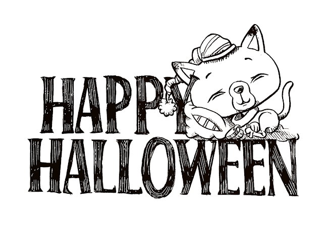
Inktober 2017 • day 31 • Scare D. Kattz (Happy Halloween and a farewell to Inktober 2017!)

Inktober 2017: Day31 • Scare D. Kattz sleeps
Ending the month-long Inktober challenge with a tired Scared D. Kattz. Definitely how I was feeling after so many children showing up at the door. Personally, I do not like how this image turned out. Did not finish Inktober on a high note in my opinion. Special thanks to Jake Parker for creating Inktober!!
RE: Halloween this year, so MANY Batgirl costumes!! Wonder why?

#Inktober Day 31: Halloween night, Inktober ends and Thank You Jake Parker!!!

Original Inked version, using a brush pen and a white gel pen for highlights

Monday, October 30, 2017

Inktober 2017 • day 30 • Scare D. Kattz's First Broom Ride

Inktober 2017: Day30
Scare D. Kattz's First Broom Ride

Added this little nod to the Harry Potter books/movies.


#Inktober Day 30: Nimbus 4000, much faster than the 2000 version.

Original Ink image

Sunday, October 29, 2017

Inktober 2017 • day 29 • Scare D. Kattz meets Skullbottom

Inktober 2017: Day29
Scare D. Kattz meets Skullbottom

Combining two characters I have drawn in the past. This time Scare D. meets Skullbottom, who was ironically named after he lost his entire body (and jawbone.)


#Inktober Day 29: Scare D. Kat meets the unfortunate Skullbottom

Saturday, October 28, 2017

Inktober 2017 • day 28 • Scare D. Kattz & The Witch's Hat

Inktober 2017: Day28
Scare D. Kattz & The Witch's Hat

I was getting kind comments from others online and email, so I decided to wrap this year's Inktober with Scare D. Kat images. 

#Inktober Day 28: Continuing the remaining Inktober days with images of Scare D. Kat

Friday, October 27, 2017

Inktober 2017 • day 27 • Scare D. Kat & Pumpkin Head

Inktober 2017: Day27
Scare D. Kat & Pumpkin Head


Heading to the end of Inktober, I thought I'd get a little more colorful in the final days. This one was drawn with a black brush pen and colored with Copic markers.


#Inktober Day 27: Bring back the kitten character I created several years ago.

(Side note: We actually had to use this sign for Halloween at around 9PM this year.)

Thursday, October 26, 2017

Inktober 2017 • day 26 • Trick or Treatin' Monster

Inktober 2017: Day26
Trick or Treatin' Monsta


I felt like doing a big goofy monster trick or treating on Halloween day.

I have to admit, I think a lot of this goofy walking stance (and definitely its feet) is inspired by Mad Magazine's Don Martin. Don Martin was the king of goofy drawing when I was a kid. It was Martin's cartoons, Sergio Aragonés randomly gutter placed doodles, and Antonio Prohías' Spy vs. Spy that were the must-read pages whenever I bought Mad Magazine.
#Inktober Day 26: Wrong Toes, the friendly neighborhood gremlin.

Wednesday, October 25, 2017

Inktober 2017 • day 25 • Little Vampire

Inktober 2017: Day25
Little Vampire

Did a similar version of this character for a trick or treat bag several years ago. I liked the pose and decided to add a top hat. I have always admired the idea of creating Tiny Monsters, this little guy would probably be the leader.
#Inktober Day 25: Happy little vampire excited for the approaching Halloween Day!


Tuesday, October 24, 2017

Inktober 2017 • day 24 • Zombie Hands

Inktober 2017: Day24
Zombie Hands


Nuff said.
#Inktober Day 24: Zombie hands reachin' for the sky!

Monday, October 23, 2017

Inktober 2017 • day 23 • Candy Corn Goblins

Inktober 2017: Day23
Candy Corn Goblins


The only thing that haunted me as a child was getting a bag of candy corn on Halloween. It has to be to most awful candy out there, far surpassing Easter Peeps and white chocolate. So it makes sense, something must be taking these triangular nightmares . . . Cause I certainly wasn't eating them!


#Inktober Day 29: Inspired by my sheer hatred of this novelty garbage candy. BLEH!

Original Ink image

Sunday, October 22, 2017

Inktober 2017 • day 22 • Morburt, the Mossman

Inktober 2017: Day22
Morburt, the Mossman


This character is one of the guardians of the Moss Fields. Not a real warrior; basically they try to look intimidating . . . But are often way too friendly to ever be in a fight.
#Inktober Day 22: Good Ol' mellow Morburt, the Mossman

#Inktober Day 22: The original inked image without the tones

Saturday, October 21, 2017

Inktober 2017 • day 21 • Scare D. Kattz

Inktober 2017: Day21
Scare D. Kattz

Bringing back an old character from several years ago . . . 
#Inktober Day 27: Scare D. Kattz in costume

Friday, October 20, 2017

Inktober 2017 • day 20 • Charli

Inktober 2017: Day20
Charli


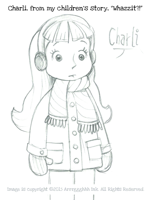
Today's Inktober breaks the pattern - because today is my wife's birthday. So, I inked a character from a children's story I wrote called, WHAZZIT. The character's name is Charli, loosely based on my wife as a little girl. I had a pencil sketch I created some time ago, but never inked that image until now.
Inktober Day 20: The inked version of Charli from WHAZZIT. (Happy Birthday, Babe!)

Original Pencil Sketch

Thursday, October 19, 2017

Inktober 2017 • day 19 • Ghost Doodles

Inktober 2017: Day19
Halloween Ghost Doodles

Today's Inktober is just a bunch of ghost doodles (with a pumpkin basket thrown in.)
I used a very soft pen brush, hence the more shaky, sketchy and varying lines.
Inktober Day 19: Various Ghost and pumpkin basket doodles

Wednesday, October 18, 2017

Inktober 2017 • day 18 • Teen Wolf

Inktober 2017: Day18Teen Wolf
This little guy was a concept design for a Trick or Treat bag. Basically, he's rising from the bag's base. I'll need to simplify this design because TOT bags are generally very graphic and iconic in today's market.

Inktober Day #18: Teen Wolf Surprise!

Tuesday, October 17, 2017

Inktober 2017 • day 17 • Go Fish! (Bunnies and Monstas)

Inktober 2017: Day17
Go Fish (Bunnies and Monstas)


Those who follow my artwork will probably recognize this image. I've been working on variations of this concept for quite some time. This is part of a calendar idea I've had for the last few years.
#Inktober Day 17: Yet another version of Go Fish from my Bunnies and Monstas collection

Character Designs for a Game: Part Four, The Minotaur

Here's the final design of the four characters I made for Steve Radabaugh's game, Dungeon Marauders: The Minotaur.
The final colored design of the Minotaur submitted for Dungeon Marauders
Of the four designs, the Minotaur was the one that needed the most changes. When I first did rough sketches, I was looking for the Minotaur to be different than the typical version we all know. So I made its face more beastly; like the main character from "Beauty and the Beast". And again, like the Ogre, I wanted to play around with a very top-heavy character with tiny legs. I sent the roughs to Steve for comments.

Quick concept pencil rough sketches of the Minotaur -- Trying to get a new look

This is where an outside critique really helps. As the designer who is constantly looking at the work, you sometimes lose focus and the perception of how others see your work. I didn't see what was wrong until Steve pointed it out. 

Tightened pencil sketch of the Minotaur which was off target . . . 

Steve felt that the sketch was off, especially around the face. While I was trying to be different, I was subconsciously omitting one of the most important features of a Minotaur . . . it's bull-like facial features.
 . . . The final pencil sketch with greatly improved Minotaur bullhead features!

Once the face was altered to be more bull-like . . . it seemed to all come together instantly. There was no question this was now a Minotaur!

The Minotaur design is seen with a drop shadow on a dark background
As Steve continues to develop his game, I hope to share his progress here with future posts about Dungeon Marauders.
Those interested can view the game's progress from his blog at 
www.radicalbomb.com
or look him up on Google+ at www.google.com/+SteveRadabaugh

Character Designs for a Game: Part Three, The Troll

Today's design is the Troll, which I have to admit is a complex creature because there are so many different versions in many world cultures. 
The full-color image on dark background with drop shadowing

Some are giants, while others are human size . . . Or they are long-haired, naked, googly-eyed imps as in the popular 70's dolls (which were re-popularized in the '90s.)
In D+D and fantasy games, they are often twice human size, slow-witted and regenerating menaces. Or, as in my Mother-in-Law's Icelandic traditions, they are 13 dwarf-looking brothers, who each take turns invading homes on the 13 days of Christmas. Some of the most annoying Trolls . . . are Internet Trolls. 

The many types of Trolls throughout the world
Some live under bridges, others live in the mountains, or as in World of Warcraft they are a dispersed race that has reggae accents. Some even turn into stone because they see sunlight.

But generally, there's one thing in common: they are ugly creatures.

Since this Troll is a role-playing game, I naturally had to focus on creating a more classic D+D gaming version . . . but keep it unique and original from all the others.
A few rough pencils sketches, which help me to explore, finding some unique (but recognizable) character features.
It was also important to keep this character different enough from the other 3 characters I was making for the game. As I previously mentioned, several of these creatures are interchangeable, where you may think a Troll might look more like an Ogre, Giant, or Orc than a Troll. Hopefully, with the main character features, props, and coloring, each of these designs will generally represent their legendary gaming creature.
The original pencil sketch of the Troll
Once I had the design cleaned and tightened, I decided to make a few color comps for the Troll's coloring using markers. The Troll was the only design of the four that I did a marker comp; I wanted to see how the coloring would affect the character. I gave Steve four color options, and again, he picked the same one I preferred . . . The yellow-green version.
Quick color comps I did with markers. Only one image was rendered on paper; then that was scanned into Photoshop, where the hues of the skin/hair were altered to create 3 more variations of color.

To help suggest the Troll's massive size, I gave him a heavy wooden club the size of a tree trunk.
The inked version of the Troll with his tree trunk sized club

 I still feel this character could easily play the part of an Orc, Ogre or Giant . . . But when comparing this to the other designs - hopefully, the traits of a Troll will be more apparent.

Character Designs for a Game: Part Two, The Ogre

Today's design is the Ogre, those big lazy bullies of the fantasy universe.
The full-color version of the Ogre on a dark background

I really wanted the Ogre to have a heavy-looking body -- yet make him appear strong and threatening. To add a little twist, I give him very tiny legs to hold that entire mass.

I think Ogres are better without too much gear, showing more flesh -- so I kept everything about this design very minimal. I focus on his body shape and bulkiness, giving him only a few shreds of clothing and an old battered sword that has seen better days. 

In the original sketch, sans sword, the Ogre appears taller.

The height was reduced to better fit the square area of the game card.
Just like the characters' sketches, I created several drawings of the weapons. These were then added to each of the character sketches in Photoshop. I find it easier to draw and design articles like this separately from the character. Designing items this way allows more focus to detail without having to worry about composition and balance.
The pencil sketches of weapons for each of the creatures
Also not wanting to make all the creatures in a tone of green, I gave Steve several color options for the Ogre. He picked the one I liked too . . . the flesh tone version. 
Take that Shrek . . . in your face!!

Several color options of the Ogre

Character Designs for a Game: Part One, The Goblin

Final image cleaned, slightly lightened and placed on transparent background

Awhile ago, during the holiday break, my friend Steve Radabaugh asked if I was interested in doing a few images for his upcoming Dungeon game. Since I've been trying to hone my work and do daily sketches of different characters each day - this was a perfect assignment. (Also, it's something I really enjoy doing - making monsters and creatures!) So over the weekends I started doodling to create some unique versions of classic creatures for his game.

Steve gave me a choice of many standard D+D creatures to pick from. I instantly wanted to do bulky and huge characters, since I thought I could have more fun giving them odd shapes and faces. I picked the Minotaur, Troll and Ogre. I also had to do the Goblin; just so many fun ways to draw these nasty little guys. 
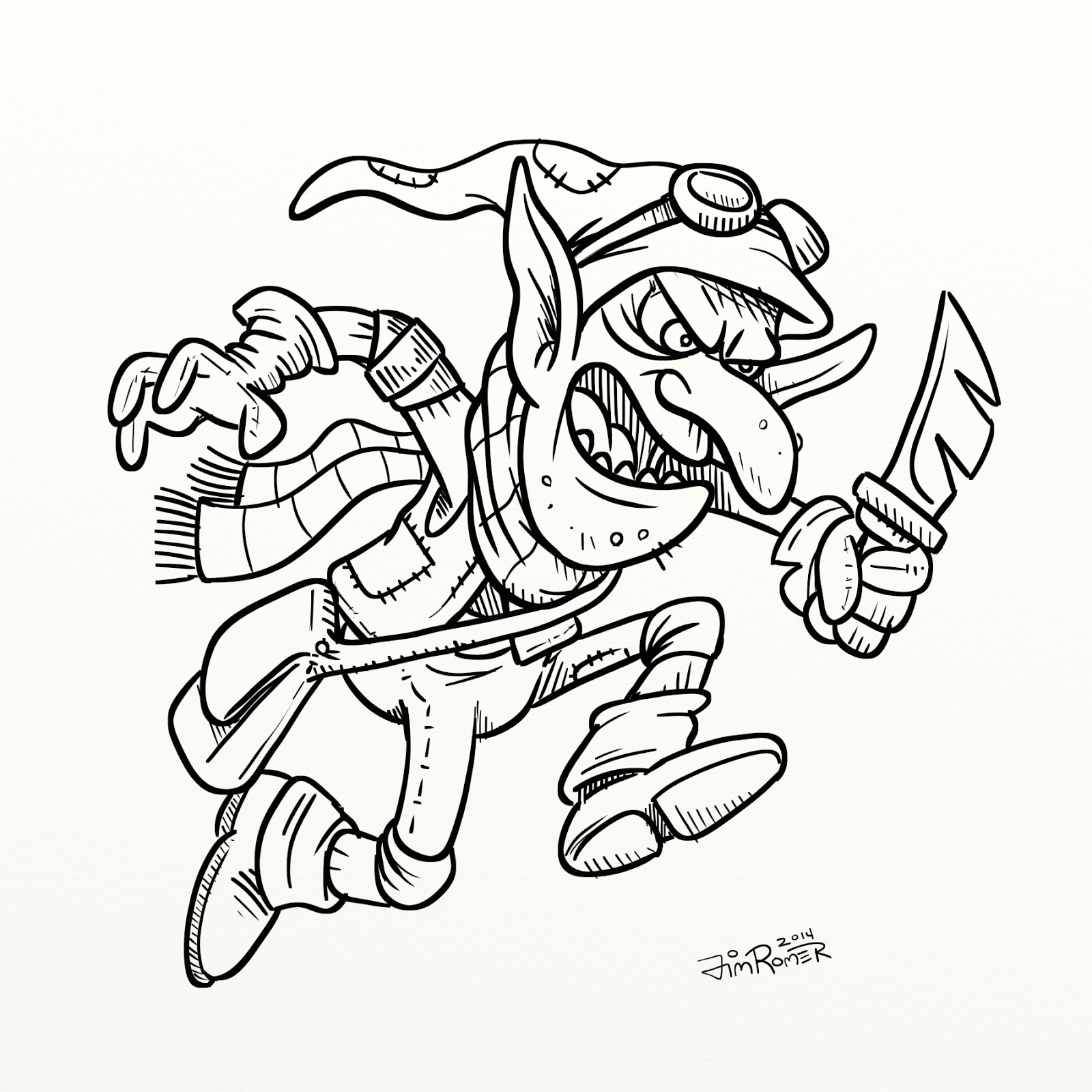
Original pencil sketch of the Goblin sans his weapon
The thing I find interesting about Ogres, Trolls and Goblins is that they are very similar in many ways and are all portrayed in many unique styles and looks. Yet, I don't think there is an absolute definitive look of a Goblin, Ogre or Troll. If you Google each, you'll find very similar looks crossing between the three - where some images it can be any one of the three.) So my first challenge was to define what each one was to me.
Inked version of the Goblin now seen with his weapon
The most obvious . . . there is a definite size difference between the three.
Also, Goblins tend to be smarter, Ogres not smart and Trolls tend to drool on everything.

Goblins seem to be more spry. They make, steal and use tools/gadgets.
So I thought my drawing of the goblin should seem more rogue-like.
Color version of the Goblin using a limited palette of colors for a more graphic look

I'll be posting more of this work during the week, showing each of the four characters.
Tomorrow, part two: The Ogre


Monday, October 16, 2017

Inktober 2017 • day 16 • Minya (aka Godzilla Jr.)

Inktober 2017: Day16
Minya (aka Baby Godzilla or Godzilla Jr.)

I always thought Minya was a strange looking monster. He had to be one of the worst creatures made in the early Godzilla movies. But with this character's introduction came so many questions about Godzilla. Was Godzilla the father or mother? Did Godzilla have a mate? Were there other children?
But the strangest thing about the character was its weapon: the smoke rings. They hardly seemed to do any damage at all. Seemed more annoying than harmful. Makes one wonder how he learned to make smoke rings, right?
#Inktober Day 16: Minya practicing how to make smoke rings

Sunday, October 15, 2017

Inktober 2017 • day 15 • Were-Cow

Inktober 2017:
Day15 Were-Cow


This cow survived a werewolf attack; As soon as it was bitten, the werewolf realized he was a vegan. I'd imagine the horrible milk this cow would produce since it's diet is probably no longer vegan. It would be close to blood pudding I bet. Oh, and good luck milking this cow.
#Inktober Day 15: Scanned version of the Were-Cow ink drawing.
Side Note: After scanning, I altered the placement of the lettering from above and set it below the character instead. Better this way, IMHO.