Tuesday, May 13, 2014

Doodle: Lyon

Here's another doodle of something I made while trying to think of designs for pet toys.
Again . . . a doodle to me is when I simply sketch without any forethought or plan to what I am drawing. Sometimes the final results surprises even me.
A doodle of a lion made with a #2 pencil
This character looks like I was starting to draw my dog character, Roger, (from my comic strip, "Home of the Brave" and children's book "Bobby's Biggest Bubble".) It definitely has Roger's face -- but then with more doodling, the character turns into a vagabond looking lion.

Why a lion?

Why worn out clothing?
No idea . . .

Friday, May 9, 2014

Doodle: Perched Owl

Another Doodle posting. I had a couple of people write me saying they enjoy seeing the unpolished designs. So I'll probably start adding more Doodles along with the Daily Sketches and Illustrated Friday images I try to post here each week.


This one turned out to be an owl perched on a branch.
Again, my doodles are very sketchy drawings I do without any plan or reason. The pen line just wanders until an image is formed. Generally these are made in several minutes.

I'm posting these on the blog because I have no time to submit finalized colored images this week (due to a heavy workload.) I'll be posting several more to keep the blog updated with new content.

Doodle: Korky

I find sometimes I just start doodling, with no plan or idea what I'm going to draw. It's almost like being in a state of meditation. So what starts as a few scribbles and lines, slowly starts to form into something unexpected. This was the case for this doodle below.

Sketch of my character Korky -- drawn with a ballpoint pen on the back of my 2013 tax forms
I've many doodles laying around, I'm thinking I'll throw a few up on the blog whenever my workload gets too hectic (like this week.) This way, it may not be my best work, but at least there'll be something new on the blog to look at.

Monday, May 5, 2014

Daily Quick Sketch: Thor

Had this sketch laying around for quite some time now. I believe it was initially drawn shortly after we saw the second Thor movie.

Fan Art: Thor in mid-float, colored digitally with Photoshop and ArtRage Pro

I went retro with the costume since it's the Thor costume I grew up seeing. I like the newer look of Thor's chain-mail textured suit seen in today's Marvel comics . . . But the classic Kirby style is the iconic look I prefer drawing. Probably because it is so "comic book."  If you were to wear such bright colors in real life, it would seem quite campy.

The original pencil sketch of classic Thor

While the modern style of superhero costumes tends to be more movie-like with realistic qualities, I feel the characters lose some of their iconic presence.  Every artist seems to take more liberties with how superheroes look today, which is a good and bad thing. (Look at Iron Man, he appears in so many difference suits - what is his traditional iconic look of today?)

Going slightly off topic: An example of comparing when a new costume design works for me and when it doesn't
(Images of Superman are the property of DC Comics)


Another good example is how Superman looked when DC's launch it's reboot with the New 52: Superman wore jeans, a t-shirt, and his cape. It was very enjoyable seeing him look more like an ordinary person. Then, several months later, DC's New 52 decided to make Superman's suit look like armor. He's Superman . . . Why does he need armor? DC's New 52 seemed like they were on the right track . . . But then they did a complete 180 and made his costume worse by adding the metallic armor style.

I'd rather see Superman go through 200 t-shirts and jeans a week, where every fight looks like he was in a battle. I never liked the idea that Superman would come out of a major battle without a single thread of this costume being torn or damaged.

Thursday, May 1, 2014

Daily Quick Sketch: Prof. Vormit

UPDATE:
It worked out that this sketch fits perfectly with Illustration Friday's word of the week: REVENGE. So I digitally colored the original sketch and submitted this to the I.F. website.

Illustration Friday: 
Every Friday a word is given on the website, 
IllustrationFriday.com. Artists and illustrators then submit an image that represents that word all during the week.


Digitally colored and added a dark background, helps emphasize the glow of the fizzy drink test tube

THOUGHT PROCESS:
Well, immediately, I thought of this character, and how I could use this sketch to emphasize "evil" . . . even though this character would actually be the kindest person on the planet, having just invent a great tasting and healthy fizzle drink for children.


The first version of this image: Digitally colored in Photoshop using various water color and texture brushes
Image felt too flat  . . . needed more depth and darkness

This sketch was inspired by a character concept I thought about for a story.
The idea is simple - create a character who appears to be vile, corrupt and evil -- but make him really be the kindest, most generous and caring person possible. I could see many uses for such a character, mostly for the humor, but also as a children's book character who can teach life lessons about prejudging others.


Original Pencil Sketch: Prof. Vormit excited about creating his great tasting health drink for children
The first thing that came to mind was the image of an evil scientist. It's such a strong stereo type, especially in cartoons. I gave him a hideous beastly face, with a bell-shaped figure and of course the mandatory evil looking goggle glasses. To counter his evil persona: He's always smiling, has lollipops in his lab coat pocket (gives them out to everyone he meets) and he's created the best tasting fizzle water soft drink that's healthy for children.

Once I finished the sketch, his name came to me instantly.
Prof. Vormit 
(a combination of varmint and vomit. I dropped the second T in his name, it just looks better.)

He's such a nice guy . . . really. . . 

Wednesday, April 30, 2014

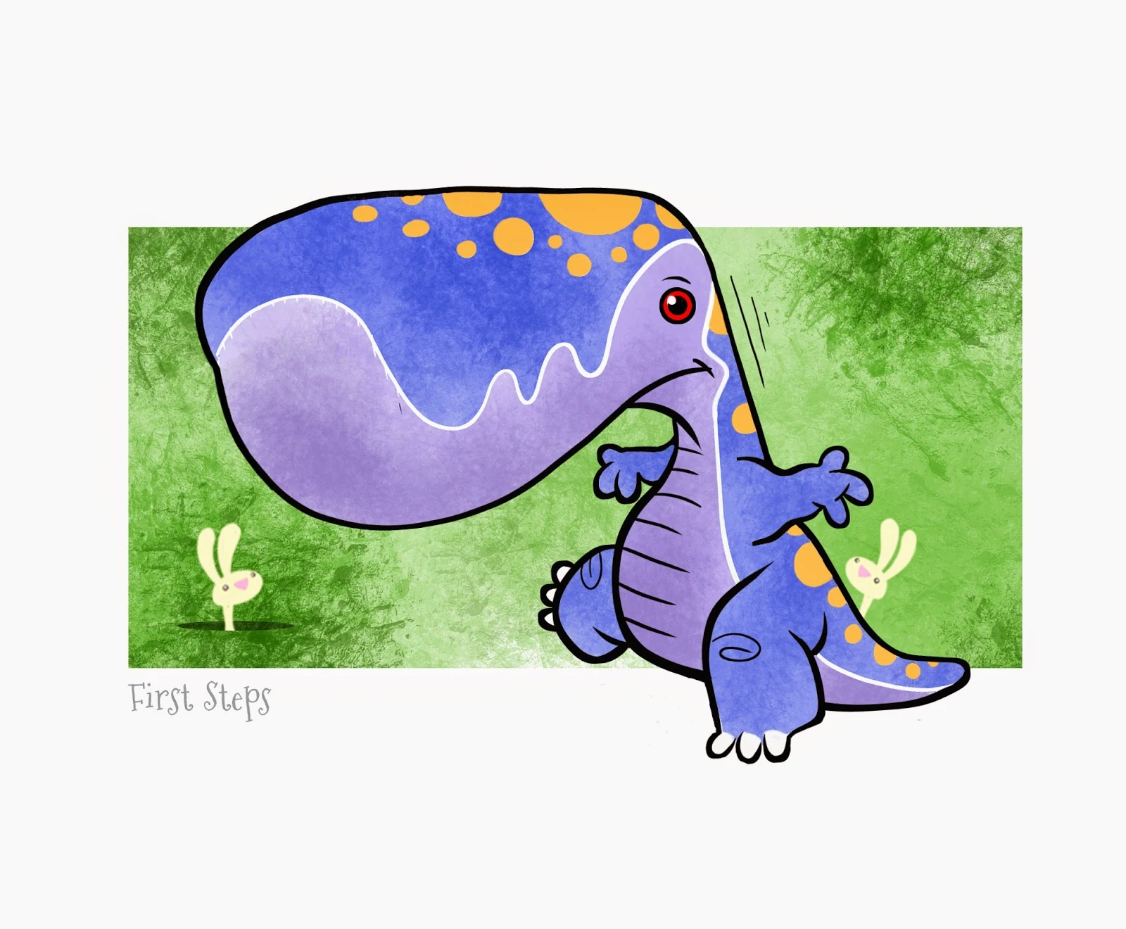
Monsters and Bunnies: First Steps

So for some time now, I've been sketching monsters with bunnies. There something about it that seems interesting to me.  Maybe it seeing the combination of the two "species" together -- how any monster seems to be cuter when in the presence of bunnies. (Go on try it, take the worst monster/killer/evil being and surround it with bunnies. Even if it's covered with blood - the bunnies make it cuter.)
"First Steps" • Part of a 6 image series of monsters with bunnies
This image was inked and colored using RagePro 4
Now, I'm not trying to create grime images, my cartooning style doesn't work like that. Plus, I believe there is a New Mom/Teen/College market for this style of images -- so of course I'm trying to make the monsters very cute even without the bunnies. 
Add those bunnies and the image just ups the cuteness level. 

Original pencils sketch of the baby dinosaur/monster
I plan to make a series of images/prints to sell. It'll take time for me to figure out pricing, material and how to best package. (I may want to soften the artwork and eliminate the black holding line too.)

I'll try to keep this projects's progress up to date here on the blog.


UPDATE:Illustration Friday: Every Friday a word is given on the website, IllustrationFriday.com. Artists and illustrators then submit an image that represents that word all during the week.This week's word: Vanity

Revamped version of "First Step" to "Vanitisaurus" for Illustration Friday's word "Vanity"
For this week's Illustration Friday, I made a variation of the image to work with the word: Vanity.


Thursday, April 24, 2014

Daily Quick Sketch: Space Mook (Updated)

This is two versions of a marker sketch of a character I call Space Mook. He's like a cross between an ape and a bear -- sporting a fancy mullet and rocket pack (which is really a guided missile.) He's one of many bounty hunters from my old sci-fi story called "Krem"

Marker sketch of Space Mook: A galactic bounty hunter, from my sci-ci story KREM
Krem was a huge story I worked on over many years. It started when I woke up from a very bad fever and found the Krem character next to my bed. Looking at the drawing, I started to imagine his back story, (which grew and grew over the years.)

Adding a simple background behind the character 

I hope to find more of Krem's supporting characters in my archive boxes of artwork and show them here in the future.

Original pencil sketch of Space Mook


UPDATE:
Forgot I did this, here's the very first rough sketch of Space Mook. So of the shoulder patch logo sketches are included. He he seems mostly ape-like. I do like the retro glass helmet, think I should add that back. 
Funny seeing this now, I feel I want his character to look more like this -- than what I developed over time.
I will revamp him again and in digital coloring (not markers) next time.


The very first rough sketch of Space Mook

Monday, April 21, 2014

Daily Quick Sketch: Sword Fightin'

Been a long time since I posted something here. Work is getting stressful and I'm having a very hard time getting the work done lately. It's probably a combination of burn out and simply doing seasonal concepts over and over again. The market is still in recession, and no one is risking on ordering anything remotely new or different. This makes it hard to do postings here, since my creativity for this type of work usually comes from less stressful times. But enough with my belly aching . . . 

The revamp version of  an old pencil sketch I call "Sword Fighin'!"
This is a revamped version of a very old sketch I did of Timmons, L.B. and Hairy. Back when I worked in New York City, I would often sketch my characters while commuting on the train to/from work. It was a nice way to practice fleshing out and fine tuning my characters.

The original sketch with all it's gritty and fading pencil lines

I hope to one day compile all of the trial and error it took to create Lumpy Bumpy to what he looks like today. (FYI: He's the big alien dinosaur laying down in the background.) L.B. is totally different from then when he was first conceptualized many, many years ago.

I also hope to start posting more images here on the blog again.
I can probably handle posting pencil sketches, but coloring images is too time consuming at this point. Hopefully things will slow down in the upcoming months and most posts here will be back on track.

Wednesday, March 12, 2014

Daily Quick Sketch: Bunny

Been extremely busy these past two weeks with work. Gearing up now to start designing for Easter. I drew this bunny a few weeks ago, trying to make a simple generic rabbit. 
Inked version of generic bunny sketch
Then, I made the mistake of re-drawing on a sketch pad with markers without testing the paper first. I saw the ink was starting to spread, but thought I could control it. Then the ink kept spreading . . . and spreading . . . until I wound up with this.

Muddy version of a failed attempt to use markers on paper that absorbs ink like a napkin
Arrrggghhh!
So, I went back to coloring this bunny digitally instead. Can''t go wrong with good old digital color. (Actually, I take that back -- you can go wrong with digital, especially if you lose power.)

Simple and clean digital coloring -- ala Photoshop


Friday, March 7, 2014

Daily Quick Sketch: Lil' Lumpy

I've been trying to get my office organized and in doing so - I keep finding old sketches long forgotten. Most are not worth remembering. Many are just scribbles or half drawn characters. But a few are worth bringing back to revamp or update. This image is one of those scribbles that I feel needs more attention.


Lil' Lumpy drawn with digital inking and color pencil crosshatching using ArtRage Pro 4.0.6

Lumpy is one of my oldest children's book characters from a story over 15 years ago. The story's characters were fleshed out over years of redrawing and tweaking. Today, Lumpy looks totally different then what I had originally created so many years ago. I think what happens is subconscious editing, where the focus on what works is emphasized; while eliminating or changing the parts of a character that don't work.

Lumpy's story is part of a 10 book series I plotted out years ago.
I always felt that the story's characters would do very well with the children's book market. But for me to create the series, I would need a good publishing house to support it. I always felt I needed to do other stories first before bringing this character up to the plate . . .


The original rough pencil sketch of Lil' Lumpy recently found among a stack of papers

At least, that was my thinking for last decade and a half. Now publishing has changed drastically. Publishing a book is now the "easy" part - it's the marketing that will exhaust a new writer.

I've not found the answer to getting noticed yet. It's still a mystery why some succeed -- while others fumble. Perhaps it's all about who you know. Or it's just luck. Either way, I'm looking forward to seeing if I can finally discover the answer.

Sunday, February 23, 2014

Illustration Friday: SPACE

Illustration Friday: Every Friday a word is given on the website, IllustrationFriday.com. Artists and illustrators then submit an image that represents that word all during the week.
This week's word: SPACE

SPOILER ALERT: The big climatic ending to my first children's book: Bobby's Biggest Bubble
Thought Process:
A no-brainer this week.

Space makes me think of the space scene I drew for the climatic ending of my first children's book: Bobby's Biggest Bubble. Of all the terrific comments and kind emails I have received about the book -- this 2-page spread was usually the fan favorite, especially for boys.


I like to think it's the coloring that made this page "pop" . . .
Knowing the amount of pink bubblegum coloring the pages would have, I boosted the night sky's blues and even made the meteor a brighter blue to counter the pink; balancing the warm coloring on the left with the cool coloring on the right. 


This page was the greatest challenge I had when making the book. It was the part of the story I worried about the most. Even though this 2-page spread was near the end of the book, other then the cover, it was the first page I completed with full color.
Once I had this part of the story behind me, the rest of the book fell into place.


You can see more about this comic strip at this link here and more recently here.

Home of the Brave: Knock Knock

Back in the early 90's, a good friend of our family started a health newspaper which was circulated all over the state at health spas and gyms. She approached me looking for a comic strip to fill their entertainment section. I mentioned I had already had a comic strip printed in a nationwide fanzine for over two years . . . she could reprint those strips at no cost. She was very interested, but questioned if it was related to health or sports in anyway. It wasn't . . . 
An example of Home of the Brave as it appeared in "The Spa Times"
So I revamped the comic strip; changed the story so that Ollie wanted to be a Super Health Officer instead of a Super Crime Fighter. But I still used many of the old images, sketches and jokes, adjusting them to work better with a general health theme. The strip became more polished looking and I got away from using too much black in every panel. 

To see other posts about this comic strip, click the keyword "Comic Strip" below in the labels sections.

Daily Quick Sketch: Rex-9

This was a test sketch, where I'm trying to develop more robotic features.

The inspiration for this character would have to be based on Alan Moore's Halo Jones series, which ran in England's "2000 AD" comic and was illustrated by Ian Gibson. In the story, there is a K-9 robot companion to Halo named, Toby. Somewhere down the line, this friendly robot dog turns out to be a derange murdering killing machine.


A gritty digital coloring of the Rex-9 pencil sketch

While I have no intentions to use this robot dog as a killer in a story, the character Toby kept popping in my mind and influenced the final look. The difference here is that Rex-9 is not really a trusting looking robot . . . I would never trust this puppy bot the way Toby was trusted in the Halo Jones story.


Pencil sketch of robot dog, Rex-9

I need to focus more on actually constructing the parts of a robot. Those who draw robots well, show the working anatomy of robotics in a way that is easily understood. While I'm sure this image can be recognized as a robot dog -- I still have a way to go with developing better robotic features and components.

Saturday, February 22, 2014

Home of the Brave: Vigilance strip found

This weekend, my office is getting a much needed cleaning. Since we have outgrown our home, it is nearly impossible to organize where to place items. So I have my work, sketches and documents everywhere. It's time to purge! But that's not easy since I don't want to throw out anything "valuable" without checking first. 

The strip shown below is a good example that I need to check everything before I throw stuff away.I was ready to toss out a box filled with of old work paycheck stubs, documents and other various paperwork, but decided to go through it -- just in case. Good thing too, for this was one of my earliest comic strips from "Home of the Brave."
Some very old artwork of my comic strip "Home of the Brave" that was lost . . . but now found.

Not sure what number strip this was in the series; the pencil markings of the strip # and date on the back are completely worn off. But based on my memory of the story, this should be somewhere around the 10th, 11th or 12th strip made for the "Home of the Brave" series.

You can see more about this comic strip at this link here.


Interesting side-note:
At the time of this strip, the late 80's, the word "Super Hero" was legally owned by DC and Marvel comics. Here's a quote from Wiki:
"While the word "superhero" itself dates to at least 1917, the term "Super Heroes" is a typography-independent 'descriptive' USA trademark which is co-owned by DC Comics and Marvel Characters, Inc."
I believe this is still true and active today. I also find it troubling that both companies can do this, claiming ownership to a popular phrase that neither companies created.
Yet, because they made the most popular super heroes, they are given TM ownership of the term "Super Heroes".

Because of this, I had to change my family of dysfunctional "super heroes" into "crime fighting heroes". The words crime-fighting and crime-fighter were frequently used in my strip . . . reluctantly. 

Friday, February 21, 2014

Daily Quick Sketch: Hellboy (Update)

Very busy week, so there wasn't much time for sketching. I squeezed in this Hellboy pencil sketch before heading to bed. I did this character as a part of the Google+ grouping CBC Artists' Alley - where the theme of the week was the BPRD group (of which Hellboy is a member.)

UPDATE: Added colored version see below

Digitally under color of the pencil line sketch of Hellboy 

Original pencil sketch of Hellboy, 2b pencil on Sketchbook paper