Saturday, March 28, 2015

Daily Quick Sketch: Dinosaur on Toned Tan Paper

I've been trying to get back into the physical drawing and painting world, having been digitally illustrating most of my work for the past two decades. I like how it forces me to change my style and technique, but I also hate when things go wrong. There something assuring and refreshing when a simple keystroke can erase any mistake instantly; but in the non-digital world, a simple mistake can ruin the entire image.

Dinosaur character created on Toned Tan paper, using pencil, ink and a white Gelly Roll pen.

I always enjoy seeing images on toned paper. Usually created with charcoals or pencils with white accents that make the images pop. For this image, I lightly pencil sketched the character first, then colored with a blue color pencil. For an added effect, I tried to maintain a horizontal stroke whenever coloring.

The dino image was made using only old school materials: india ink, pencils and a good ol' white Gelly Roll pen

Next, using a white Gelly Roll Pen, I created white horizontal lines for the light areas and highlights; finishing with the black outlines with a fountain pen filled with india ink.

Friday, March 13, 2015

Illustration Friday: STRONG

Illustration Friday: Every Friday a word is given on the website, IllustrationFriday.com. Artists and illustrators then submit an image that represents that word all during the week.
This week's word: STRONG


This week's word was easy, because:
HULK IS THE STRONGEST ONE THERE IS!
So many mysteries about the purple Hulk pants . . .

Thursday, March 12, 2015

Daily Quick Sketch: Using Watercolor Pencils + Water Pen

I bought a water brush some time ago and I haven't really had the chance to use it. I keep thinking I want to physically paint artwork so that I actually have . . . physical artwork. But, I'm so used to working digital, that it makes it very hard for me to get back into doing the physical artwork.

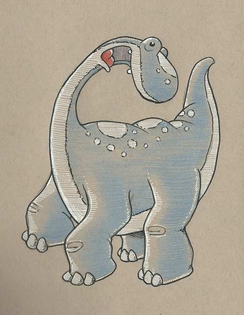
Run, Bladimir, Run! Get away from those watercolors!
My first attempt at using water color pencils and a water brush on watercolor paper . . . looking muddy

Basically my biggest problem is this . . . the physical world doesn't allow you to make mistakes. Nor does it allow quick experimenting or provide quick alternatives the way digital does. To me, the look of watercolors just screams "picture book". Its just one of the best mediums for creating images for children. Yet, I find physically painting with watercolors so stressful, frustrating and chaotic. Colors fade or bleed into each other. The paper wraps. Colors look different once dry. Etc, etc, etc.


Water Brush: a brush tipped pen that can be filled with water to help blend and control watercolors 

So, in my humble attempt to control watercolors better, I decided to try using watercolor pencils with a water brush. The pencils offer me the most control, since pencils are what I feel most comfortable using. The water brush allows me to add water where I want and it allows me to blend the water color pencils with ease. (The only real issue I have with the water brush is that sometimes dries a little while using it, which doesn't allow the water to flow out as much as I would like.)

Overall: The image above turned out too dark and muddy for my taste. Adding the ink lines didn't help the image either, since they overpowered the subtle colors of the watercolor pencils. I also believe the watercolor paper I was using was too rough.

I'll try to do several more tests and see if I can improve.
And if that doesn't work . . . there's always the option to going back to digital watercolors.

Wednesday, March 11, 2015

Illustration Friday: PATH (was SEARCH)

Illustration Friday: Every Friday a word is given on the website, IllustrationFriday.com. Artists and illustrators then submit an image that represents that word all during the week.
This week's word: Search

Illustration Friday pencil and digital coloring image for the word of the week: SEARCH

Thought Process:
First thought was a magnifying glass -- it's the search icon of the tech world. This meant I probably would need a character using a magnifying glass.

The first sketch of the character before the Illustration Friday idea . . . 
I had just sketched a little penguin recently and thought he'd be a great for this week's image. His goofy look and stance instantly made me think of the old cartoon cliché of a "detective" walking around in circles.

The pencil sketch with character revisions; made using a HB pencil on Canson marker paper

Friday, March 6, 2015

UPDATE! Character Development: Witch Nazel Color Style

UPDATE: I've been going back to my picture book concepts lately and decided to revamp another of my characters, Witch Nazel from my story "Worm Wire Glasses". It's been over two years since I originally posted about this character. 


Fine tuning and testing the pencil/oil brushes with an old favorite: Witch Nazel from my story "Worm Wire Glasses"

Originally, this story was to going to be an eBook, since making an eBook was way more cost efficient than printing another hard cover. But as I started talking to others self publishers at meet-the-author gatherings, libraries and art festivals - I was finding out that the e-book market wasn't really that great.

The biggest problem I felt was that I wouldn't have anything physical to promote anymore. Which makes going to school readings, meet-the-authors and art festivals pretty much worthless -- (unless I could get people to go directly online and purchase my book right at that moment. It's just not realistic.)  Plus, children still want real books.


So, I'm back submitting the old way. Hoping that the one right person in publishing will read my stories.


Below is the the original post from 2/4/2013:


I'm testing out working in a slightly different style for the Bladimir Blarfarg and the Worm Wire Glasses eBook. I'm enjoying using the pen +
 ink style, but I want a different look for the eBook. I feel my work gets too clean and stiff - I want to try and become more loose with my strokes, not worry about being 100% in the lines. I also want to stop wasting hours of correcting the holding lines . . . I want it to look more sketched.


Below is a quick color sketch of Witch Nazel. The overall look in generally there - but I need to turn down the color vibrancy a bit and get the colors to have more of an equal balance. 


I don't think I like the green skin, it's too much . . . GREEN.  Thinking of either going more pale ashy skin -- or just bring it to a more reasonable, normal flesh tone. Orange/Red hair I think will be a better solution too.
The black articles of clothing need to be darker, but not so much to over power the highlights of color.

Note to Self: all of the holding lines' coloring will need to be adjusted, the purple outline is far to harsh and the green outline seems a bit too dark.