First Step: The pencil sketch
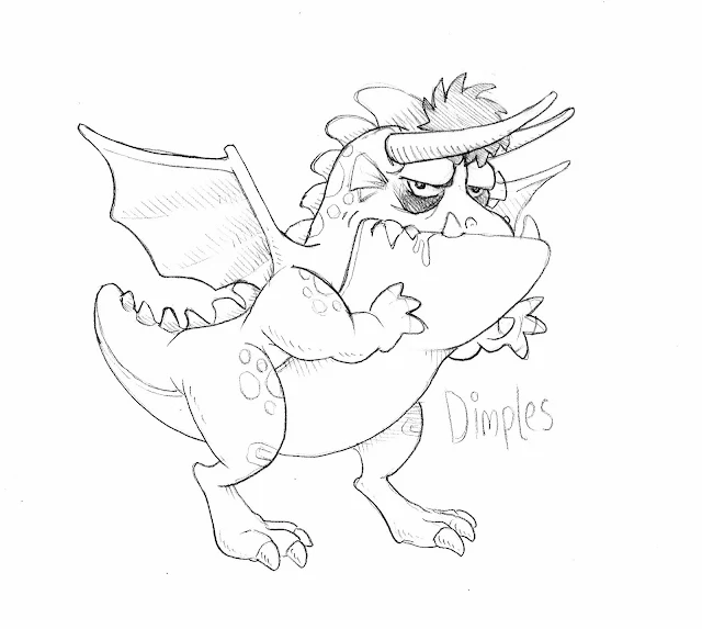
Starting with a pencil sketch, I scan it into the computer at usually 200 dpi or higher. It's important that your images are at least 200 dpi in case you ever want to go print. Once the image is scanned into Photoshop, I use "Level" settings (CTRL+L on a PC) and adjust the image to clean up any smudges or erased lines that may appear. This also can darken the sketch lines, which is important for the final look.
Starting with a pencil sketch, I scan it into the computer at usually 200 dpi or higher. It's important that your images are at least 200 dpi in case you ever want to go print. Once the image is scanned into Photoshop, I use "Level" settings (CTRL+L on a PC) and adjust the image to clean up any smudges or erased lines that may appear. This also can darken the sketch lines, which is important for the final look.
 |
| Original sketch using a pencil, which I find to be the most adjustable and comfortable way for me to create |
Second Step: The Color Marker Comp
Once the scan of the sketch is cleaned up, I print out a page to use as a guide for the marker comp. The reason I do this is to not ruin the original sketch, because the markers for the color comp will probably soak through the sheet and ruin the image below.
For this color comp, I will be using Bienfang 100% Rag Translucent Marker Paper because it is a great smooth surface that allows alcohol markers to spread evenly. It's also thin and light -- but still strong and durable, so the paper won't rip if you erase too hard or go over an area multiple times with a marker. Another reason for this brand of paper is that it is also transparent, like tracing paper, which is very important.
 |
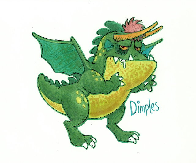
| A color comp of the the sketch, filling in all the color without any black holding lines |
I take the print of my sketch and place it under a sheet of the marker paper. This will now allow me to color-trace the sketch. I color the entire image without drawing any holding line or outlines. Once the inner areas are colored, I select a darker color marker (in this case green) and outline the entire image. For final touches, I add shading textures to the skin, wings and belly area.
When the comp is finished, I scan it EXACTLY with the same settings as the sketch. This way they are the same size and should easily combine together.
When the comp is finished, I scan it EXACTLY with the same settings as the sketch. This way they are the same size and should easily combine together.
Step Three: Combining the two together
I now have the two drawings scanned into Photoshop. I copy and paste the sketch image over the color comp image. [Note: The sketch image layer MUST be over the background color comp image.] Select the upper sketch layer, then change it to "Multiply" in the Layers settings. Doing this allows all the white areas to become transparent leaving only the sketch lines.
 |
| The 2 images combined: a nice effect with some color bleeding that creates a slight aura around the character |
You should now see the two layers combined together, but you will probably need to rotate the top sketch layer for it to align with the color below. To rotate the sketch layer, select the "Move" tool (shortcut "V" key in Photoshop) and click on the sketch layer. If "Shown Transfom Controls" is select in the top menu bar, you should see the movement handles appear around the sketch. From there, go to any corner and click when you see your mouse icon change to a rotate icon - then simply adjust the sketch to fit the color below.
So there you have it, two hand drawn images of the same character, scanned and combined in Photoshop. It creates a nice effect AND allows many alterations and adjustments in Photoshop. It's now very easy to add a background under the character; or change the colors to something completely different.