Saturday, December 23, 2023

My Top 10 AI Images of 2023 - - - - - - - - - - - #2 Willie Wonka Kaboom

I've been working on this kid's book draft for years now; directly inspired by Roald Dahl's "Charlie and the Chocolate Factory", and the original classic movie with Gene Wilder as the titular character. I tried making some Wonka images. The final result was way cooler than I thought it'd be. 

Yes, the candy parts are a bit vague, but the whole 'candy explosion' was great. I do wish I could've thrown in some floating Wonka bars, but AI's still iffy with logos and fonts and placement of items.

Something has gone terribly wrong with Wonka’s candy factory.

At first, the images generated weren’t looking like the Gene Wilder Wonka I wanted. Many weren’t truly Wilder-like at all. These images were mimicking Wilder’s features, with nothing relative to the character. Anyone who uses AI knows, it takes time, patience, and a bit o’ luck to get the images you hope to generate. So I had to learn how to keep building up details, eliminating what wasn’t working and adding to the description what was missing.

Here are a few of the original terrible results . . . 

1st attempt was so bad and dreary - especially in grayscale. (What’s the blue container in front for???)

This one was so manic; Wonka looks as though he could kill, (or maybe he already hid the body?)

Again with the grayscale, feeling like a depression era image, with a heavier Gene Wilder

Thursday, December 21, 2023

My first AI Image (Precursor to My Top 10 AI 2023 list)

It's been less than a year since I began exploring AI-generated imagery. My journey started when I joined MidJourney on February 16. For my initial attempt, I asked my wife for an actor and character combo; she suggested Ryan Gosling as Mr. Rochester from "Jane Eyre." The result was my first MidJourney creation.

My first generated image with MidJourney

A half-minute later, several images following the prompt description appeared. Everything I knew about creating and sourcing inspiration was about to change. In the following weeks, Midjourney would upgrade to version 5.0, drastically altering the level of image detail. I absorbed as much information about AI I could find, and started seeing ways to use it as a major tool for my work as a Product Designer. 

Eventually, I added Leonardo.ai and ChatGPT to my roster a month later, along with many other free AI services. and tools. Improvements, methods and tools were popping up every week. 

But enough history, let’s begin the 2023 list . . . head to the next post!

Wednesday, December 20, 2023

Santa Design 2023 (AKA Is Adobe Fresco good?)

Merry Christmas! . . . and a Happy New Year!

Santa character for 2023

Every year, I draw a Santa (or a few). This is my personal annual challenge: to draw Santa differently each year, never repeating the drawings from any previous year.

This year, I created a Santa for the first time using Fresco, Adobe's competitor to Procreate on the iPad. Like Procreate, Fresco boasts an ideal interface and excellent control over drawing lines with a stylus like Apple's Magic Pencil, or on a Wacom screen. Note: Unlike Procreate, which is currently only available on iPad, most Adobe products, including Fresco, are available on all platforms, including Windows.

I would almost say my line control feels even better with Fresco. Depending on the smoothness settings, Procreate can sometimes alter a line's path, especially near the end of a brush stroke when lifting off the tablet.

The best thing about Fresco, to me, is that you can paint and draw in Vector mode. This means you can freely resize your drawing to any size without losing detail or bitmap blocking; all lines stay smooth. It's well worth a look, especially for any t-shirt designers or poster printers out there. I may find myself weaning off Procreate due to this excellent program... (Check here next year to see which program I use for 2024's Santa!)

Tuesday, October 24, 2023

Dynamic and Explosive AI Character Developing

- - - - UPDATE - - - - (Posted on: Tuesday, October 25, 2023)

I meant to show the explosive level of creating a character with powers.
I truly lucked out on this image; so powerful and filled with emotion. I do feel like this image used some reference to Jean Grey of the X-men, the outfit and long red hair seem to echo that character throughout the image. For those interested, here is the prompt and settings use:

Using Leonardo.ai • Dimensions:744px x 1320px • Resonance:15 • Contrast Boost:0.5 • PhotoReal:On • Alchemy:On • Preset:Cinematic • Raw:On • Field of Depth:Low • Seed:963356160

Prompt: A Photograph capturing a woman's explosive fury in a comic book style. Show her intense anger radiating from her body as energy bolts crackle around her, her eyes ablaze with fiery rage. Use dynamic lines, bold colors, and exaggerated facial expressions to convey the intensity of her wrath.

- - - - UPDATE - - - - (Posted on: Tuesday, October 24, 2023)
Finally, after several attempts, I was able to generate the image I wanted. The image depicts a female character with deadly psionic daggers, glowing green eyes, and short red hair. She wields her daggers with precision and skill. Creating an image can be a time-consuming and challenging process, but with patience and perseverance, you can achieve your desired outcome.
Below are some tips that may help you in your creative journey:
• Set a clear goal: Before you start creating, it’s important to have a clear idea of what you want to achieve. This will help you stay focused and motivated throughout the process.
• Experiment with different techniques: Don’t be afraid to try new things! Experimenting with different techniques can help you discover new ways of creating and lead to unexpected results.
• Take breaks: Creating can be mentally exhausting, so it’s important to take breaks when you need them. This will help you stay refreshed and avoid burnout.
• Stay positive: Creating can be frustrating at times, but it’s important to stay positive and keep pushing forward. Remember that every mistake is an opportunity to learn and grow.
- - - - Original Post - - - - (Posted on: Monday, October 23, 2023)
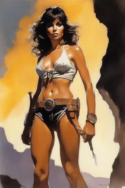
My favorite genre of video games is strategy, which includes card games, puzzles, and role-playing games. Recently, I have been playing some role-playing games that let me customize my character with my own image or artwork. I always choose the rogue or ranger class in RPGs, but this time I decided to try something different: a Soul Blade rogue. This is a character who creates psionic blades with their mind, similar to Psylocke from the X-Men comics. To make a realistic profile image for my character, I used an AI tool that can generate graphic art. My character is a female half-elf with short red hair in a pixie cut and glowing green eyes. Her eyes match the color of her psionic blades. She wears leather armor and has sigils and fae symbols tattooed on her arms.
This image was detailed, but it did not match my specifications. AI often overlooked some aspects of the prompt, and some times it requires more resources to generate a closer approximation. In other words, "Ya gotta spend more to get more". Negatives: The character’s hair was too long, there was no indication of half-elf ancestry, and nothing glowed in the image.
This one looked better, had more of the details I was asking for, but still felt static. Pretty much a posed portrait style - I wanted more dynamic action in the image. Hair was shorte and redder. Blade glows, eyes not so much. No tats due to long sleeve. Back to the AI drawing board.
This image is lively and fun, but a bit too cartoonish; and like so many female characters generated using AI, big breasted. Her eyes are attractive, but they are green instead of the color I wanted. The sword is also red and fiery, not purple and glowing. This is a common problem with AI; it overuses the colors that are specified in the prompt. If I ask for green eyes, it also added green clothing and a green shaded background. I mentioned red hair, it made the sword a fiery red (not to mention the left hand's glove too.) It might be very hard to get the exact colors I want from the AI – but I won’t give up.
I wanted a more rogue-like outfit, so I asked for a hooded cape and got this. I’m happy with this look, even though it’s not exactly what I had in mind. It suits my character well. This image has taken me off the main goal, but I am liking this different look for a rogue character, (not a Soulblade, but still a Rogue.) I'm going to request several more images, get better views of the character’s face for the game's dialogues.
This second image zooms in closer, but the character in not identical to the previous image. No mark on the face, different hood, and of course different weapon. These are details AI cannot duplicate... yet. These are differences, but they are very minor. This image looks great to me. But the key difference is the change of camera's angle; by adding the phrase "from above" this gives the image a more dramatic visual than the typical eye level approach.
The last image is a zoomed-in close-up on her face. Love the lighting and eye focus. I'm saving these three Rogue images, transferring them to the game's default portraits folder in the game so these will be available if I want to play a standard Rogue character. I'll be sure to go back to generating the Soulblade character I envisioned, and will update if I succeed.
Hazzah!

Friday, September 29, 2023

Femme Fatale: Queens of Music

I encountered a prompt for Ai to generate images in a pulp magazine style mixed with some Frazetta tones. I started doing famous actors, which often had great results. But these images weren't original, nothing we hadn't seen before. Then, while listening to 80's music, I generated an image using Debbie Harry of the famed 80's band Blondie. I have always found her unusually attractive; something about her shy-like yet dominating quirky manner, style, and beauty.
I loved the way this came out. But a square-shaped frame would take away from any full-body action pose. A vertical portrait format would permit more details, background, and dynamic poses.
From here, I started switching to other dominant female singers throughout the past 60 years. Singers from Country to Pop to Rock to Blues to Indy music.
See if you can guess them all:
The image above, which depicts Lady Gaga, showcases significant enhancements in detail, shading, and likeness due to a recent upgrade in the AI program. This improvement demonstrates the continual evolution of AI in producing more accurate and detailed representations. Additionally, it highlights that the same prompt now yields substantially different results compared to previous versions due to these upgrades. It's important to note that some AI generators offer the option to revert to earlier versions of their software, allowing users to create images with similar styles using the exact same prompts, even after updates.

Friday, September 22, 2023

AI Fun: Fantastic Four

One of the things I enjoy about using AI to generate images is the challenge of pushing it to its limits. Just 1 year ago, the images made from AI looked like images created by a computer. A terrible, low-memory computer. We're talkin' slightly better than a Commodore 64. But that's all changed now. Those limitations are fading fast. Many odd, weird, and disturbing images are still being made, but that is usually not the technology's fault. We have to get better at communicating with the AI technology.

Playing around, I decided to see what I could create using imagination, known characters, and pushing the reality level as far as I could. My subject: The Fantastic Four.

I started with Sue Storm. Why? She's the heart, commited, powerful, and a very sexy female hero, which, let's face it -- creating sultry women is generally 80% of what image generators are used for. It only made sense that Sue Storm would be the easiest of the four since she was probably the most normal-looking "person" of the group - I'll explain as each character is presented.

In the classic plastic/aura/ghost style often seen in comics/animation, Sue Storm was a challenge to make invisible. So I opted to show her more impressive power: forces fields.
It could be better. I would have liked all force fields to be circular. I also took the opportunity to hide her poorly generated left hand with another forcefield bubble. The explosions inside each forcefield bubble had to be generated separately. And. of course, the Circle 4 logo was dropped in Photoshop to give it proper lighting. (Assuming everyone knows type and logos are still a nightmare in AI as of this writing.)
Overall, I loved the dynamic power in this image. The suit, though unique, still fits the current trends of astro/space modern outerwear the characters usually wear today.

Next was the Thing. No doubt he is the fan favorite of the group. But what a task to generate an orange rock man with super strength.
First, it could not understand the rocky pattern of Ben's skin. Often, it looked like waffled crosshatch lines. I finally got to the closest I could with a very dynamic, powerful background:
In this image was the power and rage I wanted. There is so much going on in this image. AI often uses the colors/materials written in a prompt... EVERYWHERE. Mention "golden," and your entire image usually has a golden hue or gold items in the background. But in this case, the stone behind The Thing seems similar to his skin. It took his skin description and added it to the environment. But I like the overall look and feel.
One disappointment, I couldn't create his iconic brow. AI fights against making items it considers not "normal" (aka "popular" or "beautiful.")

The next challenge was The Human Torch, a man on fire, Johny Storm. He had to be engulfed in flames yet seen as a healthy, powerful young man. He also had to be flying. Most test images had the person on fire screaming because they were on fire.
Getting a burning man to properly float in the air is harder than you'd think. If you prompt Superman, AI usually knows how to place the Man of Steel in the air. Again, test images usually made Johnny look like he was falling -- and the lack of a fire trail didn't help sell the flight movement. So, in this image, I opted to have him float in place, leaving devastatingly scorched areas all around him.

Finally, the boss and the hardest one to create via AI: Mr. Fantastic Reed Richards. The challenge here was, again, forcing the AI to do something it is often dictated not to do: stretch and elongate body parts. Anyone who has tried generating images knows you push the prompt too much or confuse your meaning -- you get really deformed bodies, duped clone heads, and bizarre extremities. This has been corrected so often that now when I want deformed and oblong details, it is not easy to achieve. (At least at the time of this writing.)
I had to coax each area of his body to stretch, but it would only do this for a small portion of the image at a time. So, having the left-hand fingers stretch off the frame made sense. I thinned out the legs, making them appear longer than usual. The right hand is distorted, reaching for a power seed of the ultimate nullifier. I had intended on his left-hand fingers stretching over his head in the distance, but that wasn't in the cards with ol' AI.

And that-- that was my attempt at doing AI Fantastic Four.
Quite the challenge, as you can see several other users' examples below attempting to do the famous team. It's funny how so many of these images have The Thing on fire, two females, or one missing member. The last image is my favorite. It looks like a low-budget BBC sitcom from the '70s. Co-starring a "Jenny" Storm and what looks to be an overly-mutated Teenage Mutant Ninja Turtle.
I doubt if I could generate two of these characters into one image -- never mind having all four together. Another challenge for another day.