Monday, October 1, 2018

How different pens create different images

Someone wrote to me asking why I sometimes mention what pens I'm using for different illustrations. What you use often makes a significant difference in how your final image will look.

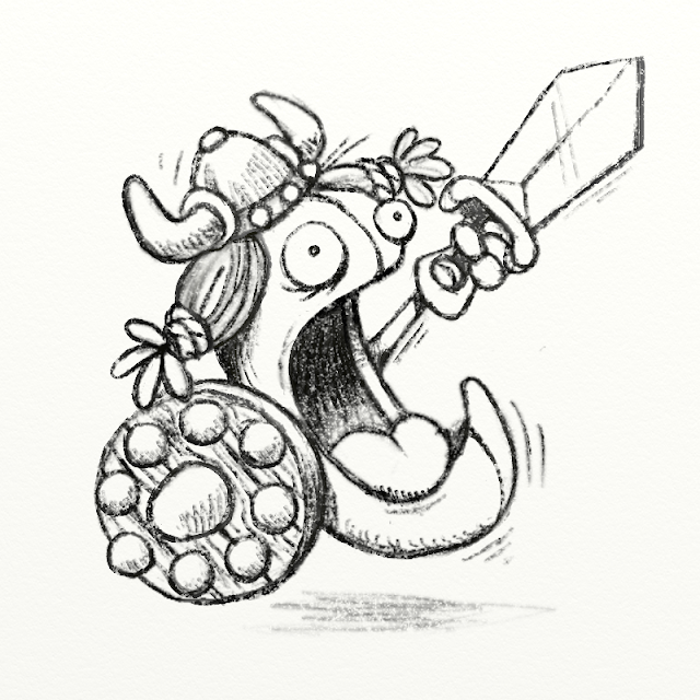
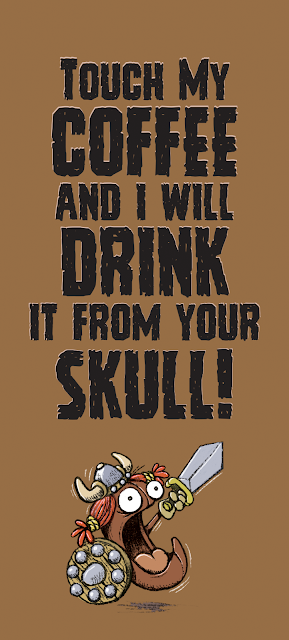
Below the middle image shows the original pencil sketch for my Day 01 Inktober 2018 entry. Note the difference of the outer two images on the left and right.

Showing how different brush pens can change the look of a drawing. Click on the image to see a larger version.

The left image is more detailed with finer lines because there was a harder point on that brush pen. So that inspires adding more tighter lines for shading and details. The image on the right was drawn with a softer brush tip, which makes it easier to create the flowing and thicker lines. That pen inspired me to use fewer lines and a simpler iconic look. The end results are quite different even though they were both based on the same pencil sketch.

The quick answer to that original question above:
By mentioning the items used to create an image, allows others to know how they could get similar results by using the same product(s).

Sunday, September 30, 2018

Inktober 2018 - Prompt List

It's that time of year again where I dedicate my warmup sketching hour in the morning to Jake Parker's Inktober. Inktober is a yearly Internet event where people draw ink images and post them online, every day in October.

This year I was going to just sketch, but I didn't enjoy the process that way. So I eventually went back to my inkings, scanning, coloring and adding text in Photoshop format that I've been using for several years now.

This is the daily word prompt list provide by Inktober creator, Jake Parker

Some may not like me adding text, color and polishing my ink sketches for Inktober . . . Too bad. Seriously, if you are one of these people, you really have too much time on your hands. Go draw something.

Saturday, September 29, 2018

Inktober 2018: Arnie Geddon Update

I have been gearing up for Inktober as mentioned previously. The plan is to do the letter-a-day/alphabet with this character Arnie Geddon, but I'm still ironing out his look. It's getting there.

Arnie Geddon, the latest version of the character
I plan to do all images on toned tan paper as seen above, using black brush pens and white pens for highlighting. I've got my ideas and the entire alphabet down on paper. Hopefully, this will all start happening around the end of the first week into Inktober 2018.

Arnie and the pens and paper I will use for his 26 Alphabet pages

Saturday, September 22, 2018

Daily Quick Sketch: Arnie McGeddon

With October approaching, been thinking a lot about what I want to do for Inktober 2018. Last year, in the final week I did several images of a cat character. I like the idea of doing something consistent, instead of a daily random drawing.


My idea is to do an alphabet book for adults using this character. So each day I'll be going through the alphabet, having Arnie interact with each letter of the day.


Saturday, September 15, 2018

Daily Quick Sketch: Burrito VS Taco! (1 of 2)

Funny how inspiration works. One of my favorite Facebook people is Jason Curtis, a cartoonist with a true sense of humor, original wit, and a fantastic simple style. I dislike Facebook, but Jason is one of the few reasons I check in once in a while.

Long story short: Jason did a cartoon one day that had the punch-line asking who would win in a match between a Burrito and a Taco. Somehow that cartoon was in my head when I was trying to sleep, I pictured what that match would look like. So, since I was awake, I drew the two characters.
In this corner, wearing red trucks that are WAY too high up his body -- The Beefy Burrito! 

The original inking of the Burrito character, using a Kuretake ZIG brush pen.
The original pencil sketch
Here's the link for Taco.

Friday, September 14, 2018

Daily Quick Sketch: Burrito VS Taco! (2 of 2)

Here is the Taco character. I felt burrito would be a heavyweight boxer, while poor old Taco would a more frail character.
And in this corner, a simple shell of a man, it is --The Crisp and Breakable Taco!

The original inking of the Taco character, using a Kuretake ZIG brush pen.

The original pencil sketch
Here's the link to Burrito.

Friday, August 10, 2018

Daily Post: Chicken Little (with video)

Today's sketch is one I had around for a while. This was a design for a story I wrote using known fairy tale and nursery rhyme characters. This is my version of Chicken Little. I know traditional, Chicken Little is a cute, little chicken in books, (or a big headed with glasses like in the animated movie.) I wanted very wacky. 

Digital color comp for Chicken Little character


Inking for Chicken Little


Wednesday, August 8, 2018

Daily Sketch: Bug

New concept sketch of a character I'm developing for my latest picture book manuscript, Bug. His name is Allen, a character with an extreme identity crisis.
Swipe to see the original sketch, inking, and color breakdown images.

Sidenote: I used an inking brush setting which resembles a leaky pen. I really like how fluid and random the line becomes.

Final color version

Original pencil sketch

Inking with some shading

Alternative image with color background

Saturday, August 4, 2018

Throwback Thursday: L.B. Monster sketch found

REPOST DUE TO CORRUPT AND/OR LOST IMAGE FILE:
Many posts labelled with Throwback Thursday suddenly missing or corrupt images.
Why is this happening Blogger (aka Google?)
Originally posted on 6/24/16


UPDATE: Color

Marker comp: Coloring LB slightly different than usual . . . testing the waters

UPDATE: Inked version


Brush pen inked version of the found Lumpy Bumpy Monster pencil sketch 

Originally Posted on 1-7-2016 - - - - - - - - - - - - - - - - - - - - - - - - - - - - - - - - - - -
It's a strange feeling to find some of my work from the past. There's this sense of seeing it with new eyes again as if looking at someone else's work. This one in particular really surprised me. It was hidden on an old hard drive I was cleaning out to scrap.This image was sketched sometime back around 2003.

An old pencil sketch of my series's main character called The Lumpy Bumpy Monster ( aka L.B.)

L.B. (short for Lumpy Bumpy) is one of my oldest and favorite characters to draw. It took me nearly a decade to mold him into the character he is today. Yet, while I have 100s of sketches and drawings, I've yet to ever really do anything with him (and his supporting characters.) L.B. was originally intended to be part of a series of books for children. I felt I needed to be established in the publishing world before I could ever do the tales I wanted with L.B. and Timmons.

I'm sure I will be finding more hidden works on old sketch pads, hard drives, floppy disks and CDs. If I ever get the time, I'd like to clean up and ink this image ...

Throwback Thursday: Golf Dad Mug Design

REPOST DUE TO SO CORRUPT AND/OR LOST IMAGE FILE WITH BLOGGER:
Originally posted on 2/4/16


This one goes back many years ago when I worked for a giftware company designing novelty products. They wanted a humorous Father's Day mug related to golf. I wrote as many insults and oddities about a typical Dad playing golf.


The mug sold well on the market, so someone asked me to create 3 more for the following year. I remember the three follow-up mugs were, Fisherman, BBQ Chef and Couch Potato -- but this original Golf mug outsold the other mugs combined.

One thing I remember while creating this design was that I did a spotless vector version, which looked very polished with solid clean lines. But this rough and loose style seemed to work much better with the text humor.

Monday, June 4, 2018

SCBWI NJ Conference 2018 + Art Contest Image

Had my first NJ regional SCBWI (Society of Children's Book Writers and Illustrators) event this weekend. Great time ... especially seeing old faces and meeting many new people.

My 11" by 17" entry image for the NJSCBWI "WONDER" art contest

THOUGHT PROCESS: 
The first thing I think of with the word "wonder" is outer space. Just staring at the stars creates a sense of wonder for me. So I knew I wanted that element in the image. I considered doing a closeup of a child's face inside a toy astronaut helmet, and in the helmet's reflection, the moon and other planets would be seen. But then I thought, instead of outside, have the moon appear inside floating over a child's bed.

The original pencil sketch concept for the SCBWI art contest


• I wanted the child dressed up in astronaut-like pajamas with a toy space helmet, but then realized there would be no personal interaction or expression without seeing the child's face.

• I wanted a question mark shape for the cat's tail in the lower right corner but I also wanted the cat to peer into the room, showing curiosity to what was happening. I had to compromise with limited spacing in that area.

• The lighting was another hurdle. Originally, I wanted a green glow, for a more mystical look. But knowing this would print out on my printer  -- green is a fickle color to control from monitor to paper. Then I re-considered, the moon usually gives off a blue light in night skies. So I saturated the coloring with blue, leaving only the reddish highlights to accent the bluish hues.

Color variation: The original base colors with white light highlights
To be honest, this image is not complete. I wanted to add more details to the room, such as a basketball, bookshelves, car toys and a ragdoll astronaut. The area above the moon was going to have a night sky filled with stars. But I was running out of time to print, cut and mount the image in time for the conference.

In this version, the foreground color was muted, white light highlights dropped, and the moon's size was increased.

RE: SCBWI Conferences 

I've gone to several SCBWI Winter NYC Conferences in the past, but I stopped going several years ago feeling it wasn't for me. The SCBWI Winter and Summer conferences are HUGE, with keynote speakers representing the top bestsellers in children's literature. It's entertaining and inspiring, but that atmosphere seems best for those already established in the market. The NJ conference is more personal and is a gathering of the people I see and know the most. Comparing the two, I feel that the NYC conferences are grander, but the NJ regional conference seemed more helpful. 

One problem I had at the conference was I could not find the rooms for the workshops in the hotel. The map provided did not help. I found just walking around reading every sign was the only way I could find the assigned rooms (of which two were relocated, which REALLY didn't help.) That never happened to me in NYC, which is about 5 times larger than the North Brunswick Hyatt hotel.

Monday, May 28, 2018

Daily Quick Sketch: Charli Bean Travel Mug

Created this concept for my wife, who loves coffee, has an Icelandic lineage and is a redhead. So I decided to make her a coffee travel mug using redbubble.com.

The original concept image I though for my wife mug
Now available to the public, if interested here's a link to find it below:
www.redbubble.com/people/arrrggghhh
What the product should look like, it should arrive next week
The original pencil sketch was done in ArtRage Pro 5

The final artwork that was sent to print the travel mug

Thursday, May 24, 2018

Mermay 2018: Octo-Tail Mermaid

This is the first year I'm doing the annual #MerMay online event where artists submit daily images of mermaids. Here's this week's image, the Octo-Tail Mermaid.
Rotated the image by 90 degrees, blotted and cross-hatched the background

Original pencil sketch
Cleaned up the pencil line with digital penciling
Laying down the base colors before adding highlights, shading, and details
The original "final" image of my #MerMay2018 Octo-Tail Mermaid
I wasn't happy about her ink at that bottom - so a change was made as seen above

Tuesday, May 22, 2018

Daily Quick Sketch: Perry Wanna Kracker. the giant pirate parrot

Today's quick sketch in pencil, brush pen and Copic markers. It is a supporting character for a little picture book story I wrote called Pirate Dreams. Perry W. Kracker is a huge parrot, abnormally huge, and he ALWAYS wants a cracker. He is part of the ship of misfits lead by the main character.

Pirry, the Pirate Parrot from Pirate Dreams. Pirry stands about 6'2" and weighs nearly 300 lbs. 


Sunday, May 20, 2018

Mermay 2018: Shark-Tail Mermaid

The second image I did for the online event MerMay2018, where artists submit their mermaid illustration during the month of May.

My final version of a Shark-Tail Mermaid with various shy neighbors

The original color background before changes to make the main character "pop" more

The original sketch in pencil