Monday, December 30, 2013

Daily Quick Sketch: Lil' Whale

This is a character I pulled from my sketch pad.

Occasionally, I think of an animal and try to create a new version, different from how I usually draw the animal. This forces me to think outside the box and it sometimes helps to discover a whole new style or technique.

Here I made a more angular body, longer mouth and placed the two eyes together and higher up than what I usually do. I also added more texture with the horizontal lines on the body/tail and the under belly's ribbing.

Lil' Whale under the water? or leaping into the sky?

The background I did very quickly in Photoshop, using several splash and cloud brushes. 

The original scan of the Lil' Whale doodle from my lil' sketch book

Thursday, December 26, 2013

Daily Quick Sketch: Little Toucan

Just another quick sketch using markers and ink. This time using a black pen brush. I like the pen brush, but the trouble with using them is that eventually the brush tip wears out and doesn't hold a fine line anymore. You can see around the sides of the toucan's feet, the brush point split, causing the tiny gaps. 


Saturday, December 21, 2013

Daily Quick Sketch: Korky

Yet another testing daily sketch using my new marker sets.

This time, I wanted to create a sidekick for one of my oldest characters, Chef Gordon Baloo. Keeping to the theory that dogs and their owners tend to look alike, I created the character of "Korky" based upon key features of Chef Gordon Baloo.

Daily sketch of the hyper puppy, Korky, made using Copic markers and a Faber-Castell "B" brush pen


The key features I took from Chef were his stout frame, wide pointy-chinned grin, baggy + googly eyes, bulbous nose and circular ears. Hopefully doing these similar (but different) features makes an automatic visual relationship between the two characters.

Chef Gordon Baloo: One of my oldest characters and the key influence to designing his sidekick, Korky
UPDATE:
Added the original pencil sketch seen below.

Thursday, December 19, 2013

Pencil Line + Marker Comp Technique

This post is used to show an example of a technique I use when creating new characters. It combines a pencil sketch with a separate marker color comp to create a final image. 

First Step: The pencil sketch
Starting with a pencil sketch, I scan it into the computer at usually 200 dpi or higher. It's important that your images are at least 200 dpi in case you ever want to go print. Once the image is scanned into Photoshop, I use "Level" 
settings (CTRL+L on a PC) and adjust the image to clean up any smudges or erased lines that may appear. This also can darken the sketch lines, which is important for the final look.
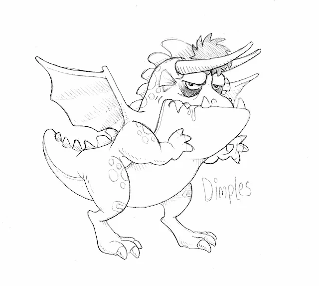
Original sketch using a pencil, which I find to be the most adjustable and comfortable way for me to create
Second Step: The Color Marker Comp
Once the scan of the sketch is cleaned up, I print out a page to use as a guide for the marker comp. The reason I do this is to not ruin the original sketch, because the markers for the color comp will probably soak through the sheet and ruin the image below.

For this color comp, I will be using Bienfang 100% Rag Translucent Marker Paper because it is a great smooth surface that allows alcohol markers to spread evenly. It's also thin and light -- but still strong and durable, so the paper won't rip if you erase too hard or go over an area multiple times with a marker. 
Another reason for this brand of paper is that it is also transparent, like tracing paper, which is very important. 
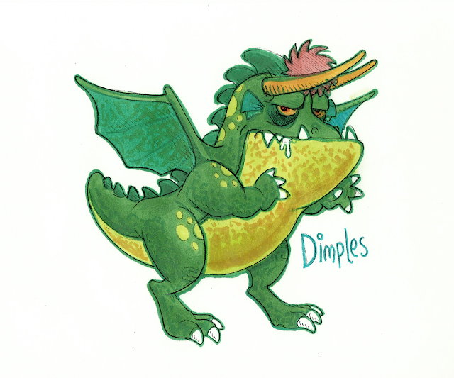
A color comp of the the sketch, filling in all the color without any black holding lines
I take the print of my sketch and place it under a sheet of the marker paper. This will now allow me to color-trace the sketch. I color the entire image without drawing any holding line or outlines. Once the inner areas are colored, I select a darker color marker (in this case green) and outline the entire image. For final touches, I add shading textures to the skin, wings and belly area.

When the comp is finished, I scan it EXACTLY with the same settings as the sketch. This way they are the same size and should easily combine together.

Step Three: Combining the two together
I now have the two drawings scanned into Photoshop. I copy and paste the sketch image over the color comp image. [Note: The sketch image layer MUST be over the background color comp image.] Select the upper sketch layer, then change it to "Multiply" in the Layers settings. Doing this allows all the white areas to become transparent leaving only the sketch lines.
The 2 images combined: a nice effect with some color bleeding that creates a slight aura around the character
You should now see the two layers combined together, but you will probably need to rotate the top sketch layer for it to align with the color below. To rotate the sketch layer, select the "Move" tool (shortcut "V" key in Photoshop) and click on the sketch layer. If "Shown Transfom Controls" is select in the top menu bar, you should see the movement handles appear around the sketch. From there, go to any corner and click when you see your mouse icon change to a rotate icon - then simply adjust the sketch to fit the color below.
So there you have it, two hand drawn images of the same character, scanned and combined in Photoshop. It creates a nice effect AND allows many alterations and adjustments in Photoshop. It's now very easy to add a background under the character; or change the colors to something completely different.

Wednesday, December 18, 2013

Illustration Friday: Spirit (Updated)

Illustration Friday: Every Friday a word is given on the website, IllustrationFriday.com. Artists and illustrators then submit an image that represents that word all during the week.
This week's word: SPIRIT

Marker and Ink image of Santa for Illustration Friday's word of the week - Spirit
Thought Process:
First thought was the "Christmas Spirit" since it is the middle of December. This made me think of Charles Dicken's "A Christmas Carol" which as everyone knows -- is loaded with spirits. But I didn't want to draw a ghostly figure . . . instead I was looking to show the emotional spirit of Christmas. So who better to do that than ol' Saint Nick. 
Pencil sketch of the Christmas spirited Santa. The original idea was to have him in his red long-johns.

But I didn't want to draw just another Santa image. I wanted the image to show Santa's Christmas spirit on a more personal and emotional level.

By taking away his coat and hat made it seem like Santa was casually relaxing at home; This is not the business-like gift delivering Santa . . . it's the happy and jolly "Thank God that's over and I have 355 days off from work" Santa. 


UPDATE

The background was pretty bland for a cheery spirited Christmas image. And just for good measure, I figured adding a snow storm in the background would help instantly convey that this dancing fool was indeed Santa. (Though, skipping around in a snowstorm like that without proper clothing - it'd be a miracle if he didn't catch pneumonia!)

UPDATE UPDATE

Okay, this is weird.
Somehow either someone or some program turned my non-snowflake falling PNG image into an animated GIF. I found it animated like this several days after I uploaded my original non-animated image to Google+.

Perhaps Google does this to some images automatically? I doubt it, since that could be a few legal problems I'm sure Google lawyers would warn against.

So I think this snow effect is something that Google+ does automatically to snowy images. I've seen several images on there that have this same animation - so i'm guessing that is the answer.

Real nice touch . . . Thank You, mystery animated GIF making app or person! 


My Santa drawing that was mysteriously turned into an animated snowing GIF image


For those interested, I found a webpage that explains how to make this snow effect.
Link: 
http://www.vlogg.com/13203/convert-photo-snow-falling-animated-gif-using-google/

Wednesday, December 11, 2013

Illustration Friday: Pattern

Illustration Friday: Every Friday a word is given on the website, IllustrationFriday.com. Artists and illustrators then submit an image that represents that word all during the week.

This week's word: Pattern


Thought Process:

I do many patterns as a designer for toys, pet, costumes and novelty items. The patterns I make are usually graphically simple, because busier patterns don't sell as well as something clean and simple.

I thought about the many patterns I created over the past decade. I wanted to come up with an idea to alter my artwork slightly and make it funny. Then it hit me, several years ago in Shanghai, I was asked by the product developer and buyer of PetSmart to create patterns for pet blankets. They were looking for something different, not the typical paw print pattern you see everywhere. So I created about 8 patterns to show them.

As usual, I didn't have much time to develop the designs, but as I was sketching and doodling, I came up with this playful puppies jumping fences pattern. I know it doesn't make much sense , but it was still cheery, silly and playful. (PetSmart never bought this design, it's was too comical for their brand of products. But I still remember liking the colorful playful pattern and rhythm it created.)

So I thought, lets break that rhythm, ruin the perfect pattern and have a solo dog doing what usually comes natural.

Sunday, December 1, 2013

Illustration Friday: Refrain

Illustration Friday: Every Friday a word is given on the website, IllustrationFriday.com. Artists and illustrators then submit an image that represents that word all during the week.
This week's word: REFRAIN

Sesame Street's Cookie Monster refraining from eating a big delicious cookie
Thought Process:
This week's word was tough. The first definition to come to mind is "to hold back" which makes me think of curbing one's appetite. I tried to think of characters that couldn't control themselves, especially with food. Wimpy from Popeye was my first thought, but he's pretty old school. Pac Man was another, but I don't think people generally think of him as a compulsive eater (and again old school.)

That's when I thought of Sesame Street's Cookie Monster.
Here's a character that usually has no control over his appetite for cookies. He's still brings back childhood memories of enjoyment when he chows down on a pile of cookies. Though in past few decades, Cookie Monster has been learning to eat healthier and cookies are not his main go to food anymore.

I understand the urge to have children learn to eat healthier -- but I find it sad to see Sesame Street alter a favored character simply for a simple moral spin. Kids understand he is over the top, that's what makes him so lovable and enjoyable. 
Seeing cookie crumbs fly all over when he eats is parts of the fun.  Having vegetable leaves fly all over when he eats? Not as funny.  
Original pencil sketch of the Cookie Monster concept for Illustration Friday's Refrain word of the week
Drawing Process:
The focus is on the huge forefront cookie that stands out on a bright foreground with Cookie Monster centered directly behind it. I decided to have Cookie Monster posed grimacing, head in hand, gazing over the cookie which is less than an arm's length away. The motion lines around the character help express his urges to pounce on the cookie. In the background, a radial burst of energy is center to the head of Cookie Monster to help pull the focus to the center of the image.