 |
| The city celebrations from my picture book "Bobby's Biggest Bubble" |
Jim Romer’s blog: character designs, writing picture books, and random thoughts!
Friday, February 27, 2015
Illustration Friday: Metropolis
Illustration Friday: Every Friday a word is given on the website, IllustrationFriday.com. Artists and illustrators then submit an image that represents that word all during the week. Tossing this in this late submission in the final hours for Illustration Friday's word of the week: Metropolis.
Sunday, February 22, 2015
UPDATE - Daily Quick Sketch: Space Frog
Update: Space Frog in Color
I took the pencil sketch and colored it in ArtRage Pro using the Oil Brush and Rough Canvas. I was very busy with work and fixing my computer this week, so I didn't have much time to spend on these personal images. I was mostly looking for speed with coloring and adding the background, so I kept everything very simple. |
Frog freaking out that he is in space.
Colored with ArtRage Pro using Everlasting Oil brush settings and Smooth Ink pen.
|
Looking online, I found quite a few "Space Frogs" using that name. But this character design was done entirely without knowing about the other existing space frogs. (Hmm, maybe that's why he feels so scared and all alone.)
 |
| Pencil sketch of Space Frog ( for now . . . until I think of a better name . . . ) |
If I get the time, I will return to this image and try to add color and a scenic background. Maybe add a space monster behind him, eh? (That'll give the little fella a reason to be scared.)
Friday, February 13, 2015
Updated: Monsters and Bunnies: Nap Time
UPDATE: You'll notice the right leg is now properly at rest on the floor. Gone is the shaking leg and the motion lines around the area.
This one I had put aside for some time.
Originally the monster was suppose to be more dragon like, with tiny wings coming out of his back. But the sleeping position made it hard to place the wings since they would be pressing against the wall. I liked the composition as it was -- and decided to simply eliminated the dragon wings.
The other problem I still have is trying to show the monster's right leg shaking, like a dog's involuntary leg reaction to it's back being scratched. The motion lines are not that apparent and the right leg looks like it's just floating the the air. I will change this so that the leg lays on the ground properly, (and I'll probably adjust the position of the bunny's head so his ears point out to the left.)
To confirm that they were fast asleep, I added a big fluffy pillow behind the monster's head. The pillow help to create a humorous contradiction to the harsh and dank cavern surroundings. (Ups the cuteness too.)
This one I had put aside for some time.
Originally the monster was suppose to be more dragon like, with tiny wings coming out of his back. But the sleeping position made it hard to place the wings since they would be pressing against the wall. I liked the composition as it was -- and decided to simply eliminated the dragon wings.
 |
| The original pencil sketch. Notice his right leg is shaking in mid air - this has been corrected. |
Wednesday, February 11, 2015
One from the Archives: Toad & Troll Ad
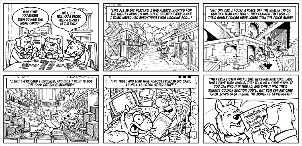
Pulling another image from the past. This one is from my freelance years. The files says it's save date was on Thursday August 9th, 2001. I remember being very busy around that time and how all the freelance work went away after the 9-11 attacks.
Looking at this now, it really looks busy, especially without color to add depth. The directions I was given were very detailed and very type heavy. It was extremely difficult to squeeze everything they wanted into 6 panels. But I guess they were happy since they asked me to do several other designs for their company, including the new versions of their company mascots.
Toad and Troll still exist as a company, they're based in Corbin, KY. Their website seems more streamline now, like an online store. It doesn't have any of my artwork anymore, which makes sense since their website's "real estate" is better off showing products than promotional images/branding.
I had forgotten about working with them; that is until last year's New York Comic Con, where Toad and Troll had a booth adjacent to my brother's ChopShop table.
Small world, eh?
Looking at this now, it really looks busy, especially without color to add depth. The directions I was given were very detailed and very type heavy. It was extremely difficult to squeeze everything they wanted into 6 panels. But I guess they were happy since they asked me to do several other designs for their company, including the new versions of their company mascots.
 |
| Comic strip style advertisement for the card game company Toad and Troll. |
Toad and Troll still exist as a company, they're based in Corbin, KY. Their website seems more streamline now, like an online store. It doesn't have any of my artwork anymore, which makes sense since their website's "real estate" is better off showing products than promotional images/branding.
I had forgotten about working with them; that is until last year's New York Comic Con, where Toad and Troll had a booth adjacent to my brother's ChopShop table.
Small world, eh?
Tuesday, February 10, 2015
Daily Quick Sketch: Chicken Little and the SCBWI Winter Conference
This was a sketch I did during last weekend's SCBWI (Society of Children's Book Writers & Illustrators) conference in NYC. I had a terrific time meeting so many people who have the same drive and passion about telling stories.
Funny thing about hearing people talk about creativity. . . It makes me want to become even more creative. So as I was listening to the speakers and taking notes, I realized I was sketching subconsciously in my notepad.
I've set a goal of 5 years: February 2020.
If nothing happens by then -- I'm out for good. But somethings tells me these stories will be made . . . it's just going to take some time and a lot of patience.
 |
| Pencil sketch of Chicken Little, one of many classic storybook characters to be used to pitch my next book. |
Funny thing about hearing people talk about creativity. . . It makes me want to become even more creative. So as I was listening to the speakers and taking notes, I realized I was sketching subconsciously in my notepad.
I've set a goal of 5 years: February 2020.
If nothing happens by then -- I'm out for good. But somethings tells me these stories will be made . . . it's just going to take some time and a lot of patience.
Sunday, February 8, 2015
Old Timey Baseball Mug Wrap
This one goes way back into my ol' Papel Freelance/Russ Berrie days where we designed novelty gifts. This design was created somewhere around 20 years ago for a Father's Day mug.
The work itself was done by first drawing four pen & ink illustrations. I had to do some old timey library searching for black & white photos to use for reference. Then I needed to create poses that worked well together to create a balanced composition, Once that was done, I took the image, reduced the size, flopped the film and created a repeating pattern in the background. Final stage, everything had to be rubber glued into place on a heavy press board.
Today, this could easily be done on computer in a heartbeat. But back then, this job was tedious. I had to measure everything and figure the proper spacing for the repeating images in the background. As you can probably see, everything had to be hand cut using an Exacto knife.
I do remember that they liked the design so much, I was "awarded" by having to do another similar design with golfers.
Subscribe to:
Comments (Atom)


