Saturday, September 8, 2012

Bobby's Biggest Bubble: Off to the Presses

After so many months/weekends working on the book, it's finally out to the printer.
WOOT!

In celebrating, I thought I'd post one of my favorite images from the book:

One of the many things Bobby does with his bubblegum winnings.

Below is the final dust jacket artwork that was sent today: 
Pictured above is the full length of the dust jacket wrap. (Plus Note: the book price was reduced down to $15.)

And below is a sample of the inner lining of the book:
Pencil sketches line the inside of the front and back of the book.

Tuesday, September 4, 2012

Last minute changes - KickStarter Tribute Page

Below is a copy of the KickStarter Tribute page in the book, Bobby's Biggest Bubble. If anyone wants to make a change to their name - this is the final day to do so. The book goes to the printer tomorrow. WOOT!


Monday, September 3, 2012

Final Stretch


Well, for the holiday weekend, I've been at the computer non-stop doing final changes and corrections to the book. Still a way to go . . . keep finding small things that need changes. Being my first book, I'm constantly worried about the layout, especially with the cover and dust cover artwork. This is where all the Algebra from high school finally comes into play. Figuring out where to place the artwork while measuring the surface distance that is created by the spine of the book, (which is figured out by the thickness of the paper and the amount of pages) - I'm sure figuring this all out gets easier with experience . . . but right now -- I'm FREAKIN' OUT! (hehe)

Here's the finalized dust cover wrap - seen below. I'm giving the inner flaps about 3.5" inches inside (hope that's enough to keep the dust cover attached to the book while reading.)


The final price has been reduce from $18 to $15, figuring this will help get the book out to more people. I will also have a free shipping code which will keep the final price to $15 per book.


Well, back to work . . .

Saturday, September 1, 2012

Grocer Sketches

Been quite awhile since my last post, was away with family for our vacation in Iceland. Such a clean, beautiful and different country; I highly recommend it.
Back to the bloggin'Back in March of 1999, my brother Tom called me asking if I could do a few cartoon sketches of grocery store owners for his Internet design company The Chopping Block. So I quickly sketched out these guys in one evening.

I think these characters were far too wacky for what my brother needed. But I had fun drawing these guys. Don't think I'd ever purchase fruit from any of these guys . . . 


Probably the most normal looking one of the grouping. 

Knowing this was for the Internet, I gave goatees to all the grocers.


I noticed giving them a hutch back look made them wackier-looking. 

This one was inspired by Scott Gordon of the old Uncle Floyd Show.

Saturday, August 18, 2012

Bobby's Biggest Bubble: The end is in sight . . . but I'm squintin'

Few people have been writing and asking for updates. So here goes:

I'm still changing a few things that bother me (like the gum balls) but overall the book's is looking better then I hoped. Coloring and shading have been the time consumers of this project as I expected. I'm constantly altering the coloring, its something I have always struggled with when not just coloring characters. Characters I have no trouble coloring - it's backgrounds. ARRRGGGHHH!

I was also concerned about the second half of the book - because several pages toward the end were the most challenging, So I started to work backwards, from the ending. That REALLY helped more than I expected, because I was constantly worrying on how to tackle a few pages (especially the big ending).
I am so happy how it turned out . . . and relieved.


I would love to show you all those BIG pages now - but I need to keep some of the pages off the Internet and out of access to the general public. Plus, I don't want to give away the entire story. So, I will show the latest coloring to one of the black & white sketches I posted some time ago.
This is the 2-page spread of pages 24+25. It still needs some cleaning, shading and highlighting. Also note the bubble bleeds out of the right side of the frame and off the page. This is something I started doing on many pages with frames to help show the bubble's massive size. There's no room on the pages for Bobby's Biggest Bubble!
Two weeks before sending the work out. Back to work!

Tuesday, August 14, 2012

Bobby's Biggest Bubble: Now and Then

I mentioned in my previous post how I been enjoying bringing back old characters into my children's book. There are about 6 characters now throughout the book that were a part of different projects from my past. This post focuses on two favorites: Gramps and Mrs. Sugarpants.

These were supporting characters from my comic strip: Home of the Brave. Gramps was an ex-super soldier/spy who had been living in the attic for well over 3 decades. Everyone thinks he's senile, except his grandson, who knows that all the wild stories Gramps speaks of in the past are actually true.

In Bobby's Biggest Bubble, I use Gramps as the local park curmudgeon, Mr Krumple. I was tempted to name him Mr. Seaman, an actual grumpy neighbor who yelled at us back when my friends and I were teenagers. (But, that last name just wouldn't be appropriate for a kid's book.)


In Home of the Brave, Mrs. Sugarpants ran the local store.  She had terrible hearing and the worst eyesight in town. She also had visions of grandeur, believing her store was so popular that it was always filled with celebrities.

In Bobby's Biggest Bubble, I gave her the same job - the local store owner - but with one important change: her name. It had to be changed for the children's book . . . so I toned it down from Sugarpants to Applebottom. It's a safer name and I think kids will enjoy the newer name.

Friday, August 10, 2012

More: Timmons and the Lumpy Bumpy Monster

Found several more dummy pages in my archive drives.

These images were saved as GIFs, which explains the grainy-pixel texture of each image. These are pages 6, 8 and 14 to the 32 page story.


Tuesday, August 7, 2012

The Chopping Block

Most people who know me, know my brother Thom Romer. Back in the 90's, when Al Gore was creating the Internet -- Thom and a creative group of people got together and started a web designing company called the "ChoppingBlock.com". It was exciting to see him start from a 2-man operation into the company it is today.

When The Chopping Block created a logo/mascot for the company, many friends and business acquaintances sent versions of "Choppy" (seen here):


It was fun seeing the different styles and concepts people would come up with. You can still see some of the designs here: Friends of Choppy.

The following images are a couple of submissions I sent to my brother:

CHOPCHICKEN
First, I sent my brother this cartoon. Not sure, but I believe it was around Thanksgiving time.
{If it wasn't , I have no idea why I thought of this . . . }

CHOPCOW
Next, there was this cow block design, which was made shortly after I made a just as offensive Christmas card (which you can see below.)  Looking at this today, I wonder now if my brother originally took this as my opinion towards his company (which was NEVER my intention!)
CHRISTMAS CARD CIRCA 1999 (in Color Pencils)
Yea . . . sometimes . . . sometimes it's not a good idea to bring back old images.
Yeaaaa . . . no idea why I was makin' bathroom humor cow cartoons back then . . . 

Blatent Plug Alert!:
It wouldn't be right for me to end this without mentioning my brother's side project called ChopShop, which sells some of the best iconic cultural t-shirts you will ever find on the internet. Tell 'im brother Jim sent ya, he'll probably give ya a discount!


Sunday, August 5, 2012

Cha-Cha-Cha-Changes: Bobby's Biggest Bubble

I can safely say that bigger is not better. 
Originally I picked 8.5" by 11", the standard letter size, to be the size of my first children's book, Bobby's Biggest Bubble. 
The reasoning: it is the most economic and largest size to print a children's book. I wanted the bubble in the story to appear bigger than life. But the 11" by 8.5" format makes the images too wide, creating too much filler background.
Too much background = the focus on the bubble is diminished. 

I was also having technical troubles with the 2-page spread pages. When making 22.25" by 8.75" images at 300 dpi on a computer (each image having about 12 layers of line work and coloring) the computer hits a memory limit and the workflow starts to slow down. Especially since I would often have several pages open at once for reference, keeping the style, lines and colors consistent from page to page.

The solution was easy:
Changing to a slightly more compact format of 10" by 8" for the inner pages makes the workflow faster with an overall better composition for the story - this simple change makes the book look better. (The overall size of the hard cover will be about 10.25" by 8.25")

Since this is my first try at self publishing, I'm looking over everything, learning as I go and I can safely say I like how things are turning out. It’s been awhile since I shared some of the artwork. Below is another sample of page 21 from the book in the new size format, where Bobby is just beginning to find out that making the biggest bubble isn't as easy as he thought it would be. 

(PS: I'm sure I'll make changes to to this image too before it's all finished!!)


Thursday, July 26, 2012

Bosco & Bruno

Found this in my archive backup drive, circa 2003. This is a good example to always jot your ideas down on paper, even if you don't use that idea for years.

These were two character design sketches of a bear (Bruno) and squirrel (Bosco) I intended to use to make an online web animation. I say "intended" because it would take months of work for me to make an 8-minute quality cartoon by myself. I never found that time. It's still one of my favorite concepts, which is a small tale about a Bronx Zoo bear who thinks he's a squirrel living in NYC's Central Park and his manipulative squirrel friend who uses the bear to his advantage. (I always imagined the squirrel's voice being played by Joe Pesci.)


But instead of simply letting this concept float away, I created this character set to hopefully one day go back and do something with it. I still have the entire cartoon story in my head. (I also have a written first draft of the animation, just in case my memory starts slippin'.)

Sadly, I didn't always take the time to draw or write down the inspirations when I was younger. So many ideas just tend to float away, never to return. Not saying they are all great ideas, but you never know how a small idea many eventually turn into a more significant concept. So, Tip o' the Day for you future artisans out there, when you do get bouts of inspiration, crazy dreams or an "idea-burp" in yer head . . . Write/draw them down.
You won't regret doing so . . .

Here's a link to a small animation loop I created using the squirrel character Bosco: LINK

Tuesday, July 24, 2012

Timmons and the Lumpy Bumpy Monster

Doing some backups, I stumbled across a group of pages from around 1997 which were on one of my old archive drives.

NOTE: Several years prior to this story, I tried to do another children's book.
After my uncle passed away from his bout with Leukemia, he became the inspiration to my first children's book idea, Bobby's Biggest Bubble. I poured all my time into making that story get published back in 1994. But after years of receiving rejection notices, I told myself that I would one day go back and do that book again. (But that's another story.)

Jumping forward to 1997: At the time, I kept on creating more stories in my head. The story ideas came fast, but developing the characters that would fit into those tales took a long time.

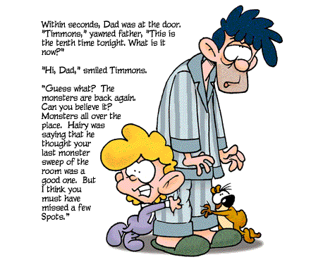
Page three of Timmons and the Lumpy Bumpy Monster

Above is one of the first pages my story about a boy named Timmons, his pet hamster Hairy and the magical monster that was in his bedroom closet. I worked on this for years as a side project in my spare time. I also wanted to generate a series of stories to go with these characters, so I wrote ten stories; creating fuller and deeper personalities and background history.
Original pencil sketch
Digitally Inked and Color Testing


For years I kept working on these characters, mostly on my train rides to and from work in NYC, drawing hundreds of sketches, fleshing the major characters out until it they had the right look I wanted. Once I knew these were the characters for my story - I started sketching pages for the first book. It was a slow process, but I felt the changing and development of the characters and story were improving. Taking time developing these characters over the year seemed to be a good idea . . .

That was until Pixar came out with Monsters Inc. in 2001, my concept of a monster that used transportation doorways was now part of a major successful film. If I did my book and showed it to the publishers in 2001, they would say I was copying the Pixar's film. Even though my monster and stories were totally different, too much of the story was parallel with Monsters Inc. This truly deflated my motivation to go forward . . . because this wasn't the first time I had similar concepts prior to Pixar releases. (see Home of the Brave  for another example and I will tell of my 3rd Pixar conflict in a near future posting.)
Fast forwarding to today, I've my first kid's book on the way this year. Special thanks to all the great people who helped with the KickStarter Project.

It feels like my stories will finally have a chance to be made. Enough years have now passed that I don't think my story would be directly tied to the Monsters Inc. concept anymore.  The chance for Timmons and the Lumpy Bumpy Monster to see print seems better and better . . . 


Thursday, July 19, 2012

Design Process for Company Logo (Part3)

6. Fine tuning 

The client had liked the direction the logo was heading and decided the highlighted hydrant with the dog hugging was the best, but she didn't want the dog hugging the hydrant. Instead, she wanted the dog facing forward -- so two more versions were created.

Her choice was to go with the left version with the sitting dog, but she also liked the blue spot background of the right design. She also liked the more rigid typeface the word "BIG CITY" was using in the 2nd image. Her last request was to try and give the dog a little more character.  


7. Print-out Variants 

The follow-up was the sheet below, showing the key design in 3 different printing formats for her to print in many mediums. Also included is an image showing several more design elements like adding spots to the dog, a blue cityscape to the background and changing the typeface of the words "BIG CITY".

To make sure that this was the image the client wanted, I created one more sheet of variations. The goal here was to throw many different colors, size alterations and detail changes to make sure that the client was going to stay with her final choice.

8. Approval 

The client was happy with the new element changes -- all but the spot around the dog's eye (which did seem a bit too much). Below is the logo that was given approval.

Unfortunately, like many websites after 9-11, the site never took off that year. I know from my current job that the pet business has been starting to grow again, particularly in the clothing for smaller dogs. I think this website's concept could do very well today - even in a bad economy.

I hope you enjoyed this step-by-step process.
My advice to new designers: be patient with your client and listen to what they say. If you don't agree with the client, try to explain your concept with logic - but always allow the customer to have the last word. Lastly, when designing logos, make sure you simplify as much as possible. The most famous logos are usually the most simplistic; so don't over color, over-shadow or use multiple colors gradients when trying to make a strong logo.

Keep it simple and clean.