Showing posts with label Character Design. Show all posts

Thursday, December 12, 2019

Giddy Santa 2019

THIS JUST IN:
It's that time of year when Santa is getting a little too giddy.
That time of year where I play around creating new character versions of Santa.

Saturday, August 4, 2018

Throwback Thursday: L.B. Monster sketch found

REPOST DUE TO CORRUPT AND/OR LOST IMAGE FILE:
Many posts labelled with Throwback Thursday suddenly missing or corrupt images.
Why is this happening Blogger (aka Google?)
Originally posted on 6/24/16


UPDATE: Color

Marker comp: Coloring LB slightly different than usual . . . testing the waters

UPDATE: Inked version


Brush pen inked version of the found Lumpy Bumpy Monster pencil sketch 

Originally Posted on 1-7-2016 - - - - - - - - - - - - - - - - - - - - - - - - - - - - - - - - - - -
It's a strange feeling to find some of my work from the past. There's this sense of seeing it with new eyes again as if looking at someone else's work. This one in particular really surprised me. It was hidden on an old hard drive I was cleaning out to scrap.This image was sketched sometime back around 2003.

An old pencil sketch of my series's main character called The Lumpy Bumpy Monster ( aka L.B.)

L.B. (short for Lumpy Bumpy) is one of my oldest and favorite characters to draw. It took me nearly a decade to mold him into the character he is today. Yet, while I have 100s of sketches and drawings, I've yet to ever really do anything with him (and his supporting characters.) L.B. was originally intended to be part of a series of books for children. I felt I needed to be established in the publishing world before I could ever do the tales I wanted with L.B. and Timmons.

I'm sure I will be finding more hidden works on old sketch pads, hard drives, floppy disks and CDs. If I ever get the time, I'd like to clean up and ink this image ...

Throwback Thursday: Golf Dad Mug Design

REPOST DUE TO SO CORRUPT AND/OR LOST IMAGE FILE WITH BLOGGER:
Originally posted on 2/4/16


This one goes back many years ago when I worked for a giftware company designing novelty products. They wanted a humorous Father's Day mug related to golf. I wrote as many insults and oddities about a typical Dad playing golf.


The mug sold well on the market, so someone asked me to create 3 more for the following year. I remember the three follow-up mugs were, Fisherman, BBQ Chef and Couch Potato -- but this original Golf mug outsold the other mugs combined.

One thing I remember while creating this design was that I did a spotless vector version, which looked very polished with solid clean lines. But this rough and loose style seemed to work much better with the text humor.

Wednesday, April 11, 2018

UPDATE Daily Quick Sketch: Piggin' and Grinnin'

UPDATE: I never liked the framing I did in this image, so I eliminated the background coloring.

Originally posted on 3/11/15:

Today's quick sketch was inspired by the blog: Dueling Banjo Pigs, a blog run by illustrators, Guy Francis and Stacy Curtis.

I seem to have jumped on the bandwagon long after this blog first started, but when viewing the blog and it's many banjo-playing pig images . . . I felt like tossing one on top of the already impressive 700+ picture collection pile.
Fully colored digital image of Piggin' and Grinnin' for the "Dueling Bango Pigs" blog site

Doing this image was a lot of fun. It's nice to just jump into doing a fun sketch with nothing but a suggested topic (a pig and a banjo.)

Inked version of the pencil lines created in ArtRage Pro

NOTE: Anyone can submit to the blog, professional or beginning artist. The blog is purely for fun. Even if you don't want to submit an image, it's worth seeing all the variations people have sent over the years. Visit the site here: http://banjopigs.blogspot.com/

Original pencil sketch from one of my sketchbooks

Tuesday, October 17, 2017

Character Designs for a Game: Part Four, The Minotaur

Here's the final design of the four characters I made for Steve Radabaugh's game, Dungeon Marauders: The Minotaur.
The final colored design of the Minotaur submitted for Dungeon Marauders
Of the four designs, the Minotaur was the one that needed the most changes. When I first did rough sketches, I was looking for the Minotaur to be different than the typical version we all know. So I made its face more beastly; like the main character from "Beauty and the Beast". And again, like the Ogre, I wanted to play around with a very top-heavy character with tiny legs. I sent the roughs to Steve for comments.

Quick concept pencil rough sketches of the Minotaur -- Trying to get a new look

This is where an outside critique really helps. As the designer who is constantly looking at the work, you sometimes lose focus and the perception of how others see your work. I didn't see what was wrong until Steve pointed it out. 

Tightened pencil sketch of the Minotaur which was off target . . . 

Steve felt that the sketch was off, especially around the face. While I was trying to be different, I was subconsciously omitting one of the most important features of a Minotaur . . . it's bull-like facial features.
 . . . The final pencil sketch with greatly improved Minotaur bullhead features!

Once the face was altered to be more bull-like . . . it seemed to all come together instantly. There was no question this was now a Minotaur!

The Minotaur design is seen with a drop shadow on a dark background
As Steve continues to develop his game, I hope to share his progress here with future posts about Dungeon Marauders.
Those interested can view the game's progress from his blog at 
www.radicalbomb.com
or look him up on Google+ at www.google.com/+SteveRadabaugh

Character Designs for a Game: Part Three, The Troll

Today's design is the Troll, which I have to admit is a complex creature because there are so many different versions in many world cultures. 
The full-color image on dark background with drop shadowing

Some are giants, while others are human size . . . Or they are long-haired, naked, googly-eyed imps as in the popular 70's dolls (which were re-popularized in the '90s.)
In D+D and fantasy games, they are often twice human size, slow-witted and regenerating menaces. Or, as in my Mother-in-Law's Icelandic traditions, they are 13 dwarf-looking brothers, who each take turns invading homes on the 13 days of Christmas. Some of the most annoying Trolls . . . are Internet Trolls. 

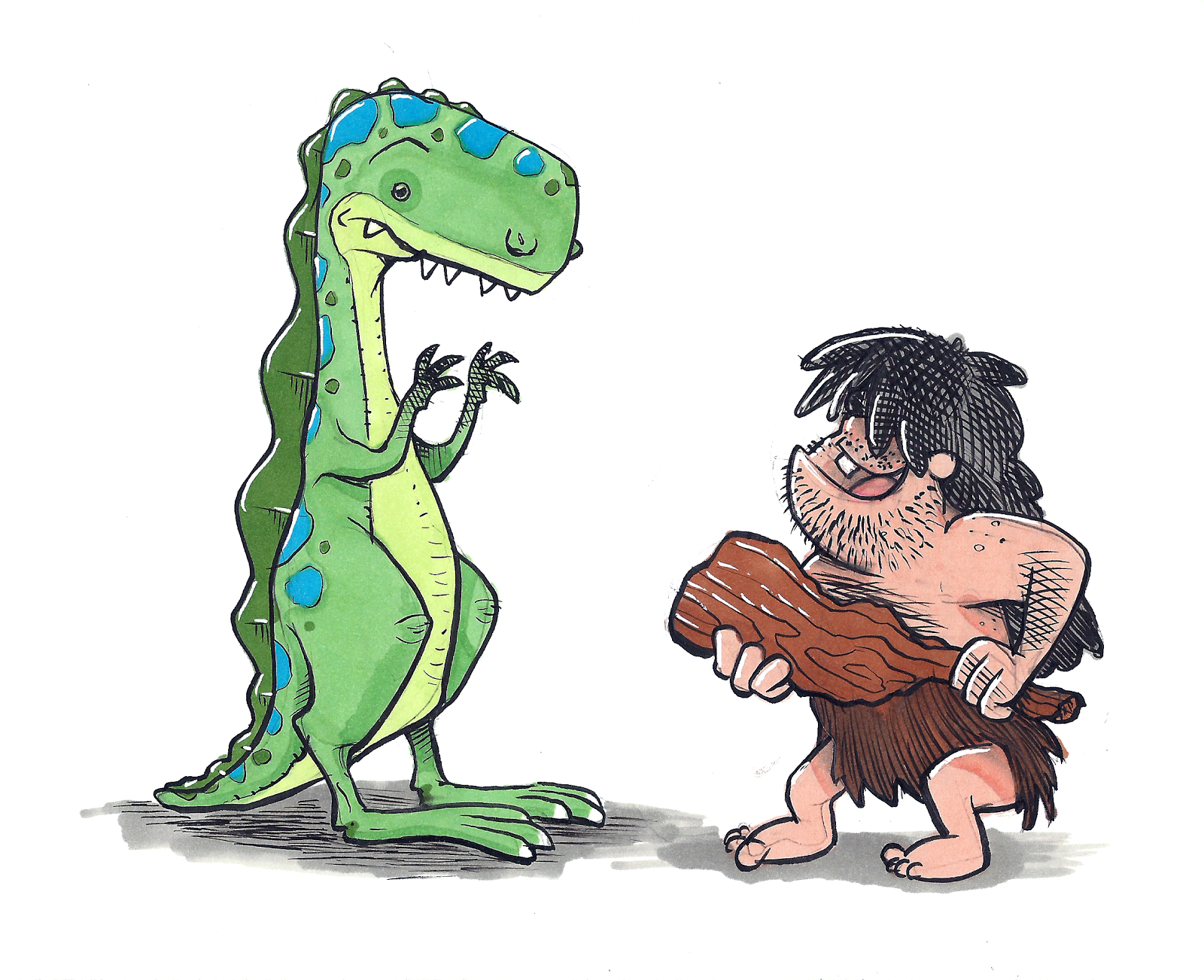
The many types of Trolls throughout the world
Some live under bridges, others live in the mountains, or as in World of Warcraft they are a dispersed race that has reggae accents. Some even turn into stone because they see sunlight.

But generally, there's one thing in common: they are ugly creatures.

Since this Troll is a role-playing game, I naturally had to focus on creating a more classic D+D gaming version . . . but keep it unique and original from all the others.
A few rough pencils sketches, which help me to explore, finding some unique (but recognizable) character features.
It was also important to keep this character different enough from the other 3 characters I was making for the game. As I previously mentioned, several of these creatures are interchangeable, where you may think a Troll might look more like an Ogre, Giant, or Orc than a Troll. Hopefully, with the main character features, props, and coloring, each of these designs will generally represent their legendary gaming creature.
The original pencil sketch of the Troll
Once I had the design cleaned and tightened, I decided to make a few color comps for the Troll's coloring using markers. The Troll was the only design of the four that I did a marker comp; I wanted to see how the coloring would affect the character. I gave Steve four color options, and again, he picked the same one I preferred . . . The yellow-green version.
Quick color comps I did with markers. Only one image was rendered on paper; then that was scanned into Photoshop, where the hues of the skin/hair were altered to create 3 more variations of color.

To help suggest the Troll's massive size, I gave him a heavy wooden club the size of a tree trunk.
The inked version of the Troll with his tree trunk sized club

 I still feel this character could easily play the part of an Orc, Ogre or Giant . . . But when comparing this to the other designs - hopefully, the traits of a Troll will be more apparent.

Character Designs for a Game: Part Two, The Ogre

Today's design is the Ogre, those big lazy bullies of the fantasy universe.
The full-color version of the Ogre on a dark background

I really wanted the Ogre to have a heavy-looking body -- yet make him appear strong and threatening. To add a little twist, I give him very tiny legs to hold that entire mass.

I think Ogres are better without too much gear, showing more flesh -- so I kept everything about this design very minimal. I focus on his body shape and bulkiness, giving him only a few shreds of clothing and an old battered sword that has seen better days. 

In the original sketch, sans sword, the Ogre appears taller.

The height was reduced to better fit the square area of the game card.
Just like the characters' sketches, I created several drawings of the weapons. These were then added to each of the character sketches in Photoshop. I find it easier to draw and design articles like this separately from the character. Designing items this way allows more focus to detail without having to worry about composition and balance.
The pencil sketches of weapons for each of the creatures
Also not wanting to make all the creatures in a tone of green, I gave Steve several color options for the Ogre. He picked the one I liked too . . . the flesh tone version. 
Take that Shrek . . . in your face!!

Several color options of the Ogre

Character Designs for a Game: Part One, The Goblin

Final image cleaned, slightly lightened and placed on transparent background

Awhile ago, during the holiday break, my friend Steve Radabaugh asked if I was interested in doing a few images for his upcoming Dungeon game. Since I've been trying to hone my work and do daily sketches of different characters each day - this was a perfect assignment. (Also, it's something I really enjoy doing - making monsters and creatures!) So over the weekends I started doodling to create some unique versions of classic creatures for his game.

Steve gave me a choice of many standard D+D creatures to pick from. I instantly wanted to do bulky and huge characters, since I thought I could have more fun giving them odd shapes and faces. I picked the Minotaur, Troll and Ogre. I also had to do the Goblin; just so many fun ways to draw these nasty little guys. 
Original pencil sketch of the Goblin sans his weapon
The thing I find interesting about Ogres, Trolls and Goblins is that they are very similar in many ways and are all portrayed in many unique styles and looks. Yet, I don't think there is an absolute definitive look of a Goblin, Ogre or Troll. If you Google each, you'll find very similar looks crossing between the three - where some images it can be any one of the three.) So my first challenge was to define what each one was to me.
Inked version of the Goblin now seen with his weapon
The most obvious . . . there is a definite size difference between the three.
Also, Goblins tend to be smarter, Ogres not smart and Trolls tend to drool on everything.

Goblins seem to be more spry. They make, steal and use tools/gadgets.
So I thought my drawing of the goblin should seem more rogue-like.
Color version of the Goblin using a limited palette of colors for a more graphic look

I'll be posting more of this work during the week, showing each of the four characters.
Tomorrow, part two: The Ogre


Thursday, October 20, 2016

Inktober 2016: Squeeze (#20 of 31)

This one's showing my age. Day20 for Inktober and the word is SQUEEZE.

My generation grew up on Looney Tunes cartoons, by far the funniest and best quality cartoons on television at that time. Today, I have no idea if children watch any of these classic cartoons anymore, especially when most of them have been edited, censored or banned.
Inktober Day20 "Squeeze", using a Tombow brush pen and Copic markers
"Squeeze" reminded me of one of my favorite cartoon characters as a kid, Hugo the Abominable Snowman. Hugo was only in a few cartoons, but he was such a great goofy character; (basically a tribute to the novel "Of Mice and Men.) Anyone who remembers Hugo, remembers his phrases . . . that's what inspired this cartoon.
Original pencil sketch of "Squeeze"

Wednesday, October 19, 2016

Inktober 2016: Flight (#19 of 31)

Ever notice how Hollywood usually portrays an angel as a neatly dressed, well-mannered, good looking and nearly perfect person with wings? Hollywood, cartoons and historical painters have really helped to distort what real angels are from the bible.

Angels in the bible are not good humans who get their wings when they arrive at heaven's gate. Angels are powerful spiritual beings who do the bidding of God. When angels show up, it's usually not a good time at all.

So I was thinking . . . for the people who believe they get wings when they go to heaven - what would they really look like? Basically, they would still look and be themselves, right? And if that said person loved smoking and drinking beer . . . well he/she would get to do that while in heaven too, right? (Otherwise, it just wouldn't be heaven.)
Realistic angel inked and shaded using a black brush pen and Copic gray markers

Saturday, October 8, 2016

Inktober 2016: Rock (#08 of 31)

For the 8th day of Inktober, the word of the day is Rock. That reminded me of my rock people characters . . . And my favorite is King Mudsok.

Blue pencil and inked character design of King Mudsok, the beloved leader of the Molten People.

Mudsok is one of the many characters I have been developing for a humorous story that takes place underground. His name is King Mudsok. Not sure where I got the name, but it popped into my head as soon as I finished drawing him. He is the king of the Molten People, a tribe that is at war with the Mucklugs, (a tribe of underground plant people.)

I see his character as being one who intimidates those who meet him. His voice is deep and rough, and his size is pretty impressive. He speaks with a loud, aggressive tone that vibrates the surrounding area. But underneath all that tough persona lies a very passionate, loving and caring soul. He really is a softie -- made of stone.

King Mudsok is a part of one of my many children's book stories for my "Timmons and the Lumpy Bumpy Monster" series. I'll try to find the Mucklug leader, Zoobi-Dang and post it when I can.

Friday, September 30, 2016

Illustration Friday: Weapon

Illustration Friday: Every Friday a word is given on the website, IllustrationFriday.com. Artists and illustrators then submit an image that represents that word all during the week.

This week's word: Weapon

For this week's submission, I simply took from an old image I did of my character Hairy. The page had Hairy getting ready to battle a monster in the closet, using the best toy weapons he could find.

Hairy loaded and ready for battle. Image taken from one of my oldest picture book stories.

Below is the original full image from which this image was taken from. This page is  #14 from the story, "Timmons and the Lumpy Bumpy Monster" back in the early 90's.

Original full colored dummy book page from "Timmons and the Lumpy Bumpy Monster"

Sunday, August 28, 2016

Daily Quick Sketch: Octopus Character (for another children's book concept)

It's been awhile since I posted on the blog. I'm in a bit of a low creative mode lately due to work and general stress. Yet, another concept for a children's book idea came to me recently during the night. I woke up and created this character sketch to get that concept down on paper.
(Too many other ideas have floated away when I didn't do the same . . . )

ADDED: Just added a quick color version of the sketch above.

Digitally colored using PhotoShop

Inked Octopus character for a children's book idea set in an underwater setting
The first thing I thought was, "I need an octopus character." I've drawn many octopus characters over the years, often created with a typical look and style. So I thought I'd change my usual technique and think outside the box.

Original pencil sketch design of my Octopus character for my newest children's book story

I thought adding a long neck/torso would make the octopus look unique enough. I also envision him walking on four arms and using the remaining limbs as arms. Like all characters I create, this one will be redrawn, adjusted and hopefully improved to have a unique character look.

Watercolor + Pen variation

Sunday, June 26, 2016

Daily Quick Sketch: Witch Nazel

UPDATE: B+W Image Colorized
Digitally colored in Photoshop
Quick note on the information below. I mention publishing an eBook version of the story, but after reading up on the market, eBooks aren't really catching fire . . . especially with children's books. Parents still want higher quality printed books and are willing to pay for that quality.

The major problem with eBooks is that everyone can make one - and it seems like they do. This creates a huge glut of poorly edited, poorly drawn and unprofessional picture books, which in turn makes any worthy eBook harder to find among all the clutter.

Bottomline: I'm no longer considering eBook publishing . . . going to try the old fashion way of submitting and waiting. We'll see if I can break into the business the proper way.


Originally Posted on Friday, December 20, 2013

I just purchased a new set of Copic Cool Gray markers and wanted to test them out.

I already had Warm and Neutral Grays . . . so I thought it would be best to try to create a wintry image with the cool grays. This was also a good opportunity for me to develop one of my supporting characters, Witch Nazel.

This version of Witch Nazel is more feminine, friendly and less freakish looking.
Marketing wise, this would be a better choice for her design since she would be accepted by more people. But the wacky side of me prefers a weirder looking Witch Nazel, (or at least not as clean cut as she appears in this image.) So, this may not be the version of Witch Nazel once the eBook is published. (. . . or . . . maybe it is . . . too early to tell.)


Gray toned image of Witch Nazel made with a cool gray set of Copic markers

This image of Witch Nazel is taken from one of the pages in my eBook, Worm Wire Glasses. I altered the background to make it more of a winter scene. Below is the original pencil sketch. You can slightly see a hint of the monster, Bladimir, flailing about in the lower right corner -- kicking a garbage can. This is from the scene where Witch Nazel floats over the ruckus that Bladimir is causing below on Halloween.   

Original pencil sketch of Witch Nazel flying on her broom during a Halloween night

Thursday, June 23, 2016

Throwback Thursday: Milo

Here's an old character I have been keeping for a certain story I wrote over 20 years ago. I named him Milo, after the main character from my favorite story when I was a kid . . . (Norton Juster's) The Phantom Tollbooth. That story captivated me like no other book, filled with crazy characters, wordplay, and imagination.

Old color comp of my character Milo for a picture book story

My character, Milo, is a smart nerdy little kid with a troublesome baby sister. Their story takes place on a Saturday morning, the time of the week when Mom & Dad sleep late -- appointing Milo the "Saturday Morning Boss of the House."

The first pencil sketch of Milo wearing pajamas
I originally pictured Milo differently with a big blockhead and very angular features. I was never satisfied by his look. Years later, looking at random sketches in a pad, I added big glasses to a doodle of a little boy's face . . . and that created the Milo character I was searching for all this time.

Pencil sketch of Milo readying for a major confrontation in the kitchen
One of the first major changes to the character was his clothing. I originally had drawn him wearing shorts, sneakers and a t-shirt (even a baseball cap in some sketches.) But since this story happens during the early hours of a Saturday morning, Milo should be wearing his pajamas. It made sense, though it never dawned on me until years later. Sometimes figuring out little details takes time . . .

Sunday, June 12, 2016

Daily Quick Sketch: More Monstas and Bunnies sketch stuff

Had this sketch laying around since the end of last year. The sketch was an idea I had envisioned and quickly jotted down on paper before forgetting it. It helped that it was the holiday season, which inspires this type of work. Looking at the image now, a half-year later, there are many changes needed to improve the composition. Mostly the sizing of everything is off. The characters and the tree need to be bigger with less emphasis/detail to the background.
Inked rough sketch of a concept for a Monsta and Bunnies calendar

I would like to create a calendar of this subject one day. This one would be December's image. I know the subject and images would work well, but I'm still undecided on what style medium I would want to use for final images. Time will tell.
Original pencil sketch of the holiday concept

Thursday, June 2, 2016

Daily Quick Sketch: Doggie Doodle

Found this doodle among pages in a lined paper pad. I don't remember doing this image, so it's a true doodle. A typical dog doodle with many features I usually draw. It's really just a smaller and more compact version of my character, Woger (from Bobby's Biggest Bubble.)

Sketchy ink pen doodle of a dog on lined notebook paper
The loose and angular line strokes make this image look different enough for me to archive and possibly use for future work one day.

Monday, May 30, 2016

Daily Quick Sketch: Baby Elephant

Few years ago, I created a story that needed a small elephant (and several other creatures.) This sketch was one of the first I created trying to develop a look for one of the main characters. While it is a cute elephant, I quickly rejected it because it just wasn't a proper fit for the character of the story.

Digitally colored image made with Photoshop
My overall feeling of this character is that it is too generic. In other words, if I needed to draw many elephants together, this would be the typical look all those elephants would have. A key character needs to have something more.

Original inking of Baby Elephant

Wednesday, May 18, 2016

Daily Quick Sketch: Dinosaur + Caveman

Here's another sketch that I had drawn on the back of a checking account printout. Again, I don't really remember doing these characters, just a random drawing. These characters are good enough to keep in my archives, but they still need some work to make them a little more interesting.
Prehistoric characters draw with pencil, ink with brush pen and colored with markers

Thursday, May 12, 2016

Daily Quick Sketch: Lil' Turtle

Found this little doodle in the back of one of my sketch pads. I don't like this image. It's a great example of what can go wrong with using markers without planning.

The major reason I don't like my sketch is the color. The tone is too dark and muddy. That is a major problem with using markers, you must work light to dark colors. Once that color is down on the paper, that's it. In this case, I was just doodling and experimenting with several new marker colors. Usually, creating a quick color comp or studying a color chart would help prepare for which colors to use.
Quick little marker and brush pen doodle found inside a sketch pad

You can try to paint over and correct a marker color, but my experience is that usually makes a huge mess and ruins the entire image. You could also correct the work in Photoshop or similar programs, But the amount of time it takes for me to clean up an image like this is usually wasted - since re-drawing the image from scratch often improves the overall look and design of the work.

Example of a self-made color chart, one of many I create for each set of markers I own
This chart is a small sample grouping of Premiere alcohol markers

Even the line work bothers me. It's too busy or the head is too angled to be truly cute. The most this doodle will ever be used (if ever) for is for some subtle background, 

One word of advise: If you are considering to try/use markers, especially alcohol based markers, be aware that is it very costly and hard to maintain a good grouping of colors. A typical marker is said to have a 2-year shelf life. And of course, the colors you use the most for backgrounds or characters will need to be refilled often.